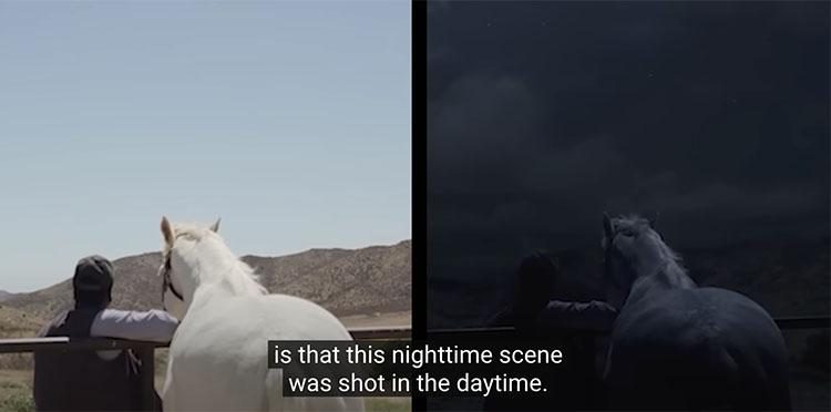
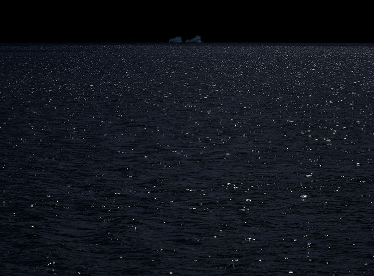
Because both analog film and digital image sensors are not as sensitive in low light as the human eye, night scenes recorded in natural light are typically underexposed to the point where little is visible. However, night scenes can be rendered with daylight.
"Day for night" is a set of cinematic techniques used to simulate the appearance of night while filming during the day. It's often used when it's too difficult or expensive to shoot at night, but it's sometimes selected deliberately because it offers special image qualities. It's not just technique; it's also an aesthetic.
The same techniques cinematographers employ can be used for still images.
Exposure
When shooting day for night, scenes are typically underexposed in-camera or darkened during post-production, reducing saturation and adding a blue tint – though some movies, like Mad Max: Fury Road, deliberately overexpose. There's more than one way to create the impression of night, and each one offers unique qualities.
ND filters are needed only for the brightest scenes or to prolong exposures to create motion blur.
Continue to use ETTR (expose to the right) but use it more cautiously; above all, don't clip highlights. This will offer you more latitude during post-processing. Avoid dramatic underexposure, which can crush shadows, flatten midtone contrast in ways that reduce flexibility during post-processing, and accentuate noise.
Very bright skies can disrupt the effect. If the sky isn't necessary in a composition, eliminate it. If it is, plan your exposure accordingly. Consider making a second, darker exposure for the sky.
Using HDR exposure techniques, even when a normal exposure wouldn't require them, will give you a variety of exposures for shadows and highlights to choose from or allow you to render a lower contrast combination that is more likely to produce convincing effects.
Lighting
Always consider the scene's light and modify your exposure and post-processing accordingly.

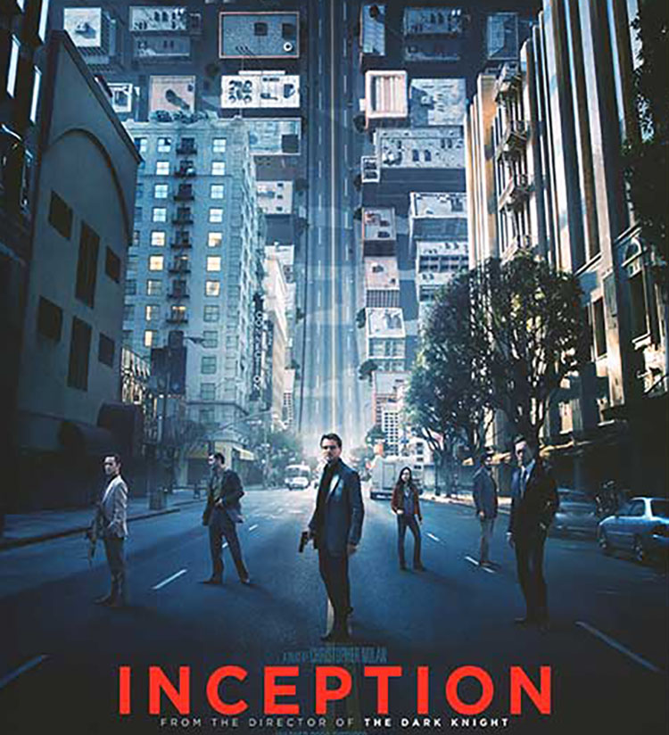
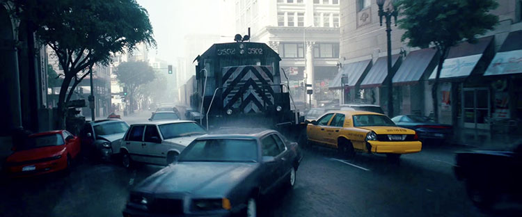 Dream layer one’s rainy exteriors are dominated by grays, dark blues, and blacks.
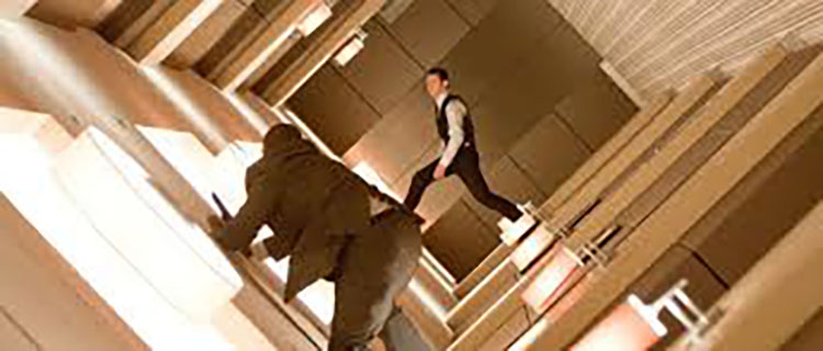 Dream layer two’s urban interiors are composed of warm oranges and browns.
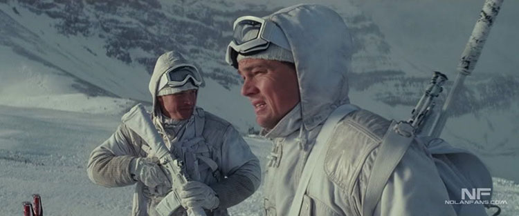 Dream layer three’s snowy exteriors are rendered with bright whites and grays.