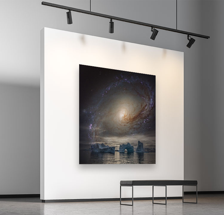
How To Avoid 6 Printing Mistakes That’ll Make You Want To Curse

Having taught over a thousand people for thirty years, I’ve seen and done it all. Here are the most common mistakes that people encounter when printing their images that you can avoid by simply looking at your files more closely and handling your paper more carefully.

Files

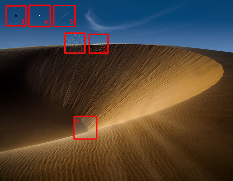
You won’t see this stuff if you’re zoomed out and looking at the whole image. Zoom in to 100% screen magnification. You’ll also miss things if you move around the image erratically. Move through each image one screen at a time and make a systematic quadrant-by-quadrant sweep.

1 – Noise

Too much noise can be distracting, especially color noise, unless you’re an impressionist. A little texture is good and makes images look sharper, so don’t overdo noise reduction, or your subjects will look like they’re made of plastic. Noise is most visible in smooth areas, like skies.

In some cases, you’ll want to reduce noise selectively with layers and masks in Photoshop, for instance, when you want to reduce noise in a sky more aggressively than in a foreground.

2 – Halos

One of the key things you want to watch out for when sharpening is producing halos. Most often seen along high-contrast contours, like horizons, halos are distracting and can make a straight photograph look like a composite. Though it can be done, retouching them is a bitch. So don’t produce them and use lower sharpening settings. If you need more sharpening in areas without contours (and the Texture slider won’t cut it), use layers and masks in Photoshop to sharpen selectively.

3 – Dust In Your File

Those dagnab little dust bunnies. They’re so easy to miss when you’re zoomed out and so easy to see when you’ve made a big print. Even if you keep your camera sensor clean, zoom in and check for them. If you find them, retouch them permanently.

Media

When it comes to media, the mantra is handle with care. This extra consideration will save you time, materials, and money. And it will earn the respect of your viewers. (God forbid that you don’t notice these things until your prints are exhibited.)

4 – Dust On Your Paper

If dust and lint fibers is on your paper while you’re printing, it can act as a resist and later fall off, leaving areas without ink. You can prevent this. First, store your paper in a sealed plastic bag or box. Two, look at your paper in the light and check for dust and lint, and if you see it, blow it off or use a soft brush to wipe it off. 

5 – Scuffing

Different than scratching, which gouges the paper surface, scuffing pushes down the fiber of paper and burnishes the particles in the ink, leaving a faint mark that can be seen as a difference in sheen on the surface of the print. Handle your paper carefully at all times, and cover it with a protective sheet when you’re not handling it.

6 – Wrong Side Of The Paper

If you print on the wrong side of the paper, blacks will be weak, colors will fade, and detail will be soft. How do you tell which side is the printable side? One, it’s the side your wet lips will stick to. Two, the printable side will usually feel smoother to the touch. Three, you can feel a slight lip on the edges of the back side where a cutting blade has pushed through the paper.

Pay your files and materials these extra considerations, and you’ll not only make better prints, you’ll also save you time, materials, and money.


Find more printing resources here. 

Learn more in my digital printing workshops.

Save Time, Money, Resources With These Printing Checklists

Have you ever had this feeling?

You’re looking at a gorgeous print of one of your photographs … then you notice a small detail that needs to be fixed, and you know you’re going to have to reprint it. More time, more paper, more ink. Frustration. It’s so obvious when you see it now! Why didn’t you see it before? Save time, money, resources, and increase your productivity and enjoyment at the same time.

Use these checklists to eliminate this problem.


Before you print check your … 

File

level horizon

precise crop

shadow detail

highlight detail                   especially at the edges

midtone contrast

saturation                             overall and specific hues

white balance                     casts are best seen in neutrals, flesh tones, and memory colors

noise reduced                      avoid blurring and artificial smoothing effects

sharpened                            avoid producing halos

imprecise masking            edges misaligned or haloed

imprecise retouching       blurry or misaligned or repeating patterns

dust                                           check at 100% screen magnification

softproof                                make output specific tweaks based on printer profile used

resampling                            if resolution is below 240 ppi or above 720 ppi

output sharpening             compensate for image softening due to dot gain


You can ensure you take all these steps with a consistent workflow.

Explore these color resources for more detail.

Explore these sharpening resources for more detail.


While you print check your …

Printer

orientation                             portrait (vertical) or landscape (horizontal)

page setup                             paper size and margins

color management             Adobe or Printer (for B&W)

printing profile

media setting                        precise or nearest paper type

ink                                              MK matte or PK photo black

printer resolution                1440 matte or 2880 photo


Save these settings as a Preset so you can use them again with a single click.

Explore these printing resources for more detail.


After you print check your …

Print

white spots                            dust on paper before printing

scuffing                                   handle paper with care before and after printing

banding                                   align heads or reduce print speed or make sure data transfer’s fast

microbanding                       check for nozzle clogs or print speed

local color casts                    areas check for nozzle clogs

colors faded                           wrong side of paper


Make sure you view prints in enough light with the right color temperature.

Explore these printing tips for more detail.


Learn more in my digital printing workshops.

9 Ways To Tell If Your Photographs Are Over Cooked

9 Ways To Tell If Your Photographs Are Over Cooked

Have you ever taken an image so far it gets completely out of control? I know that feeling well.  It happens to all of us. It’s not all bad. We have to step over the line to find it. It is better to work hot and then to cool down than play it so safe we never get where we really want to go. 

If you find yourself in so deep that you’re not sure where you got off track and you don’t know what to do, use this check list to identify the issue. Then fix it. Even one thing can make a big difference.

Here are some common pitfalls to avoid. (Most of these moves help images; this is just a matter of taking them too far.)

Highlights clipped

You want your highlights to glow, right? But you want them to have detail too. That’s the limit. Paper white is for poets not photographers.

Too Bright

Have you ever felt like viewing an image would be easier with sunglasses on? It’s common to make images brighter while trying to get them to glow. The key lies in midtone contrast. Place it in the most important image areas and darken and/or reduce the contrast of surrounding areas to support it further.

Shadows Clipped

Unless you’re going for gothic or graphic, hold that shadow detail. Areas of dark do make midtones and highlights appear brighter. Better still, handled sensitively these dark areas can hold a unique light at the same time.

Too Much Contrast

Contrast glows, until it makes you squint. More’s not always better.  Think of Goldilocks; one of them was just right.

Over-Sharpened

Yes, we tend to think of focussed sharp images as signs of good equipment and good technique. Blurry photographs are a real drag unless the blur in them is intentional. Nevertheless, it’s easy to overcompensate and make images too sharp, completely forgetting about the sensual possibilities of texture. Let those be your guide as to how far to go and not go. (Remember, angels have halos, not horizons.)

Noise 

A little bit of noise is not the end of the world. But try not to add more during processing. Guard against it when applying extreme contrast like Clarity and Dehaze as well as when sharpening. It’s not hard to reduce during post-processing but here again don’t overdo it; don’t make your subjects look like they’re made out of plastic wrap.

Posterization

Posterization is nobody’s friend except Andy Warhol. Not working in high-bit color modes and applying strong contrast and/or saturation adjustments quickly causes posterization. Use extra care when you’re working on JPEGs. (Don’t confuse this with a graphics card being challenged to display an image when zoomed in or out; if you don’t see posterization at 100% screen magnification it’s not in your file and won’t print.)

Unnatural Saturation

Don’t fool yourself. If you don’t believe it, neither will anyone else. Often just one or two colors will seem off. When this happens adjust them separately from the others. There’s no reason to limit one color because of another.

Vignetting

Vignetting can be a great way to strengthen the frame and to direct and keep attention in it. As with all things, it can be overdone, calling attention to itself and reducing the contrast of the areas it affects adversely. Monitor lens corrections as the ant-vignetting they apply often goes too far and you end up with corners that are so light they become distracting.

Using preflight checklists is a standard practice for pilots and doctors. Though the stakes aren’t as high, they’re a good idea for photographers too. Use this checklist before you share or print images and you’ll completely eliminate Homer Simpson moments. (Doh!) Checking these things will quickly become second nature for you, but don’t let that lead to sloppiness; be thorough. There are enough items to check that it’s easy to forget one or two. But there are so few that you can count them off with your fingers. It’s probably taken you longer to read this than it will to do it on your next image or print. Just scan the bullet points.

7 Things To Look For In Great Prints & Great Artists Who Make Exceptions

Get The Digital Printing Quick Start Guide here.