4 Ways To Divide The Frame


The four most important lines of any image are the ones that are often least recognized consciously – the frame. Second only to these are the lines that divide the frame, creating frames within the frame. Becoming more aware of how the frame can be used and how it can be divided will help you make more successful compositions.
There are many ways the frame can be divided. You can divide the frame horizontally, vertically, or diagonally; in each case the layers included define the virtual space presented. Different areas in an image can be divided differently. You can divide the frame (or a frame within the frame) multiple times; the more times the frame is divided the more packed and dynamic it becomes, progressively growing more design oriented and finally being reduced to pure texture. Each operation has significant consequences.
One of the most significant results of dividing the frame is the creation of specific proportions. (The combination of the individual aspect ratios of each element creates a new unified aspect ratio.) Much has been made of the ‘rule of thirds’. Dividing the frame into three parts (left/center/right or up/middle/down) is a simple and often useful strategy for making images more directed, by prioritizing one element over another, and dynamic, through imbalance. Too little has been made of other ratios. What of fourths, fifths, sixths, sevenths, or eighths? No musician would be content to only divide an octave into halves and thirds. Every proportion produces particular effects, which are further modified by placement (high/low or left/right) and content. Rather than a rule to be adhered to, proportion is a force to be explored expressively.
When it comes to controlling the division of the frame in your images, you have more options available to you than you might think. You can crop, retouch, distort, or composite. These four operations can be used in combination with one another. For instance, you may decide to first crop an image and then distort it to a standardized aspect ratio. Or, while maintaining a frame of the same aspect ratio, you might increase the scale of a selected area only and in the process crop a portion of it. Many other permutations are possible.
If you find these many new possibilities dizzying, you get it. The only way to understand this intuitively is to explore your options. The development of new possibilities encourages us to ask new questions and develop new habits. For what effect are you dividing the frame? To that end, how many different ways can you think of dividing the frame? My advice? Develop the habit of exploring your options before settling on final solutions, ones that help you create your strongest statements.
Read more at Digital Photo Pro.
See my related post Exploring The Expressive Possibilities Of Aspect Ratio.
Learn more in my digital photography and digital printing workshops.

Encourage Plans To Evolve

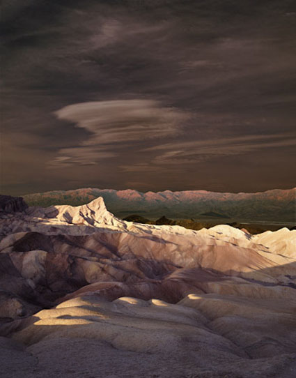
Oriens I, Death Valley, California, 1999

I missed the shot(s) the first time. When I got back from Death Valley, a friend said, “Zabriskie Point? Again? Well, I’ll bet you could photograph it in a way that hasn’t been done before.” I knew what she meant, but her comment actually clarified another idea for me.

I had been deeply impressed by the way the light changed mercurially over time, continually transforming the landscape from pre-dawn through early morning. It first lit the blue-gray sky with pale pinks, then turned the far mountains from a cold brown to a hot coral, crept slowly across the valley floor to set Manley Beacon on fire (the crescendo in a magnificent symphony of light that most photographers favor), and continued to create moving pools of light in the foreground during a process that lasts for more than an hour. It is a wonder to behold and to fully appreciate it, one needs to be still and vigilant for some time. Its full impact cannot be found in a single moment. I found it in many.

The solution? Make multiple exposures of the same composition throughout changing passages of light and then blend them together to create the impression of an extended moment in time.
I had made exposures of sunrise at Zabriskie Point, but I hadn’t made the ones I needed now. I had to go back. It took a year and a half. Knowing that so many unexpected things often happen, I prefer to make flexible plans, so I wondered if I would return for an idea that ultimately wouldn’t work. I envisioned glorious light in every layer of the landscape. As I began making the exposures, I realized there was a flaw in my plan. If I selected the ‘best’ light in every area of the picture, all areas would demand equal attention. There would be no contrast. The final image needed shadow just as much as it needed light. I persisted, making exposures, without moving the camera for more than an hour, of every significant change in light – and shadow. My original plan was useful but it needed to be modified as it was executed based on specific conditions, new information, and insight. To succeed, I had to listen not just what was in my head but also to the place and the process.

Later, as I looked at my transparencies, the final solution presented itself. This new solution even highlighted my feelings about the place more strongly than my original idea. The result, different from my initial conception but consistent with my intention, achieves a dramatic lighting effect never before seen at one time. Yet, throughout time, a similar sequence of experiences has been witnessed countless times by so many.

The light on the foreground is unaltered, or to be more accurate, I should say is faithful to the transparencies that recorded it. The separate portions have not been modified substantially, nor were they modified unequally – there has been no dodging and burning. Instead, the light has been reorchestrated with time, faithfully representing the existing light(s) but changing what can be seen in a single moment.

Nothing in the foreground, midground, or background has been added or removed. The sky, however, is an addition from another location. I found the smaller sliver of sky contained in the original exposures made the composition cramped. It lacked the vast sense of space found in the desert. The sky had in fact, been the first indicator of the presence of the coming light, making a thousand transformations before its arrival. But the sky that morning was not particularly noteworthy. I could have spent a lifetime waiting for the perfect sky. I chose instead to incorporate another sky from another location that supported both the composition and the light. This sky I altered dramatically, both in tone and color. I did so to expressively complement the drama of the light below, to support it and not detract from it. While the lower half of the image is a matter of resynchronization, the upper half is a matter of recontextualization.

Neither method (resynchronization or recontextualization) yields a classically objective document. However, the results of their application may yield artifacts that are truer to our experience of events than traditional photographic practices. If applied in specific ways, they can represent certain aspects of events more faithfully, such as the passage of time.

Making this image changed the way I think about and experience the essential elements of photography – light and time.

How many ways can thinking more predictively about change aid your creativity?
How many new ways can you think about the fundamentals of your medium?
How can planning increase your creative success?
What can you do to encourage your plans to evolve?

Read more The Stories Behind The Images here.

Disclosure – Images That Changed


Several images changed for inclusion in my book Antarctica. Why? The original versions contained small, but significant,  elements that were composited from other sources. So I removed them for this project. Even though it’s often highly interpretive, editorial work is about representing the scene as it was witnessed. It wasn’t clear to me until after the initial voyage what kind of project I was developing. As it became clearer and clearer I realized I needed to put certain restrictions on my standard practices – otherwise it would become a different kind of project. There’s nothing wrong with those practices. They’re just not appropriate for this kind of project.
It’s usually only astronomers who realize that the moon in the first version is impossibly lit; it should have light on the same side as the iceberg and mountains. I like to leave clues like this for the viewer that alerts them to the fact that images have been altered. With my other type of work, I usually don’t tell them. Instead, I let them figure it out. This keeps viewers asking a lot of questions, which is really beneficial for everyone. In the case of my Antarctica work, I’m now doing the reverse. It’s appropriate and relevant to do so. In this case, full disclosure raises more questions. Questions and dialog are useful.
Find out about my exhibit here.
Stay tuned daily for more resources.
Get priority status in my Antarctica 2011 workshop.
Email info@johnpaulcaponigro.com.

Disclosure – Images That Didn't Make It


Several images didn’t make it into the second edition of my book Antarctica. Why? This body of work is editorial in nature. I’ve only included images created with the similar limitations. These two images are composites that replace the original background with a Russian research vessel with a more aesthetically pleasing seascape. Even if the author expresses an opinion in it, editorial work is primarily about informing and secondarily about aestheticizing, not the other way around. So these are completely different kinds of images. They need to be placed other contexts.
Find out about my exhibit here.
Stay tuned daily for more resources.
Get priority status in my Antarctica 2011 workshop.
Email info@johnpaulcaponigro.com.