3 Qualities Of Light You Can Use To Make Your Images Glow

Color has three elements – luminosity, hue, and saturation. 

Luminosity describes a color’s lightness.

Hue describes a color’s temperature. (It’s the rainbow ROYGBIV.)

Saturation describes a color’s degree of neutrality.

All colors can be described as a combination of these three values.

Each of these elements offers a unique quality and type of contrast. (Think energy.)

While we see all three elements simultaneously, learning to distinguish these three elements from one another is a useful skill that will help you see more clearly and see more possibilities for enhancing your images.

Consider the transformations each element of color offers.

When highlights are lightened with luminosity, this image feels cooler and more brilliant.

When highlights are warmed with hue, the image feels hotter and more humid.

When highlights are intensified with saturation, the image feels more lush and fertile.

Each of these elements of color implies a different atmosphere, a different time of day, or perhaps even season, and, in this case, a state of plant growth. Color becomes a code for many different qualities, and so can offer you many possibilities for creative enhancement and personal expression.

The following examples will illuminate some of the possibilities and pitfalls for you.


Insights Members can login to read the full article.
Email:
or Sign up

Select And Mask Hue With Photoshop’s Color Range

IMG_5175_425

When you want to make a selection based on hue, start with Photoshop’s Color Range. (It’s located in the Select menu.) It’s an invaluable selection tool that’s easy to master.

The heart of this tool is the default setting for the Select drop-down menu – Sampled Color. Once you learn to use it, you’ll find you’ll use it often. For Sampled Colors, it’s an oversight to activate the slider for Fuzziness (the number of related hues included) and not Range (targeting specific lightnesses). Hope, no request, that Adobe activates both Fuzziness and Range sliders for all drop-down settings. For now, you can overcome this limitation to some extent and customize any range of color with surprising precision by using the icons on the right of the dialog box Eyedropper Tool, Add to Sample, and Subtract from Sample icons as well as the Invert checkbox. It is also the only setting that activates the Localized Color Clusters check box, which essentially adds a radial gradient around the point you sample a color from. You can master this tool in a few minutes.

SampledColors_425
SelectDropDown_425

You’ll probably find that you’ll use the other settings in Color Range’s Select drop-down menu sparingly, some not at all.

Skip them. The color choices in the Color Range drop-down menu – Reds, Yellows, Greens, Cyans, Blues, Magentas – are almost useless. They’re not as accurate as you’d like them to be and they don’t offer Fuzziness or Range sliders to control them with. It’s all or nothing, usually nothing.

Use them occasionally. The Highlights, Midtones, and Shadows options have improved by activating both Fuzziness and Range sliders. Curiously, if you Invert the Highlights setting you get a slightly different result than simply choosing Shadows setting and vice versa. But don’t worry, the Fuzziness and Range sliders will give you all the control you need to compensate and much, much more. Color Range’s selections of luminance yield different results than making luminance selections by loading channels as selections (See my article Masking Luminosity.); for better or for worse, they tend to produce fewer gray values and so they yield more generous selections with quicker less smooth transitions into surrounding values, as if you added contrast to a channel selection.

Consider it. While it offers only the control of the Fuzziness slider and not the Range slider but adds a Detect Faces feature, Skin Tones can be quite useful – at times. It is clearly biased towards Caucasian skin tones as it picks up whites before darker browns but it does a good job of avoiding very saturated warm hues. If Skin Tones fails, use the default Sampled Colors instead and choose a custom base color you’d like to start with.

Forget about it. Be careful about the Out Of Gamut feature. It works based on the profile loaded for an output device, usually an offset press. It’s designed to help you prepare files for printing by selecting and subsequently desaturating colors that are too saturated to be printed accurately. Using color management and good output profiles is a better way to control gamut compression.

Finally, if you want a larger preview of the selection/mask being generated, the Selection Preview drop-down menu offers four settings that will change the appearance of the image window Grayscale, Black Matte, White Matte, and Quick Mask. In most cases, the generously sized icon in the Color Range window will be all you need.

Photoshop’s Color Range is an indispensable selection tool that continues to improve. When you want to make a selection based on hue, start here.

Read more about Selections & Masks.
Learn more in my digital photography and digital printing workshops.

The Temperature Of Color – Warm Or Cool ?

2_wake4

An essential quality of color is temperature. Temperature can be used to attain a color balance. Temperature can be used to enhance spatial relationships within an image. Temperature can be used to elicit psychological responses within the viewer. Understanding and exploring the dynamics of temperature in color can benefit any visual artist.

There are physical characteristics of color linked to temperature. The color temperature of light (Kelvin degrees) is determined by measuring a black body radiator (an object heated so that it emits light). As the physical temperature of the object rises, color transitions from red (long wavelengths – low energy) to blue (short wavelengths – high energy) through ROYGBIV (red, orange, yellow, green, blue, indigo, violet). When it comes to light sources, physically, blue is warmer than red.

There are also psychological qualities of color linked to temperature. Psychologically, blue is cooler than red. These associative qualities of color with regard to temperature are almost universally accepted. This is due in large part to our physical environment – water is blue, plants are green, sunshine is yellow, fire is red.

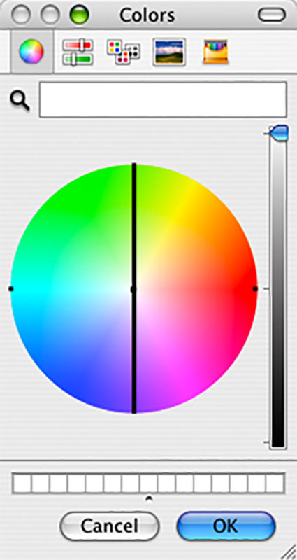
Using the qualities of one sense (touch) to describe the qualities of another (sight) can be a tenuous affair and may lead to ambiguity and confusion. The more precise a language is the more useful it is. The language of HSL (hue, saturation, luminosity) is a very precise language. When using the language of HSL, hue values mark a position measured in degrees on a color wheel. A circle has 360 degrees, so the scale is 0 – 359.

While every degree represents a new hue, you can use broader terms to describe a color family; red, orange, yellow, etc. Think of the color wheel as a clock where every hour marks a new color family.
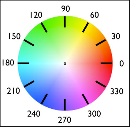
hue_clock

0          red
30        orange
60        yellow
90        yellow green
120      green
150      blue green
180      cyan
210      green blue
240      blue
270      purple
300      magenta
330      blue red

hue_degrees
warmcoolsamples

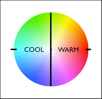
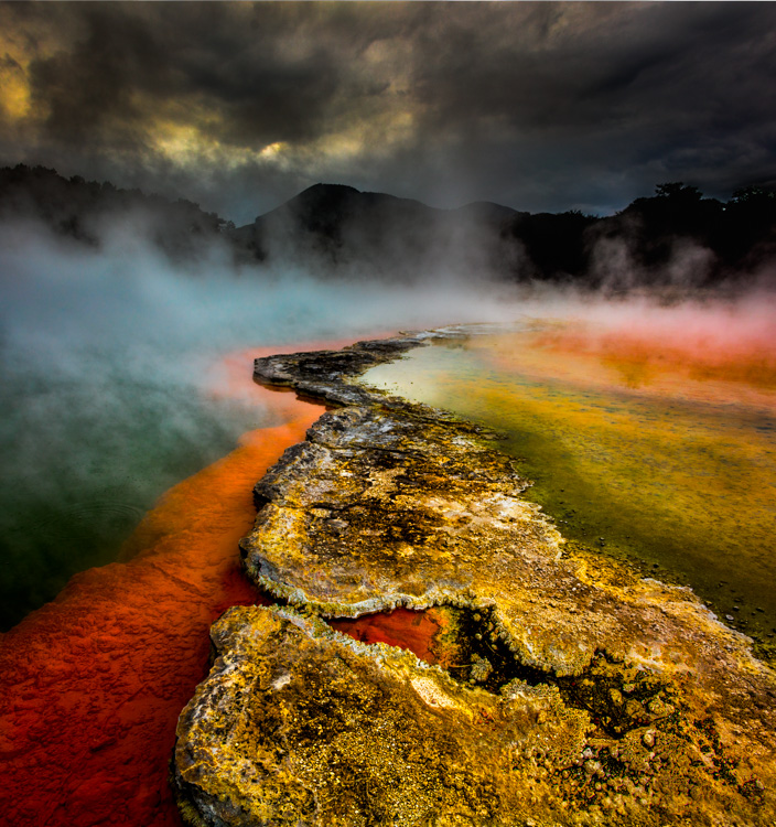
Absolutely warm and cool colors can be found at 0 (red – the warmest color) and 180 (cyan – the coolest color) degrees. Determining whether one color is warmer or cooler than another can be measured by their proximities to these poles. A line between 90 (green yellow) and 270 degrees can be used to broadly demarcate warm colors from cool colors; colors on the right (towards red) are warm while colors on the left (towards cyan) are cool. The association of yellow with the sun, a warm light source, subtly skews the associative quality of warmth towards yellow (60) and away from blue; as a result, colors above the line between 0 and 180 tend to seem warmer than colors below it. (i.e. while both are equally distant from red (0), orange (30) seems warmer than blue red (330).) While one color can be seen as warmer or cooler than another color, each color also has warm and cool components; there are warm yellows and cool yellows, warm blues and cool blues, etc. (Where numerical classifications of colors define hues very specifically (1 degree per hue, 30 degree spread per linguistic color), linguistic specifications of colors (red, orange, yellow, etc) define broad ranges of hues.) Defining the warm and cool endpoints of any linguistic color is useful at a coarse level of granularity but becomes increasingly subjective at a fine degree of granularity. At what point does blue become purple? At what point does blue become green?

It’s possible to describe the adjustment of hue simply in terms of warming and cooling.

Photographic color adjustment strategies rely on adjusting a balance in each of three complements.

Red – Cyan
Green – Magenta
Blue – Yellow

colorbalance

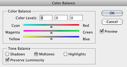
Most hue adjustment tools, like Photoshop’s Color Balance, have these complements built into their interface. You can’t increase one hue without decreasing its complement.

Each set of complements has a warm and cool dynamic.

R (warm) –  C (cool)
G (cool) –  M (warm)
B (cool)   – Y (warm)

These three complementary axes have different warm/cool dynamics with respect to the three color primaries – RGB.

red (warm red)      –   cyan (cool blue)           warm/cool
green (cool green) –   magenta (cool red)       cool/cool
blue (warm blue)   –   yellow (warm green)    warm/warm

1_warmcoolaxis

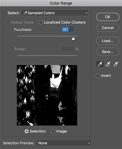
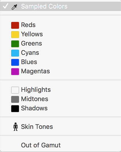
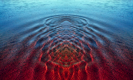
You can analyze the color temperature dynamics at work in any image by sampling it and graphing it. Doing this will not only help you understand how it works but also how you might improve it.

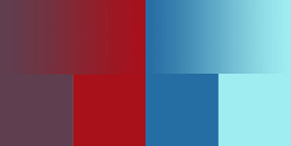
You can make a field of color appear more dynamic, complex, and three-dimensional by preserving or introducing a variety of warm and cool components in it.

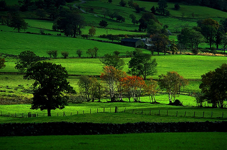
The temperature of color carries spatial associations with it. Warm colors tend to appear to be nearer than cool colors. Again this is universal. It can be overturned by many factors; some factors are related to color, such as saturated colors appear nearer than desaturated colors or a progression from light to dark may be the primary element that establishes spatial hierarchy; some factors are not related to color, for instance, placement and overlap in the composition may be primary spatially, overriding color relationships.

Color balance, spatial proximity, association – these are just three of the uses of warm and cool color dynamics in images.

Whether you are adjusting preexisting color relationships or creating new ones, having thoroughly explored the warm and cool dynamics of hue, you can apply that knowledge towards the realization and enhancement of your images.

Learn more in my digital printing and digital photography workshops.
Learn more with my DVDs on Color here.
Learn more with my free color resources here.

Indentifying the 3 Elements of Color

Color has 3 elements – luminosity, hue, and saturation. All colors can be described as some combination of these three values. While we see all three elements simultaneously in a single color, learning to distinguish these three elements from one another is an important perceptual skill.

luminosity
Luminosity, the light and dark of color, can be describe on a scale of 0-100. 0 is pure black. 100 is pure white. (It’s the zone system’s 0-10 times 10.)

hue
Hue, the color temperature of color, can be described on a scale of 0-360. (There are 360 degrees in a circle. Every 30 degrees transitions into a new family of color – i.e. 0 is red, 30 is orange, 60 is yellow, etc.)

saturation
Saturation, the degree of neutrality of color, can be described on a scale of 0-100. 0 is absolutely neutral. 100 is maximum saturation.

LHS (luminosity, hue, saturation) is an excellent language for describing color perceptually (though not necessarily the best for editing and printing). Instead of memorizing RGB values for all the colors in all the standard color spaces, or CMYK values for all devices, or a Pantone swatchbook, you can simply observe color and translate that into 3 values.

LHS is an easy language to learn. Luminosity and Saturation are described on a 0-100 scale, essentially a 1-10 scale with more granularity. Easy. Learning numerical values for Hue is more challenging, but if you memorize a few values you can easily figure out the others. Think of the color wheel as a clock. 0 degrees, red, starts at 3 o’clock. Count back 1 hour, 2 o’clock, to the next color, orange, or 30 degrees. Keep counting back in 1 hour increments to the next color, (i.e. 1 o’clock or 60 degrees is yellow). (An easy mnemonic for remembering the progression of hues is ROYGBIV – red, orange, yellow, green, blue, indigo, violet. You’ll need twelve words to make it all the way around the clock – red, orange, yellow, warm green, green, cool green, cyan, blue, warm blue, purple, violet, magenta.)

Consider LHS a ‘zone system’ for color. It’s a simple sophisticated language that can be used to describe color with greater clarity. You’ll find learning it will lead to better communication. Once you learn it, you’ll be able to communicate more precisely with others who know it – you can even teach it to others quickly.

You’ll also find that once you learn the language of LHS, you’ll see color more clearly, remember it better, understand more about how colors work together, and find ways to adjust colors to reproduce them more accurately or enhance their capacity for expression.
Learning LHS is time well spent.

Exercise
Identify colors with LHS numbers.
Here are three examples.
50-0-0
50/0/0
100-0-100
100/0/100
30:75:75
50/30/50
Now, call out numbers for more of the colors you see.
Make this a habit and you’ll develop razor sharp color perception.

Read more Color Theory.
Learn more in my digital photography and digital printing workshops.