Adventures In Ice – Webinar

CCIce_425

If you missed it the recording can now be viewed above.

The Camden Conference and Camden Public Library host internationally renowned photographer John Paul Caponigro, who will share his images from six voyages to Greenland and contrasts them with twelve voyages to Antarctica including his personal adventure stories, conversations with scientists, and facts about the region.

Live via Zoom on September 15 at 6:30 pm.

Find out more about Camden Conference here.

My Top 12 Images Of 2015

Alignment VI

Alignment VI

Alignment X

Alignment X

Alignment XXIII

Alignment XXIII

Alignment XXII

Alignment XXII

Alignment XXVIII

Alignment XXVIII

006_20150913_GRNnordvestfiord_0371-Edit-1

Constellation XV

Constellation_XIV

Constellation XIV

009_Greenland1

Untitled

008_Greenland2

Untitled

20141119_AFRskeletoncoast_0002-Edit-1_425

Illumination XXIV

20141103_AFRsosssusvlei_0117-Edit-2_425

Illumination XXXV

This is a selection of my top 12 images of 2015. This selection doesn’t reflect sales, publication, or activities on the web. It simply reflects my opinion. Click on the titles to find out more about each image.
Geography
My obsession continued with places defined by water (either an abundance of it or a lack of it) in the polar-regions of Greenland and Iceland and in the deserts (an absence of water, yet often shaped by waters long gone) of Namibia, Argentina, and California.
Process
Half the images I released in 2015 were exposed in other years. Several of the other images were processed on location or the day they were exposed. I date “straight” shots based on the date they were exposed and composites on the date they are completed.
Concepts
There were several new twists on old subjects and themes: amid sensual dunes multiple moments / perspectives became conjoined; levitating stones became ice; below reflective water surfaces instead of closer details full landscapes are seen; seeing through things to what lies behind them shifted from skies to landscapes.
Magnificent Moment
Once again, flying over the 1,500 foot coral dunes of Sossusvlei for more than an hour was simply divine, especially when coupled with the hours spent walking its shifting surfaces in constantly changing light.
It’s challenging to choose so few images from so many – but it’s insightful. Try selecting your own top 12 images. Try selecting the top 12 images of your favorite artist(s).

View more of my Annual Top 12 Selections here.

View more images in my ebooks here.

View my full Works here.

View my Series videos here.

View new images in my newsletter Collectors Alert.

Alumnus Sam Krish's Polar Exhibit Opens June 14

mirror8
Sam Krisch opens his second solo exhibit of the year “Above Zero: Photographs From The Polar Region”  Sunday, June 14 at the Allentown Art Museum in Pennsylvania.
In this post, Sam shares what he learned on his journey to creative success. You’ll find it inspiring and helpful.
Here are a few highlights.
“John Paul’s mentorship as well as the inspiration and encouragement of countless others led me to work harder, to dig deeper, to find new places: physical locations, internal emotions, and fresh ways of seeing. Hard work and constant study added to my skills. Through the fellowship of an international group of artists I found community and stimulation: a vast ocean of knowledge and inspiration.”
“Each particular curator sees an artist’s work in a particular way, interprets it, and often brings out a way of seeing the work that the artist hadn’t considered. A great pleasure for me is working with professionals who approach the presentation of my work in a different way. They ask probing questions for the lectures, gallery guides, and docent training. I always learn something from exhibiting my work and I am often surprised by people’s reaction to it. Some are emotionally moved, some want to know technical details, some may not like it. It’s the risk you take when you exhibit.”
Read More

Alumnus Michael J Quinn’s New Print Portfolio

Quinn_2 Quinn_5
I have been honing my photographic skills over the last several years. Making strides in composition, storytelling and mechanics of photography, I still lacked some finer processing skills and the art of printing. I decided that a print is the ultimate goal of a photographer. There is just something very tangible, very permanent about a print. Anybody can flick through a series of images on an electronic device. But actually taking the time to make a print, matting, framing, hung on the wall and lit well -takes considerable more effort. It also then requires more contemplation by the audience. I think they place more weight and value on the print than in electronic form. They are more willing to commit more time with the print.

During the span of a year, I completed both of John Paul’s Intermediate and Advance printing classes. At that point, I believed that I had achieved the skills required to attempt my own Print Portfolio.

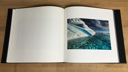
There is just something substantial about the physical print. Let’s face it, we can casually look through tons of images on our electronic devices. They are there and then gone. But having a book full of prints is something completely different. You engage two more of your senses, touch, and smell. Every book has a certain feel and personal experience to it. It evokes more of an emotional response than the electronic equivalent.

So my goal with this project was severalfold.
1. Create a body of work of 24 images
2. Improve my image processing
3. Improve my print quality / skills
4. Share with as many people as I can
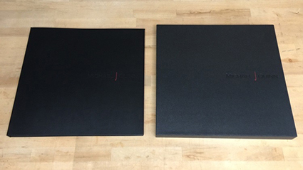
A decision had to be made on the format of the book. Landscape, Portrait, or Square. I deiced that the square format was the most versatile of the three. With a square book, I could print any aspect ratio that I wanted and not feel constrained to a particular style. Since I knew this book was going to be a work in progress and may change over time, I thought being versatile was a good trade-off versus being locked into a portrait or landscape format.

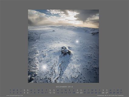
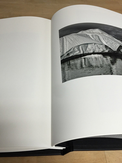
The next decision that I had to make was the size of the book. I based this partly on the common size of paper available. The other influence was what kind of reaction I wanted from people when they viewed the book. I made 5 prints on 13×14 inch and 17×18 inch papers and then just stapled them together to simulate the two sizes of the book I was considering. I printed horizontal, vertical and square images. I had my own opinion and then solicited several peoples opinions. The larger size won hands down. You would not think that 4 extra inches would make that dramatic of a difference but it really did. It took the scale of the book from something casual to something cherished. The larger size was just so much more engaging.

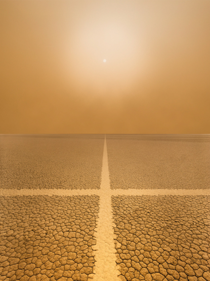
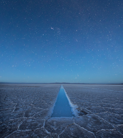
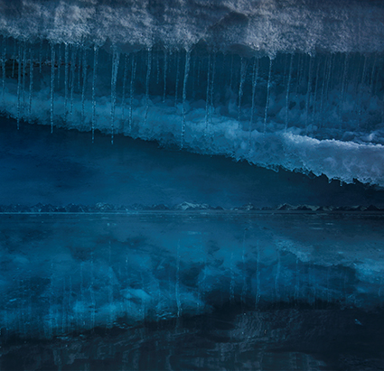
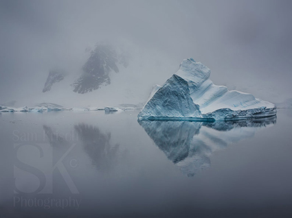
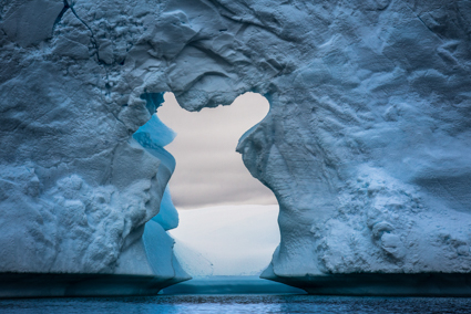
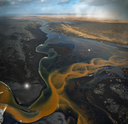
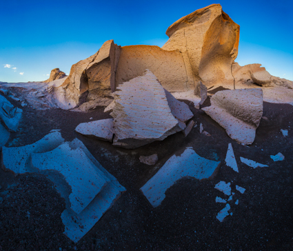
The paper choice for my Epson 9900 printer, (after some experimentation) Epson Ultrasmooth. It brought an extra dimension of depth to my ice images. The warmth of the paper gave an extra separation to the printed images. I decided that the easiest form factor would be to use 17″ wide roll paper. Then I would just allow the printer to cut the sheets to a length of 18″. This way I would not have to do any post printing trimming of the prints.

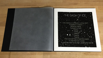
For the physical book, I had a custom binding post book and slip cover made. I choose the binding post style so that it would be easy to replace prints and so that I could completely change the theme of the book if I desired. For materials I choose Black on Black on Black. This might be generic, or called corporate, but I liked the neutrality of it and its future potential. Each of the three surfaces were a different material, so that added a subtle variation to the book. I added just a splash of Red into my debossed logo. The inner front and back sheets are sanded mylar. This essentially adds an end sheet to the book and enhances the experience when opening the book.

Quinn_3
Quinn_4
I learned a lot through this process. It was a great growth experience. Having a project focuses your mind and creativity. Completing a project gives you a sense of accomplishment. Sharing the experience – I hope I can inspire all of you to do something wonderful.

Find out more about Michael J Quinn here.

My Top 12 Images Of 2014

Alignment V

Alignment V

Alignment IV

Alignment IV

Antarctica CLXVI

Antarctica CLXVI

PS Manges Color, lighten, lighten shadows

Antarctica CLXXI

Antarctica CLXXII

Antarctica CLXXII

Constellation XI

Constellation XI

Constellation XII

Constellation XXI

008_Contrail V-4

Contrail V

Contrail IV

Contrail IV

Antarctica CLXV

Antarctica CLXV

Incubation X

Incubation X

This is a selection of my top 12 images of all time. This selection doesn’t reflect sales, publication, or activities on the web. It simply reflects my opinion. Click on the titles to find out more about each image.

Geography
Antarctica, Argentina, Iceland, California
Process
I added something new to old projects; Antarctica and Constellation. I began moving forward on bringing a long-standing series to completion; Alignment. I released the first images from a new series Contrail that shows man’s marks in nature found in even the most remote places on earth; a complementary companion series of is soon to be released.
Concept
Similar themes echo throughout most of my individual series creating a shared network of connections. Alignment connects with Contrail and Refraction in different ways. Constellation connects with Correspondence in other ways. More connections are revealed over time.
Magnificent Moment
An hour and a half flying over Iceland’s south coast is magnificent but four hours of zodiac crusing in Antarctica’s Plenneau Bay (The Iceberg Graveyard) followed by three hours of dramatic light while passing through the La Mer Channel is even more magnificent.
It’s challenging to choose so few images from so many – but it’s insightful. Try selecting your own top 12 images. Try selecting the top 12 images of your favorite artist(s).

View more of my Annual Top 12 Selections here.

View more images in my ebooks here.

View my full Works here.

View my Series videos here.

View new images in my newsletter Collectors Alert.