There are many ways to achieve neutrality in your images. The results they offer are not same. You need to know the differences so you can make better choices and get solutions that are right for you and your images. Explore them and you’ll be more likely to make better choices for your images in the future. Keep exploring them and you’ll open up a world of possibilities within your images.
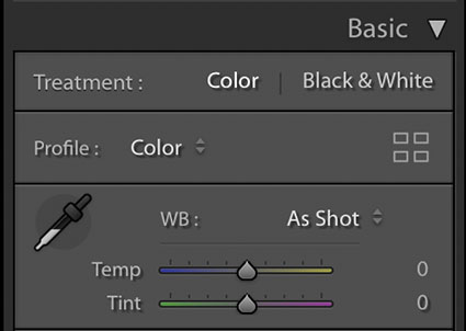
Lightroom & Camera Raw White Balance Dropper and Sliders
The simplest way to achieve neutrality is to correctly set white balance during Raw conversion with Lightroom or Camera Raw. Click on the eyedropper tool and click on a target area within the image. It’s that simple.
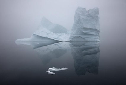
What’s not so simple is identifying a good target. This will be easy if you photographed a color checker within the image or in a separate exposure at the same time, but few do. If you’re like most photographers, you’ll have to identify a good target visually, introducing a margin of error equal to your discernment. Usually, the best choices are midtones. This tool also works well with highlights, but they’re more likely to carry color casts that you won’t see at first glance.
After you click on a target, the results can be refined further with the Temperature (blue to yellow) and Tint (green to magenta) sliders.
Remember, you can use Camera Raw as a filter in Photoshop too.
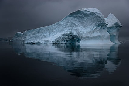
Normal blend mode
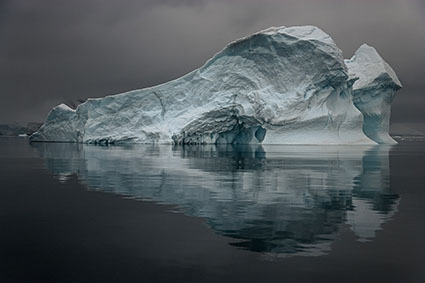
Color blend mode
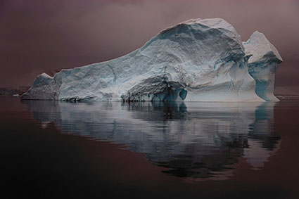
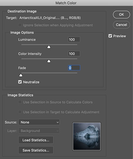
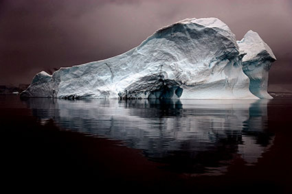
Match Color
Match Color is Photoshop’s often unfound and overlooked feature that offers such sophisticated results when neutralizing colors that it’s often surprising. Not all colors will be affected equally – and that can be a good thing. Using Match Color is even easier than using Lightroom / Camera Raw’s white balance eye-dropper because you don’t need to click on a target. Simply check the box Neutralize – and leave all the other sliders and drop-down menus alone.