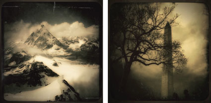
How To Enhance The Illusion Of Space With Atmospheric Perspective

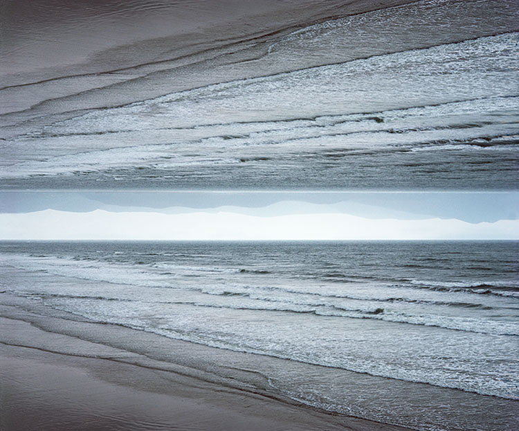
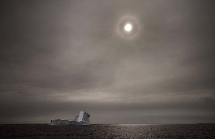
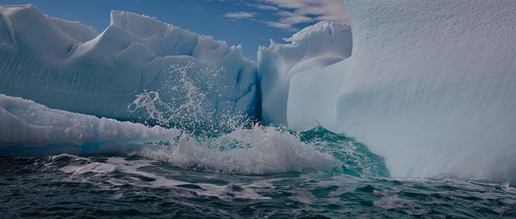
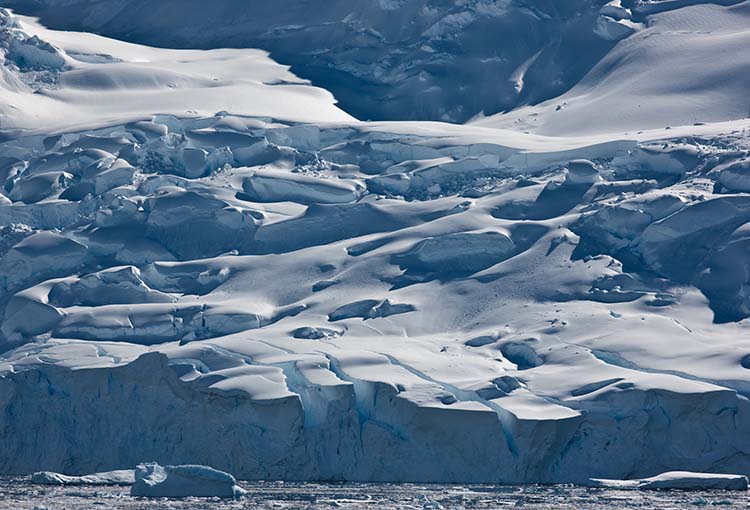
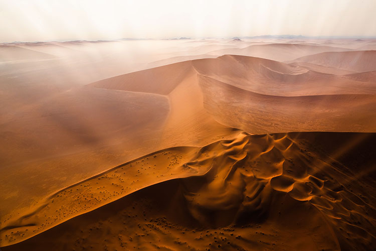
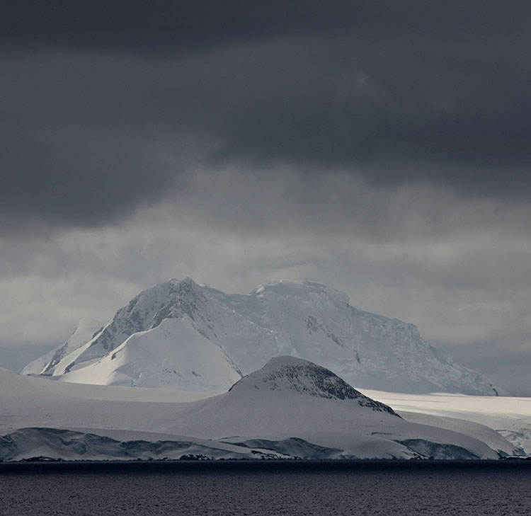
As atmosphere builds up, contrast and detail are diminished, while colors grow cooler and less saturated.

Whites are an exception; they get darker and yellower.

Atmospheric perspective can be applied to neutral or black-and-white images using luminosity only.
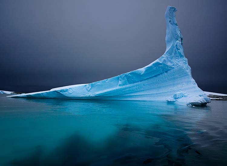
In the foreground, increase contrast. In the background lighten blacks and darken whites.

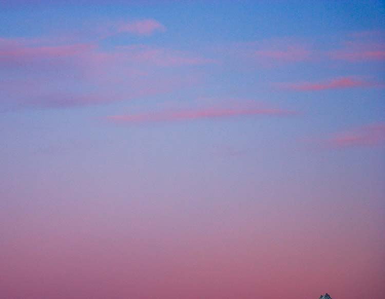
Because compositionally, skies are quickly read as separate spaces, they can generally hold more saturation and still seem far away… but don’t overdo it if you want your photographs to be believable.


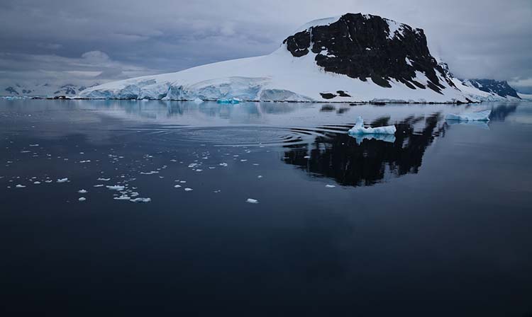
Used in Western art since the Renaissance, the principle of atmospheric perspective can be stated simply. Some colors rise forward, while others fall back. Lighter, warmer, saturated colors, with more contrast, appear closer, and darker, cooler, desaturated colors, with less contrast, appear farther away. You can use atmospheric perspective to control the illusion of three-dimensional depth in your two-dimensional images. When you do this, the scenes you present will become more believable, eye-catching, and compelling.

Adjust Color Selectively

The key to using atmospheric to enhance your images is to adjust color selectively.


Insights Members can login to read the full article.
Email:
or Sign up

5 Powerful Ways You Can Use Space In Your Images


Spacey


Spacious


Gracious


Nice Fit


Compact


Packed

Impressionist composer Claude Debussy famously remarked, “Music is the space between the notes.” Space is just as important for images as it is for music.  While the spaces are different in the final products, one is temporal, and the other is physical, space is equally important in both forms of art. As with music, in images, there’s a missing third dimension of space. Because music is usually abstract, it can be freer from the concerns of creating the illusion of depth, something that is essential in representational images. There are many ways to work with space, using tools like color, line, and texture to create distance, scale, and negative space, among other things. There are even many kinds of space and many kinds of spaces. How you treat space in your images speaks volumes. It reveals your deepest concerns and the vision through which they are expressed.

Distance From The Frame

How far you place elements relative to the frame can have a profound impact on a composition. 


Insights Members can login to read the full article.
Email:
or Sign up

Benjamin Grant: "Overview: A New Perspective of Earth" | Talks at Google


“Inspired by the “Overview Effect” – a sensation that astronauts experience when given the opportunity to look down and view the Earth as a whole – the breathtaking, high definition satellite photographs in OVERVIEW offer a new way to look at the landscape that humans have shaped. Benjamin Grant, creator of the Instagram project Daily Overview from which the book is inspired, discusses how the project and book came about.”
Follow the Daily Overview on Instagram here.
Find the book Overview here.

Check Out PHOTOGRAPH – Issue 4

PHOTOGRAPH4_425
Issue 4 of PHOTOGRAPH (quarterly add free emagazine) is now available.
It’s packed with Portfolios / Q+As (this time from Nick Hall, Kathy Beal, and Sam Krisch – two of whom are members of my Next Step Alumni) and columns / articles (including contributions by David duChemin, Martin Bailey, Michael Frye, Chris Orwig and more). My Creative Composition column focuses on using Space in compelling ways.
Purchase PHOTOGRAPH issue 4 for $8.
Subscribe to PHOTOGRAPH for $24 (save $8).
PHOTOGRAPH4c
PHOTOGRAPH4b
PHOTOGRAPH4a copy
Krisch425

Hubble Site

hubblesite
Hubble Site contains a gallery of images harvested from the famous telescope for over 20 years. Images are free to download in a variety of sizes. You’ll also find out how color is added to each of the images, which are originally captured in black and white.”