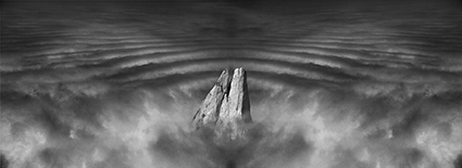
The Big Differences Between Vision & Style – And How They’re Related

Many people think vision and style are the same. They’re not. What’s the difference?
Vision is what you have to say; style is how you say it.
Confusing one for the other or focusing on one and not the other can be disastrous.
Just because your images look different doesn’t mean you’ve said anything or said it well. No matter how dazzling something may look, when style becomes a substitute for vision ultimately the viewer leaves unsatisfied – though they don’t always know why. If you confuse style for vision it confuses your viewers. And when you use a style that’s inappropriate for your vision it distorts the way your work is seen and it’s likely that you’ll be misunderstood. A style without a vision is a gimmick; visual cleverness. A style that supports a vision is a vessel for deep authentic expression.
You don’t have to make your images look different to say meaningful things and say them in your own authentic way. Sometimes less is more. Less style, more vision. Stronger styles make the viewer work harder to see past the surface of an image and find the deeper meaning within it. Strong styles work only if they complement a vision – then both become stronger.
Vision and style are related. Hopefully, vision drives style. Vision gives style meaning and purpose. When style reflects purpose it deepens the whole experience, making statements more deeply felt. Style can create meaningful connections between the subject and the way an image looks and even between multiple images. Subtle shifts in style throughout a body of work and even an artist’s lifetime have the potential to communicate even more meaning.
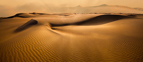
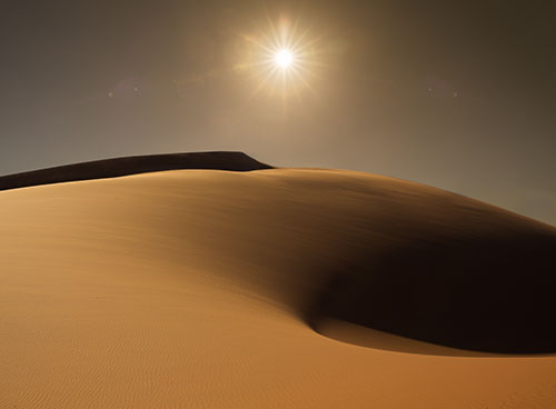
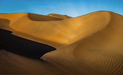
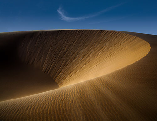
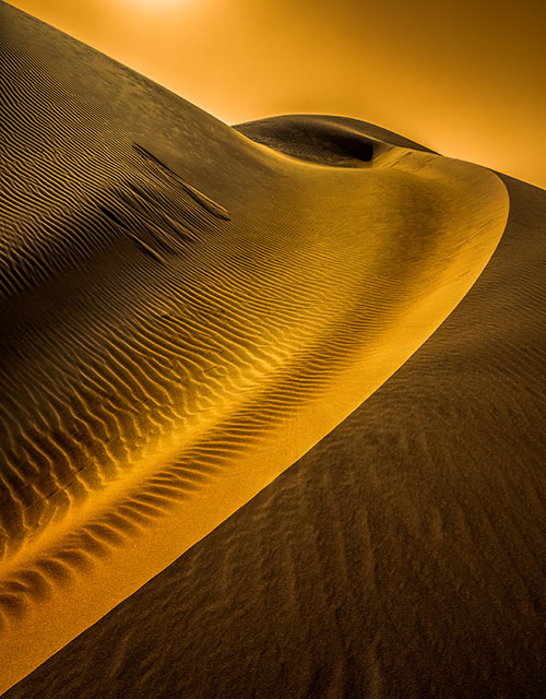
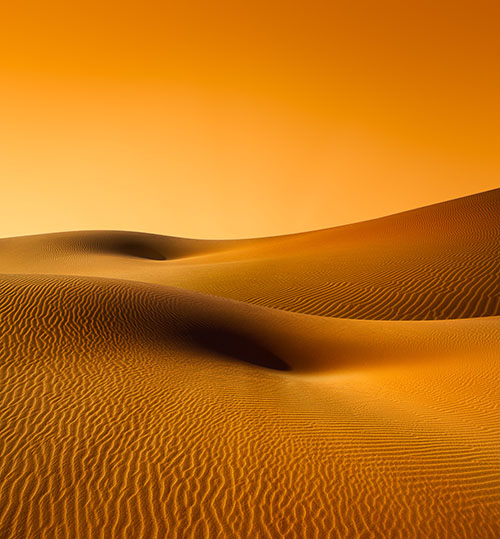
Style is easy to identify because all you need to do is make formal statements about what you see. You simply describe how the things in an image look. When describing style you focus less on the things you see and more on how they look. You state what your eyes actually see, the visual building blocks of an image not the content those elements are used to represent. To do this well, you need to learn a little vocabulary to formally describe images in ways that others will understand, but there’s an added benefit, learning that vocabulary will help you look more carefully and see more things and relationships between them. Each one of those relationships is a creative opportunity. Line, shape, volume, color, texture, scale, proportion, range, and compositional patterns are the fundamentals – and you can make finer distinctions in each of these categories. Some aspects of style describe relationships that are visible between multiple images such as the number of images used, their sequence, its pace and rhythm. Style can be extended to anything you do in a particular way, not your actual practice (she used a camera) but the way you practice it (she always moved in close). The ways you do things communicate the kinds of connections you like to make and the relationships you like to cultivate and so they imbue what you make with meaning.
Vision is harder to identify than style. Vision is the mystery you (and your viewers) are trying to solve; style offers the clues to figuring it out. It takes some guess work and repeated confirmation to figure out where your images are going. But vision is where you move beyond taking pictures of things (subjects) and start making pictures about things (themes). It’s part plot; your subject, events that happen to it, actions it takes, reactions, and consequences. It’s part theme. The theme is the big (or main) idea and subthemes are smaller (or subordinate) related ideas. It’s what the work says about a subject. It’s the overall message and the underlying messages. This is the least literal often least visible aspect of work and it’s often where the most soul can be found.
It’s part you … the patterns you see and create, your relationship to your subject and the images you create of and possibly about it, all the associations and connections you make between it and other things, the things you choose to show and not to show, your emotional reactions to things and events and even their appearances, the reasons why you care and why we should care. All these things say a lot about you, so vision is also about self-discovery and expression.
If the style of your images is appropriate it will help us see your vision … in a very particular meaningful way.
You don’t have to figure out your vision or your style before you start making meaningful images. Whether you start with no idea or a good idea, it’s likely that you won’t know the full meaning of your work until you make it. An essential part of the process of creating images is figuring things out. Show your process, not all of it, just the interesting parts, the ones you decide are meaningful. What you finally make doesn’t have to be perfect, finished, or even fully resolved; you just have to do it well enough to create a compelling experience. And to do that, you have to figure out a few things, perhaps only the most important things, about your vision (what you have to say) and style (how you say it). Then make more images and figure out a little more. Keep repeating this process enough times and you’ll find your way, your vision and your style, If you hold nothing back and give it everything you’ve got, you will be amazed by what you discover.