4 Ways To Enhance Color Temperature In Your Images

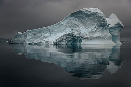
What Is Color Temperature ?

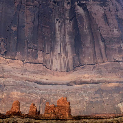
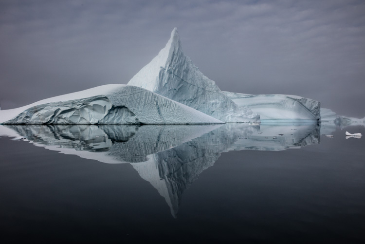
Of the three elements of color (luminosity, hue, and saturation), hue is the one most closely associated with temperature.  This is a psychological temperature, not a physical temperature. Most people associate red with fire or blood (warm things) and blue with sky, water, and ice (cool things), where physically a blue flame is hotter than a red flame. You can identify which hues are warmer and which are cooler by their proximity to the absolute poles of red (warm) and cyan (cool) on the color wheel. When comparing any two hues, you can always ask, “Which one is warmer and which one is cooler?”. Even when comparing two variations of the same hue, very often one will be slightly warmer or cooler. Color temperature is part of what creates color variety, which is one spice of life, a very important one, especially when it comes to visual communication.

The Things You Can You Do With Temperature

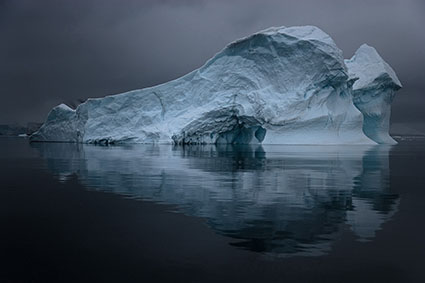
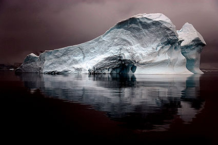
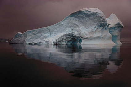
Many photographers think of color temperature as something to "get right" during exposure, but you can also use color temperature creatively in post-processing. You can produce many compelling color effects with color temperature. You can make distant close layers feel closer by warming them and distant layers more distant by cooling them. You can make objects feel more three-dimensional by warming highlights and cooling shadows. You can add a warm glow that simulates early morning or late evening light. You can  You can even make day look like night by dramatically cooling it. And every one of these moves will change the emotional tone of an image. Temperature is a critical element for communicating with color.

Lightroom & Photoshop

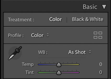
There are many color adjustment tools in Lightroom and Photoshop that adjust hue. Having used them all since the day they were released (or before), I regularly use four and consider them go-to tools worth mastering.


Insights Members can login to read the full article.
Email:
or Sign up

4 Ways To Achieve Neutrality In Your Images

Antarctica XLII
There are many ways to achieve neutrality in your images. The results they offer are not same. You need to know the differences so you can make better choices and get solutions that are right for you and your images. Explore them and you’ll be more likely to make better choices for your images in the future. Keep exploring them and you’ll open up a world of possibilities within your images.
WB

Antarctica XLII

Lightroom & Camera Raw White Balance Dropper and Sliders
The simplest way to achieve neutrality is to correctly set white balance during Raw conversion with Lightroom or Camera Raw. Click on the eyedropper tool and click on a target area within the image. It’s that simple.

What’s not so simple is identifying a good target. This will be easy if you photographed a color checker within the image or in a separate exposure at the same time, but few do. If you’re like most photographers, you’ll have to identify a good target visually, introducing a margin of error equal to your discernment. Usually, the best choices are midtones. This tool also works well with highlights, but they’re more likely to carry color casts that you won’t see at first glance.

After you click on a target, the results can be refined further with the Temperature (blue to yellow) and Tint (green to magenta) sliders.

Remember, you can use Camera Raw as a filter in Photoshop too.
17_MatchColor
Antarctica XLII

Normal blend mode

Color blend mode

Antarctica XLII
Match Color
Match Color is Photoshop’s often unfound and overlooked feature that offers such sophisticated results when neutralizing colors that it’s often surprising. Not all colors will be affected equally – and that can be a good thing. Using Match Color is even easier than using Lightroom / Camera Raw’s white balance eye-dropper because you don’t need to click on a target. Simply check the box Neutralize – and leave all the other sliders and drop-down menus alone.


Insights Members can login to read the full article.
Email:
or Sign up

I Use – ExpoDisc


A majority of the time, I treat white balance subjectively. But, that doesn’t mean I don’t use a white balance target. Targets give you the option of setting white balance objectively. Without them you have to fall back on the SWAG method (Scientific Wild Ass Guess). My favorite white balance target is ExpoImaging’s ExpoDisc. (I use a Flat; while they’re more expensive, they can be used with any and all lenses.) Why do I like the ExpoDisc so much? It performs three functions at once – white balance, dust map, vignetting map. In addition to setting white balance you can use it to precisely map dust on you sensor and vignetting. Once you’ve identified these with a single exposure, you can automatically apply those corrections to all images shot during that session. Automatic retouching? Yes! Dust mapping will save you hours. Often, I’ve felt a resistance to using white balance targets in the field. Because the ExpoDisc offers so much more and is so easy to use, I use it consistently.
I demonstrate these kinds of techniques in all of my field workshops.
Download my Review of the ExpoDisc here.
Find out more about the ExpoDisc here.
Find my Review of the ExpoDisc here.
Get Insights free here, for upcoming alerts of new Reviews.
See more of the products I use here.
Check out my field workshops here.
Get a 20% discount on my Iceland (8/18-22) workshop here – expires 8/10.
Get a 15% discount on my Fall Foliage (10/17-20) workshop here – until 8/17.
The first 5 Insights Members get $1000 off South America (2/2-14/09), thereafter $250.

I Use – X-Rite ColorChecker


The X-Rite ColorChecker is the standard target for getting accurate color in the studio. But, it’s useful in any shooting situation. You can create a custom calibration setting for your camera using the X-Rite ColorChecker and Tom Fors Adobe Camera Raw camera calibration script. Do this once for significantly different lighting situations; daylight, overcast, full shade, tungsten, florescent, etc. You only have to do it once for each lighting situation. The calibration is model specific and chip specific, so do it for every digital camera you use. Performing this routine makes an appreciable improvement in color rendition. Saturated hues will be represented more accurately.  In the field, I use the credit card sized ColorChecker.
I demonstrate these kinds of techniques in all of my field workshops.
Click here for a step-by-step guide to using the X-Rite ColorChecker and the Tom Fors script.
Download Tom Fors script here.
Find my Review of the X-Rite ColorChecker here.
Get Insights free here, for upcoming alerts of new Reviews.
See more of the products I use here.
Check out my field workshops here.
Get a 20% discount on my Iceland (8/18-22) workshop here – expires 8/10.
Get a 15% discount on my Fall Foliage (10/17-20) workshop here – until 8/17.
The first 5 Insights Members get $1000 off South America (2/2-14/09), thereafter $250.