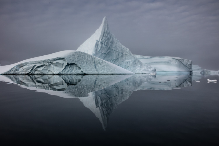
4 Ways To Enhance Color Temperature In Your Images

What Is Color Temperature ?
Of the three elements of color (luminosity, hue, and saturation), hue is the one most closely associated with temperature. This is a psychological temperature, not a physical temperature. Most people associate red with fire or blood (warm things) and blue with sky, water, and ice (cool things), where physically a blue flame is hotter than a red flame. You can identify which hues are warmer and which are cooler by their proximity to the absolute poles of red (warm) and cyan (cool) on the color wheel. When comparing any two hues, you can always ask, “Which one is warmer and which one is cooler?”. Even when comparing two variations of the same hue, very often one will be slightly warmer or cooler. Color temperature is part of what creates color variety, which is one spice of life, a very important one, especially when it comes to visual communication.
The Things You Can You Do With Temperature
Many photographers think of color temperature as something to "get right" during exposure, but you can also use color temperature creatively in post-processing. You can produce many compelling color effects with color temperature. You can make distant close layers feel closer by warming them and distant layers more distant by cooling them. You can make objects feel more three-dimensional by warming highlights and cooling shadows. You can add a warm glow that simulates early morning or late evening light. You can You can even make day look like night by dramatically cooling it. And every one of these moves will change the emotional tone of an image. Temperature is a critical element for communicating with color.
Lightroom & Photoshop
There are many color adjustment tools in Lightroom and Photoshop that adjust hue. Having used them all since the day they were released (or before), I regularly use four and consider them go-to tools worth mastering.


sarah
20.01.2020 at 16:17Cool! Thanks!
John Paul Caponigro
20.01.2020 at 16:18You’re welcome!
cheights
21.01.2020 at 08:41Great post. I’d be interested in more of your insights into how to work with color in Photoshop. I’ve been experimenting with Saturation used with Color Dodge or Color Burn and Blendif settings pushing the effect into the midtones. There’s a lot of power in Photoshop.