How To Use Association To Go Deeper With Your Photographs

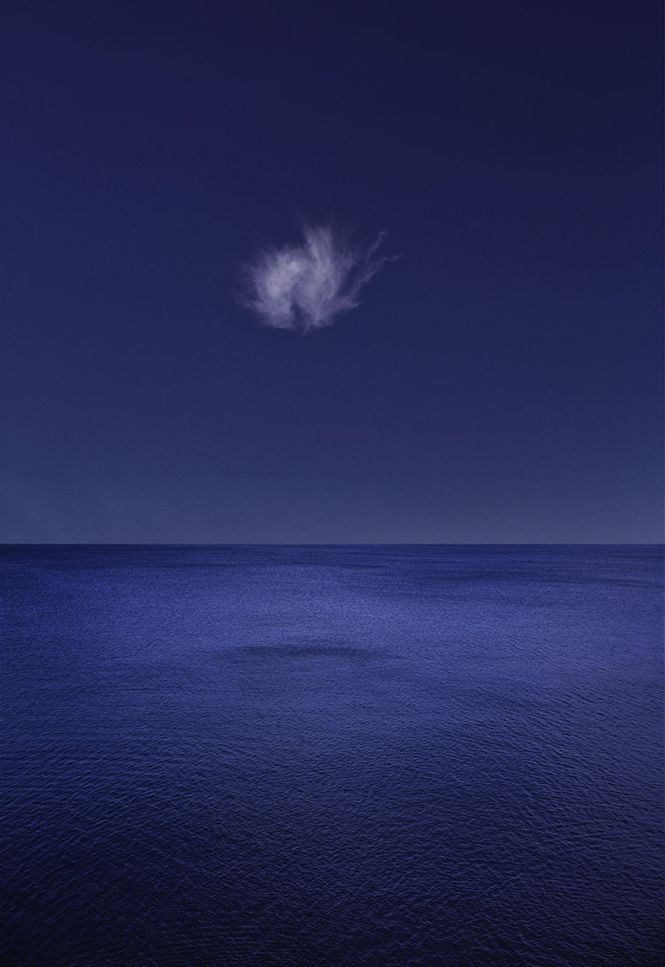
My early curiosity about clouds displaying invisible forces at work, lead to associations of nephomancy (divination by clouds) and later clouds as divine messengers.

The working title for this series, Glory (later changed to Illumination) was drawn from religious iconography in western art history.

The working title for this series was Heaven's Breath but it was later released as Exhalation, leaving room for viewers' interpretations. The many personal associations I bring to my imagery remain subliminal but strongly felt giving them consistency and depth.


Our work is as deep as the relationships we have with it. Mastery involves much more than researching subjects and perfecting craft, it also means doing some soul searching. So how can you deepen your relationships with your work? How can you understand the inner life of your work better? One way is to associate freely.

Free association is a classic psychological technique that can be used to reveal and clarify internal relationships. While most association is done linguistically, you can use anything as a touchstone for association; sounds, gestures, tastes, smells, images, etc. Use one or more at the same time. Whatever you choose to associate with, record your associations with something that doesn’t get in the way of the free flow of your association process. If you use words, use the language that comes most easily to you. If you use something else (colors, sounds, images) make sure that collecting them can be done fast, fluidly, and flexibly. Do record your associations. If you don’t record them, you’ll forget most of them and the patterns they make will elude you. 

Simply observe what comes to mind. Don’t critique or censor yourself during the process; nothing shuts down this process faster. Let it all out. Be thoroughly spontaneous and utterly candid with yourself. You may or may not choose to do this with others. It’s your choice. Try different approaches and see how each influences the experience and results.

There are several ways to guide association.


Insights Members can login to read the full article.
Email:
or Sign up

Explore The Power Of Color Psychology

14 Great Quotes By Photographer Lauren Greenfield

 
Enjoy this collection of quotes by photographer Lauren Greenfield.
“When the words ‘like a girl’ are used to mean something bad, it is profoundly disempowering. I am proud to partner with Always to shed light on how this simple phrase can have a significant and long-lasting impact on girls and women. I am excited to be a part of the movement to redefine ‘like a girl’ into a positive affirmation.” – Lauren Greenfield
“I’m also looking for the psychological elements that fuel commodity culture. For example, if we imbue girls with deep insecurity about their bodies through images of an impossible ideal, we create a really vulnerable and avid consumer. If somebody feels that they’re not OK without a certain product, you have a very deep and loyal market that will come back to the product again and again. Sometimes, this process is both rational and irrational.” – Lauren Greenfield
“You have these relationships with people that you care about, but I also try to stick to my job as filmmaker and be fair and truthful about what I saw and my experience of the people, hopefully informed by a deep understanding of them.” – Lauren Greenfield
“I’ve also been documenting an unsustainable way of life. And you see in peoples’ stories that this world of consumerism does not support the moral and spiritual values – of family and community – that people feel are most important. From an environmental perspective, the quest for more and more is not going to be possible on this planet. This is a historical documentation of an unsustainable path, and my hope is that this work allows people to think about their own agency and the potential for change.” – Lauren Greenfield
“Race is a huge factor when it comes to income and social inequality, and it plays a role in the structural barriers you are talking about. But when you’re in the upper echelon of the 1 percent – even though it’s certainly a more white demographic overall – there are fewer barriers.” – Lauren Greenfield
“Hip-hop has been so important in my work, because it speaks to the idea of money being tied to cultural capital in an honest and transparent way. When I was growing up in LA, money was equivalent to class, and it was a passport. Hip-hop emphasizes that, but Hollywood and show business bear it out. If you have money, there really is no barrier to social mobility. There are still social clubs in Newport where you can’t get in even if you have money, but that is really rare.” – Lauren Greenfield
“These days, the media is defining what cultural capital is, and it’s easily learned. If you have money, anything can be bought. We see this in China and Russia with what I call the “Bling Dynasty and New Oligarchy” in Generation Wealth. As people got rich and everybody started buying Louis Vuitton bags, it became clear that to distinguish yourself you had to have more than an expensive bag. People began to want the things that money is not supposed to be able to buy – history, tradition, education, and culture.” – Lauren Greenfield
“I’m constantly trying to deconstruct what I see and to show its beauty and its attraction. I use bright colors and strobes to get that full reflection. I want to acknowledge and reference the attraction of wealth. But I’m also looking for the layer that reveals how wealth doesn’t fulfill its promise.” – Lauren Greenfield
“The people in the popular group say there is no peer pressure because they are at the top of the food chain. Really what they are doing is just eating away at everybody else.” – Lauren Greenfield
“What I’m documenting can be hard to distill, because it’s all around us like the air we breathe. I often need to go to a place where I can capture extreme moments.” – Lauren Greenfield
“I’ve often used the extremes in my work to comment on the mainstream. I think that sometimes a subject that I’m working on, like popular culture, is so present all around us that they’re hard to see. It’s like: How do you see the air you breathe? How do you see how it affects you?” – Lauren Greenfield
“I’ve long been interested in looking at the culture of consumerism and also was interested in this connection between the American dream and the house, and the house being kind of the ultimate expression of self and success.” – Lauren Greenfield
“The 1970s were the height of social mobility. College was accessible. My grandfather was a poor immigrant who went to a public school in Ohio, and my father went to Harvard. That wasn’t unusual. There was a feeling that anything was possible and you didn’t have to be born into money to have a successful life. Now, people don’t believe in the idea that anything is possible. We have more inequality than we’ve had ever before and a greater concentration of wealth in the hands of a few.” – Lauren Greenfield
“During the Reagan eighties, the idea that money was a good thing – it was good to be rich; that wealth was a reflection of your character. We see this today in perceptions of Donald Trump: the idea that money is an expression of success and even goodness. I compare that with my dad’s generation, where the American Dream was about giving your kids a better life, but not just in material terms. The American Dream was also about doing something good in the world. The home was at the center of the dream, but home also represented community, shelter, and stability for your family.” – Lauren Greenfield
Visit Lauren Greenfield’s website here.
Read 18 great quotes by Lauren Greenfield.
View this documentary on Lauren Greenfield.

View more 12 Great Photographs collections here.

Explore The Essential Collection Of Quotes By Photographers.
Explore The Essential Collection Of Documentaries On Photographers

We Change Each Other’s Experiences

Inhalation I, Nantucket, Massachusetts, 1998

I find this image supremely challenging – because of other people’s reactions to it.

The first time I exhibited this image, over the space of a weekend, in front of this image, four women shared stories of personal loss – a friend, a son, a husband, a father. Over the years, this has happened more than sixteen times. Years later, in front of this image, in the same location in the same room, I found myself discussing the death of my first wife with one of the first women to share her own story of personal loss. I could pass this off as a coincidence, but that would be irrational. While it sheds a little light on this mystery, Jung’s concept of synchronicity furthers rather than solves it. I simply can’t explain this. This challenges me – and others. Though largely formed of conjecture, the discussions are interesting. Specific combinations of qualities, universal color codes, sacred geometry, archetypes, intuition, precognition … theories multiply. The mystery remains.

When I made this image, I wasn’t aware of the themes of death and loss weighing on my mind or heart. I was totally absorbed in making the image. Now, it’s almost impossible for me not to think of it, though I can still see much more in this image.

What people share about works of art may change their own and other people’s relationships to them. What the artist shares about their relationships to the works of art they create often changes the relationships their viewers strike up with them. This process is often encouraged and sought out. It can work the other way too. What people share about an artist’s works of art may change the artist’s relationship with his or her own work. While this type of process is less typical, it raises an interesting set of questions to consider, “When, where, and in what ways is encouraging this exchange most beneficial?”
The process of communicating the experiences stimulated by works of art and the results of those interactions, which continue spreading in many ways, often producing both intended and unintended consequences, is part of the life of a work of art. Though not entirely in the control of the artist, it is not separate from the work of art. Works of art connect us in unique ways.

It’s interesting that the amount of energy imbued in a work of art is not limited to the amount of energy invested by the artist; more is added through others’ experiences of them. How strongly a work of art does this is one criterion, among many, for evaluating its quality and success.

How many ways can you encourage meaningful discussion about your images?
How many ways can you seek useful feedback about your images?
How many ways can you give yourself useful feedback about your images?

Read more The Stories Behind The Images here.

We All See Different Things

Exhalation I, Mosquito Point, Maine, 1996

I’ve collected more responses to this image than any other. While they use varied words, most people’s associations share some quality of breath and/or a divine presence. However, some people’s associations vary wildly.

One night, at an opening, a man reeking of scotch and smoke approached me and said, “I love your satanic icon!” Surprised, I looked around the room to see which image he was referring to. He directed me to this one. Challenged by his response (It was very different than my intentions), I held to my practice of not sharing my responses to images unless I feel the viewer can maintain and possibly add to rather than replace their own.

On another occasion, a friend bought a print of this image and surprised his wife with it, saying, “Look! Isn’t it beautiful?” She replied, “You’re not hanging that in here!” “Why not?” he responded. “Can’t you see? It’s dirty. It’s an x-ray of someone sitting on the toilet.” It took some negotiation and an extended session of sharing what they saw in the image for him to be able to hang the image in his office.

The response I treasure most came from a four-year-old boy who stopped in his tracks and caught his breath as he crossed the threshold of the door to the room this image was displayed in. Then he raced to it, waving his arms in the air, “It’s a giant sneeze!” Touched by his spontaneous outbursts, I tried to reconcile them with my desire to communicate something general, if not specific. I had given the image the working title of Avra, the Sanskrit word for breath. I thought, breath … sneeze … close enough. Everyone in my studio now refers to this image as ‘the giant sneeze’.

How can other people’s associations inform your work?
How many ways can you stimulate viewers’ associations with your images?

Read more of The Stories Behind The Images here.

The Weight Of Color


1

Images with lighter palettes tend to be brighter and less saturated (though driving colors towards white desaturates them), while those with heavy palettes tend to be darker and more saturated (though driving colors towards black desaturates them).


2

Brighter less saturated colors seem lighter, while darker more saturated colors seem heavier.


3

Colors can be matched or contrasted by weight to control visual dynamics. Here yellow and blue are matched in weight.


Many psychological attributes have been assigned to color, such as temperature. It’s so natural to think of color having temperature that we often don’t think about how this is an associative meaning rather than a physical fact. Physically a blue fire is much hotter than a red fire. Nonetheless, red is universally (in all cultures and periods of history) considered the warmest color and blue the coolest color. It’s quite likely that this comes from our experiences with fire (generally red, orange, and yellow) and water (typically blue in large quantities). You might think the ascription of temperature to color is particularly strong for photographers who assign white balances to their images based on the color temperature of the light a photograph was made from to reproduce color accurately. But, it’s equally strong with painters and designers who use temperature associations to create expressive color schemes.
One other useful psychological attribution to color is weight. Does yellow feel lighter than green? Does purple feel heavier than orange? Most people would say yes. Of course, our response depends on the specific variation of each broad color family. You can make a green seem lighter than yellow if you make it brighter, either with luminosity or saturation or both.

So how can you use this information? Here are four ways.

1            You can strengthen comparisons or contrasts between two image areas by making their relative weights appear more or less similar.

2            You can also set the tone for an entire image. Set a brighter airier tone by using lighter colors. Set a darker earthier tone by using heavier colors.

3            You can attract the eye more strongly to specific areas. Once a predominantly light or heavy palette has been set, you can accent it dramatically with smaller accents of contrastingly weighty colors.

4            You can create comparatively lighter and heavier palettes for specific areas of an image, such as a lighter color scheme for higher areas and a heavier color scheme for lower areas.

It’s useful to note that weight is also associated with gravity and thus vertical location.

That the word ‘light’ can be used to describe both the appearance and the mass of an image speaks volumes. Psychologically, color has weight. With only a little practice and more sensitivity, you can use this to make your images more effective.

Exercise
Sensitize yourself to the weight of color by matching the weight of colors.
1               Create two or more colors. Match the weight of two colors from the same color family, such as blue.
2               Create two or more colors. Match the weight of two colors from different color families, such as blue and yellow.

Read more Color Theory.
Learn more in my digital photography and digital printing workshops.