On Press – Banding
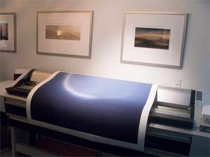
We’ve been finishing the last prints for my annual open studio exhibit where I unveil New Work from 2008 for the first time. We ran into subtle banding in a few prints. So how do we trouble shoot it?
First check the file at 100% screen magnification. If it’s in the file add a touch of noise. If you need to use more noise than you’d like, use Noiseware afterwards.
Second check the printer. Is the data transfer fast enough? (Don’t perform other calculation intensive operations while printing. Close other programs if necessary. Make sure your cable connection isn’t too slow or too long.) Are the heads aligned? Are you sure it’s banding and not nozzle clog? (Nozzle clogs are tiny light lines. Banding is dark lines, often thick with soft edges.) Are you printing at high speed? (Try printing it slower.)
Third, as a last resort, rotate the image 90 degrees and try printing it again. Huh? Right! Many of my files are particularly difficult to print – semi-neutral fields with very smooth gradations. These types of images display incompatibilities with printer drivers and their screening frequencies that just don’t happen in most images. It has to do with screening frequencies. Why does rotation help? I don’t have an explanation for it. But it works.
Hopefully all of this will help you with your prints.
Get information on my Annual Exhibit here.
Check my blog for the most up to date information on the event.
Check out my blog during the event to see video of my new installation events.
Check out my Gallery to see more images.
Check out my Gallery during and after the exhibit to see new images.
Check out my workshops series The Fine Digital Print here.
Charles
21.07.2008 at 09:59Avoiding banding is an artform. I used to output Iris and Agfa imagesetter CMYK jobs, it seemed like the worst output jobs required heavy banding reworking. Oh I should tell you a story..
One day I was proofing a client’s complex tabloid size page, mostly designed in Illustrator, and assembled in XPress with some photos from Photoshop. It had a background with a color gradient, blending from one CMYK color to another, diagonally down the 11×17 page. Uh-oh, this sort of job usually gets banding. So I proofed it on the Iris and it looked fine. I sent it off to the imagesetter for negatives, I got it back and the yellow negative has one huge, distinct, hard-edged, ragged band down the middle. The other plates all looked fine. I thought it was a RIP error, so I ran it again, and got the same error. I ran it rotated 90 degrees on the imagesetter (that’s why your story reminded me of this) and it got the same error.
I spent considerable effort tearing the job apart to see what was wrong. The designer used FOCOLTONE colors, so the specs on the colored gradient were all in CMYK space. I started measuring the colors, it turned out the Y colors were only 1 apart, so the yellow gradient was like Y15->Y16. Well no wonder it banded, that’s not much of a gradient, it’s only one step.
At that point one of the old printing press geeks came by, and said, hell, nobody will even notice there’s a 1 point yellow gradient when it’s printed, let’s do a Matchprint. He laid down the yellow first, and damn if you could barely see the band. When he laid down the CMK plates, you couldn’t see the band at all. The designer might as well have laid down a flat yellow, it really made no difference on the printed page. I asked the old pressman what was up with that, he said yellow is such a weak color it takes a large difference to be a visible change. Hmm.
Well anyway, banding is a complex calculation that involves both the design of the image and the output device. It’s a function of the color steps over the distance to step them, plus the rez of the device. You could reduce banding by dropping the rez or printing the image smaller, there are lots of ways to optimize. But there are other ways to maximize. I concur with your advice to add noise to smooth gradations, it makes a more natural look. I’ve done a few computer generated images with very flat and subtle color gradients that banded badly until I added noise, it does work well.
johnpaulcaponigro
21.07.2008 at 14:57Great case study!
I was talking about this post with Mac Holbert at lunch today during our workshop The Fine Art of Digital Printing at the Hallmark Institute of Photography.
In addition to rotating the paper (landscape versus portrait), on occasion he’ll rotate the file – not necessarily in 90 degree increments but sometimes small percentages like 20%. The downside to this is it resamples the file slightly softening it, but generally this is slight and much more preferable than banding and can be compensated for with additional sharpening.