“In this video, Julieanne walks through the new features in Adobe Camera Raw 18.3. You’ll learn how to make depth-based selections, correct anamorphic images, reduce wide-angle distortion, and apply film-inspired presets. These updates provide more control for both technical corrections and creative adjustments.”
“Join Julieanne Kost for an in-depth look at the latest innovations in Adobe Camera Raw 18.4. Discover how the next-generation Select Subject technology delivers dramatically improved mask accuracy for challenging subjects, explore the new bidirectional Linear Gradient for more flexible local adjustments, learn how the powerful new Vectorscope provides an objective way to evaluate and refine color, and more! Along the way, Julieanne demonstrates advanced masking refinements, improved background selections, enhanced Lens Blur accuracy, natural skin-tone correction workflows, Generative AI-powered removal of transparent areas, HDR workflow improvements, and significant performance gains for Denoise on Apple Silicon systems. Whether you’re a photographer, retoucher, or creative professional, this comprehensive overview will help you take full advantage of Camera Raw 18.4’s latest tools and AI-powered enhancements to achieve faster, more precise, and more creative results.”
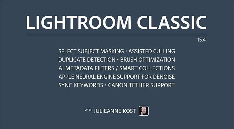
“Discover what’s new in Lightroom Classic 15.4 with Julieanne Kost. In this video, you’ll learn about eight new features and updates designed to improve your editing workflow.
Highlights include:
• More accurate Select Subject and Background masking
• Enhanced AI Assisted Culling with per-person Eye Sharpness and Eyes Open scoring
• New Duplicate Detection across catalogs, folders, and collections
• Faster Denoise performance on Apple Silicon Macs
• Improved Brush responsiveness in Masking
• New AI Edit and Masking filters for Metadata and Smart Collections
• Bidirectional Keyword Sync between Lightroom Classic, Mobile, and Web
• Expanded Canon tethered capture support”
Is AI truly making Photoshop skills obsolete? In this video, we’ll explore 10 time-consuming Photoshop techniques to see how they match up against the latest AI tools.
From removing harsh shadows, clearing reflections from glasses, and erasing background distractions like wires and crowds, we will look at skills that used to take hours of manual work but can now be done in seconds. We will compare classic editing techniques with automated tools like Generative Fill, Firefly, and advanced upscalers to see exactly where AI saves time and where it makes messy mistakes. You will learn how to combine smart masking and blend modes with these new features, proving why understanding core Photoshop concepts and trusting your own artistic taste will always keep you leaps and bounds ahead of anyone who just knows how to type a prompt. I hope this video helps you. Thank you so much for watching 🙂
00:00 Reality of AI vs Photoshop Skills
00:47 1. Remove and Replace Almost Anything
02:41 2. The Pros and Cons of Expanding Photos
05:49 3. Relighting without Dodge and Burn
07:38 4. Impossible Glass Glare and Reflections
08:47 5. Magic of Auto-Selection and Photoshop Skills
10:32 6. Adding or Removing Accesories Precisely
12:26 7. Complex Distraction Removal
13:31 8. Reparing the Backdrop with Few Clicks
14:49 9. Modern Sharpening and Recover Blurry Photos
15:25 10. Mind-Blowing 8K Upscaling
16:21 Why Learn the Skills?
I’ve been waiting for these features for some time. They’re
“Adobe just added a new mask edge refinement tool to Camera Raw, and at first glance it looks like it solves a long-standing masking problem. But there’s a catch. In this tutorial, Colin Smith shows how the new edge control works, where it succeeds, where it fails, and the techniques you can use to get clean, professional mask edges when working with architecture, trees, foliage, and other difficult selections. You’ll learn: How the new Edge control works Why some masks still produce rough edges How to refine AI masks for better results A powerful trick for fixing tree and foliage selections How to get cleaner, more natural-looking adjustments If you’ve already seen this new feature, there’s a good chance you missed the most important part.”
“In this tutorial, Julieanne Kost walks through three updates in Camera Raw: New Edge and Feather Refinement sliders for AI masks (including Sky, Subject, Background, Landscape, and People masks), Color Grading controls now available within local masking for targeted creative adjustments, and an extended Temperature Range for White Balance. Follow along to see how these enhancements give you more precision and creative control over your edits.”
“Photoshop can now rotate any object in a photo and fill in what the camera never captured! You have to see this!”
“Rotate object allows us to turn a photo into a posable 3D object within Photoshop beta. Colin Smith shows you how to use one of the most powerful compositing tools to ever come to Photoshop.”
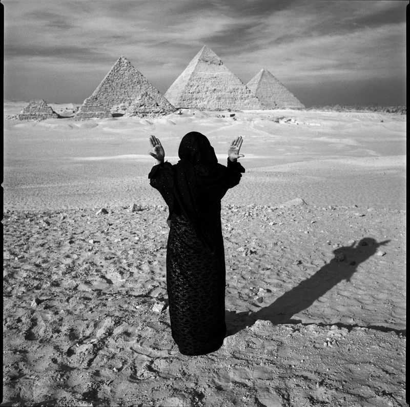
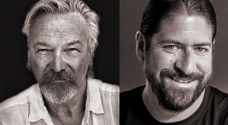
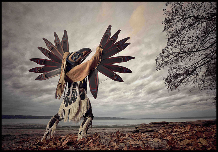
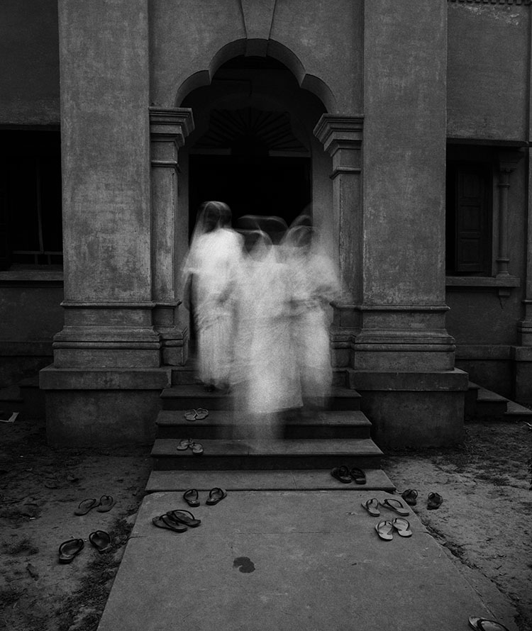
Creativity Continues at Santa Fe Workshops with a conversation between two photographic masters, Chris Rainier and John Paul Caponigro.
Our hour of inspiration will begin with a short presentation of images by both artists – one focused on land and the other on culture.
Then, Chris and John Paul will share their journeys and insights. What is sacred? What does it mean to approach the sacred with photography? What does a sacred image look and feel like? Can one actually photograph what is sacred? What is a sacred journey? How can other cultures inspire our own sacred journeys?
We’ll finish with a lively question-and-answer session open to all participants.
Join Santa Fe Workshops’ worldwide community of photographers and writers as Creativity Continues.
–
Chris Rainier began his career as Ansel Adams’ last photographic assistant. Then he began a journey to explore the world’s most sacred places and cultures. That journey continues some thirty-five years later. Rainier is a National Geographic Fellow and photographic Explorer. From 2000 to 2015, he directed a number of Initiatives at the NGS focused on documenting Traditional cultures. He is now the Director of Cultures Sanctuaries Foundation that helps traditional societies maintain and amplify their traditional knowledge. His photography and books are a part of the Permanent collections of the George Eastman House, International Center of Photography in New York, The Australian Museum in Sydney, The Royal Geographic Society in London, and the Explorers Club in New York.
 “Discover what’s new in Lightroom Classic 15.4 with Julieanne Kost. In this video, you’ll learn about eight new features and updates designed to improve your editing workflow.