R Mac Holbert’s DVD – Nash Editions Master Class


The Dirty Dozen: Eliminating Common Imaging Mistakes – Mac Holbert’s first DVD is about to be released by Acme Educational.
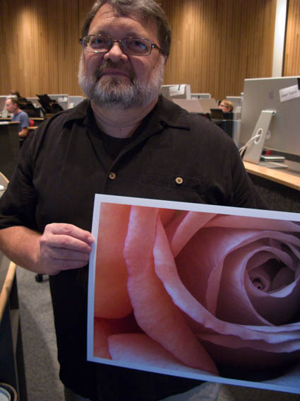
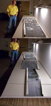
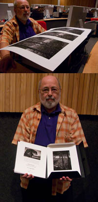
Mac’s a pioneer in the field of digital printing. He’s also a dear friend. I can’t think of another person I’d rather teach digital printing workshops. We do it twice a year in special workshop sessions sponsored by Epson – The Fine Art of Digital Printing. (We just finished a great five day session at the Hallmark Institute of Photography.) Mac’s presentation on fine art workflow is first rate. I do similar workflow sessions in all of my workshops. We’ll be presenting a session on the topic together at PhotoPlus East this year. We also cover it in our Epson Print Academy sessions. It’s a corner stone of our workshop. And his new DVD covers many of the topics Mac demonstrates during these sessions.
Here’s what you’ll find on his DVD.
“When it come to fine art printing R. Mac Holbert along with Graham Nash started it all. If it was not for them fine art inkjet printing would not be what is today. Simply put Nash Editions is THE name in fine art printing and R. Mac Holbert is the talent behind that name. This DVD is the first of R. Mac Holbert’s Nash Editions Master Class. This is a truly unique opportunity to have access to the knowledge of one of the pioneering innovators of digital imaging.
Have you ever printed an image only to find you’ve overlooked a minor but critical mistake? Or have you made a small print, only to find a larger print shows issues that need to be fixed in Photoshop? Whether you print your own images or send them to a service, this Nash Editions Master Class DVD is an invaluable lesson on eliminating twelve common imaging mistakes. Distilled from 18 years of printmaking experience these elementary mistakes are made routinely, not only by the neophyte, but by the seasoned professional as well. Learning to avoid them will save you time, printing costs and ultimately will enable you to more precisely realize your vision on paper.
Learn how to correct contaminated neutrals with only one layer, doing the work of 4 -5 color correction layers. Learn how mid-tone contrast can add dimension to your images. Get these and other techniques on your workflow checklist, integrate them into your workflow and take your images from the ordinary to the extra-ordinary.”
Topics include …
Destructive Workflow
Oversharpening
Midtone Contrast
Image Alignment
Imprecise Cropping
Bad Masking
Contaminated Neutrals
Unreasonable File Size
Untagged Files
Cross Purpose Layers
Incorrect Layer Stack
File Extension Issues
It’s $39.95 until it ships and $49.95 thereafter.
Check out Mac’s DVD here.
Find out more about The Fine Art of Digital Printing workshop here.
Find out about my The Fine Digital Print workshop series here.

Ollie Treadway – Simplifying Workflow


For Ollie it all came together on the final day of our workshop The Fine Art of Digital Printing (this time at the Hallmark Institute for Photography). He was able to untangle his workflow and his file structure and produce better results in less time.
Here are a few core concepts he absorbed. Keep it simple; amid multiple methods that offer equal quality, the simplest way is best. Work globally first, then regionally. Don’t fix problems created during the editing process, fix the adjustments that created the problems. Organize and label your layers.
Now that the technical issues have been answered and simplified, Ollie’s freer to direct his energies in more important areas of his creative growth – finding and developing his own authentic voice.
These are the kinds of dialogs Mac Holbert and I have every day with participants in our the Fine Art of Digital Printing workshop during our extensive One on One and Review sessions.
Look for future workflow sessions from Mac and I at PhotoPlus East and the Epson Print Academy.
Check out my workflow PDFs here.
Check out Ollie’s website here.
Find out about the Hallmark Institute of Photography here.
Find out more about The Fine Art of Digital Printing workshop here.
Find out about my The Fine Digital Print workshop series here.

Presenting Your Work


What’s it take to succeed in fine arts? Perseverance, smart work, hard work, information, luck, talent, and friends – in that order. Oh, and it’s not pick two out of eight, it’s all of the above.
In my workshops I not only show my students my work (professionally presented), but I also discuss presentation practices, packaging, marketing, and the business of fine art. There’s an art to the business of fine art. And high quality sources of information on the topic are sorely lacking in this area.
Mary Virginia Swanson does a better job of outlining the business of fine art and identifying opportunities than anyone else I know.
Check out her blog here.
Find out about the Hallmark Institute of Photography here.
Find out more about The Fine Art of Digital Printing workshop here.
Find out about my The Fine Digital Print workshop series here.

Marc Siegner – Testing Sharpness


Marc creates multimedia prints and installations. He uses a wide variety of media for their material characteristics. So naturally he’s particularly sensitive to the look and feel of his images. We tested sharpness (low, medium, and high) with one of his images. Then the whole class had the opportunity to see the results side-by-side. Consensus wasn’t instant. Some like it sharp. Some like it soft.
One thing became clear, sharpness influences spatial relationships – especially when applied selectively. Typically, sharper image areas appear closer to the viewer, while softer areas appear further away.
So sharpness not only involves aesthetic choices, it can also be used to control spatial relationships within an image. Texture and contour are essential elements in visual vocabulary that you can use to further your personal expression.
Test it for yourself! On your images! Do it! While you can imagine the results, there’s nothing like experiencing it.
How important is sharpness in your images? Do you like your images sharp or soft? Comment here.
Find out about the Hallmark Institute of Photography here.
Find out more about The Fine Art of Digital Printing workshop here.
Find out about my The Fine Digital Print workshop series here.

Christine Carr – Testing Substrates


Christine’s been working on images of projected light and screens. So she decided to explore presenting her images as screens with projected light. She found some alternate substrates – transparency, transparent material with a translucent backing, tissue paper, glossy film. We did a little brainstorming about presentation. We played with light and shadow. The light and shadow itself took on a presence in the presentation. Essential elements of photography, light and shadow, what photography represents and uses to represent, are beginning to be incorporated into the presentation – sometimes abstractly and dynamically. A whole new set of doors opened up. It’s important to explore the potential of new materials. After all, this is what has propelled photography all along, including fueling the digital revolution.
How many ways can you think of extending printmaking for your work?
These are the kinds of dialogs Mac Holbert and I have every day with participants in our the Fine Art of Digital Printing workshop during our extensive One on One and Review sessions.
Find out about the Hallmark Institute of Photography here.
Find out more about The Fine Art of Digital Printing workshop here.
Find out about my The Fine Digital Printing workshop series here.

Jay Strojnowksi – Testing Substrates


Jay took a risk. He brought in large scale photographs printed on canvas for review. They were different. This triggered a long dialog on mixed media and installations. Now he’s no longer thinking in conventional terms about making prints. In 30 minutes we listed dozens of ideas for expanding the possibilities of printmaking and presentation; multiple media – silk, mylar, metal, transfers; multiple picture languages – photographs, blueprints, text, code; and multiple installations – hung on walls, becoming the walls, drapes, projections. This is one of the things that’s so stimulating about teaching. It’s inspiring to see diverse perspectives. And it’s a privilege to be able to help others realize their visions. I highly recommend you take time to explore your options. Think of the possibilities! You might surprise yourself … and us!
How many ways can you think of enhancing your images with media? Make a list. Then rank the list and try the most promising options.
These are the kinds of dialogs Mac Holbert and I have every day with participants in our the Fine Art of Digital Printing workshop during our extensive One on One and Review sessions. This week we’re at the Hallmark Institute of Photography.
Check out Jay’s website here.
Find out about the Hallmark Institute of Photography here.
Find out more about The Fine Art of Digital Printing workshop here.
Find out about my The Fine Digital Printing workshop series here.

Cemal Ekin – Crafting a Signature Style


Cemal was fairly confident that he wanted an alternative process look so he printed a key image for a series of black and white images on Epson matte papers – UltraSmooth, Velvet, and Watercolor paper.  He like the rich black of the Velvet surface. Then Cemal made two unexpected moves that gave what at first seemed like an antique treatment a very contemporary edge. He “crunched” his shadows running the contrast high, heavily darkened regional areas, and he used heavy sharpening (both Unsharp Mask and High Pass), making them look like photographs drifting towards etchings. He confirmed that this was indeed the most compelling treatment for his images by printing renditions with more shadow detail and less sharpening. Some experiments succeed, some fail. You need to risk failure. In fact, failures aren’t failures if you learn from them – they bring confirmation and direction. This kind of experimentation is necessary to create more distinctive and expressive prints. The key is to do focused experiments that are most likely to give useful or relevant information.
What kinds of focused experiments would help you most? List a few now!
Cemal brought with him a beautiful portfolio of small prints (printed on Moab Entrada and collected in a companion folio). Comparing them to prints of larger scale revealed yet one more facet of his work.
These are the kinds of dialogs Mac Holbert and I have every day with participants in our the Fine Art of Digital Printing workshop during our extensive One on One and Review sessions. This week we’re at the Hallmark Institute of Photography.
Find out about Cemal Ekins here.
Find out about the Hallmark Institute of Photography here.
Find out more about The Fine Art of Digital Printing workshop here.
Find out about my The Fine Digital Printing workshop series here.

2880 vs 2400 – Gamut Comparisons


Today, Mac Holbert and I started teaching The Fine Art of Digital Printing at the Hallmark Institute of Photography in Turners Falls, MA. Epson shipped in new 2880 printers for this special event. Epson’s new 2880 uses UltraChrome K3 with Vivid Magenta. How much does Vivid Magenta expand the gamut? Check out these diagrams – 2D, 3D, and 3D looking at Dmax. The 2400 is in white and the 2880 is in full color. Both are graphing Epson Premium Luster Paper. The graphs indicate warm blues, magentas and greens are where it pays off. Slight increase in Dmax. It’s not a dramatic increase but in specific images (polarized skies and saturated foliage, it can be significant. There are also slight tradeoffs in other areas of the spectrum (wherever the white volume extends beyond the color volume).
Words and pictures can work together to tell a fuller story. These diagrams were made with Chromix’s ColorThink. I use it to graph ICC profiles and compare substrates and to compare inksets. Doing this more clearly illustrates the pros and cons of each.
It’s something I do in all of my color management sessions (like the whirlwind tour of color management participants in the FADP workshop got this morning and the sessions you’ll find on my DVD 6 Simple Steps to Color Management).
Check out my Review of Chromix’s ColorThink used to make these graphs.
Check out Chromix here.
Check out my earlier post on the 2880 here.
Check out the 2880 here.
Check out our workshop the Fine Art of Digital Printing here.
Check out my Fine Digital Print workshop series here.
Check out Hallmark’s post on today’s session.

Harry Sandler – The Fine Digital Print Expert Workshop Finding Your Voice


(The above images are after and before.)
This is just one of the many reasons to teach. You make a real difference for some really great people. Harry Sandler had a breakthrough last week. He connected emotionally and intellectually to the work he was doing with a level of clarity he hadn’t achieved before. It’s given him a better sense of himself, the reasons he does the work he does, and how to approach both his old and new work. Mastering any tool (especially Photoshop) means more than knowing how to use it; it means knowing how to apply it to achieve specific results. To achieve those, you first have to know what you want to achieve – and why.
Here’s the letter Harry sent me after he left the workshop.
“John Paul,
First of all many thanks for a wonderful experience at your Fine Digital Print Expert workshop – it far outweighed my expectations. I am most appreciative of how technical information was balanced with the idea of discovering one’s artistic voice.
Having dabbled in imagery for most of my life without ever fully realizing what moved and in turn motivated me I enjoyed being pushed a bit toward finding a technical solution to being able to express myself physically, a breakthrough, albeit just a start, that happened on the third day of the workshop.
When asked to stretch the limits of one image (an image that we felt to be a cornerstone for a body of work) by taking it in various directions I had an epiphany of expression within myself. In particular it would appear that I connected this photo (and the way it was printed) with some inner turmoil from my childhood that opened during this exercise, and, that sense of discovery continued after working on another file from the same body of work. The instant feedback from the print resonated deeply and appears to be the catalyst for moving farther down the road to more self-discovery.
A quote came to mind that evening while viewing the image: “Be still with yourself until the object of your attention affirms your presence” – Minor White
PS: On my drive back on Saturday I also noticed myself drifting off into the cloudy sky noticing small shifts of saturation and color so maybe there is hope for this old time black and white brain of mine.
Regards,
Harry Sandler”

Download my PDF Portfolio Review here.

Download my PDF Aesthetics of Printing here.
Find out about my Fine Digital Print workshop series here.
Find out about The Fine Digital Print Expert workshop here.

I Use – ExpoDisc


A majority of the time, I treat white balance subjectively. But, that doesn’t mean I don’t use a white balance target. Targets give you the option of setting white balance objectively. Without them you have to fall back on the SWAG method (Scientific Wild Ass Guess). My favorite white balance target is ExpoImaging’s ExpoDisc. (I use a Flat; while they’re more expensive, they can be used with any and all lenses.) Why do I like the ExpoDisc so much? It performs three functions at once – white balance, dust map, vignetting map. In addition to setting white balance you can use it to precisely map dust on you sensor and vignetting. Once you’ve identified these with a single exposure, you can automatically apply those corrections to all images shot during that session. Automatic retouching? Yes! Dust mapping will save you hours. Often, I’ve felt a resistance to using white balance targets in the field. Because the ExpoDisc offers so much more and is so easy to use, I use it consistently.
I demonstrate these kinds of techniques in all of my field workshops.
Download my Review of the ExpoDisc here.
Find out more about the ExpoDisc here.
Find my Review of the ExpoDisc here.
Get Insights free here, for upcoming alerts of new Reviews.
See more of the products I use here.
Check out my field workshops here.
Get a 20% discount on my Iceland (8/18-22) workshop here – expires 8/10.
Get a 15% discount on my Fall Foliage (10/17-20) workshop here – until 8/17.
The first 5 Insights Members get $1000 off South America (2/2-14/09), thereafter $250.