Kevin Ames – Perfectly Imperfect


Kevin Ames found that perfect wasn’t and imperfect was, while he was a special guest during a special session of my Fine Digital Print workshops this week. After years of doing top notch commercial photography, to get the most expressive results from a developing body of work, he first had to follow the lead of a very happy accident. Replicating the look and feel of a color crossed, soft focus, grainy original from pristine originals challenged him to be clear about every move he made. Ultimately, he found that rather than going back to lesser tools to distress his images he had much more flexibility and freedom when simulating the look using high quality originals. The results became perfectly imperfect. In the end, given the subject matter and his treatment of it, a perfectly lit, perfectly processed original was just too perfect – and far less emotive. It wasn’t easy to go in the opposite direction years of good habits had taken him. He had to give himself permission to do so – and was encouraged unanimously by the other participants to pursue his unconventional results. Even then, it took repeating the results with several images to get the final confirmation he needed. The results were undeniably strong.
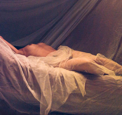
Here’s what Kevin shared about his experience. “Breaking rules is part of being artistic. This odalisk was made during the very early days of digital portraiture with a three chip camera the when given enough light was really quite good. I broke the flash sync socket at the beginning of the shoot forcing me to use the
modeling lights in the soft box as the sole and dim source of illumination. That camera shot at ISO 40 and the exposures were quite long adding a lot of noise to the image.  During portfolio reviews at
John Paul’s Digital Print II workshop last spring it was the pick of my work by the group. I added it to my print portfolio for last week’s workshop and again it was the unanimous favorite of my submissions.
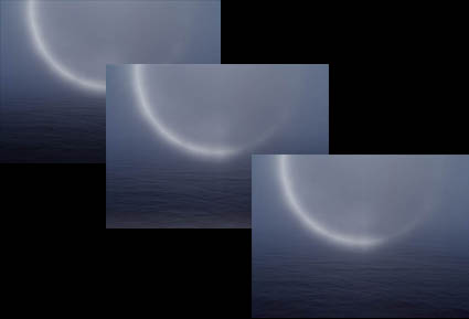
Understand that at the beginning of the workshop it was not the direction that I thought I wanted to follow. The breakthrough came when it was printed out to a large scale–forty by forty inches. Up
close it looks impressionistic. From ten feet it becomes painterly. Using the odalisque as a touchstone I am adding grain, noise and color washes to current high resolution work that is very sharp and well
lit. Printed larger than life the figures take on a whole new aspect. I can control the size of the grain in the subsequent photographs as part of the visual vocabulary. When the body of work is finished this
touchstone image will be the one that doesn’t truly fit. Breaking the rule of “noise free is better” has led me to seeing my work in a whole new way–all due to collaborating with the participants of the
workshop and of course John Paul’s guidance.”
Tell him what you think! Comment here!
Check out Kevin’s website here.
Check out my Fine Digital Print workshops here.

Justin Hartford – Distinctive Printing Style


Justin Hartford perfected his black and white palette during a special session of my Fine Digital Print workshops this week. He’s printing his high contrast landscapes right to the ragged edge. Deep blacks with very faint traces of detail and very bright highlights with only traces of detail. He’s using those in localized planes not in the same object. This makes extreme dynamic range a visual code for space (recession/progression). This distinctive palette combined with a larger than classic scale gives his work a very contemporary look to a classic subject (the American southwest).
Tell him what you think! Comment here!
Check out my Fine Digital Print workshops here.

Charlotte Rush Bailey – Appropriate Scale


Charlotte Rush Bailey printed her African portraits at a variety of scales in a special session of my Fine Digital Print workshops this week. It took physically experiencing them with her own body to find out how they were working. She held them up to her face. When the portraits are larger than life they take on a more graphic quality evoking mass media presentations. When they’re life size the representational quality of them is heightened. When they’re small the intimate quality of them is emphasized. Scale had a big impact on her subject. Only certain subjects function this way. Making life-size or larger than life-sized representations of vistas (landscape, cityscape, seascape) is often impractical if not impossible.
To a limited degree you can preview scale by projecting an image before printing. But nothing is a substitute for actually experiencing the final print. In addition to evaluating technical aspects of a print, it’s important to identify associative qualities as well. They can make a big difference.
Tell her what you think! Comment here!
Check out my Fine Digital Print workshops here.

Don Ross – Little Things Can Make a Big Difference


Don Ross knows that little things can make a big difference.  He brought many beautiful prints to a special session of my Fine Digital Print workshops this week. He was looking for “that extra something”. We identified one of the strongest images/prints that would give us a lot of information relevant to the rest of his body of work. Further resolving this one image would unlock the keys to how most of the other images need to be handled. How much saturation? How much contrast? How much sharpening? What kind of sharpening? Applied selectively? What paper? How big? He spent the better part of two days fine-tuning the image. At the end of it, he turned a good print into a great print. It was time well spent. “It’s a strange thing. When it comes to making really good work. It’s almost as if, little things make all the difference.”
Now that he knows how to resolve this one image, he knows how to resolve similar images. I’ll bet the next great print comes in a matter of hours. It was time really well spent.
Tell him what you think! Comment here!
Check out my Fine Digital Print workshops here.

Certificates of Authenticity


How do you reduce forgery? One way is to issue certificates of authenticity. The artist issues a certificate of authenticity with the artwork. There are many ways to handle this. The artist can give the certificate to the client. The artist can keep the certificate on file for clients. Or, the artist can give one to a client and keep a duplicate. Ultimately a certificate can be forged. But holographic seals can’t. The Hahnemühle Certificate of Authenticity (certificates and holographic seals) was designed to help reduce the risk of forgery.
There are many steps you can take to reduce forgery.
1 Share digital files only with trusted sources and post low resolution files to the web
2 Insert copyright information in the file (as a layer, in the file info fields, in metadata).
3 Sign and number all prints(even if issued in an open/unlimited edition). Sign only saleable prints.
4 Keep good records of sales.
5 Note provenance (production history) on the back side of prints.
6 Use certificates and seals.
What other steps do you/could you take to ensure authenticity? Comment here!
Learn this and other tips and techniques in my Fine Digital Print workshops series.

Printing – Finding the Coated Side of the Paper


Finding the side of a paper that’s optimized for printing can sometimes be challenging. Here are a few tips to help.
1 Look for the logo – the logo is always on the back.
2 Compare whites – the coated side is often whiter.
3 Feel the surface – the coated side is smoother.
4 Lick the paper – the coated side sticks more.
5 Feel the edge – paper is cut coated side up leaving a tiny lip/edge on the back side.
If you have other tips for finding the coated side of paper, comment here!
Learn this and other tips and techniques in my Fine Digital Print workshops series.

Printing – Humidity


Extreme humidity can impact print quality. This is particularly true for but not exclusive to matte papers, which are more absorbent.
We printed for my Annual Exhibit in high humidity. The paper had absorbed a lot of moisture and so there was substantially more dot gain. The prints were coming out substantially darker and we were having trouble maintaining shadow detail. It’s made me want to store all of my paper in a climate controlled environment (using a dehumidifier or air conditioner). Or, climate control my entire studio. Rather than reprofiling for an atmospheric condition that changes unpredictably, we compensated with proofing. We lightened the files selectively before printing. With a little testing, we came up with standard adjustments that could be used on multiple images, with customized shadow masks for individual compositions. It pays to think about the impact of humidity on your printing. Control humidity when you can. Compensate for it when you can’t. You get better prints.
What do you do to compensate for excessive dot gain due to environment or overinking? Comment here.
Check out my Printing downloads here.
Check out my DVD The Art of Proofing here.

Find out about my The Fine Digital Print Workshop Series here.

Printing – Proofing


Proofing is an essential part of making the finest prints possible.
While color management and softproofing get you 90% of the way there, there are all kinds of things you still need to check in hardcopy – materials, ink limit, sharpening to name a few. Every time I print an image, I create a BAT (a final proof) that I archive for future reference. The next time I print the same image the BAT tells me how I got the best results the last time it was printed. That then becomes a starting point for future improvements. Combine advancing technology (printers, ink, substrates) and good color management / proofing practices and you’ll find your print quality will constantly evolve.
Do you proof? What kinds of things do you routinely proof?
Check out my DVD 6 Simple Steps to Good Color Management here.
Check out my DVD The Art of Proofing here.
Check out my Proofing downloads here.
Find out about my digital printing workshop series The Fine Digital Print here.

Printing – Glass / No Glass


It can be helpful to see what presentation behind glass / plexiglass will do to print quality. The appearance of prints can shift slightly; darker and/or towards blue or green.
You can preview this before framing by keeping a sheet of glass/plexi-glass in your printing area and looking at final proofs and finished prints under glass / plexiglass to see the impact it will have on print quality. On occasion you may want to make small adjustments to a final print based on what you see. But remember, glass is often replaced. If you compensate for glass and the glass is replaced, make sure the new glass matches the old glass.
What kind of glass do you use for presentation? Do you use it? Comment here!
Check out my Printing downloads here.
Check out my DVD The Art of Proofing here.

Find out about my The Fine Digital Print Workshop Series here.

Printing – Dot Structure


What’s the big deal about dot structure? Fine detail. Smooth gradients.
It’s more than small dots (picoliters). It’s also how the dots are placed (screening algorithms). And, how precisely the dots are placed (piezo-electric or heat-based). And, what shape they are. And, which colors are used with other colors. It’s complex! Thankfully, inkjet printers are easy to use.
I print a lot of smooth gradients. Gradation is a key component to the way I use color. All my exhibition prints are made on an Epson 11880. The dot structure and gradation generated by the latest generation print heads and screening algorithms from Epson are simply the best on the planet.
Dots structure has advanced so far, so fast it’s dizzying. A decade ago inkjet printers produced prints that looked like Roy Lichtenstein paintings. Now you have to look very carefully to see the dots. Sometimes you may be tempted to confuse grain or noise with dot structure, but if you look more closely you’ll see the difference; grain/noise is usually larger, softer, sometimes more random, and sometimes it collects in distracting clumps. Pretty soon, you won’t be able to see the dots in inkjet prints with the naked eye.
Find Epson printers here.
Check out the Epson Professional Imaging website here.
Check out my Printing downloads here.
Find out about my digital printing workshop series The Fine Digital Print here.