Epson Print Academy – Downloads
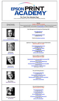
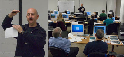
The Epson Print Academy Track 2 downloads contain dozens of PDFs, test files, and actions. They’re electronic. So they’re green. They’re portable. They’re transmittable. And they’re updateable. They evolve and grow as the sessions do. Items include Color Management (Rodney), Sharpening Workflow (Schewe), B&W Conversion (Gorman), Fine Art Workflow (Holbert), The Art of Proofing (Caponigro) and much, much more.
They’re for attendees only!
Find out about the next Epson Print Academy near you here.
Check out my downloads here.
Check out my Fine Digital Print workshops here.