Suffusion XXII – The Making Of The Print

I’m having a great time printing this series of images!
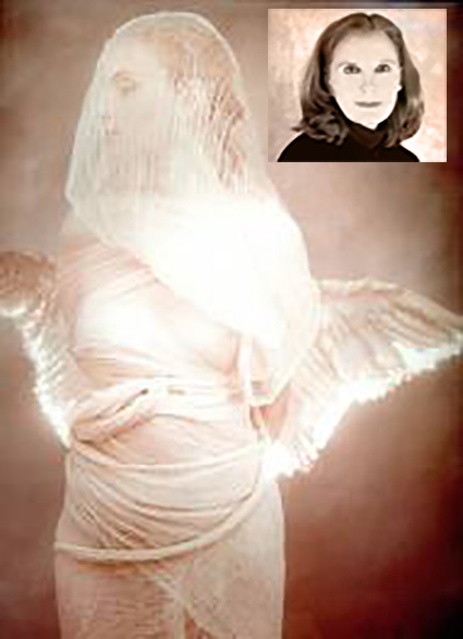
At first glance, they look like classic black and white images. In reality, they’re full color captures of a near neutral subject, processed and printed as color images. The trace amounts of color from the original subject make a very subtle but meaningful addition to the final image and print.
The trace amounts of color in the image are so subtle, I wasn’t sure which color management options would yield the best printed results; shadow detail, gradation, neutrality and graybalance all play major roles.
To get the final prints today, I tested multiple printer color management routes (Photoshop, Printer, Printer Adv B&W)(my ImagePrint tests are pending). Using Printer color management for color offered the results I was looking for – not Photoshop, which clipped deep shadow detail and not Printer Adv B&W which rendered warm grays by default and cool toning solutions added more cool toning to the highlights than the shadows making the prints look like they carried a faint color cross).
They’re really touchy images. I found out how touchy when I went from 4×6 proofs to 11×14 prints, which when enlarged looked slightly lighter and lower contrast. A contrast curve for enlargement solved this.
At larger scale the noise became an issue, which I’m sleeping on. On the one hand, the subject is made of particles of water, which you can see when you are there. On the other hand it looks distracting to people who don’t know this. Water blurs with motion but the motion is frozen in these very fast exposures. I polled other people around me (including my father). Then I settled on an unexpected solution. I let some of the noise come through only in the areas of greatest focus, drawing slightly more attention to them. (Some noise can makes images appear sharper.)
There was a another surprise. I tested the images on glossy paper (Epson Exhibition Fine Art Paper). The extra depth in the blacks made another improvement in the image, so much so that it was worth the trade off for the soft surface of the matte paper. I made a similar test with a related series, Fumo, and didn’t make this choice. But here it was clear. This is the first time I’ve made my final prints on glossy paper.
I made these images while scouting my 2011 Focus On Nature workshop with Ragnar Th Sigurdsson and Arthur Meyerson. Arthur and I, two colorists who love the colors black gray and white and talk about them as colors.
I’m looking forward to returning to Iceland (and this waterfall) this August to lead a workshops again for Focus On Nature with +Einar Erlendsson , +Ragnar Th. Sigurdsson and +seth resnick . +Arthur Meyerson Arthur Meyerson will join us at the end of our Iceland workshop for our Arctic Voyage workshop/cruise from Longyearben to Greenland and finally back to Iceland.
We have a few more spaces left our Iceland workshop.
There’s one space left in our Greenland workshop.
There are a two more spaces in my Fine Digital Print Advanced workshop.
Learn more in my digital photography and digital printing workshops.