.

Earth Hour – Saturday March 28, 8:30 – 9:30pm


This year, Earth Hour has been transformed into the world’s first global election, between Earth and global warming.
For the first time in history, people of all ages, nationalities, race and background have the opportunity to use their light switch as their vote – Switching off your lights is a vote for Earth, or leaving them on is a vote for global warming. WWF are urging the world to VOTE EARTH and reach the target of 1 billion votes, which will be presented to world leaders at the Global Climate Change Conference in Copenhagen 2009.
This meeting will determine official government policies to take action against global warming, which will replace the Kyoto Protocol. It is the chance for the people of the world to make their voice heard.
VOTE EARTH by simply switching off your lights for one hour, and join the world for Earth Hour.
Saturday, March 28, 8:30-9:30pm.
Find out more here.
And here.

PSW – The Fine Art of Digital


This evening is always one of my favorite events. DiVitale, Glyda, McNally, Maisel, Versace, Caponigro, Peterson. We all show recent work and talk about our creative processes. What we do. What we produce. Why we do the things we do. The really important stuff. It’s always different. I never do the same thing twice.
The evening is full of great pearls of wisdom. Like Joe McNally’s “If you want to take more interesting pictures, go to more interesting places.” Or, Jay Maisel, “Let the picture come to you.” Or Vincent Versace’s quotes of Ernst Hass, “Don’t take pictures. Be taken by pictures.” and Cartier Bresson, “Give me inspiration over perspiration.”
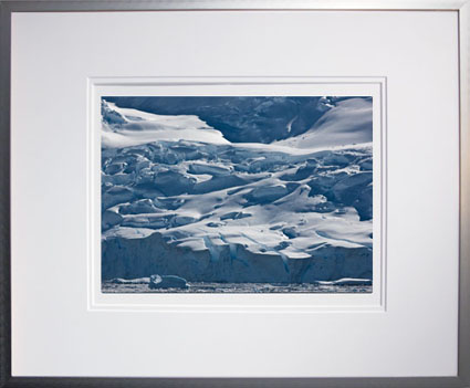
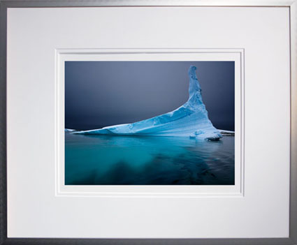
Tonight I’ll be showing new work from my recent voyage to Antarctica in January 2009.
See my work in Antarctica here and stay tuned for new updates.
See my text on Antarctica here and stay tuned for updates.
Watch for my Antarctica Blurb book update later this spring.
See upcoming destinations here.

PSW Keynote – Configurator & Watermarker


Adobe’s John Loiacono, Russell Brown, and John Nack gave a great overview of all the key new CS4 features making a compelling case for upgrading. They noted that there have been many free enhancements to the product line since the release, including great updates for Camera Raw. If you upgraded, but didn’t get these updates, get them! And there’s a new utility that let’s you make your own custom panels – Configurator. NAPP has made a new panel to help make watermarking your images a breeze. It’s free to members.
Missed the event? See it here!
Check these other blogs for co-coverage of the event.
Corey Barker
John Paul Caponigro
RC Concepcion
Dave Cross
Jim Divitale
Laurie Excell
Martin Evening
Richard Harrington
Scott Kelby
Matt Koslowski
Deke McClelland
Joe McNally
John Nack
Moose Peterson
Jeff Schewe
Colin Smith
Ben Willmore
David Ziser
Find out more about Photoshop World here.

Facebook Group – John Paul Caponigro Alumni


I started a Facebook Group for my workshop and seminar alumni.
If you’re one of my alumni you can use this group to …
Network – Connect and stay in touch.
Learn – Exchange information.
Promote – Grow an audience for your projects.
I use Facebook to stay in touch with people. I let them know what I’m doing. I find out what they’re doing.
My hope is that this group will be useful to you to … Read More

Coblogging Photoshop World XVII


Precons at Photoshop World XVII start today.
We’re coblogging again. Presenters will try and make one post a day of a highlight.
I haven’t even started my Epson Print Academy Precon (today from 1-5 with Rodney and Schewe) yet and I’ve had a highlight. RC Concepcion, Matt Koslowski, Corey Barker and I were discussing shooting for HDR for their demo during their Precon session. RC had scouted locations and remarked that crowds might be a problem. So I offered an idea. Shoot 3 shots for each bracketed exposure (three each for low, medium and high). First merge the moving people out. Then use the remaining three merges for the HDR merge. This stuff gets you thinking – in new ways. I love it! I’ll be do this in my workshop in Palms Springs next week. Someone will let you know how it goes. When they do you’ll find a link here.
You can see what other presenters share each day by accessing these links.
Here’s a list of everyone who coblogged last year. Check back for more links each day.
Corey Barker
John Paul Caponigro
RC Concepcion
Dave Cross
Jim Divitale
Laurie Excell
Martin Evening
Richard Harrington
Scott Kelby
Matt Koslowski
Deke McClelland
Joe McNally
John Nack
Moose Peterson
Jeff Schewe
Colin Smith
Ben Willmore
David Ziser
Find out more about Photoshop World here.
Check out the Epson Print Academy here.
Check out my Workshops series here.

Who Uses NEC?


Who else uses NEC monitors? These guys – Schewe, Holbert, and Maisel.
These guys also use NEC – Holbert, Schewe, and Maisel.
In 1989 when we started Nash Editions … there was no expectation that the screen would accurately represent how the image would translate to paper but it did provide direct control over our output.
With the release of Colorsync in 1993 color management slowly became more and more accurate. By 2000 we were working on calibrated CRT’s that provided us with a nominally accurate representation of our printed images. Finally in 2003 we acquired 2 Sony Artisan CRT’s and we experienced an unmatched level of on-screen accuracy. As the Artisans neared their end of life we realized that replacement displays would not be CRTs. Since then we have replaced all our mission critical displays with NECs. We find that they provide us with an unparalleled level of color accuracy and angle of view. – R Mac Holbert
For the Camera Raw video tutorial, I chose to use the NEC LCD2690WUXi because it had the right combination of resolution, wide screen display, wide color gamut and yet extremely accurate profiling so I could rely upon what I saw on the display. I use it day in and day out and it’s proven trustworthy… As a visual artist, everything depends upon what I see. – Jeff Schewe
I just want the rest of the process between shooting and presenting work to be accurate and simple. That is what I like about the NEC MultiSync LCD2690WUXi monitors we use at my studio. – Jay Maisel.
Find out more about what they have to say here.
Read my conversation with Will Hollingworth (Senior Manager – Product Development for NEC) here.
See the monitors in action in my workshops.

Using Color Wheels to Structure Relationships


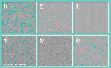
Photographers are often not introduced to the same color theory painters are. At best, color theory is a matter of identifying complements to produce neutrality or color balance. But there are few strategies presented for conceptualizing color relationships in a photographic curriculum, while there are many for painters. In part, this is because painters could change color relationships so easily. The photographer couldn’t – until Photoshop. Now, the language and concepts of other disciplines becomes very useful to photographers. This video give you a taste.
But, be careful of one thing. Painters define complementary colors based on mixing pigments, which contain impurities. They use Red/Green, Yellow/Purple, Blue/Orange. True optical complements are found in photography (light without impurities). Use Red/Cyan, Green/Magenta, and Blue/Yellow instead. You can find confirmation of this by studying retinal after images. Stare at a color for 20 seconds. Then look to a neutral ground. The color residue you see will be the optical complement of the color you stared at.
Learn more about color in my DVDs.
Learn more about color in my workshop The Power of Color.

The Elements of Color – Color Equilibrium


Josef Albers’s Theory and Interaction of Colors is considered the definitive classic on color theory from a painter’s perspective. I actually prefer his colleague Johannes Itten’s The Elements of Color. Itten’s language is exceptionally clear. How important is language? Very! Itten does something brilliant. He avoids the whole mess of discussing color ‘harmony’, which is subjective (influenced by culture, region, individual, and time), and describes color relationships in terms of ‘equilibrium’. Complementary colors produce equilibrium; red and cyan mix to produce gray. ‘Color balance’ is produced by an equal mix of the two colors. An ideal color structure is produced by an equal mix of all colors. Equilibrium produced a perfect balance. There’s lots more where that came from. I highly recommend the book.
Find this and other books on color here.
Learn more about color in my DVDs.
Learn more about color in my workshop The Power of Color.

ICC Is A Scale


During the Epson Print Academy Andrew Rodney uses many great metaphors to explain a complex subject – color managment. Here’s one. The ICC standard is just a scale that gives numbers a context and ultimately a meaning. 1500! What’s 1500? 1500 what? Meters? Kilometers? The scale gives the number meaning and ultimately use. And using a common scale that we all share makes communication easier and more precise. Color management is ultimately all about scientifically describing and communicating color.
Catch one of the last three Epson Print Academy dates this season.
Toronto – Saturday, 3/21
Boston – Tuesday, 3/24
Vancouver – Saturday, 5/23
Learn more.
Check out the Epson Print Academy here.
Check out Andrew Rodney’s Color Management here.
Find Andrew’s book Color Management for Photographers here.
Check out my Color Management downloads here.
Check out my DVD 6 Simple Steps to Good Color Management here.
Check out my Fine Digital Print Workshops series here.