The Fine Digital Print – Seminar – Total Solution

Today I present a seminar The Fine Digital Print.
One of the things I discuss is that print quality is a product of a total a solution. It can be challenging to compare the many new offerings from multiple manufacturers. Breaking the systems down into their component parts and understanding what impact each has on print quality is essential to achieving a balanced well-informed viewpoint. Here are five items to bear in mind.
PRINTER
INK DELIVERY SYSTEM
PAPER DELIVERY SYSTEM
SELF-PROFILING
INK
DMAX & GAMUT
FAST DRYING
LONGEVITY & DURABILITY
SUBSTRATE
ISO BRIGHTNESS DMAX & GAMUT
COATINGS – DRYING AGENTS & BRIGHTENERS
LONGEVITY & DURABILITY
DRIVER
INK LIMIT
PAPER FEED
DOT STRUCTURE – SIZE & PLACEMENT
SEPARATION – WHICH INKS ARE USED WHERE
16 BIT
RIP – POSTSCRIPT COMPATIBILITY FOR VECTOR GRAPHICS & TEXT
PROFILES
HIGH QUALITY PROFILES ARE EASIER TO GENERATE IF …
PRINTERS ARE LINEARIZED (AT FACTORY) & STABLE
INKSETS ARE CONSISTENTLY FORMULATED
Check out my free Printing downloads here.
Check out my workshops here.

Epson Print Academy – New Dates


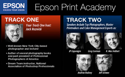
The Epson Print Academy is gearing up for another tour. There are two tracks.
Track I programming includes …
Jack Reznicki seminars and hosts.
Video presentations by top industry experts.
Track II programming includes …
Andrew Rodney    Color Management
Jeff Schewe        Raw Conversion
Greg Gorman     Black and White
Mac Holbert     Fine Art Workflow
J P Caponigro    21st Century Dodging & Burning and The Art of Proofing
Video presentations with Michael Reichmann, Henry Wilhelm, and Epson Professional Product Managers.
Which track should you attend? Find out here.
Nov 8, 2008       Atlanta
Nov 16, 2008     Washington DC
Dec 6 , 2008      New York
Dec 13, 2008     Dallas
Jan 31, 2009      Seattle
Feb 7, 2009       San Francisco
Feb 21, 2009     Los Angeles
Feb 28, 2009     Boston
Mar 14, 2009     Chicago
Mar 21, 2009     Toronto
April 4, 2009      Minneapolis
April 25, 2009    Denver
May 3, 2009       New York
May 9, 2009       Los Angeles/Orange County
May 16, 2009     San Francisco
May 23, 2009     Vancouver
Get more details on dates and locations here.
Track 1 costs $79.95. Track 2 costs $149.95. This is one of the best deals around. Sign up now!
Check out Schewe and Reichmann’s video tutorial here.
Check out Holbert’s DVD The Dirty Dozen here.
Check out my DVDs here.
Check out my Fine Digital Print workshop series here.
If you attended the Epson Print Academy tell us what you liked and what you’re looking forward to. Comment here!

Certificates of Authenticity


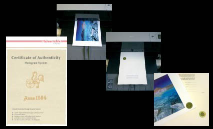
How do you reduce forgery? One way is to issue certificates of authenticity. The artist issues a certificate of authenticity with the artwork. There are many ways to handle this. The artist can give the certificate to the client. The artist can keep the certificate on file for clients. Or, the artist can give one to a client and keep a duplicate. Ultimately a certificate can be forged. But holographic seals can’t. The Hahnemühle Certificate of Authenticity (certificates and holographic seals) was designed to help reduce the risk of forgery.
There are many steps you can take to reduce forgery.
1 Share digital files only with trusted sources and post low resolution files to the web
2 Insert copyright information in the file (as a layer, in the file info fields, in metadata).
3 Sign and number all prints(even if issued in an open/unlimited edition). Sign only saleable prints.
4 Keep good records of sales.
5 Note provenance (production history) on the back side of prints.
6 Use certificates and seals.
What other steps do you/could you take to ensure authenticity? Comment here!
Learn this and other tips and techniques in my Fine Digital Print workshops series.

Printing – Finding the Coated Side of the Paper


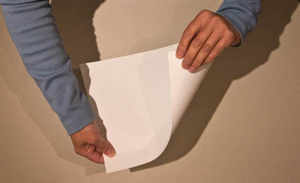
Finding the side of a paper that’s optimized for printing can sometimes be challenging. Here are a few tips to help.
1 Look for the logo – the logo is always on the back.
2 Compare whites – the coated side is often whiter.
3 Feel the surface – the coated side is smoother.
4 Lick the paper – the coated side sticks more.
5 Feel the edge – paper is cut coated side up leaving a tiny lip/edge on the back side.
If you have other tips for finding the coated side of paper, comment here!
Learn this and other tips and techniques in my Fine Digital Print workshops series.

Printing – Humidity


Extreme humidity can impact print quality. This is particularly true for but not exclusive to matte papers, which are more absorbent.
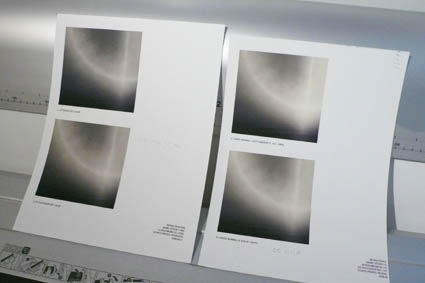
We printed for my Annual Exhibit in high humidity. The paper had absorbed a lot of moisture and so there was substantially more dot gain. The prints were coming out substantially darker and we were having trouble maintaining shadow detail. It’s made me want to store all of my paper in a climate controlled environment (using a dehumidifier or air conditioner). Or, climate control my entire studio. Rather than reprofiling for an atmospheric condition that changes unpredictably, we compensated with proofing. We lightened the files selectively before printing. With a little testing, we came up with standard adjustments that could be used on multiple images, with customized shadow masks for individual compositions. It pays to think about the impact of humidity on your printing. Control humidity when you can. Compensate for it when you can’t. You get better prints.
What do you do to compensate for excessive dot gain due to environment or overinking? Comment here.
Check out my Printing downloads here.
Check out my DVD The Art of Proofing here.

Find out about my The Fine Digital Print Workshop Series here.

Printing – Proofing


Proofing is an essential part of making the finest prints possible.
While color management and softproofing get you 90% of the way there, there are all kinds of things you still need to check in hardcopy – materials, ink limit, sharpening to name a few. Every time I print an image, I create a BAT (a final proof) that I archive for future reference. The next time I print the same image the BAT tells me how I got the best results the last time it was printed. That then becomes a starting point for future improvements. Combine advancing technology (printers, ink, substrates) and good color management / proofing practices and you’ll find your print quality will constantly evolve.
Do you proof? What kinds of things do you routinely proof?
Check out my DVD 6 Simple Steps to Good Color Management here.
Check out my DVD The Art of Proofing here.
Check out my Proofing downloads here.
Find out about my digital printing workshop series The Fine Digital Print here.

Printing – Glass / No Glass


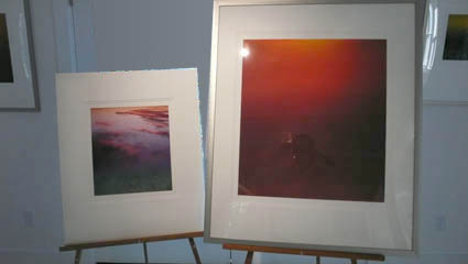
It can be helpful to see what presentation behind glass / plexiglass will do to print quality. The appearance of prints can shift slightly; darker and/or towards blue or green.
You can preview this before framing by keeping a sheet of glass/plexi-glass in your printing area and looking at final proofs and finished prints under glass / plexiglass to see the impact it will have on print quality. On occasion you may want to make small adjustments to a final print based on what you see. But remember, glass is often replaced. If you compensate for glass and the glass is replaced, make sure the new glass matches the old glass.
What kind of glass do you use for presentation? Do you use it? Comment here!
Check out my Printing downloads here.
Check out my DVD The Art of Proofing here.

Find out about my The Fine Digital Print Workshop Series here.

Printing – Dot Structure


What’s the big deal about dot structure? Fine detail. Smooth gradients.
It’s more than small dots (picoliters). It’s also how the dots are placed (screening algorithms). And, how precisely the dots are placed (piezo-electric or heat-based). And, what shape they are. And, which colors are used with other colors. It’s complex! Thankfully, inkjet printers are easy to use.
I print a lot of smooth gradients. Gradation is a key component to the way I use color. All my exhibition prints are made on an Epson 11880. The dot structure and gradation generated by the latest generation print heads and screening algorithms from Epson are simply the best on the planet.
Dots structure has advanced so far, so fast it’s dizzying. A decade ago inkjet printers produced prints that looked like Roy Lichtenstein paintings. Now you have to look very carefully to see the dots. Sometimes you may be tempted to confuse grain or noise with dot structure, but if you look more closely you’ll see the difference; grain/noise is usually larger, softer, sometimes more random, and sometimes it collects in distracting clumps. Pretty soon, you won’t be able to see the dots in inkjet prints with the naked eye.
Find Epson printers here.
Check out the Epson Professional Imaging website here.
Check out my Printing downloads here.
Find out about my digital printing workshop series The Fine Digital Print here.

Printing – Ideal Viewing Distance


Scale changes ideal viewing distance.
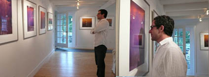
To see a 4×5” print you have to get close to it. You can’t see anything but its shape and color from the end of a long hall. To see a 6×10’ print in its entirety you have to stand well away from it. If you stand very close to it, you won’t be able to see the whole image, much less anything else.
The rule of thumb for determining ideal viewing distance is to stand at three times a print’s diagonal dimension. This tends to place the entire image well within a viewer’s field of vision in such a way that overall general detail can be resolved at once, minimizing panning and scanning.
Of course, zooming happens. Both artists and viewers tend to view works of art from many different distances; examining details closely and evaluating a total composition distantly. Viewing distance changes perceived scale. Viewing distance subtly changes the quality of the viewing experience. So viewers tend to compare a variety experiences, dynamically forming a total impression of a work of art.
What do you think the ideal viewing distance for prints is? Comment here!
Check out my Printing downloads here.
Check out my DVD The Art of Proofing here.

Find out about my The Fine Digital Print Workshop Series here.

Printing – Big Prints


Scale can have a dramatic impact on the way images are experienced.
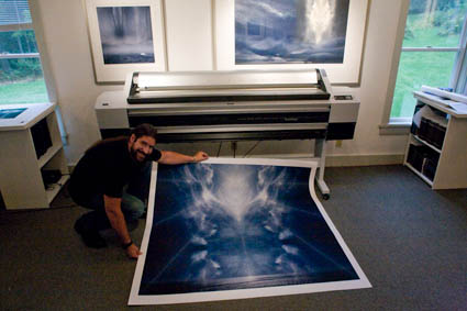
We’ve been printing up a storm here! All the prints are made on an Epson 11880. The prints can be very large. Up to 64″. How big do I typically print? Generally under 30×40″. Would I like to print bigger? Yes! Why don’t I print bigger more often?
Here’s the problem. How do you handle them during production? How do you present them (framed or unframed)? How will they fit in the exhibition space? How do you store them? When you get really big, all of these practical considerations become really significant.
New possibilities bring new opportunities and challenges.
How big have you printed? What did you do to overcome these considerations? Comment here!
Check out my Printing downloads here.
Check out my DVD The Art of Proofing here.

Find out about my The Fine Digital Print Workshop Series here.