Metamerism / Metameric Failure


It’s often called metamerism, but the correct term is metameric failure.
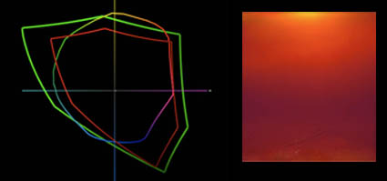
Metameric failure is the tendency of an object to change appearance under different light sources. Different light sources, even of the same color temperature, are often comprised of differing amounts of spectral frequencies (i.e. red or blue frequencies). Some objects change appearance more quickly than others; they are more highly metameric. This is true when comparing dye-based inks with pigmented inks. As pigments are made of irregular particles, they tend to refract (reflect and bend) light more strongly than uniform dye globules. The most current ink technology coats pigment particles in resin to reduce this effect. Additionally, some color pigments, typically the most saturated ones, are more prone to metamerism. By separating the file differently and using more of the less metameric ink to reproduce an image, the print’s appearance stability is increased. This is particularly important when reproducing neutrals, as small shifts in hue are quickly detected in these colors.
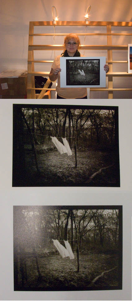
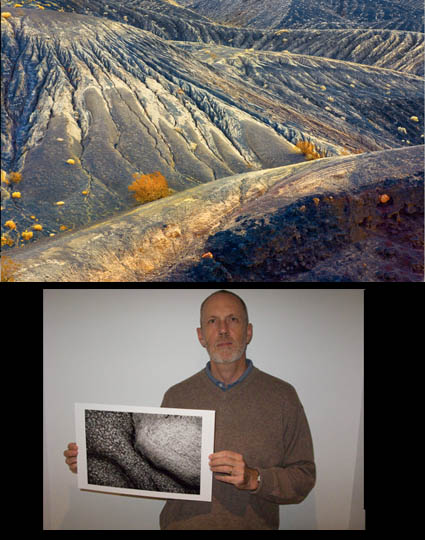
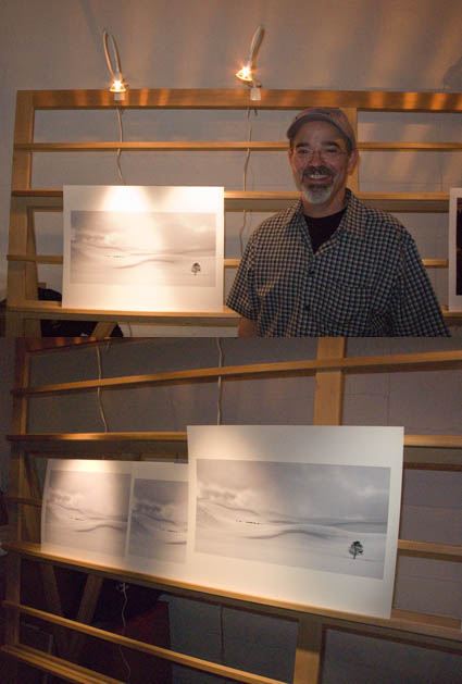
How can you evaluate metameric failure? Make two prints of the same image (preferably containing significant neutrals) and compare them side by side in different light sources.
What can you do to reduce metameric failure? Use the latest inksets (such as Epson’s Ultrachrome K3) and drivers (with the latest separation routines). And, when practical, standardize the light your prints are viewed under. Can metamerism be completely eliminated? No. Everything is metameric. But metameric failure in prints can be reduced to the point where it is no longer significant.
Read the rest of this article in the current issue of Photoshop User.
Learn more in my workshops.

Print Proofs To See Undisplayable Colors


You softproof (constrain a monitor with an ICC profile) to see what colors are out of gamut of an ink and paper combination before you print. You proof (print) to see colors out of gamut of the monitor.
What? Yes! Today’s inksets exceed the gamut of of even the widest gamut monitors, in certain colors.
This graph shows ColorMatch (equivalent to most CRTs and LCDs), Adobe RGB 1998 (higher end LCDs), and Epson Ultrachrome HDR Ink on Epson Exhibition Fiber Paper. The new printers with the latest substrates can print more saturated yellows and oranges than even the best monitors can display. And, they can also print more saturated blues and greens than average LCDs can display. Evolution in printers is forcing an evolution in monitors.
Which monitor do I recommend? Check out my previous post here.
Check out my DVD 6 Simple Steps to Good Color Management.
Check out my DVD The Art of Proofing.

See me demonstrate this and more during the Epson Print Academy.
Learn these techniques in my workshops.

Epson Print Academy – Wilhelm / Reichmann


The videos for the Epson Print Academy are always rich. In the newly updated Track 2 sessions attendees get to see a 14 minute short cut of Michael Reichmann (Luminous Landscape) interviewing Henry Wilhelm (Care and Permanence of Photographs) on longevity. A lot of myths and misnomers are dispelled. It’s well worth scanning.
You can see and/or listen to the full 68 minute version here.
Find out about the next Epson Print Academy near you here.

Epson Print Academy – Downloads


The Epson Print Academy Track 2 downloads contain dozens of PDFs, test files, and actions. They’re electronic. So they’re green. They’re portable. They’re transmittable. And they’re updateable. They evolve and grow as the sessions do. Items include Color Management (Rodney), Sharpening Workflow (Schewe), B&W Conversion (Gorman), Fine Art Workflow (Holbert), The Art of Proofing (Caponigro) and much, much more.
They’re for attendees only!
Find out about the next Epson Print Academy near you here.
Check out my downloads here.
Check out my Fine Digital Print workshops here.

Epson Print Academy – Atlanta 11/8


The Epson Print Academy will be in Atlanta tomorrow Saturday, November 8th at the Renaissance Atlanta Hotel Downtown. It’s the first of a 15 city tour. Track 1 & 2 are both updated with new sessions. Track 1 is hosted by Jack Reznicki with live demonstrations and informative videos featuring industry professionals giving an excellent introduction to the medium.  Track 2 features advanced sessions by Andrew Rodney, Jeff Schewe, Greg Gorman, Mac Holbert and John Paul Caponigro. The gallery features images printed with the new Epson Stylus® Pro 7900 printers with UltraChrome® HDR inks. Attendees will be registered to win one 4880 printer (given at each venue) and one of the 7900 printer (given July 2009). At $79.95 and $149.95, these sessions are a phenomenal value. Don’t miss them!
Get more information here.
Find out about the next Epson Print Academy near you here.
Check out my Fine Digital Print workshops here.

Dan Steinhardt – About Paper / Meaningless Terms


Last week at The Fine Art of Digital Printing workshop The Fine Art of Digital Printing workshop (taking place at Brooks sponsored by Epson) spoke about paper. We always have special guests at these events and we were delighted that Dano was able to come this time. Dano explained a lot of interesting things about paper (three types – swellable, microporous, cotton fiber)(the history and myths of OBA’s – optical brightening agents – used in paper coatings, some longer lasting than others)(longevity facts – it’s a combination of many factors, lightfastness being only one).
One of the funnier things that everyone came away with was how many terms we’re used to hearing and using that are essentially meaningless and can be potentially misleading if you make assumptions often associated with the terms. “Fine art paper”, “museum grade”, “archival”, “pearl”, “luster”, “stipple” are all marketing terms with no definite meaning. “Permanent” means water fast, but doesn’t imply light fast. “Compatibility” simply means the paper will transport through the printer – nothing more. So it pays to know which terms are truly meaningful/useful and which terms aren’t.
More to come on this. Stay tuned.
Look for upcoming Epson Print Academy dates here.
Check out The Fine Art of Digital Printing workshops here.
Check out my Fine Digital Print workshops here.

Peg Fredi – Simulating Alternative Processes / Waxing Prints


This week at The Fine Art of Digital Printing workshop (taking place at Brooks sponsored by Epson) Peg Fredi wanted to simulate the look of the alternative process prints she’s been making with digital contact negatives. She tried several toning solutions – variations of traditional warm toning solutions. She found that she like the black of the inkjet prints, which is even blacker than alternative process blacks. She tried several paper types, ultimately deciding on Epson Velvet paper, which she then planned to wax (with butcher’s wax) to enhance the surface further. Actually, waxing print surfaces has been around a long time. It adds an extra dimension and quality to any print. And it doesn’t affect longevity. It pays to experiment. You may find new solutions that are just right for your work.
Have you finished your prints in unusual ways? Tell us about it! Comment here!
See Peg Fredi’s work here.
Look for upcoming Epson Print Academy dates here.
Check out The Fine Art of Digital Printing workshops here.
Check out my Fine Digital Print workshops here.

Steve Robeck – Thinking File Structure


This week at The Fine Art of Digital Printing workshop (taking place at Brooks sponsored by Epson) Mac Holbert and I reviewed file structure at the end of the week – by processing student work. Everyone participating in the workshop got a valuable review of the file building workflow Mac and I use and recommend. Steve Robeck also got more than one possible window into the art of interpreting digital files. Time and time again, you modify how you apply a tool, eliminate it from the process, or add another. In this case we added a Photo Filter adjustment layer applied selectively to the highlights to add subtle warm ambient color and we used an additional Hue/Saturation layer to increase the saturation of yellow accent colors throughout the image. Adopting a consistent file structure and working methodology is important. And, knowing when and why to make exceptions is equally important.
Look for upcoming Epson Print Academy dates here.
Check out The Fine Art of Digital Printing workshops here.
Check out my Fine Digital Print workshops here.

Carlos Conseco – Print Surface


This week at The Fine Art of Digital Printing workshop (taking place at Brooks sponsored by Epson) Carlos Conseco discovered how important it is to test materials and evaluate images side-by-side. He printed one of his best images on a variety of surfaces – Epson Watercolor, Velvet, Ultrasmooth Fine Art, Luster, and Exhibition Fiber. They were all good. Each material added something new to the expression of his print. Materials affect print quality in technical ways (glossy papers produce blacker blacks) and aesthetic ways (matte papers seem softer and more organic). So he slept on it before making his final decision. The most important thing he learned was that materials matter.
What papers do you like? Why? Comment here!
Look for upcoming Epson Print Academy dates here.
Check out The Fine Art of Digital Printing workshops here.
Check out my Fine Digital Print workshops here.