Cheryl Medow – Consistent Style


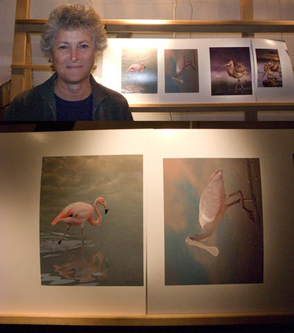
Cheryl Medow creates wildlife composites. She’s attending the Fine Art of Digital Printing workshop (Caponigro and Holbert at Brooks sponsored by Epson). Yesterday, some of them looked like photocomposites (surreal) and some looked like paintings (graphic). Today, after a long discussion about the most successful components in separate images and the intent she wants to communicate, they all look like they’re made by the same person who has a cohesive message. Some of the keys to unlocking her style included keeping shadow and highlight detail extremely full (none of them pure black or white, sometimes with significant color). In addition to keeping luminosity contrast low, she did the same with hue contrast, glazing the different colors in her images with a single color. Both create a more softly modulated color palette. Cheryl had to reconsider what she had learned about traditional photographs to find her own personal style. Her first step was to find the words to describe the new qualities she found through exploration (trial and error) and now wanted to repeat. The next step is to ask why. She’s got a lot of ideas, but she’s still working on it. That’s great. That’s when work starts to get really interesting.
Check out Cheryl Medow’s work here.
Check out the Fine Art of Digital Printing workshops here.
Check out my Fine Digital Print workshop series here.

R Mac Holbert’s DVD – Nash Editions Master Class


The Dirty Dozen: Eliminating Common Imaging Mistakes – Mac Holbert’s first DVD is about to be released by Acme Educational.
Mac’s a pioneer in the field of digital printing. He’s also a dear friend. I can’t think of another person I’d rather teach digital printing workshops. We do it twice a year in special workshop sessions sponsored by Epson – The Fine Art of Digital Printing. (We just finished a great five day session at the Hallmark Institute of Photography.) Mac’s presentation on fine art workflow is first rate. I do similar workflow sessions in all of my workshops. We’ll be presenting a session on the topic together at PhotoPlus East this year. We also cover it in our Epson Print Academy sessions. It’s a corner stone of our workshop. And his new DVD covers many of the topics Mac demonstrates during these sessions.
Here’s what you’ll find on his DVD.
“When it come to fine art printing R. Mac Holbert along with Graham Nash started it all. If it was not for them fine art inkjet printing would not be what is today. Simply put Nash Editions is THE name in fine art printing and R. Mac Holbert is the talent behind that name. This DVD is the first of R. Mac Holbert’s Nash Editions Master Class. This is a truly unique opportunity to have access to the knowledge of one of the pioneering innovators of digital imaging.
Have you ever printed an image only to find you’ve overlooked a minor but critical mistake? Or have you made a small print, only to find a larger print shows issues that need to be fixed in Photoshop? Whether you print your own images or send them to a service, this Nash Editions Master Class DVD is an invaluable lesson on eliminating twelve common imaging mistakes. Distilled from 18 years of printmaking experience these elementary mistakes are made routinely, not only by the neophyte, but by the seasoned professional as well. Learning to avoid them will save you time, printing costs and ultimately will enable you to more precisely realize your vision on paper.
Learn how to correct contaminated neutrals with only one layer, doing the work of 4 -5 color correction layers. Learn how mid-tone contrast can add dimension to your images. Get these and other techniques on your workflow checklist, integrate them into your workflow and take your images from the ordinary to the extra-ordinary.”
Topics include …
Destructive Workflow
Oversharpening
Midtone Contrast
Image Alignment
Imprecise Cropping
Bad Masking
Contaminated Neutrals
Unreasonable File Size
Untagged Files
Cross Purpose Layers
Incorrect Layer Stack
File Extension Issues
It’s $39.95 until it ships and $49.95 thereafter.
Check out Mac’s DVD here.
Find out more about The Fine Art of Digital Printing workshop here.
Find out about my The Fine Digital Print workshop series here.

Ollie Treadway – Simplifying Workflow


For Ollie it all came together on the final day of our workshop The Fine Art of Digital Printing (this time at the Hallmark Institute for Photography). He was able to untangle his workflow and his file structure and produce better results in less time.
Here are a few core concepts he absorbed. Keep it simple; amid multiple methods that offer equal quality, the simplest way is best. Work globally first, then regionally. Don’t fix problems created during the editing process, fix the adjustments that created the problems. Organize and label your layers.
Now that the technical issues have been answered and simplified, Ollie’s freer to direct his energies in more important areas of his creative growth – finding and developing his own authentic voice.
These are the kinds of dialogs Mac Holbert and I have every day with participants in our the Fine Art of Digital Printing workshop during our extensive One on One and Review sessions.
Look for future workflow sessions from Mac and I at PhotoPlus East and the Epson Print Academy.
Check out my workflow PDFs here.
Check out Ollie’s website here.
Find out about the Hallmark Institute of Photography here.
Find out more about The Fine Art of Digital Printing workshop here.
Find out about my The Fine Digital Print workshop series here.

Presenting Your Work


What’s it take to succeed in fine arts? Perseverance, smart work, hard work, information, luck, talent, and friends – in that order. Oh, and it’s not pick two out of eight, it’s all of the above.
In my workshops I not only show my students my work (professionally presented), but I also discuss presentation practices, packaging, marketing, and the business of fine art. There’s an art to the business of fine art. And high quality sources of information on the topic are sorely lacking in this area.
Mary Virginia Swanson does a better job of outlining the business of fine art and identifying opportunities than anyone else I know.
Check out her blog here.
Find out about the Hallmark Institute of Photography here.
Find out more about The Fine Art of Digital Printing workshop here.
Find out about my The Fine Digital Print workshop series here.

Marc Siegner – Testing Sharpness


Marc creates multimedia prints and installations. He uses a wide variety of media for their material characteristics. So naturally he’s particularly sensitive to the look and feel of his images. We tested sharpness (low, medium, and high) with one of his images. Then the whole class had the opportunity to see the results side-by-side. Consensus wasn’t instant. Some like it sharp. Some like it soft.
One thing became clear, sharpness influences spatial relationships – especially when applied selectively. Typically, sharper image areas appear closer to the viewer, while softer areas appear further away.
So sharpness not only involves aesthetic choices, it can also be used to control spatial relationships within an image. Texture and contour are essential elements in visual vocabulary that you can use to further your personal expression.
Test it for yourself! On your images! Do it! While you can imagine the results, there’s nothing like experiencing it.
How important is sharpness in your images? Do you like your images sharp or soft? Comment here.
Find out about the Hallmark Institute of Photography here.
Find out more about The Fine Art of Digital Printing workshop here.
Find out about my The Fine Digital Print workshop series here.

Cemal Ekin – Crafting a Signature Style


Cemal was fairly confident that he wanted an alternative process look so he printed a key image for a series of black and white images on Epson matte papers – UltraSmooth, Velvet, and Watercolor paper.  He like the rich black of the Velvet surface. Then Cemal made two unexpected moves that gave what at first seemed like an antique treatment a very contemporary edge. He “crunched” his shadows running the contrast high, heavily darkened regional areas, and he used heavy sharpening (both Unsharp Mask and High Pass), making them look like photographs drifting towards etchings. He confirmed that this was indeed the most compelling treatment for his images by printing renditions with more shadow detail and less sharpening. Some experiments succeed, some fail. You need to risk failure. In fact, failures aren’t failures if you learn from them – they bring confirmation and direction. This kind of experimentation is necessary to create more distinctive and expressive prints. The key is to do focused experiments that are most likely to give useful or relevant information.
What kinds of focused experiments would help you most? List a few now!
Cemal brought with him a beautiful portfolio of small prints (printed on Moab Entrada and collected in a companion folio). Comparing them to prints of larger scale revealed yet one more facet of his work.
These are the kinds of dialogs Mac Holbert and I have every day with participants in our the Fine Art of Digital Printing workshop during our extensive One on One and Review sessions. This week we’re at the Hallmark Institute of Photography.
Find out about Cemal Ekins here.
Find out about the Hallmark Institute of Photography here.
Find out more about The Fine Art of Digital Printing workshop here.
Find out about my The Fine Digital Printing workshop series here.