Mastering Color Management

Download your free copy now!


Use color management to make better files and insure others see them in their best light.


How To Do It


7 Simple Steps to Good Color Management
Take these simple steps to get consistent high-quality color.

Step 1 – Use ICC Profiles 
Assign ICC profiles to make color consistent and predictable.

Step 2 – Profile Your Monitor
Calibrate your monitor with hardware.

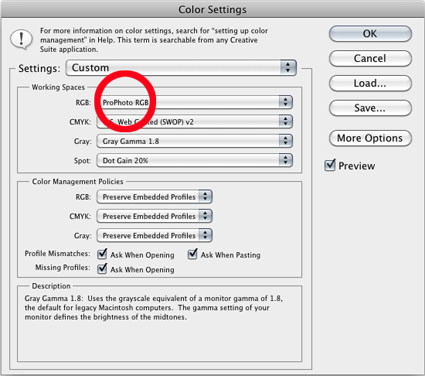
Step 3 – Set Adobe Color Settings
Set good Photoshop Color Settings in seconds.

Step 4 – Profile Your Printer
Better printer profiles help make better prints.

Step 5 – Softproof Before You Proof
Preview how your print will look before printing it.

Step 6 – Check The Correct Boxes In Your Printer Driver
Set good color management policies in your printer driver.

Step 7 – Control Your Viewing Environment
Use good quality light in neutral environments to evaluate your images.


Things To Watch For


16-Bit
Thousands of shades of gray reduce posterization.

Choose A Wide-Gamut Editing Space
Choose a wide-gamut editing space to make the best prints possible.

Editing Spaces Compared
From small to large, standard RGB editing spaces including sRGB, Adobe RGB (1998), and ProPhoto.

Rendering Intents Compared 
Perceptual, Relative Colorimetric, Absolute Colorimetric, Saturation.

What to Do with Color Management Dialogs 
Know what to do with the color management dialog boxes you encounter.

The Difference Between Converting Versus Assigning With Color Profiles 
Understand the difference between assigning and converting to a profile.

Where to Put ICC Profiles 
ICC profiles need to be filed in the correct location on your computer.


Tools


When And Why To Print Test Files 
Find out more about what to test.

Make Camera Profiles With X-Rite’s Color Checker Passport
X-Rites’ Color Checker Passport can be used to quickly deliver more accurate color in a variety of ways.

Managing Camera Profiles 
If you make camera profiles customized for your camera, sooner or later you’re going to want to rename or delete a few.

Graph Profiles With Chromix Colorthink
Colorthink graphs ICC profiles for visual comparison and contrast.

Use Full Spectrum Or HIgh CRI Viewing Light
Choose full-spectrum lighting with appropriate brightness and temperature.


Sign up for Insights for new content!

The Difference Between Converting Versus Assigning With Color Profiles


Understanding the difference between assigning and converting to a profile is one of the most conceptually challenging things about color management in digital imaging. It’s counterintuitive to think that by changing numbers the appearance of colors will stay the same or that if you don’t they won’t. But, once you understand why this is happening, how to set up your color management environment and what to do when you encounter color management dialog boxes will become much clearer.

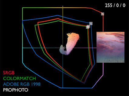
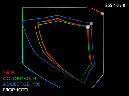
In color management you “change to stay the same”. Why? Take the values for the most saturated red in any RGB color space – 255/0/0. If you graph this in sRGB (a small color space) and ProPhoto RGB (a large color space), you can quickly see that one will produce a much less saturated red than the other. Similarly, all the other numerical combinations produce different appearances in different color spaces too, with the exception of absolutely neutral colors whose values are equal – i.e. 128/128/128. To maintain the appearance of colors when you move them from one color space to another (for instance from a monitor to a printer), you have to change the numbers very precisely, using ICC profiles or maps for each color space and recipes for mixing colors in them.

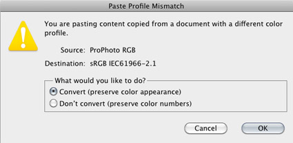
The parenthetical remarks in Photoshop’s Paste Profile Mismatch dialog box say it clearly.

If you Don’t Convert but “preserve color numbers”, the appearance of a file will change, sometimes dramatically, because the numbers in the file have not been converted but a new color profile has been assigned, changing the meaning of the numbers.

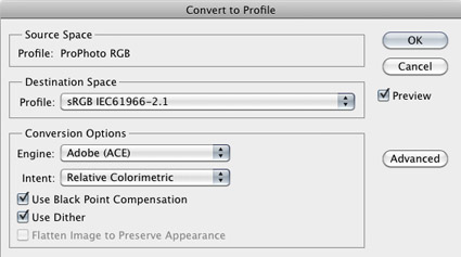
If you Convert you “preserve color appearance”; Photoshop does this by referencing the ICC profiles of the source and destination color spaces and precisely changing the numbers in the file so that they produce the closest possible match to the original appearance; only the appearance of very saturated colors will change if you convert a file to a smaller gamut color space.

Note that information converted from sRGB into ProPhoto RGB does not get more saturated. The editing space becomes wider gamut, but the potential for increased saturation can’t be accessed unless values in the file are further enhanced with software. The best way to get the most saturated color possible is to convert the source file (Raw) into ProPhoto RGB.

If you adopt a consistent workflow and always convert into and create new files in the same color space, you’ll encounter these dialog boxes infrequently. You’ll quickly find you won’t have to think about it anymore. And when you do, you’ll simply take appropriate action with confidence when you need to, confident that the images you’re creating are the very best that can be created.

Remember, color management isn’t about ensuring that color doesn’t change, it’s about ensuring it changes as little as possible and is changed as precisely as possible.


Read more on Color Management here.

Learn more in my digital photography and digital printing workshops.

Profile Your Monitor


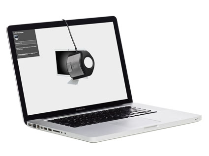
If you want to display your images accurately and make sophisticated decisions about how they will or could look, calibrate your monitor with hardware. Monitor calibration is a must. It’s not optional. It is easy. You need a device to do it well.

The visual comparator method (using your eyes to approximate an appearance on-screen) is too fraught with inaccuracies and inconsistencies to be relied on. Instead, use consistent, accurate, objective hardware and software. Colorimeters don’t have favorite and least favorite colors, don’t have color deficiencies, don’t get fatigued, don’t drink caffeine or eat sugar, don’t change over time or adapt to their environments, and don’t have emotions. You do. All of these can affect your perception of color at one time or another. Colorimeters are in a stable state. You’re not. So when it comes to making sure that your monitor displays color as accurately as possible, use a colorimeter.

While some colorimeters, and the software packages that ship with them, are better than others, most colorimeters are good. Unless it’s defective, any colorimeter is better than none.

Spectrophotometers can also be used to calibrate monitors. What’s the difference between the two? Unlike a colorimeter, a spectrophotometer has it’s own light source that can be used to make printer profiles. Spectrophotometers can do more. They also cost more.

There is a difference between calibrating and characterizing devices. Calibrating a device is changing its state, like setting the brightness of a monitor. Characterizing a device is measuring and mapping the color capacity of a device or building an ICC profile to describe it. Most of the process of monitor ‘calibration’ is actually ‘characterization’.

Calibrating and characterizing your monitor is a simple process. Use the profiling device and software of your choice.(I personally use X-Rite products.)

Take these steps. Read More

Rendering Intents Compared

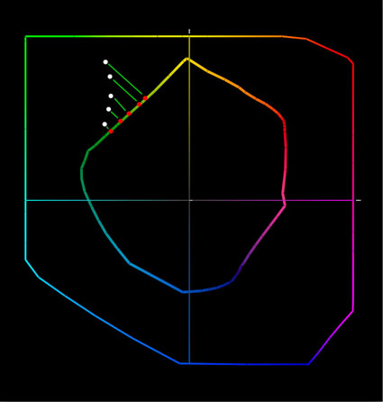
gamut clipping

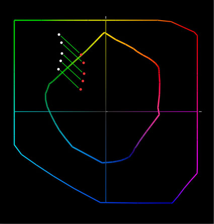
gamut compression


Your choice of rendering intent tells a color management system how to handle color conversions between different color spaces. This is particularly important when converting colors from a wider-gamut color space (such as an editing space like ProPhoto) to a smaller-gamut color space (like a printer color space). You’ll get different results, even when using the same ICC profile, depending on the rendering intent you choose for a color conversion. You have four choices; perceptual, relative colorimetric, absolute colorimetric, and saturation.

What’s the difference between these four rendering intents?

Perceptual
Use a perceptual rendering intent for printing images with highly saturated colors. Watch it carefully. To deliver very saturated colors, it may lighten an image or shift the hue of specific colors. Both side-effects can be compensated for with output-specific adjustments.

Relative Colorimetric
Use a relative colorimetric rendering intent for printing images where the luminosity structure is most important. You may get slightly less saturated colors but brightness values will be most stable with this rendering intent. This makes it the ideal choice for near-neutral and black and white images.

Absolute Colorimetric
Use an absolute colorimetric rendering intent for making a proof of one device on another, like making a proof of an offset press on an inkjet printer. It’s not useful for making the best inkjet print; it will limit the results the printer delivers. Note, you can’t simulate a printer with a greater gamut than the device you’re printing on, only one with a smaller gamut.

Saturation
Use a saturation rendering intent for eye-catching graphics where color impact is more important than color accuracy , like pie charts. It will so much saturation it will distort continuous tone images in an adverse way.
Here’s the color geek explanation.

Read More

Choose A Wide Gamut Editing Space

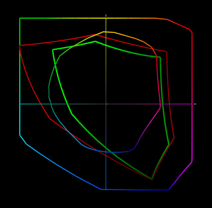
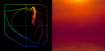
Today’s inksets can exceed the gamut of even the best monitors in yellows, oranges, and blues. Epson UltraChrome HDR ink on Epson Exhibition Fiber is plotted against sRGB, Adobe RGB (1998) and ProPhoto.

The gamut of this image and the print made from it exceeds the gamut of Adobe RGB (1998) and the monitor. You have to make a print to see the most saturated color possible.


Choose a wide gamut editing space to make the best prints possible. If a file’s color space is smaller than the printer’s color space, you won’t be able to realize the full saturation your printer is capable of.

Today’s inksets exceed the gamut of all but one of the standard editing spaces (sRGB, Colormatch, and Adobe RGB (1998)), making ProPhoto the best choice for creating files in. Since ProPhoto exceeds the gamut of human vision, it’s unlikely that you’ll ever need a wider gamut editing space than ProPhoto. If you create your files in ProPhoto you’ll be well-positioned to take advantage of future advances in printer and media technology. So, choose ProPhoto.

How do you do this?

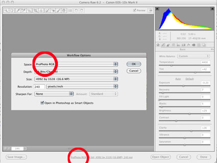
1         If you’re converting a Raw file, choose ProPhoto in the Raw converter’s interface.

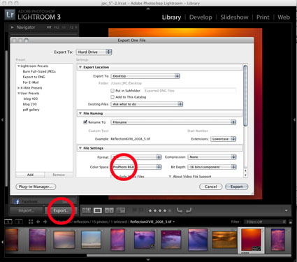
2         If you’re exporting a file from Lightroom, choose ProPhoto.

3         If you’re creating a new file in Photoshop, set ProPhoto as your default color space.

4         If you’re scanning an image, choose ProPhoto in the scanner’s interface.

Read More

Using ICC Profiles


ICC profiles define a meaning for the numbers used to represent colors in digital images. Without an ICC profile digital files will produce unpredictable and inconsistent results.

As a rule, always use ICC profiles. There are a few rules for using ICC profiles. Always assign ICC profiles (the correct ICC profile) when you create a digital file. Always use ICC profiles when converting digital files from one color space to another. Never remove an ICC profile from a digital file without replacing it. Use accurate high-quality ICC profiles. While there are exceptions to these rules, they’re rarely encountered.

Here’s one of the single most confusing things about color management. The same numbers in different color spaces produce different colors. Why? Because while RGB color spaces (including the standard device neutral editing spaces sRGB, Colormatch, Adobe 1998, ProPhoto) all use the same numbers from 0–255 to describe color, each color space is capable of different things. For instance, wider gamut color spaces are able to represent more saturated colors. The numbers used to produce the most saturated red (255/0/0) will produce a more saturated red in a wider gamut color space than they will in a smaller gamut color space. So the same numbers in different color spaces produce different results.

Here’s another way of saying the same thing: Change to stay the same. Use ICC profiles to define a source and destination so you can change numbers precisely to make sure colors stay the same. Once you know what numbers you need to produce the same color in two different color spaces (like a monitor and a printer), you can precisely change the numbers to produce the same color appearance as you move a digital image from one color space to another. If you don’t change the numbers, the appearance of the colors will change when you move a digital image from one device/color space to another.

Some change is inevitable when moving from a larger color space to a smaller gamut color space and ICC profiles can be used to predict how color will change. They can be used to show you what must change and can’t be restored (out of gamut colors) and what will change and can be restored (in gamut colors). While you won’t gain color quality when converting from smaller gamut spaces to larger gamut color spaces, you’ll lose a tiny bit of data, which if done a number of times can degrade an image. So, keep color conversions to a minimum. (Optimally, convert once when you acquire an image; a second temporary conversion will be made while you print an image).

Use ICC profiles. ICC profiles are recipes for color that clearly define numbers making color consistent and predictable. They’re the foundation for working with color in digital imaging.

How important is this?
See what can happen below if you don’t use ICC profiles correctly.

Read More

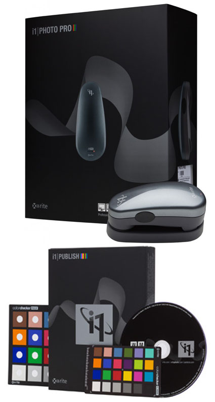
X-Rite i1Photo Pro


“The long awaited day is here!  X-Rite i1 Professional solutions, which includes the new i1Photo Pro, are now available. Each solution features the all-new i1Profiler software application designed to delivers superior color results!  i1Profiler is driven by a new color engine, sports a dual mode interface (basic and advanced) and new quality assurance features, plus so much more. The new i1Photo Pro was designed specifically for discerning photographers to attain the highest quality color results and color control throughout your complex digital photo workflow, at a very attractive price.
The new portfolio is comprised of three software/hardware/target bundles ­– i1Basic Pro, i1Photo Pro, i1Publish Pro – and i1Publish, a software/target solution. All four feature groundbreaking new i1Profiler software technology designed to accommodate all levels of proficiency and expertise, and provide the power and control needed to create the highest quality color profiles. The new PANTONE Color Manager color swatch bridging software,  ColorChecker Proof, a new ColorChecker target for direct viewing analysis against a printed target and ColorChecker camera calibration system are also featured.
Upgrade packages are available for those who have i1Pro devices as well as MonacoPROFILER 4 and ProfileMaker 5 users. Read more about the upgrade opportunities and review the features of i1Profiler software at www.xritephoto.com.”
The advances in software make every function more precise.
Printer profiling takes a major leap forward with easy to make light temperature and image specific profiles.
If you haven’t invested in X-Rite technology do it now.
If you have, upgrade now.
This is a major upgrade that all users should seriously consider.
Find out more about i1Photo Pro here.
View more in my DVD 6 Simple Steps to Good Color Management.
Learn more in my digital printing and digital photography workshops here.

Save Up To 20% On Chromix’s ColorThink Software


They say “A picture is worth a thousand words.” In some cases, it’s worth far more. That’s certainly true of the images generated by CHROMiX’s ColorThink. The folks at CHROMiX say, “You can’t manage your color if you don’t understand it. Nothing gets the idea across faster than the graph of a printer gamut.” They’re right.

CHROMiX ColorThink is the award-winning color management toolset that helps you understand your color more than ever before, primarily (but not exclusively) by graphing it. The ColorThink toolset is an application for managing, repairing, evaluating and graphing ICC profiles, composed of nine modules that are proven to “keep your brain on color”.

Profile Manager
Organize your profiles individually or in sets

Profile Inspector
Open all types of ICC Profiles and inspect their color data and other details. Change default settings to fit your workflow. Display neutral rendering curves.

2D Graphing
2D graphing gives you both general and specific views, allowing the overlay of multiple profiles and data sets.

3D Graphing
3D graphing gives you the whole picture. Analyze your devices and workflow. See the cause of proofing and printing problems. Graph measurement files and image colors to compare with device gamuts.

Image Inspector
Open images and see the embedded profile. Export, change(mac only) or delete(mac only) it at will. Learn to handle the files your customers are sending.

Profile Renamer
Profiles have two names; internal and external. Confused by what appears in menus? Change the internal and external names with this tool.

Profile Linker
Some RIPs allow linked profiles to be loaded for proofing purposes. Profile Linker will build those profiles for you, quickly and easily.

Profile Medic
Multi-point integrity checks can be performed on one or all the profiles in your system. If Profile Medic finds fixable problems with a single click it will get you back to work.

Color Lists
Open measurement files from most profiling applications. View them in list form with rendered colors. Apply profiles to the lists for testing and graphing.

ColorThink is a very robust color management software. Only a few advanced users will use its full toolset. But almost everyone can benefit from using a few of its most essential features.

For me, graphing color is the core utility of this tool. Graphs are useful abstractions. When you’re dealing with a lot of information, graphs can condense and focus information from specific perspectives revealing useful information. This is certainly true of color. Because color has three dimensions (luminosity, hue, and saturation), graphs of color in 2D always leave something out, while graphs of color in 3D give you a more complete picture and more useful perspectives.

ColorThink gives you powerful tools for graphing color in both 2D and 3D. You can graph ICC profiles (input, display, output), color, color lists, or images. You can graph multiple profiles simultaneously for comparison. You can graph profiles and images simultaneously for comparison. You can view graphs in multiple formats such as shaded objects, wireframes, points, and vectors. You can change color and transparency to make comparison easier. And you can rotate, pan, and zoom your viewpoint dynamically.
Every time I lecture on color, I use ColorThink. Every time I evaluate a new inkset or substrate or printing profile, I use ColorThink. While I don’t graph every image before I print it, I do graph particularly challenging images to print and ColorThink always reveals useful information. I recommend it highly.

This utility not only expanded my understanding of color and color management but it has also helped me refine an advanced perspective on color theory (the conceptual tools artist’s often use to help structure color palettes and make color choices). It’s my hope that in the 21st-century 2D color wheels (such as Leonardo’s, Goethe’s, and Itten’s) will be replaced with 3D color volumes.


1    An image.
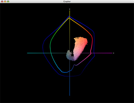
 

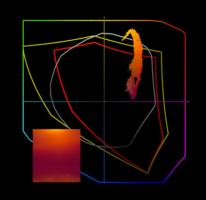
2    A 2D graph (two profiles and an image) tells only part of the story. The gamut of semi-gloss papers seem moderately extended when compared to matte papers; the image appears in gamut for both.
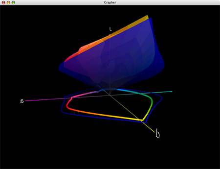
 

3    A 3D graph of two profiles tells you more. Semi-gloss papers have greatly extended dmax and gamut in dark values but reduced gamut in lighter hues; warm highlights are out of gamut for both (better highlight saturation is found in matte) and cool shadows are out of gamut for matte.
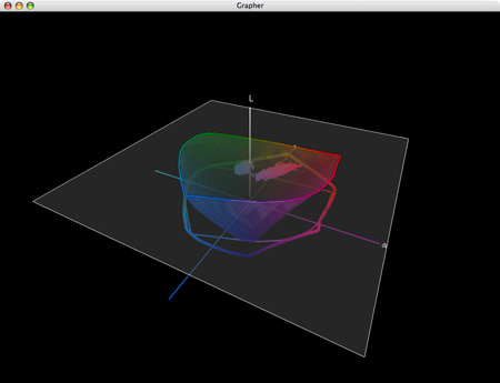
 

4    Gamut can be sliced at specific luminosity values.
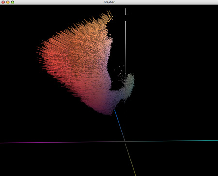
 

5    Display the effects of profiles on colors in images with vectors.


Visit the ColorThink product pages at www.chromix.com to learn more.


Read more on Color Management here.

Learn more in my digital photography and digital printing workshops.

Where to Put ICC Profiles

colorsyncutility
ICC profiles need to be filed in the correct location on your computer for them to be available to applications.
Where do you put them? It depends on the system and version you’re using.

Mac OS X
–    Library / ColorSync / Profiles – storing profiles here allows all Users to use them.
–    Users(Username) / Library / ColorSync / Profiles – storing profiles here makes them available to the current user only .

Windows 7, Vista and XP
–    Windows \ System32 \ Spool \ Drivers \ Color
–    Right click on the profile and select “Install Profile” to copy the profile to the directory.
– Profiles need to be copied manually to the directory to replace profiles.

Mac OS 9.x
–    System / ColorSync / Profiles

Windows 2000 and NT
–    Winnt \ System32 \ Spool \ Drivers \ Color
–    Right click on the profile and select “Install Profile” to copy the profile to the directory.
–    Profiles need to be copied manually to the directory to replace profiles.

Windows ME and 98
–    Windows \ System \ Color
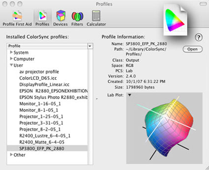
Apple’s ColorSync Utility displays details of individual profiles, shows gamut plots, can rename profiles, validates profile structure, etc.
Microsoft’s has a Control Panel Applet installs and removes profiles, edits internal and external names, creates 3-D gamut plots, compares profiles, etc.


Read more on Color Management here.

Learn more in my digital photography and digital printing workshops.