Scanning Black & White Originals

Here’s a simple formula for scanning black and white originals (film or prints). Scan in Grayscale (there’s no benefit to scanning in RGB), in 16 bit, and at the native resolution of a scanner (upsample in Photoshop only if needed, not during scanning). Make sure sharpening is turned off. Test a scanner’s lookup tables for negatives; if they clip shadow or highlight detail scan negatives as transparencies and invert in Photoshop.
Get my free download here.
Find out more about black and white in my DVD Black & White Mastery.
Find out more about black and white in my Workshop Black & White Mastery.
Special discounts are available until January.

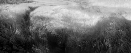
Leaves of Grass – Simulating Infrared


Looking for an infrared effect? Two options; capture in infrared or post-process to simulate infrared. Either way, the results can be compelling.
Here’s an excerpt from a statement I wrote on infrared techniques sometime ago.
“It looks like another world, yet it’s not. By opening a window into a spectrum we can’t see with the naked eye, infrared photography shows us our world in an extraordinary light … The effects are often unpredictable and almost always surprising. Perhaps, that is why this effect is so compelling.”
Read the rest of my artist’s statement here.
Read other artist’s statements here.
Find out more about black and white in my DVD Black & White Mastery.
Find out more about black and white in my Workshop Black & White Mastery.
Special discounts are available until January.
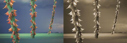
Dangerous Passage – Distilled in Black & White


Some images are better in black and white. This is one.
“Dangerous Passage was a compelling image. But something wasn’t working. The thorns were red. The stalks were green. The water was blue. They were not subtle. The color was garish. In many ways, the color was too literal. The drama of the composition was competing with the drama of color. The two were at odds. Their moods were incompatible. One was harsh and edgy. The other was bright and cheery. Color was the problem. So I removed it … The message was clarified. The image carried a much greater weight. Less became more. The image was somber in black and white. That much suited the mood. But it was ashen, cold, and remote. I missed the emotional power of color. So I put it back. I converted the image back to a color mode and introduced new color into the image.”
Read the rest of my artist’s statement here.
Read other artist’s statements here.
Find out more about black and white in my DVD Black & White Mastery.
Find out more about black and white in my Workshop Black & White Mastery.
Special discounts are available until January.

Achieving the Blackest Black


The blackest black in print is achieved with today’s inkjet materials. Epson Exhibition Fiber printed on Ultrachrome K3 or UltraChrome HDR produces a 2.65 dmax; silver gelatin selenium toned produces a 2.35 dmax. You get this extraordinary black when printing through the printer driver’s Advanced Black & White mode; print the same image through a standard color color management route and you’ll only get a 2.4 dmax. Also, matte papers yield weaker blacks, roughly 1.85 dmax.
Get my free download on Epson’s Advanced Black & White mode here.
Find out more about black and white in my DVD Black & White Mastery.
Find out more about black and white in my Workshop Black & White Mastery.
Special discounts are available until January.
Give Your Friends Over 100 Downloads Free


New member? Old member and skipped over a few issues? You’re missing free content! As a member of Insights enews you get over 100 free downloads. Actually, the number far exceeds 100. I stopped counting after 100. More resources are added every month.
Tell your friends! Give them these same resources free!

Many Ways to Convert Color to Black & White


There are over 14 ways to convert color to black and white.
1    Raw Conversion
2    Convert to Grayscale
3    Convert to Lab then convert to Grayscale keeping the L channel
4    Desaturate
5    Channel Mixer
6    Black & White Adjustment Layer
7    Dual Adjustment Layers - Dual Hue / Saturation
8    Dual Adjustment Layers - Hue / Saturation with Selective Color
9    Dual Adjustment Layers - Hue / Saturation with Channel Mixer
10    Triple Adjustment Layers - 3 Channel Mixers
11    Gradient Map
12    Calculations
13    Apply Image
14    Channels as Layers
Some of these methods aren't optimal. Some are equal. Some are superior.
Which should you use?
It depends on the image.
Sometimes a simple solution will do just as well as a complex one.
Sometimes you need the power of a more complex solution.
Here are my four favorites, ascending from simple to complex.


Insights Members can login to read the full article.
Email:
or Sign up

What Do We Mean By Black and White Images?


There are many types of black and white images. Here are six.
1    Neutral
2    Monochrome (uniformly warm or cool toned)
3    Duochrome (split-toned – i.e. warm highlights cool shadows)
4    Polychrome (tinted – i.e. handcolored)
5    Full Color – neutral subject
6    Full Color – black, gray, and/or white subject
They’re all black and white images, but they’re very different types of black and white images and the differences are important.
This is just a taste of the unique perspective (born of traditional training in both painting and photography) that you’ll find in my work, on my website, on my DVD, and in my workshops.
Get my free download here.
Find out more about black and white in my DVD Black & White Mastery.
Find out more about black and white in my Workshop Black & White Mastery.
Special discounts are available until January.
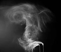
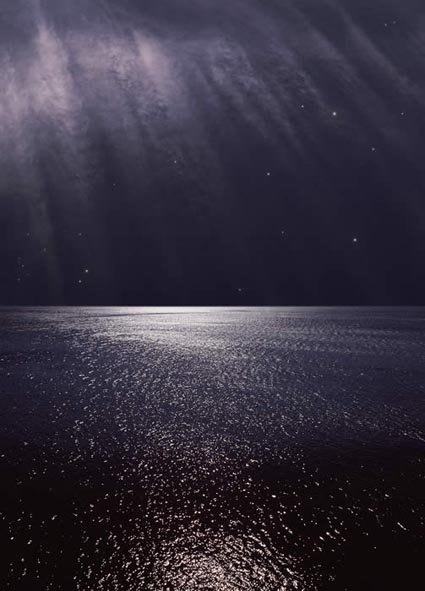
Nocturne XII – Color At Night


“They say we can’t see color at night. By comparison to day, I suppose that’s true. However, if there’s a significant amount of light, there are wonderful colors to be found at night.”
I wrote this many years ago. Since then I’ve come across recent scientific research that overturns the notion that we don’t see color at night. While our sensitivity to hue in low levels of light does diminish, we very definitely see it. We see color at night, even in the darkest hours.
Time and time again, throughout the history of art, I’ve seen examples of people calling it like they see it and expressing an underlying truth that science has yet to catch up with. My advice? Look closely. Trust your direct perception over the way you’ve been taught to see or think about seeing. Hold the questions of how it all works answered but open. With an open mind we learn more every day, There’s always more to learn.
See the rest of the statement here.
Read more statements here.

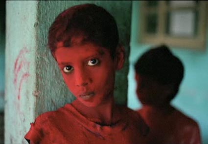
Steve McCurry – Face of Asia


“I look for the unguarded moment, the essential soul peeking out, experience etched on a person’s face. I try to convey what it is like to be that person…I guess what you’d call the human condition.”
For more than twenty-five years Steve McCurry has covered areas of international and civil conflict, including the Iran–Iraq war, the disintegration of the former Yugoslavia, Beirut, Cambodia, the Philippines, the Gulf War, and Afghanistan. Face of Asia concentrates on his extensive work from Asia, including images from India, Afghanistan, as well as recent work from Cambodia and Tibet. McCurry’s vivid color images and descriptive titles give us in the West a window into the cultures and peoples of Asia.
Check out this podcast at eastmanhouse.org.
Find out exhibition venues and dates here.