Using Color Management For Color Adjustment – Synthetic Profiles

SyntheticProfiles_425

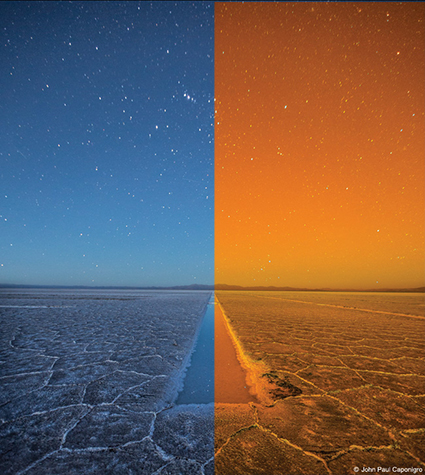
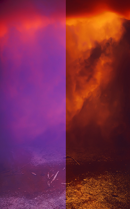
How can you change the appearance of a digital image without changing the numbers that assign the color values? Change what those numbers mean by changing the image’s ICC profile. Using abstract or synthetic profiles, you can make massive changes to an image with little to no cost, changes that ordinarily would cause big problems using standard methods, such as posterization and noise. It’s a practice known to color geeks and few others. When you’ve got a big job to do, it can get you out of a pinch in a hurry.

In most cases, we think of using color management to accurately match colors when moving between different color spaces; ICC profiles are used to describe different color spaces and to make precise transformations to values moved from one to another to maintain consistent appearances. In very rare cases, when profiles are assigned to image files without a color conversion, the appearance of the image changes; values stay the same, but their meaning changes, so the image looks different. So when you use this unorthodox method of color adjustment, you get a change in appearance without changing the values in the file, and this is particularly useful when you want to pay a very small price for making very big changes.

Am I saying that ICC profiles are used to change values so the appearance stays the same? Yes. Am I saying that a color space is just a recipe for color, and that there are many different RGB recipes? Yes, but while they’re the standards, sRGB, ColorMatch RGB, Adobe RGB (1998) and ProPhoto RGB are just a few among many.

With just a little experimentation, you’ll find you, too, can make big changes to your images and pay a small price using synthetic profiles. Using synthetic profiles is color adjustment without editing values; they change no values, but they do change the meaning of those values—and thus their appearance. Don’t believe it? Check your histogram when you assign a profile. You won’t even see it move! It’s kind of unbelievable. Try it. See it with your own eyes. You’ll quickly become a believer, too.
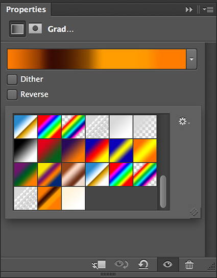
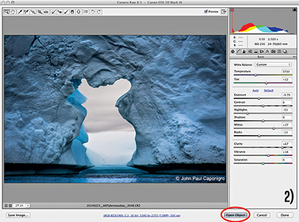
Learn the steps you need to take to make your own synthetic profiles …
Read more on Digital Photo Pro.
Learn more in my digital photography and digital printing workshops.

Photoshop’s Color Lookup Makes Complex Color Effects Easy

Resonance in Blue and Gold IA
Originally designed for color grading film and video, Photoshop’s Color Lookup feature offers novel ways to adjust color that will quickly reveal new possibilities in your images. Capable of performing extremely complex calculations extraordinarily efficiently, color lookup tables (LUTs) work by looking up a source color in a table and using the replacement color specified in the grid to transform it for the final destination.
Like Match Color and Gradient Map adjustments (See my last two articles for Digital Photo Pro.) the color effects Color Lookup generates are so complex they are not easy to previsualize. Like anything new, this takes practice. And these are new! Experiment and you’ll find many rich possibilities. Unlike Match Color, Color Lookup is loaded with presets that will allow you to quickly explore many different effects, ones that are far more sophisticated than Gradient Map presets. In this way, using them can be as easy as using many smartphone app effects.
You can also generate your own Color Lookup presets. To do this create a color effect you like with any with any combination of adjustments layers, Opacity and Fill, Blend If sliders, blend modes. (Layer masking and transparency will not be included, because alpha channel information in alpha channels is not included in the recipe.) Then go to File: Export: Color Lookup Table, name the file, and click OK. (I recommend the titles you give your presets include the color space you created them in.) These files are stored in Photoshop’s Presets folder or if they’re saved as ICC profiles in your operating systems Profiles folder. You can now use your custom preset at any time on almost any file by making a Color Lookup adjustment layer and choosing your preset. You can share your custom Color Lookups with others by giving them these exported files. Color LUTs created in Photoshop can even be used in other programs such as After Effects, Premiere, SpeedGrade and other applications that use color LUTs.
Using Photoshop’s Color Lookup you can choose to create color effects as subtle or dramatic as you like. This game-changing color adjustment tool may seem exotic at first because it offers a new way of thinking about and seeing in color. Once you become more familiar with this mindset you’ll truly begin to see with new eyes. Isn’t that what it’s all about?
Read more on Digital Photo Pro.
Learn more in my digital photography and digital printing workshops.

See Color In New Ways With Photoshop’s Gradient Maps

1_BeforeAfter
2_GradientMap

Whether used subtly or dramatically, Photoshop’s Gradient Map color adjustment tool can open up new ways of seeing and working with color for any artist. Photoshop’s Gradient Map assigns new colors to existing brightness values. With it, you can enhance existing colors, transfer colors from one image to another or create entirely new color relationships. It can be wild!
The Gradient Map interface looks difficult to use, but with a few pointers, you’ll find it surprisingly easy to use. While you can apply a Gradient Map directly to a layer (Images > Adjustments > Gradient Map), I recommend you apply Gradient Maps as adjustment layers (Layer > New Adjustment Layer > Gradient Map) to take advantage of both the greater flexibility and control you’ll gain over the final effect.
Once activated, there are a number of default presets you can experiment with, but it’s most likely that you’ll want to create your own. Simply click on an existing gradient in the Properties panel to activate the Gradient Editor. Click New. Click at the bottom of the gradient to add new colors. A pointer will appear; double-click it or the Color box to choose a color. You can move the pointer to direct the color into different tonal values. (Move left to target darker values and right to target lighter values. Alternately, enter a new number in the Location field.) The diamonds left and right of it will control how each color fades into surrounding colors. You can add dozens of different pointers/colors, but for most applications, I recommend you restrain yourself to as few as possible. You can delete a pointer/color by clicking on it and clicking Delete or by pressing the Delete key. When you create an effect you’d like to use more than once, type a Name and click Save; you can easily store, retrieve and share these GRD files.
The color effects you can generate with the Gradient Map are so powerful and so varied, you simply must spend a little time experimenting with it to truly understand both how far you can go and how subtle you can get. Consider this kind of visual research time well spent.
After you’re done experimenting, then it’s time to deliver. Working with the Gradient Map often takes a little finessing. You’re likely to be a little disappointed if you try and get the perfect colors with the Gradient Map alone. You can spend a great deal of time picking and re-picking colors until you get it just right. Instead, try working more broadly, getting close to a desired effect and then fine-tuning the results.
Read details on how to do this on Digital Photo Pro.
Once you’ve mastered the interface, the real challenge begins—visualizing color possibilities. Previsualization can only go so far; instead, use software as a tool for visualization. Instead of rushing to a single finished result, I prefer to work on multiple copies of an image to make side-by-side comparisons of a set of variations. The possibilities are seemingly so limitless that you must perform experiments to find the best solution. If your experiments are both targeted and iterative, you’ll generate many solutions that are more likely to be optimum.
Here, a little color theory can be useful. Use dark colors in shadows and light colors in highlights; otherwise, you may posterize or solarize. Use analogous colors (similar color families) to create transitions; transitions between complementary colors tend to get muddy. Variations on earth tones work well for both realistic and antique effects. Variations on warm colors can add intensity, even fire. Variations on cool colors can generate nocturnal and even aquatic effects.
Photoshop’s Gradient Map is an exotic color adjustment tool that can be a real game changer. If you truly understand the possibilities this tool opens up, you’ll have learned to see in new ways. What could be more valuable?
Read more at Digital Photo Pro.
Learn more in my digital photography and digital printing workshops.

4 Reasons You Should Use Photoshop's Smart Objects

SmartObjects425
Smart Objects are smart layers, and they have been in Photoshop for years. They have been evolving, but few people truly understand them and fewer still take full advantage of them. There are major benefits to learning what Smart Objects offer you and how they can change your workflow. Here are four things Smart Objects can do for you.
1. Change Or Update RAW Conversion Settings.
2. Apply Filters Nondestructively.
3. Apply Nondestructive Scaling And Distortion To Layers.
4. Blend Multiple Exposures Or Layers With Stack Modes. 
The first benefit, Change Or Update RAW Conversion Settings, is the most essential; something every Photoshop user should know how to use. Here’s how to use it.
Whether you’re using Lightroom or Bridge/Photoshop, if, and only if, you acquire a RAW file as a Smart Object, by double-clicking it, you’ll be able to change conversion settings and even update the RAW-processing algorithms to the latest version. Forgot to adjust a setting? Found better settings? Want to take advantage of advances made in the latest process version of ACR? All of these are reasons to use Smart Objects.
To acquire a RAW file as a Smart Object in Lightroom, go to Photo > Edit In > Open As Smart Object In Photoshop. With Adobe Camera Raw, click the blue underlined line at the bottom of the window to access Workflow Options and check Open In Photoshop As Smart Objects, which will set this as a default for opening files. The Open Image button will change to Open Objects. Notice that in Photoshop the bottom layer uses the file name instead of Background, and it contains a small rectangular icon that indicates it’s a Smart Object.
But wait, there are three more reasons to use Smart Objects. You’ll find the steps for the other three benefits detailed in my column on Digital Photo Pro.
There’s more than one kind of Smart Object; those that reaccess Raw file data and those that don’t. Smart Objects have limits; the list is steadily diminishing. Smart Objects come at a price; larger file sizes. While Smart Objects aren’t simple, but they’re extremely powerful and flexible. For this reason, I consider them essential components of an optimum Photoshop workflow. Exactly how and when you implement Smart Objects will depend on the specific challenges you face with a given image. While everyone needs to be aware of the possibilities Smart Objects offer, make your use of Smart Objects as simple as possible, but not simpler. You’ll find that even the most minimal implementation of Smart Objects will be extremely helpful.
Read more on Digital Photo Pro
Learn more in my digital photography and digital printing workshops.

Advanced Color Adjustment – Blending Channels

 
BlendBefore_425

 Before

BlendAfter_425

After

BlendChannels_palettes

Layer Styles

Blending channels is a powerful color adjustment strategy that can handle even the biggest challenges. It takes information from one channel and combines it with information from another. It’s great for repairing clipping in one or even two but not three channels. Rather than simply enhancing existing tonal values, blending channels reshapes one channel’s tonal structure with another’s. Consequently, in most cases, blending channels calls for a substitution of information by percentage, not a wholesale replacement of the deficient channel. You usually blend channels from different versions of the same image because blending channels from different compositions produces a highly altered effect.
Blending channels is complex. It often produces additional unintended color effects that may require further correction, such as shifts in hue that aren’t uniform across the tonal scale. Blending channels is neither the simplest nor the most direct path to color adjustment, but in certain situations (files that are exceptionally problematic), it may be the best path. The resulting benefits can be dramatic.
There are several ways to blend channels: Channel Mixer, Apply Image, Calculations and the most robust using channels as layers.
How do you do it? Duplicate a layer. Double click on the layer to activate Layer Styles (rasterize copies of Smart Objects to get this). Then check the channel you want to use, select a Blend Mode (typically Darken or Lighten and sometimes Multiply or Screen), adjust the Opacity, and use the Blend If sliders to constrain the effect or alternately a mask.
Read all the details on Digital Photo Pro.
Part I
Part II 
Learn more in my digital photography and digital printing workshops.

4 Ways To Divide The Frame


The four most important lines of any image are the ones that are often least recognized consciously – the frame. Second only to these are the lines that divide the frame, creating frames within the frame. Becoming more aware of how the frame can be used and how it can be divided will help you make more successful compositions.
There are many ways the frame can be divided. You can divide the frame horizontally, vertically, or diagonally; in each case the layers included define the virtual space presented. Different areas in an image can be divided differently. You can divide the frame (or a frame within the frame) multiple times; the more times the frame is divided the more packed and dynamic it becomes, progressively growing more design oriented and finally being reduced to pure texture. Each operation has significant consequences.
One of the most significant results of dividing the frame is the creation of specific proportions. (The combination of the individual aspect ratios of each element creates a new unified aspect ratio.) Much has been made of the ‘rule of thirds’. Dividing the frame into three parts (left/center/right or up/middle/down) is a simple and often useful strategy for making images more directed, by prioritizing one element over another, and dynamic, through imbalance. Too little has been made of other ratios. What of fourths, fifths, sixths, sevenths, or eighths? No musician would be content to only divide an octave into halves and thirds. Every proportion produces particular effects, which are further modified by placement (high/low or left/right) and content. Rather than a rule to be adhered to, proportion is a force to be explored expressively.
When it comes to controlling the division of the frame in your images, you have more options available to you than you might think. You can crop, retouch, distort, or composite. These four operations can be used in combination with one another. For instance, you may decide to first crop an image and then distort it to a standardized aspect ratio. Or, while maintaining a frame of the same aspect ratio, you might increase the scale of a selected area only and in the process crop a portion of it. Many other permutations are possible.
If you find these many new possibilities dizzying, you get it. The only way to understand this intuitively is to explore your options. The development of new possibilities encourages us to ask new questions and develop new habits. For what effect are you dividing the frame? To that end, how many different ways can you think of dividing the frame? My advice? Develop the habit of exploring your options before settling on final solutions, ones that help you create your strongest statements.
Read more at Digital Photo Pro.
See my related post Exploring The Expressive Possibilities Of Aspect Ratio.
Learn more in my digital photography and digital printing workshops.

Exploring The Expressive Possibilities Of Aspect Ratio

Distortions of the same image explore aspect ratio expressively

The proportion of an image’s frame is a fundamental part of its statement.
Unlike many documentary photographers who keep the proportion of their image frames constant to reduce their presence and suggest that their images haven’t been altered, I do the opposite for precisely the opposite reason, to more clearly highlight that my images have been altered by me. The question of whether an image has or has not been altered is a misleading question. Every image, whether documentary or artistic, has been altered, but to different degrees, in different ways, and for different reasons. Questions of method, extent, and intent are more revealing and interesting.
I use the proportion of the frame expressively. Because different proportions each add something different, I don’t standardize, I customize the proportions of my images. I distort the frame, crop the frame, and/or extend the frame through compositing and sometimes retouching, before settling on a final solution that creates the strongest statement.
How do you use aspect ratio in your images?
Read more on Digital Photo Pro.
Learn more in my digital photography and digital printing workshops.

Get More From Smart Objects


“Any “object” that needs the ability to adjust size and rotation without the normal limitations of layered images is an excellent candidate for Smart Objects … When doing a traditional multilayer composite, the resizing and rotation of a layer can cause image degradation. Positioning and sizing an object has to be a precise operation because if you use Free Transform to make a layer smaller and then find out you actually need it back at the original size (or bigger), you basically have to start over. The way to deal with this situation when doing a complex composite is to make those layers into Smart Objects. Smart Objects are embedded image objects that allow resizing, rotation and other select editing without changing the pixels in the object. The image layers are actually treated as a separate file embedded within the master file. You can’t do all editing on the Smart Object, but you can open the original layers as a temporary file and do pixel-level editing there and then save the changes back into the Smart Object; the changes will auto-update in the image in which the objects are embedded.” – Jeff Schewe
Read more about Smart Objects at Digital Photo Pro.
Get Schewe & Evening’s book CS5 for Photographers: The Ultimate Workshop.
Learn more with my online resources.
Learn more in my digital photography and digital printing workshops.

Blend It Out


It’s a perfect shot! If only those unwanted moving objects (UMOs, i.e., a person or a crowd) in the scene would disappear. As long as the unwanted elements in your frame move, even just a little, you can make them disappear from your image by taking two or more shots and using Photoshop’s layering and blending capabilities.
You don’t have to retouch your image. Blending is different than retouching. The unwanted elements aren’t covered over with new information by hiding them with replacement information similar to the surround, either from the same source or another. With blends, the information behind the moving subject is revealed. How? It’s contained in the other shot(s).
You even can do this with exposures that are made with slightly different angles of rotation or framing, so you can use this technique with handheld exposures, not just those made with a tripod. Camera motion may make manual registration difficult, but Photoshop automatically will align and, in some cases, distort the separate exposures so that they register precisely …
Read more at Digital Photo Pro.
Learn more in my digital photography ebooks.
Learn more in my digital photography workshops.

Crop or Retouch ?


As visual communicators, we’re responsible for everything that’s in the frame; we’re also responsible for everything that’s not in the frame. Deciding what’s in the frame and what’s out is a critical decision that can make or break an image. Here are two essential framing strategies.
1.?Use the frame to eliminate distracting information around a subject.
Take extra care with image information that touches the frame, as it will draw extra attention. Do this with significant compositional elements.
2.?Eliminate space around a subject to focus a viewer’s attention.
A lot of space between the subject and the frame can be used to call on psychological associations with space, such as freedom or isolation. Some space between the subject and the frame can give the appearance of the subject resting gracefully within the frame. Touching the subject with the frame strongly focuses the attention of the viewer and may seem claustrophobic. Cropping the subject with the frame can focus the attention of the viewer on specific aspects of the subject and/or give an image a tense quality, evoking evasion and incompleteness—this often seems accidental if less than half the subject is revealed.
There’s more than one way to apply these strategies. While cropping techniques are simple to practice, the reasons for their application and the choices made about how to apply them, as well as the final effects, may be exceptionally complex. You have two choices ..
1. Reposition the frame before exposure.
2. Contract the position of the borders of an image after exposure
If you plan to retouch, you’ll frame and crop differently …
Read more at Digital Photo Pro.
Find more digital photography techniques here.
Learn more in my digital photography worskhops.