Humanized Technology – Paola Antonelli


“Paola Antonelli, MoMA’s curator of Architecture and Design, provides insights into where design is headed both as a creative discipline and as a tool for making sense of the world. In this interview, she talks about the vision behind her upcoming exhibit at MoMA, Talk To Me, “We may not think about it consciously on a day to day basis, but objects around us are always talking to us in both explicit and implicit ways. There’s the obvious directive of a stop sign or a traffic cone, but there’s also the unspoken messaging conveyed via the ATM machine, the alarm clock, and that shiny new iPad. Objects have always been designed with the idea of communicating their use and meaning in mind, and it’s this relationship that MoMA’s Senior Curator of Architecture and Design, Paola Antonelli, seeks to explore in her upcoming exhibition, Talk to Me, slated for summer of 2011.”
Learn more about Talk to Me here.

The View Project – Tenneson Lecture Tonight in Naples

Joyce Tenneson lectures tonight at the Naples Museum of Art for The View Project exhibit on display Dec 18 – March 13.
.
The View Project, conceived and organized by Joyce Tenneson, is an exploration of why certain places or photographs that have such a powerful effect on us as individuals. What is it – beyond surface beauty – that makes specific visual moments so indelible in our memory?
.
The View Project is about photographs that mirror something in the photographer’s inner life – images that are personal and powerful, yet perhaps not clearly understood, even to the viewer/photographer” – Joyce Tenneson
.
Photographs and comments by a wide array of photographers are included – John Paul Caponigro, Sean Kernan, Douglas Kirkland, George Lepp, Jack Resnicki, Rick Sammon, Joyce Tenneson, Jerry Uelsmann, and many more.
.
Two of my alumni Kathy Beal and Stephen Starkman are included in the book and exhibit.
.

Alumni Participate in The View Project


Alumni Kathy Beal and Stephen Starkman are included in Joyce Tenneson’s book and exhibit The View Project.
Photographs and comments by a wide array of  photographers are included – John Paul Caponigro, Sean Kernan, Douglas  Kirkland, George Lepp, Jack Resnicki, Rick Sammon, Joyce Tenneson, Jerry  Uelsmann, and many more.
The View Project, conceived and organized  by Joyce Tenneson, is an exploration of why certain places or  photographs that have such a powerful effect on us as individuals. What  is it – beyond surface beauty – that makes specific visual moments so  indelible in our memory?
“The View Project is about photographs that  mirror something in the  photographer’s inner life – images that are  personal and powerful, yet  perhaps not clearly understood, even to the  viewer/photographer” –  Joyce Tenneson

Epson Advanced B&W Photo

Black and white printing presents several significant challenges; the ability to produce a neutral color, the ability to maintain that neutral appearance under different light sources (reduced metamerism), the ability to attain graybalance (consistent color throughout the entire tonal scale); the ability to achieve a very dark black (high Dmax) without sacrificing shadow detail (low dot gain), and longevity. All of these things are now easily attainable.

Black and white inkjet printing has come of age. In past years, there have been many compelling solutions for making black and white prints with inkjet technology; some have been fraught with problems (third party quadtone ink sets clog easily) and others have been expensive (ColorByte's ImagePrint RIP). Today, superior quality inkjet printing is both affordable and easily achieved.


Insights Members can login to read the full article.
Email:
or Sign up

Navigating The Epson Printer Driver With Photoshop


Successfully managing color for digital printing requires that the color in an image file be converted from its device-neutral color space to a device-specific color space. (Typically this occurs by converting from Adobe RGB 1998 or Pro Photo RGB  to a device-specific color space defined by an ICC profile characterizing a specific combination of printer, ink, paper, and driver.)

Using Photoshop, you can either convert color in an image before you send it to a printer driver or after you send it to a printer driver.

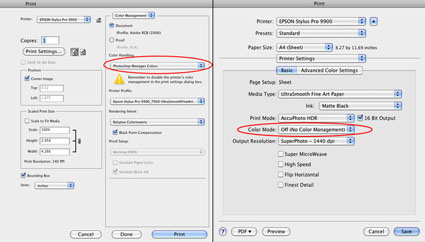
Choose one method of color management – not two. Easily made, a classic mistake is using both. Double color management typically results in a print that is too light and magenta.

The Epson printer driver provides many ways to manage color conversions and get reasonably good color. Two methods offer the best results; the Photoshop route and the Epson route.
How do you choose either of these methods?

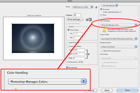
Let Photoshop’s Print window (under Color Handling) guide you – Let Photoshop Determine Colors and Let Printer Determine Colors. (While the principle is the same for most printers, interfaces will vary. Here’s information for the most current Epson interface.)

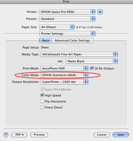
If you choose Let Photoshop Determine Colors under Color Handling, select a profile for Photoshop to make the conversion with (a paper/ink/driver specific profile not the interface default of Working RGB) under Printer Profile, choose a Rendering Intent of either Relative Colorimetric or Perceptual, and then click Print Settings. In the Print window choose the correct Printer and then change Copies and Pages to Print Settings. Select the correct Media Type, uncheck High Speed, and choose the highest printer resolution available. Finally, change Print Settings to Color Management and select Off (No Color Adjustment). The Photoshop route turns Photoshop’s color conversion on and turns the printer’s color conversion off.

The Photoshop route tends to hold slightly more saturation but it’s rendition of neutral colors and gray balance is usually not as good as the Epson route. The Photoshop route is the route to take when you want to use a custom profile. Use it if you are printing with either third-party inks or papers which require the use a custom profile to accurately describe the behavior of the alternate media.

If you choose Let Printer Determine Colors under Color Handling, choose a Rendering Intent of either Relative Colorimetric or Perceptual, and then click Print Settings. In the Print window choose the correct Printer. Change Copies and Pages to Print Settings to select the correct Media Type, uncheck High Speed, and choose the highest printer resolution available. Finally, change Print Settings to Color Management, choose EPSON Standard (sRGB) under Mode, and select Color Controls. The Epson route turns Photoshop’s color conversion off and turns the printer’s color conversion on.

The Epson route tends to deliver a significantly improved rendition of neutral colors and gray balance with slightly less saturation. Try it when printing neutral colors. Use the Epson driver’s Advanced B&W Photo feature for black and white images.

Each route works well. Each route yields slightly different results. Test them to see the differences. (Note that you cannot see the differences between printing routes when softproofing; you have to make physical proofs to see these differences. They can significant.)
Read More

How To Avoid Double Color Management – Epson Printers


Get This – Correct Color Management
Avoid This Double Color Managed
Is your print too light and magenta? Double color management. It’s a classic mistake. I sometimes make it myself when I’m working too fast. So that you know what to look for, I recommend that you make the mistake deliberately, once, and only once, if possible.
Don’t do this …

And this …

What’s the right solution?
Check your software (Photoshop or Lightroom) and printer software (Epson driver) settings, reset them, and print again. Choose one method of color management – not two.
Read more in my online resources.
Learn more in my digital printing workshops.

7 Great Great Resources For Developing Your Creative Mindfulness Practice


.
Want to become more perceptive?
Want to improve your concentration?
Want to optimize your performance?
Want to reduce stress?
Mindfulness can help you do all of these things and more.
Some people think meditation is Buddhist; it’s pan-cultural.
Some people think meditation is religious but many forms are non-denominational.
Some people think meditation is doing nothing; there are many active forms.
Some people think meditation requires a lot of time but a few minutes a day offer many benefits.
It’s likely that there’s a lot more to mindfulness than you think.

Apps

These apps are an easy way to start and sustain your practice.

Check out these apps …

Headspace (breath awareness-based)

Chopra (mantra-based)

.

Books

I recommend these books for their approachability and practicality.

David Fontana
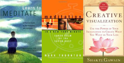
Learn to Meditate: A Practical Guide to Self-Discovery and Fulfillment

David Fontana
The Meditation Handbook: The Practical Guide to Eastern and Western Meditation Techniques

Mark Thornton
Meditation in a New York Minute: Super Calm for the Super Busy

Thich Nhat Hanh
The Long Road Turns to Joy: A Guide to Walking Meditation

Shakti Gawain
Creative Visualization: Use the Power of Your Imagination to Create What You Want in Your Life


Find more on Mindfulness here.