Why It’s So Important To Develop Personal Projects
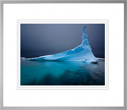
Find out more about my exhibit Antarctica here.
As a fine artist, I advance my career with personal projects. Personal projects also create a clearer direction for and develop greater meaning in my life. My life would be unfulfilled without them.
You don’t need to have a fine art career to benefit from personal projects. Many commercial photographers find that personal projects re-energize them, add purpose to their lives and quite often lead to new assignments or whole new streams of income. Many amateurs, making images purely for the love of doing it, find greater satisfaction and personal growth through their personal projects.
As an artist who mentors other artists in workshops and seminars, I’ve often been called to speak about the importance of personal projects; how to find them, start them, develop them, complete them, present them, and promote them.
Here’s an overview of what I share.
Define a personal project.
Defining a project is one of the single best ways to develop your body of work. When you define a project you focus, set goals, set quotas, set timelines, create a useful structure for your images, collect accompanying materials, and polish the presentation of your efforts so that they will be well received.
Focusing your efforts into a project will help you produce a useful product. A project gives your work a definite, presentable structure. A finished project makes work more useful and accessible. Once your project is done, your work will have a significantly greater likelihood of seeing the light of day. Who knows, public acclaim may follow. Come what may, your satisfaction is guaranteed.
Create a mission and set goals.
Define the purpose of your project and what you’d like to achieve through it. Many times, people adopt the mission and goals of others without first checking if those goals are personally beneficial. Some have professional aspirations, others don’t. Your goals will help you determine projects and timelines that are appropriate for you. The few moments (or hours) you spend clarifying why you’re doing what you’re doing and what you’d like to see come of it will save you hours, months, even years by ensuring that you’re going in the right direction – a direction of your own choosing. When you take control of your personal projects, you also take control of your life.
Make a plan to achieve your goals.
A plan will help make your project a reality. A simple action plan is all you need to get started. Action plans define the steps that are required to achieve completion. Action plans should be clear and practical. Action plans should be flexible; odds are, things will not go exactly according to plan and you’ll need to modify your plan to accommodate surprises, both pleasant and unpleasant. Reality happens. Grace happens too. Having defined what you need to accomplish, your unconscious will go to work on the task, generating many ideas. You’ll find yourself ready to make the most of unexpected opportunities as they arise.

Read more on creating goals, projects, and next actions here.
Set a timeline.
A timeline can be used to combat procrastination and/or distraction and encourage you to produce work. Set realistic timelines. Unrealistic timelines simply produce frustration.
Identify where and when you’ll need and who will help you.
While many artists define and produce projects themselves, some artists engage a curator, gallery director, publisher, editor, agent, writer, or designer to help them realize a project, in part or in whole. Finding the right collaborator(s) can improve any project. Above all, seek feedback. Seek feedback from people with diverse perspectives whose opinions you value and trust. One thing you can always use, that you can never provide for yourself, is an outside perspective. People with different perspectives may identify ways to improve, expand, or extend the reach of your project. Remember, feedback is food for thought, not gospel. In the end, all final decisions are your decisions; it’s your project.
Stay focused and follow through.
You can work on multiple projects at a time. Be careful that you don’t get scattered. Starting projects is easy. Finishing them is hard. Make sure you’re working on the best project. List all your possible projects and identify the ones that are most important and the ones that are easiest to finish. If you’re lucky enough that the same project fits both criteria, focus all of your efforts there. Otherwise, you’ll have to strike a balance between what’s practical and what’s most important to you. Only you can decide this and the balance is likely to shift as time passes and circumstances develop. Look for a common theme among projects. Often your projects will be related. Focus your efforts on related areas. It’s very likely those areas have greater relevance for you than others. Your work will be perceived as stronger and more cohesive if your projects relate to one another, implying evolution.
What’s your project?
A project is a wonderful thing. It gives direction. It brings clarity. It increases productivity. It produces tangible results. It brings personal growth. It presents your work in the very best light. You and your work deserve this. Pick your projects well. They define not only how other people see you but also what you become. You are what you do. Take the first step today; make a commitment to creating a personal project. (Write something right now – put your words somewhere where you’ll constantly be reminded of them and can continue refining them!)
Find extended versions of this content here.
Now, let me speak in more specific and personal terms, as a way of sharing a few more of the insights I’ve found over the many years I’ve developed personal projects.
Plan to plan.
Many people refuse to plan, especially in creative fields where discovery is desired. They say, “Failing to plan is planning to fail.” Everyone needs a plan. Often, when you start a project, knowing you need to learn more as you go forward, you feel like you don’t have enough of the pieces to make a plan or you don’t have all of the pieces to make a complete plan. My recommendation is to start with a rough plan and continue to refine it as you go.
Find my collection of quotes on planning here.
Stay flexible.
The best plans aren’t written in stone. The best plans remain flexible. Flexible plans allow you to make course corrections along the way as you learn more about your subject, your medium, yourself, and your audience. Expect to update your plan. I find that, if I don’t update my plan during the development of a project, this a clear indicator that I haven’t found the insight(s) necessary to complete it. I expect to be changed, for the better, by the projects I engage in. I expect to grow.
It helps to have a mission.
You have so many options before you, and so many more will soon present themselves to you, that you’ll find it challenging to choose which project(s) to move forward on or which path(s) to choose during project development. Defining a mission for your creative efforts, in general, will help ensure that you stay on track. I don’t take on a project unless it contributes to my mission (what’s achieved), reinforces my brand (how it’s communicated), or makes a lot of money (how it’s supported).
My mission is to “encourage conscientious creative interaction with our environment.”
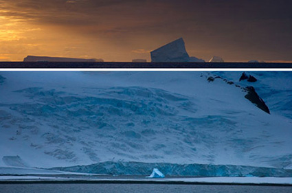
The first time I went to Antarctica in 2005, I planned to make altered images. I was surprised that I had enough finished images by the end of the trip to exhibit a small body of images, that were comparatively unaltered. This represented a significant challenge to my brand. I found the challenge created to the public perception of my work, in general, was useful; rather than creating confusion, it clarified many things about my vision and my purpose, especially how I create images that are unaltered and altered in parallel with one another.
You don’t have to know all the answers before you begin to work. You just have to know the most important questions. Creating is a matter of solving mysteries, of finding answers. You don’t have to solve a mystery completely; you just have to find a few answers that you can stand by. If you’re lucky, you’ll find new questions and new mysteries along the way.
The second time I went to Antarctica in 2007, I had a lot of questions about how to complete an unaltered body of work. How journalistic or cinematic should I be? Should I photograph everything I saw? Ultimately, I found a balance between my personal concerns and passions. I focused on climate. I returned with enough material to produce a book.
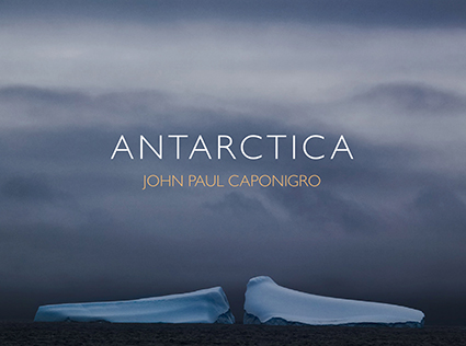
Find the most current version of this ebook here.
Find your groove. Find your message.
Doing things consciously, repeatedly, and consistently brings mastery. Repeat your successes
and find meaningful variations on them. When you do this you give your work a theme and style, which communicate a message. When does a groove become a rut? Don’t worry about the rut too soon, most people don’t stick with one thing long enough to find a groove. They go off-road, traveling anywhere and everywhere, by any and all means, and ultimately don’t end up anywhere in particular, much less a place to return to, a place they can call their own.
The third time I went to Antarctica in 2009, I expanded my body of work further adding relevant variety to the material. I searched the work I had produced to date and listed the missing pieces, as well as the ones I wanted to reinforce. Each voyage was significantly more productive than the previous one. I created a website to support and extend the project, which includes blog posts made live during the voyage and details my creative process.
Past projects lead to new projects.
Often the seeds of future work lie in present work. Themes that were unclear or latent, at the beginning of a personal project, once developed, lead to new lines of inquiry and more work. A creative life is never truly over. The best creative lives evolve; growing deeper, more complex, and more sophisticated.
Now as I plan to return to Antarctica (Find out about my next Antarctica workshop here.), I’m developing my original idea of producing a body of altered images from a new perspective. As I recently sketched out this plan, once again, I realized much of the work is already done. I’ve been producing altered images with material from the region all along, but not presenting them in this way. Now my challenge is to develop them in a way that makes this collection cohesive and contrasts the collection of unaltered images in a useful way – or to move in an entirely new direction.
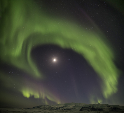
Having developed an Antarctic body of work, I’ve also been developing an Arctic body of work, to create a useful comparison and contrast. I’d have gone to these regions sooner, but the opportunities came later. I learned I had to make the opportunity rather than wait for it – and that took another kind of planning, so did getting there at the right times of year. Now, like Antarctica, my Iceland and Greenland photography workshops are semi-annual traditions for me.
Find a way to monetize your project.
Projects take time. Time is money. Don’t fall prey to the cliche that art and commerce are and should remain separate. If artists can’t make money with the fruits of their labors, then they need grants or patrons. Projects need funding. You often can’t do the work unless you can afford to do it. There are many expenses to consider – equipment, travel, production, collaboration, presentation, promotion, etc. You need to think about these things early in the development of a personal project or you may later find yourself without the necessary resources to finish it. So empower yourself with good business practices. You can be just as creative in business as you are in other arenas.
Prepare to make your work effective.
Even the best images will go unnoticed if they’re not presented and promoted properly. If you’ve spent a significant amount of time and resources to develop a personal project, you own it to yourself to see it presented well. This may be as simple as presenting your images well to yourself or as complex as promoting a publication and or exhibit, physically and/or virtually.
I’ve created my own exhibition/publication workflow. Framed exhibits are ready to ship with supporting biographies, statements, and press releases online. Complete bodies of work are supported by a portfolio of matted prints, also ready to ship, and a print-on-demand catalog. This makes producing, shipping, and promoting exhibits much easier, so I can readily respond to new opportunities at a moment’s notice.
![]()
You can preview my current catalogs here.
One project begets another.
What’s better than one project? Two – or more. Often, one project leads to another. While you’re developing a project you find more ideas than a single project can accommodate – and some of those ideas can become new projects. This continuity can give your work a discernable arc that communicates your visual voice even more strongly.
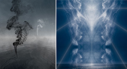
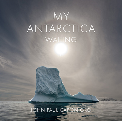
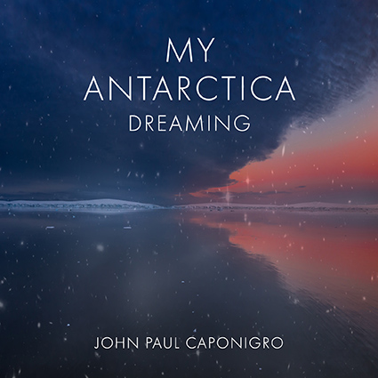
While my initial goal was to produce a book of one hundred straight images of Antarctica (Waking), I later decided to collect altered images with sources from Antarctica (Dreaming), and then to launch another multi-continent project Global Warning by first focusing on images from Antarctica.

Make visible touchstones to guide your progress.
If you’ve got a personal project you want to complete, make a visible touchstone and keep it in one or more places where you can see it frequently. By doing this, you’ll be directing your conscious mind to focus on it and suggesting to your unconscious mind that this is a matter of importance – both will start to work on the challenge, even when you’re unaware of it. You will literally be sleeping on it. Many of the best ideas come during this period of gestation and incubation.
I print covers of unfinished book projects for developing series and display them in my studio.
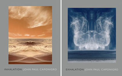
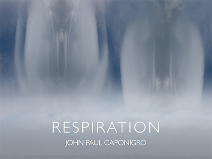
See the single ebook these two related projects produced.
Projects take time.
Projects can take hours, days, weeks, months, or even years to complete. Some projects can be completed very quickly, especially once you’re familiar with the concepts and skills necessary to finish them. Projects get easier with practice. Some projects are ongoing and never end, producing many milestones along the way (publications, exhibitions, commissions, etc. Some projects lie dormant for a period of time and then suddenly come to life again. Some projects change over time. Projects have lives of their own. Projects require commitment, but the depth of your commitment will be reflected in your work and in the achievements you make with it.
I can’t recommend more highly that you start your own personal project – now.
Learn more in my Storytelling resources.
Learn more in my creativity and digital photography workshops.
4 Reasons To Take More Notes & 3 Ways To Make The Most Of Them
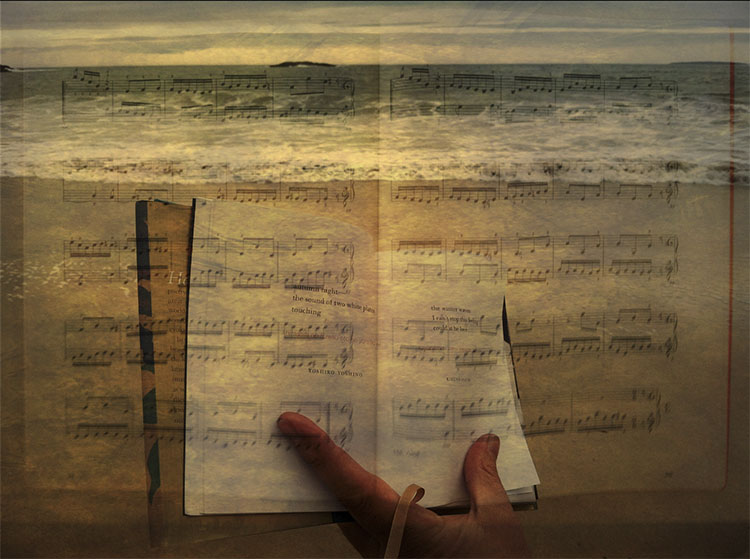
There are so many reasons to write! You don’t have to write professionally to experience the many benefits writing can offer you. Remember, while few people write professionally, everyone writes, most often to help them do their work. While you may not consider yourself a writer, you already write. So write more! Even if it’s just a little you’ll find it will help a lot.
Here are four reasons to write.
1 Retention
Writing will help you remember things. Most people can only hold seven things in their minds at once. Many times, if you’re full up, new ideas won’t come, until you make space for them. Other times, when new information comes in, old information is lost. Either way, the solution is to write it down – and there are additional benefits to making notes. You’re 73% more likely to remember and act on something if you write it down. (If you type your notes, this number drops to 39%, which is still much better.) Part of this stickiness comes from finding the words that work best for you, so use the language that you’re most comfortable with and that means the most to you. You probably have a to-do list professionally, so why wouldn’t you use one to help you excel in your creative life too? And there are times when everyone needs a checklist. (Atul Gawande’s Checklist Manifesto shows how doctors used checklists to reduce hospital deaths and complications by more than 33%.)
2 Clarity
Writing helps you see more and see more clearly. Like any creative discipline, writing encourages closer observation. You note more things – more information. Plus you’ll find patterns in the things you note – information about information. You’ll understand your experiences better and you’ll find more ideas. Unlike photography, which encourages observation of things you can see, writing can also help you observe things you can’t see like your thoughts and emotions, interactions within relationships, and processes unfolding in time. When you find the right words to describe something you understand it better.
3 Productivity
Once you see what you’ve written new ideas will come to you. You can accelerate this process by playing word games. Alex Osborne’s acronym SCAMPER (Substitute, Combine, Adapt, Modify, Put To Other Uses, Expand, Reverse) is a mnemonic device for a series of mental operations you can use, each of which is capable of leading to countless new ideas.
4 Organization
Organizing your writing helps you organize your thinking. Often the process of taking notes isn’t linear, you simply let it all out. When you revisit and reorganize your notes you make even more sense out of your observations. Lists help you identify steps in a process, set priorities, and identify more important items. Remember, you can also use size, color, or graphic symbols like underlines and stars to make some words stand out more than others.
It’s important to file your notes in an easily retrievable organized system that you trust, otherwise your mind will continue trying to remember everything, which no one can do, not even the gifted who have a photographic memory.
Audio
What about taking notes with audio? Many apps (like Notes) will turn what you say into text. This can be a fast way to take notes, especially when you’re multitasking.
Audio files that aren’t turned into text take more time to review as they’re played back, as much or more time than it took to make them, so they’re not the most efficient way to retrieve. However, if you are having a conversation with someone and you don’t want to interrupt the flow audio is very useful. Nothing records intonation and inflection as audio does. And there are occasions where you want to note the particular sound of something, which words can’t duplicate.
Take Notes With Images
Some things are better noted visually rather than verbally. If you can see what you want to make a record of then a photograph can very efficiently make a note, often one full of detail that would take more time than necessary to record. If you need to make a visual note and you can’t photograph it, make a doodle instead. Diagrams can be particularly useful for recording processes (vectors, paths, timelines, etc) and relationships (maps, graphs, Venn diagrams, etc).
Go Multi-Media
You can combine text and audio and images. Together they’re even richer and more powerful than they are alone.
Avoid Perfection
Perfect takes time, so for this purpose, it isn’t. Not only is it too much pressure, in the wrong way at the wrong time, it’s a distraction. So satisfice. And above all, enjoy the process. Think of your notes as a place to record and explore your observations – not the way you’ll present them to others. With this realization, you’ll be freer about what you record and how you record it and so you’ll do it more often. And that’s the point.
Make notes, lots of notes, and keep doing it. Developing this habit will help you see more, think more, feel more, do more. You’ll get more out of life.
(Want more on this subject? I recommend David Allen’s book Getting Things Done.)
Read more in my Creativity Resources.
Learn more in my Creativity Workshops.
The Number 1 Reason Not To Should All Over Yourself – Or Anyone
We have so many choices in life. As a teacher I’m frequently asked questions like these.
“What should I do? Should I do this? Or, should I do that?”
I invariably reply, “What are you trying to do?”
Our choices imply our intents and we don’t all have the same goals, visions, or styles. (Thank goodness; our variety makes life so much more interesting.)
And then I recommend rephrasing those questions to get better results.
Here are questions that you can use instead.
How many ways can I do this?
This question is a creative challenge designed to open up many possibilities. Start here. Don’t skip it before rushing to the next question. (I recommend you write down all the answers you can think of and keep adding to your list over time.)
What happens when I do that?
This question provides clarity on the most likely consequences of your choices. It’s cause and effect, which can sometimes change in different contexts so add when and where into the equation.
Why am I doing this?
This question helps identify goals. (If you’re unsure of your goals ask “Why?” five times in a row. You may not find your final answer this quickly but you will develop a clearer picture.)
Should I do this or that?
It’s a question that limits your choices to two. This question is useful only after you’ve identified your goals, limited many possibilities to two, and you’ve asked the next question. So ask many other questions first.
Whenever possible, avoid using the word should. It’s limiting and in most situations, you have more choices. The word should often implies obligation. There are reasons you choose to do what you choose to do. You may not like all the choices you have and sometimes have to make the least objectionable rather than the most favorable. Still, you choose it. So own it.
Self-talk matters. Becoming more conscious of the language we use internally has many benefits including increased awareness of what’s going on outside and inside us as well as our reactions to these psychic events … and with that awareness comes choice. Once we’re aware of what’s going on inside us we can choose to let it flow uninterrupted or we can influence its speed, course, and tone. It’s not just stop or go, it’s also how and where would you like it to flow?
Read more in my Creativity Resources.
Learn more in my Creativity Workshops.
3 Easy Ways To Make Colors Pop In Photoshop – Jesus Ramirez
Over The Threshold – A Creative Conversation With Sean Kernan

Over The Threshold – A Conversation On Creativity With John Paul Caponigro and Sean Kernan
During this inspiring hour, John Paul and Sean share images, thoughts, and provocations for themselves and viewers. A lively question and answer session brings this free program to completion.
At some point, all photographers sense their best and truest work lies at a point somewhere out beyond the threshold of their comfort. The question then becomes how to get there.
John Paul Caponigro and Sean Kernan, long-time friends, approach creativity in different ways, but they both head for the same transformative experience. During this conversation, they share personal stories of moments that changed their art and their lives. Meditation, playing music, acting, drawing, and writing are just a few of the practices they use to make room for the revelations that improvisation brings. They offer insights into moving beyond habitual practices and making space for the unknown, which is where the magic of the creative process happens.
Read Sean Kernan’s quick Q&A here.
Read our conversation for Camera Arts here.
View more video with Sean Kernan here.
View more Creativity Continues events at The Santa Fe Workshops.
An Easy Way To Turn Day Into Night Using Photoshop
Make Your Color Grading LUTs More Powerful With This Hidden Photoshop Trick
4 Ways To Crop Your Images – Crop, Distort, Retouch
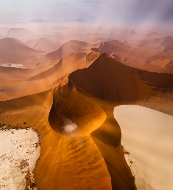
Deciding what’s in the frame and what’s out is a critical decision that can make or break an image. You can look at it very simply. What is an image of? What is an image not of? And how does what’s left over support or distract from the essence of an image?
In the past we had two simple options; one, use the frame to crop; two, crop when printing or post-processing. Now we have two more options to think about; three, distort; four, retouch. Each of these offers different possibilities and becoming familiar with them all will help you choose.
It’s a new mindset. Once you learn to see in these new ways, you’ll find you’ll make images that you previously passed by, leaving them unmade or even unnoticed. As a result, you’ll make many more successful images.
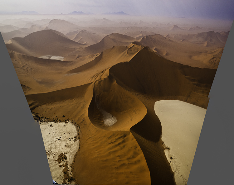
Classic crops eliminate the most information
Crop
You’ve got choices. Choose wisely.
One – Crop Before Exposure
Use the frame to eliminate distracting information around a subject(s). Take extra care with image information that touches the frame, as it will draw extra attention. If part of an object is eliminated by the frame make sure what’s left looks deliberate - just a sliver lopped off or a sliver left over seems careless. Once you’ve made your exposure, you’re committed. You can crop more but you can’t uncrop. When in doubt, shoot both tight and loose.
Two – Crop After Exposure
Shoot loose (more than you need) and you’ll preserve your ability to refine a composition during post-processing, testing, and comparing many variations, even over extended periods of time, before settling on a final solution. Doing this will take more time but you will gain precision.

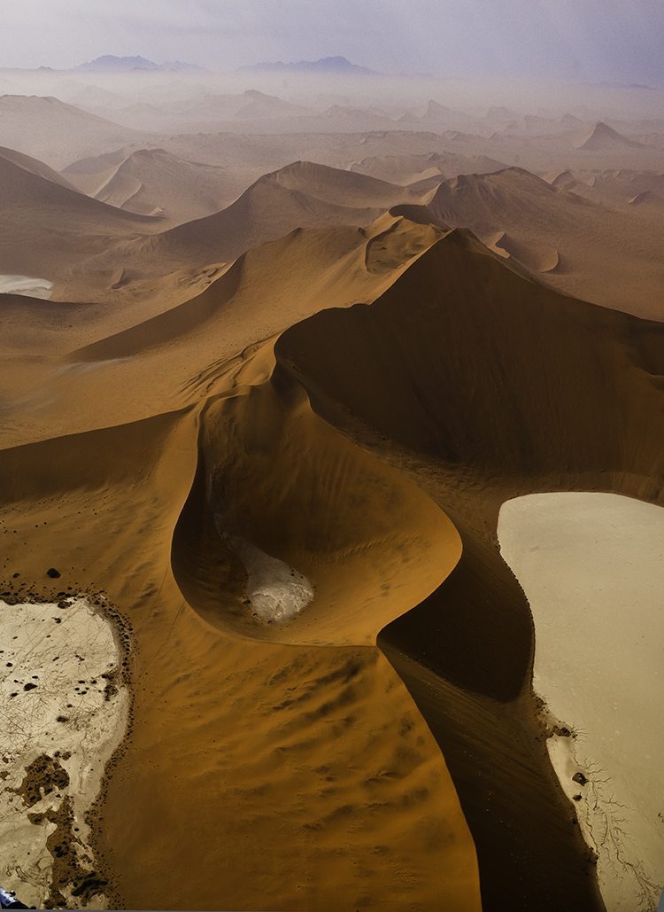
Distorted to fill the frame
Distort
Distorting photographs is widely practiced. But most photographers tend to think of their limited use of distortion as having produced no distortion. In fact, every lens distorts in its own way, some more than others, like wide-angle lenses. Lens profiles are designed to correct for lens distortion during post-processing by ‘undistorting’.
Many people think they aren’t distorting their photographs when in fact they are doing it on most of their images in multiple ways, first by using a lens, second by using a lens profile, and sometimes third by creating panoramas. Why are these practices more acceptable than using distortion and retouching as a part of your cropping practices? In the end, it’s your choice.
You can push one or more sides of an image outside its frame and achieve similar results to cropping. What’s different here is that the proportions of the objects and spaces left within the frame will change, typically getting taller or wider, usually only a little but potentially a lot.
You’ve got options. Test them before you settle on your final solution.
One - Transform
Use Photoshop’s Edit > Transform to distort an image uniformly. To move an entire side, hold the Shift key to move one side without moving the others. And/or, to move one corner independently, press the Command key before moving a corner point.
(To do this an image’s Background Layer needs to be a Smart Object or a duplicate layer.)
Two - Content-Aware Scale
Use Photoshop’s Edit > Content-Aware Scale to distort an image non-uniformly – smooth areas will expand or contract more than textured areas. Pull the areas you wish to crop outside the frame. Hold the Shift key while you’re doing this if you wish to change one side more than another and the image’s aspect ratio with it.
(Do this on a duplicate layer. Content-Aware Scale doesn’t work on a Smart Object.)
Three - Warp
Want more localized control? Try Warp. (Edit>Transform>Warp) Warp gives you a grid to adjust more points with. It adds the ability to modify the position of elements not just with the edges but also the insides of the frame. Do this on a duplicate layer or duplicate Smart Object. Warp works on Smart Objects but since it is not a filter so you can’t get the future flexibility of a Smart Filter.
Four - Liquify
You can use the Liquify filter to distort small portions of an image. For instance, moving something in the middle of the edge of a frame off frame without moving the corners. To do this, go to Filter>Liquify, start with the first tool Forward Warp and use the brush to get the effect you desire. It’s worth exploring the other brushes too as Liquify is a powerful distortion tool.

Distorted to fill the frame
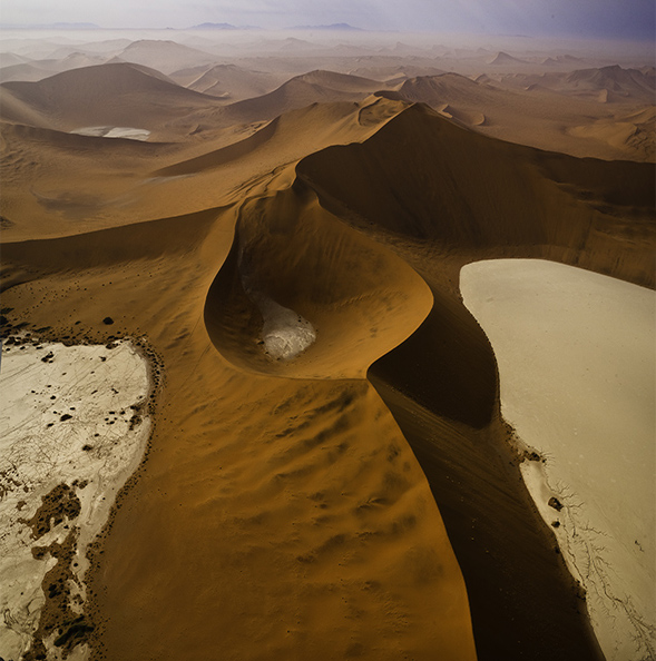
Distorted version with aspect ratio changed afterward
Preserve Or Adjust Aspect Ratio
Both cropping and distortion may or may not change an image’s aspect ratio (the proportions of the frame). Cropping can be set to preserve a set aspect ratio but this puts limits on what’s possible as at least two edges, if not all, are adjusted together. if you adjust one edge separately from the others you’ll change the aspect ratio, for better or worse. But if a specific aspect ratio is important to you (either because the original creates consistency between images or because a new ratio is more expressive), after cropping you can distort the entire frame to the aspect ratio of your choice.
See What You’re Missing – 2 Ways To Non-Destructive Crops
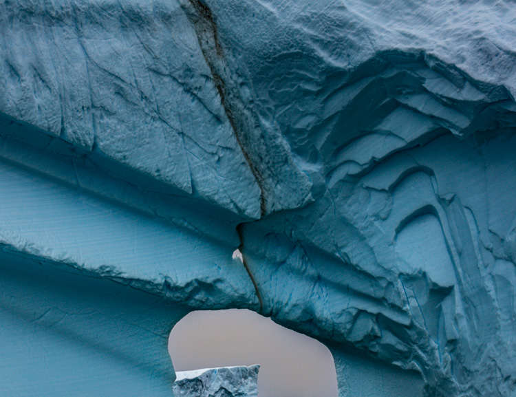
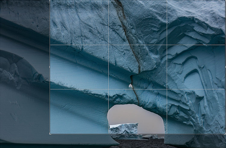
We’re responsible for everything that’s in the frame. We’re also responsible for everything that’s not in the frame. Deciding what’s in the frame and what’s out is a critical decision that can make or break an image. Framing and cropping are critical. If you miss a key element during framing you’re out of luck. However, if you overcrop you’re not, if you crop non-destructively and you remember to reconsider your crop from time to time. After you crop, you forget what you’re missing. It’s out of sight and out of mind. But it doesn’t have to be.
Lightroom and Photoshop’s crop tools allow you to see the image information you’re missing Here’s how …
In Lightroom, highlight an image and tap R. You’ll see the areas eliminated with a darker overlay. You never lose image information when you use Lightroom. It couldn’t be easier. What’s hard is remembering to do it.
Photoshop also makes almost as easy. First you have to open an image. Then press C (or click on the crop tool). Then click on the Crop tool control handles and you’ll see the missing information, again under a darker overlay. When you use Photoshop, be careful. Unlike in Lightroom, you can eliminate image areas permanently. Here are two ways. One, check the Crop tool’s option Delete Cropped Pixels. Two, flatten the file or merge other layers with the Background layer. You may think this has happened when you first look at a file that has been cropped in Photoshop as when you first click on the crop handles you won’t see the larger canvas but simply drag the right corner of the window out and you’ll see the bigger canvas.
Why would you need to reconsider your crop? To make future improvements as your vision evolves. In the analog darkroom photographers never (almost) cut their negative’s or transparencies. They masked them during printing. This means every time them made new prints they reconsidered their crops. Sometimes, after their seeing matured, they changed their minds – significantly. I’ve witnessed the greats reviewing their top images. One day, Arnold Newman adjusted his crop on his portrait of igor Stravinksy. Another day, my father reconsidered his crop for Running White Deer, making subtle but significant shifts in their final compositions. Those two images are both dramatically influenced by the way they’re cropped. If the masters do it, you may want to consider doing it too.
Small changes can make big differences. But you won’t think to make them if you don’t see what you’re missing. So make it a habit to reconsider your crops from time to time. It only takes a few moments and if you do, perhaps even your best images will improve.
Read more in my Creative Composition resources.
Learn more in my digital photography and digital printing workshops.


