Enjoy this new interview where I discuss my photographic upbringing with Jill Waterman on B&H’s Explora blog.
“When it comes to photographic dynasties, the name Caponigro holds a privileged position at the top of the list. The father/son duo of Paul and John Paul Caponigro are masters of their respective crafts, spanning many years and a broad reach, from the muted tonalities and classical elegance of Paul’s large-format landscapes to John Paul’s complex, ethereal digital composites.
In 2016, B&H Photo hosted father and son as invited speakers at the B&H OPTIC Conference, where they both presented their work to great acclaim. Offstage, they also chatted about art, nature, and spirit with the Explora podcast team. After recently drawing inspiration from this archived content, we decided to take a deeper dive into the family history and respective working methods of these legendary artists in celebration of Father’s Day.
We caught up with John Paul Caponigro in a conversation over Zoom, and we present excerpts from our chat below, with their 2016 OPTIC presentations and podcast audio interspersed with the text.”
Your father makes large-format photographs of landscape and nature. Outside of his artistic practice, did he or your mother make family snapshots when you were growing up?
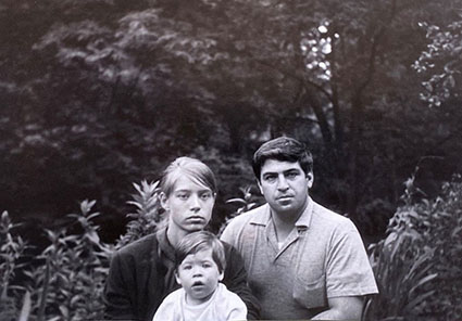
When I was young, photography seemed to be a serious thing. It seemed like there were very few snapshots, but there were a few and both of my parents seem to find more as the years go by.
I think my mom had an Olympus 35mm with roll film. I don’t even remember whether Dad had film rolls or not at that time. He did later when I started doing some things. But, when I was younger, it didn’t occur to me to ask why Mom would send her film to the drugstore and get these little 3 x 5″ prints. I was just watching what they were doing.
Do you have any early memories of your father teaching you about art or photography?
There are many stories. One time, Dad started talking about the color of the black-and-white prints he was making. “What color?” I asked. He then showed me how papers and developers and toners offered different subtle colorations, and how that changed the spatial dynamics within them, and our emotional responses to them. After that, I never thought of black-and-white or gray as colorless. You could even say they’re my favorite colors.
But, when you think of my father, just remember, there is no routine. He had certain papers and developers that he would favor. But he was very much interested in how each one had special characteristics, and wanted to become familiar with that, almost like becoming familiar with the tone of an instrument, matching the image with the characteristics of the paper / developer combination. He printed like his mother cooked, to taste. I remember getting the first pizza lesson from my grandmother. And she says, “Now you take a handful of salt,” and I’m like, “Nona, your hand is this big, and my hand is this big. So, give me your hand.” And I poured the salt from her hand into the measuring cup, and said, “OK, I’m going to write that down.”
So, it’s much more of a print-to-taste kind of thing. He just wasn’t so technical. But it’s hard to say that, because he did his homework. My dad really stripped-down Ansel Adams’s zone system into something that was very practical and approachable. He had done all of that, and then at a certain point, he liberated himself. You know, the technical can become an obsession. It can be what drives the show. And, he’s enough of an artist to want to let the emotion, and then the perception, drive the process.
You met many important photographers and artists as a youth, who were friends of your father’s. Are there any memorable stories you can share from these encounters?
My father used to tease Ansel Adams that he had a cloud stick in his bag. So being a kid of 6 or 7, I went looking for it. I was young enough to believe in magic, and I was really disappointed to find out it was just a joke. Decades later I got my own cloud stick—Adobe Photoshop.
I was too young to take one of Ansel’s workshops, but I certainly watched him on opening nights, and evenings at dinner, and so many other times. As a kid, Ansel and Eliot Porter were two of my heroes because they were so involved with environmental organizations. But, also the fact that Ansel had this whole workshop program in the middle of Yosemite Valley, it was really quite magical. And then he would invite other artists to come in; he had created his own community. There aren’t that many workshop programs out there like that, still today. It might have been the only one at that point. It was pretty neat to see that whole thing.
My relationship with Eliot Porter came out of my mom designing most of his books after a certain point. He lived right down the road, in Tesuque, New Mexico. He was tremendously influential to me in so many ways. He had such a keen, scientific mind, and this endless curiosity, this restlessness, this activeness socially, or at least environmentally. He was just a super guy.
You’ll find much more on B&H including two videos and a podcast.
.