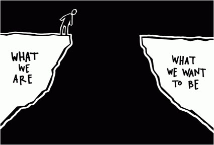
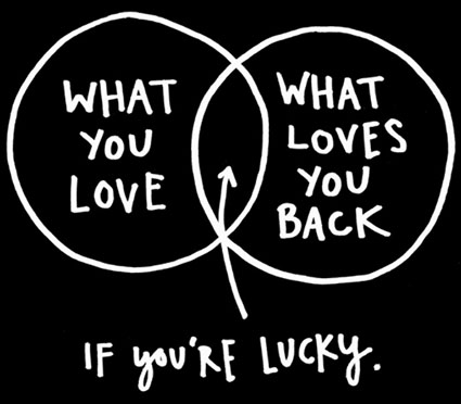
.

Photoshop’s Marquee Tools Make Surprisingly Useful Geometric Selections

Masking_Marquees

Photoshop offers two Marquee tools (Rectangular or Elliptical) for making simple geometric selections. They’re easy to use.

Click hold and drag to define a selection.

Hold the Option key to draw from the center of the shape.

Hold the Shift key to constrain the shape to a perfect square or circle.

You might question how often you’ll use simple geometric selections, particularly in complex photographs, but you’ll be surprised. They’re excellent for quickly selecting large areas of a canvas, which can be further refined with any of the other selection tools. They’re extremely useful if you feather them heavily; targeting the center of an area then fading off gradually to create vignetting effects, either for the entire image frame or a small portion within it.

Read more about Selections & Masks.
Learn more in my digital photography and digital printing workshops.

The Difference Between Painters’ and Photographers’ Color Wheels

ColorWheel_Apple_425

The photographers’ color wheel rendered by Apple.

ColorWheel_Itten_425

The painters’ color wheel painted by Johannes Itten.


In color theory, one of the primary uses of color wheels is to plot complementary colors.

Painters and photographers use this information to create neutral colors. Painters mix complementary colors to get more neutral hues. Photographers add complementary colors to remove color casts, making neutral colors appear more neutral.

But photographers and painters apply different complements. Photographers identify three primaries and complements; red and cyan, green and magenta, blue and yellow. Painters identify three primaries and complements; red and green, blue and orange, yellow and purple. Why do they use different complements? Painters have to address the impurities in the pigments they’re mixing.

Photographers deal with pure light.

From a practical standpoint, both types of artists learn to achieve the effects they want to achieve. From a conceptual or theoretical standpoint, the difference is significant – and they share the same theories but their application of those theories differs. Photographers and painters should talk to each other more.

Photographers can enrich their understanding of color if they become familiar with the longer richer history painters have had with color, and at the same time painters can refine their theories and produce stronger effects by using photographic complements.
Physically and biologically our eyes do specific things. By using maximum hue contrast, complementary colors in close proximity to one another create optical effects: they make each other look more intense; any lines between them becomes more pronounced, often producing a light line, which can appear to flash if the eye moves back and forth across it; if made very small (like scanned pixels or printed halftone dots) they average to a neutral color. Artists use these effects to make more powerful visual statements.

Optically photographic complements are correct. You can test and prove this yourself. To do this, take advantage of the retinal after images your eyes produce. Simply stare at a solid patch of color for more than twenty seconds and then shift your gaze to a neutral field of color, like a white wall. The color you’ll see will be the photographic complement. So, if you want to take maximum advantage of the optical effects generated by complementary colors, choose photographic complements.

Finally, color theory can be very useful. Artists frequently create consistent color structures (some call them color harmonies), much like the tonal structures or scales musicians. They often use color wheels to plot these relationships (not unlike a musician plots a circle of fifths to identify musical harmonies). They draw geometric figures inside a circle of color to identify regular intervals between the colors chosen; straight lines for pairs, triangles for trios, rectangles for quartets, etc. There’s no ideal structure. Different structures generate different effects, both optical and psychological – and it’s useful to know what those are. What matters most is that a color structure is created, rather than color chaos. The colors identified as complements define a color wheel. Once again, because of the impurities in pigments, painters distort their color wheels (expanding the oranges and reducing the cool blues) to help them identify which colors to mix to make neutral or more neutral colors, but the unintended consequence of doing this is that they plot color structures on a distorted color wheel. Their ideal theories are skewed by physical imperfections.

Long after his death, it was noted that pointillist painter Seurat, who started a whole school of painters who used broken bits of complementary colors rather than blended less intense colors, could have achieved even richer visual effects if he had adjusted his color choices. Viewers experience visual effects with their eyes. And the photographer’s color wheel is aligned with our eyes.


Learn more about Color Theory here.

Learn more in my digital printing and digital photography workshops.

The Care & Feeding Of Your Authentic Vision

Revelation XXIV
I create and curate a lot of content on creativity, art, and photography.
Here I’ve collected some invaluable resources for finding, energizing, and deepening your creative vision.
You’ll get a great taste for the content on creativity we offer in our Digital Photo Destinations Workshops.
Seth Resnick @ B&H – Seeing Color & Enhancing Creativity
John Paul Caponigro @ TEDx – You’re Created To Be Creative
John Paul Caponigro @ Google – The Creative Process
John Paul Caponigro @ Austin Talks – Find Your Way
Gregory Heisler highlights the importance of doing things your way.
Gregory Heisler @ Creative Live – Embracing Your Uniqueness
David Duchemin writes soulfully about cultivating your vision.
David DuChemin – Your Next Step : Authentic Work
David Duchemin – Finding Vision ?
David DuChemin – Chasing Photographic Style
David DuChemin – Vision And Voice
Hungry for more? Savor this book.
Thomas Moore’s – Original Self
Want to find out more about my creative process?
Check out my ebook Process.
The big take away? Creativity is an evolving process of discovery. If you simply engage the process with an open mind and a willingness to try new things, you’ll be uplifted by the surprises it holds for you. And, with mindful practice, you can start to influence the courses your creative life takes to make it more likely that you’ll get the results you desire most. Dream, act, fulfill them.
You’ll find more content like this in my newsletter Insights.
Sign up for my newsletter Insights here.

"Thinking, Fast and Slow" | Daniel Kahneman – Talks at Google


“Daniel Kahneman, recipient of the Nobel Prize in Economic Sciences for his seminal work in psychology that challenged the rational model of judgment and decision making, is one of our most important thinkers. His ideas have had a profound and widely regarded impact on many fields—including economics, medicine, and politics—but until now, he has never brought together his many years of research and thinking in one book.
In the highly anticipated Thinking, Fast and Slow, Kahneman takes us on a groundbreaking tour of the mind and explains the two systems that drive the way we think. System 1 is fast, intuitive, and emotional; System 2 is slower, more deliberative, and more logical. Kahneman exposes the extraordinary capabilities—and also the faults and biases—of fast thinking, and reveals the pervasive influence of intuitive impressions on our thoughts and behavior. The impact of loss aversion and overconfidence on corporate strategies, the difficulties of predicting what will make us happy in the future, the challenges of properly framing risks at work and at home, the profound effect of cognitive biases on everything from playing the stock market to planning the next vacation—each of these can be understood only by knowing how the two systems work together to shape our judgments and decisions.
Engaging the reader in a lively conversation about how we think, Kahneman reveals where we can and cannot trust our intuitions and how we can tap into the benefits of slow thinking. He offers practical and enlightening insights into how choices are made in both our business and our personal lives—and how we can use different techniques to guard against the mental glitches that often get us into trouble. Thinking, Fast and Slow will transform the way you think about thinking.”
View more Creativity Videos here.
Explore The Essential Collection Of Quotes On Creativity here.

New Interview – Find Your Way

FindYourWay_425

Shortly after the opening of my new exhibition Land Within Land, Scott David Gordon recently interviewed me for his podcast Austin Talks. He picked up on many of the ideas I shared during my gallery talks … and ran with them.
As he said, “If you are looking for a technical discussion on Photoshop and cameras to choose this is not the one. We had a fairly philosophical conversation about many subjects including defining a mission in life, being present, nature, spirit of place, creativity, play, and how to find your own way as an artist and a human. I love how thoughtful and specific he is with his words and wisdom. It’s no wonder he is a sought-after lecturer and teacher.”
I hope you enjoy our conversation!
Find out more about Scott David Gordon here.
Listen to more Austin Talks here.

Easily Refine Any Photoshop Mask With A Brush

LandInLand_066
You can refine any mask in Photoshop with a brush. How? Choose any Brush tool and paint on it. The Brush, Healing Brush, Clone Stamp, Eraser, Gradient, Blur, Smudge, Dodge and Burn tools all have their uses. Whether simple or complex, layer masks are just black and white images; you can do anything to a mask that you can do to a black and white image.
It’s important to remember this because you might not realized just how much you can refine a selection or mask. Sometimes tools like Quick Selection do an amazingly fast job of selecting specific image areas, but their results can be improved further with a brush. Many times the sophisticated selections made with tools like Select By Color Range (which will allow you to quickly select Shadows, Highlights, or single colors like Red, etc) end up selecting too many areas and you may want to remove some of those areas from the selected regions in a mask. Painting over those areas with a black brush is one way to do this. (By contrast painting over areas with white will remove any gray values and let the effect of a layer pass through unimpeded.) While there are many brushes you can refine them with, more often than not you’ll find yourself using a simple soft-edged brush to paint black and/or white at varying opacities. It’s a simple but powerful technique, making it extraordinarily useful.
There are many times you’ll want to manually refine a mask with a brush.
Here are a few examples.
Mask_Contour_After

Mask_Contour
The edge of a contour made with the Quick Selection tool can be refined.

Mask_Gradient_Before
Mask_GradientNoMountain

A gradient can be removed from an area.

Here a gradient only affects the sky but not the mountain.

Mask_Highlights_Before

Mask_HighlightsNoSky

Specific areas of a luminance mask can be removed.

Only the highlights of the lower portion of this image are affected.


Mask_Red_After

Mask_Red_Before

Specific areas of a selection made with Select By Color range can be removed.

One orange area is removed from the selection of other orange areas.

Read more about masking here.
View more in my DVD Drawing With Light.
Learn more in my digital photography and digital printing workshops.

How To Choose Which Photoshop Mask Color To Start With

20170206_ANT_yalourislands _190_B$_425

Image before selective adjustment.

20170206_ANT_yalourislands _190_425

Image after selective adjustment (dodging).

Mask

It takes fewer white strokes than black strokes to make this mask.

20170206_ANT_yalourislands _425 copy

So, instead of starting with a white mask, start with a black mask.

LayerStack_425

The layer stack.

When you’re making masks in Photoshop, you can get the job done more quickly and easily by starting with the right color mask. When you make a mask, you can start with one of two colors – white or black. What’s the difference? A white mask shows everything on a layer as if it were at 100% opacity. A black mask hides everything on a layer as if it were at 0% opacity.
So use this simple strategy when you’re brushing in image adjustments with masks.
If you want to affect most of the image, start with a white mask and add a few black brush strokes to reduce the effect in smaller areas.
If you want to affect just a few areas of an image, start with a black mask and add a few white brush strokes to show the effect in only the areas you paint on.
For even more control, you can vary the opacity of the brush strokes you make to reveal or reduce effects partially. (Keep the Opacity of the layer being masked at 100% and then you can make the opacity of different areas vary based on the brush strokes you make.)
How do you make choose the color of the mask when you make it?
You can get a white mask when you target a layer and go to the menu Layer > Layer Mask > Reveal All. Or, simply click the mask icon at the bottom of the layers palette.
Alternately, you can get a black mask when you target a layer and go to the menu Layer > Layer Mask > Hide All. Or, hold the option/alt key before you click the mask icon at the bottom of the layers palette.
A mask is automatically created when you make an adjustment layer. By default an adjustment layer mask is white. If you want to start with at black mask instead, hold the option/alt key before you make an adjustment layer.
To make masking even more efficient, you can start with a simple selection (made with any selection tool, including the Lasso, Marquee, Magic Wand, or Quick Selection tools) and then, while the selection is still active, make a mask. If you do this, the selected areas will appear in white and everything else will be blacked out on the mask. You can then brush the mask to refine it further.
But wait, there’s more! Remember, you can always invert a mask (making black white and vice versa) by going to the menu Image > Adjustments > Invert or pressing the keys Command I. So if you forget to start with the right color mask, just invert it.
These simple techniques will save you a great deal of time.
Read more about masking here.
View more in my DVD Drawing With Light.
Learn more in my digital photography and digital printing workshops.