My Free December Desktop Calendar Features Greenland
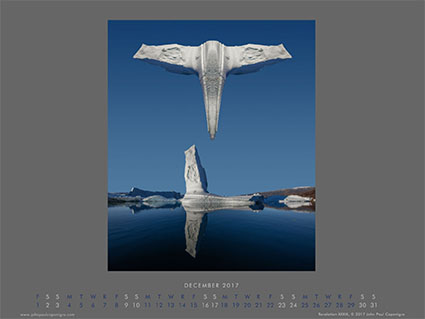
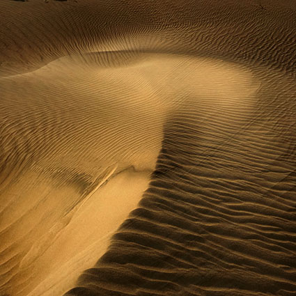
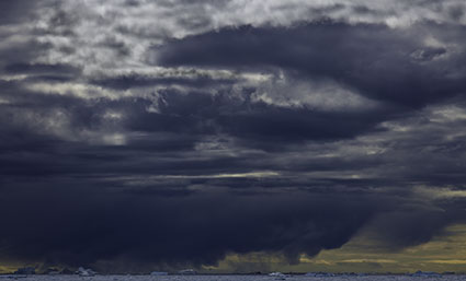
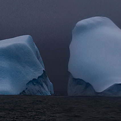
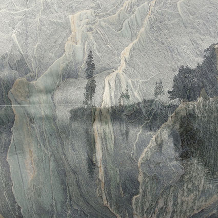
My free December Desktop Calendar features an image from Greenland’s Scoresbysund.
Download your free Calendar here.
View more images in this Series here.
Get the eBook here.
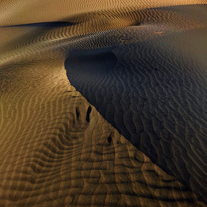
My free December Desktop Calendar features an image from Greenland’s Scoresbysund.
Download your free Calendar here.
View more images in this Series here.
Get the eBook here.

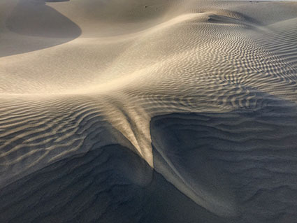
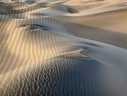

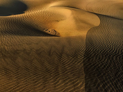
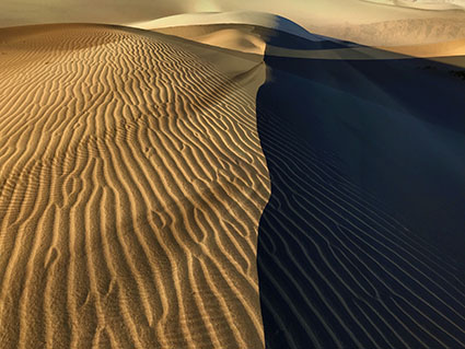
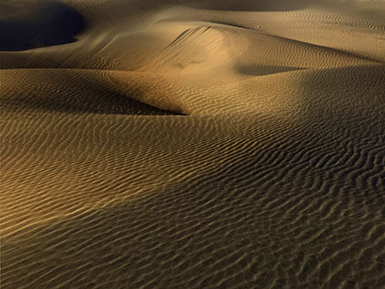


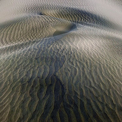
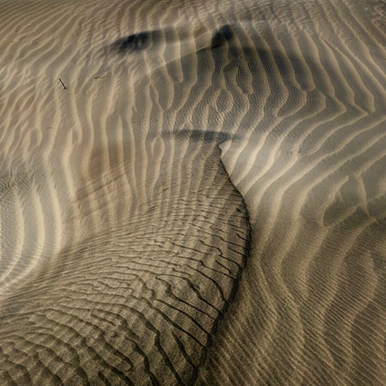

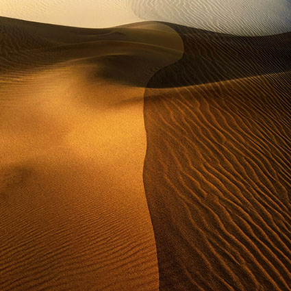
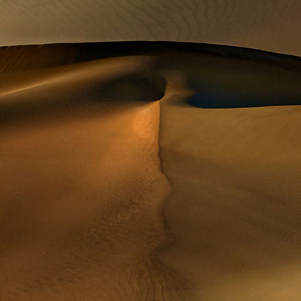
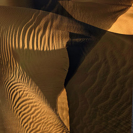
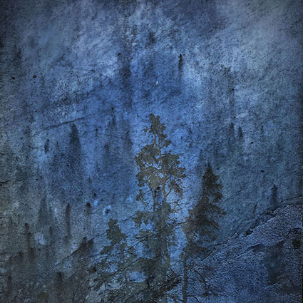
A new series of images surprised me during our recent DPD Project Death Valley Workshop. While developing another iPhone initiated project Land In Land I discovered Interference and these images ran away with me in a new direction. I anticipate both series will be expanded with DSLR exposures soon. The iPhone is a wonderful laboratory for experimentation. There is no finer sketchbook or journal. Sometimes what you thought were sketches turn into finished works.
View more images in my Gallery.
View my related series here.
Find out about Print prices here.
Noise happens. Most of the time you want to lose it, but sometimes it’s better to use it. There are many reasons to use noise in your photographs.
Detailed areas look sharper with less noise reduction.
Make Images Look Natural & Sharper
Be careful not to reduce noise so much that your images begin to look synthetic like they’ve been rendered by software rather than captured by hardware. When you need to aggressively reduce noise, you’ll find there will be times when adding back a little noise will produce more satisfying results. You can also use noise to restore a more naturalistic appearance to highly retouched areas and even synthetically rendered elements. Surprisingly, adding a touch of noise will make even slightly out of focus images appear sharper.
Reduce Banding
You can use noise to reduce or eliminate banding. Don’t confuse the linear banding sometimes produced by different output devices; this kind of banding can only be removed by maintaining the machine. However, irregular banding that follows color or tonal transitions in digital files, usually the result of aggressive image editing, often in 8 bit instead of 16-bit mode, can be substantially reduced or removed altogether by adding a little noise. Before you try this, try to identify where banding was introduced during your editing and redo those edits so that banding doesn’t occur; prevention is the best cure. Consider adding noise as a solution only when this is either unavoidable or impossible.
Unite Images From Multiple Sources
You can use noise to unify images from multiple sources with varying noise structures. One day, you may find you need to composite images with different noise characteristics, either from multiple sources (different resolutions and capabilities) or from one source used under very different conditions (different ISOs or exposure times).
First, reduce noise in each source separately, as much as possible without compromising image quality adversely. Next, using the noisiest element as a baseline, add noise to the other elements to make them seem as if they were all drawn from a single source used under the same conditions. In some cases, you may decide to have variances, small or large, in noise between different elements for creative effect. Textured elements, like the foreground in a landscape, hide noise better than smooth ones, like skies, so consider treating them differently. How far should you go? There are no formulas here as different people have different tastes and many different solutions will work within a range of acceptability. Look carefully and use your best judgment to create an effect that is pleasing or convincing to you; that’s the best way to ensure it will be pleasing or convincing to others.
Build Creative Effects
You can use noise as a creative effect. Many great photographers have used noise for creative effect. Shiela Metzner, Michael Kenna, and Robert Farber are three. Images may become more evocative because they contain noise. Many people use words like rough, gritty, nostalgic, impressionistic, mysterious to describe the effects of noise. For some, noise can be merely a gimmick (a meaningless distracting stylization unrelated to a way of seeing or relating to images) for others, noise can be a truly compelling artistic device (a meaningful element that enhances or creates a way of seeing and relating to images and thus a useful clue to artistic intention). In your images, one way or another, noise will either be there or not. Either one is a choice and a statement. So think carefully about what level of noise is most appropriate for your images.
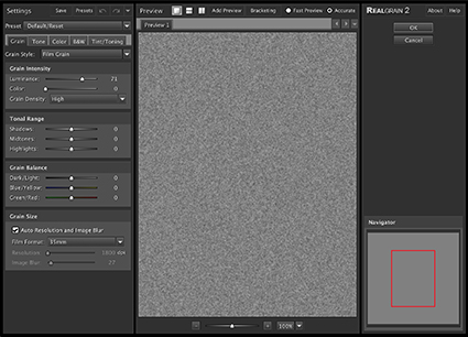
Imagenomic’s RealGrain
Customize The Look And Feel Of Noise
Noise can come in many forms. Organized or random patterns. Small, medium or large-sized or some combination of all three. Hard-edged or soft-edged. Monochromatic or polychromatic, of any hue and saturation level. Light or dark. Targeted in specific tonal ranges (shadows, midtones, and/or highlights). You can customize the look and feel of noise in your images with a relatively simple digital imaging toolset.
Photoshop offers two filters that are particularly useful for noise effects.
Noise (Filter: Noise: Add Noise) offers simple controls; Amount controls the intensity of the effect; Uniform and Gaussian control the random pattern generated; and a monochromatic checkbox. (The color of noise can be controlled more precisely with an adjustment layer. Apply noise in full color to an effect layer – 50% gray set to a Blend Mode of Overlay. Make a Hue/Saturation adjustment layer clipped to the noise layer. Use the Saturation slider to control saturation. Use the Hue slider to control Hue. You can even use the Edit pull-down menu to control a specific color of noise. For instance, to have only red noise, you can change all the blue and green noise to red.)
Grain (Filter: Texture: Grain) offers more control over the patterns generated; Regular, Soft, Sprinkles, Clumped, Contrasty, Enlarged, Stippled, Horizontal, Vertical, Speckle. All of them are useful. Horizontal and Vertical create patterns that are so regular that they are the least likely to be chosen.
After exploring these two filters, if you still haven’t found what you’re looking for, consider third-party plug-in noise generators such as Imagenomic’s RealGrain or Nik’s Color FX and Silver FX Pro.
Try Multi-pass Noise
Noise applied multiple times adds up differently than noise applied once. This is true of all filters that involve an element of randomization. In rare instances, when one application of noise won’t do the job, consider applying a filter (or filters) multiple times at reduced intensities. There are three ways you can do this. One, use a lower filter setting and apply it multiple times to the same layer. Two, apply the filter at full strength and then reduce the Opacity (or Blend Mode) by fading it (Edit: Fade) – and repeat. Three, apply a reduced application of noise to multiple effect layers. Multipass applications of noise can be particularly useful when trying to reduce extreme banding. If one pass won’t do, try two.
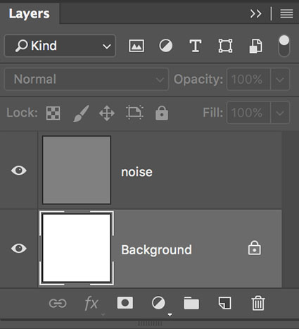
Add Noise Effects On Separate Layers
When you add noise to digital files, place it on a layer that is separate from the image(s) so you can control both independently of one another. This way you’ll have extraordinary control and flexibility. When noise is placed on its own layer you can eliminate or change it at any time in the future, reduce its opacity, localize it with masking, desaturate it, target it into specific channels, move it, scale it, blur it and much more. Here’s how to do it in Photoshop.
1 Create a new layer (Layer: New Layer) set to Overlay blend mode filled with 50% gray.
2 Filter the layer with noise (Filter: Noise: Add Noise or Filter: Texture: Grain).
3 Add a Hue/Saturation Adjustment layer clipped to the noise layer to reduce the saturation of the effect only.
4 Optionally, double click the layer to activate Layer Styles. Uncheck specific Channels to remove the noise from them. Use the This Layer sliders to reduce the amount of the dark and/or light noise. Use the Underlying Layer sliders to remove the effect from shadows and/or highlights.
5 Optionally, add a Layer Mask to the noise layer to localize the effect using either a selection,brush or gradient.
6 Optionally, use Edit:Free Transform to resize the effect.
7 Optionally, use Filter: Blur: Gaussian Blur to soften the effect. (Or use any other blur filter, like Motion Blur, to add unique distortion effects.)
You can modify the effect at any time in the future, without compromising the original image information. You’ve got a lot of options. That’s the point. You’ve never had so much control over noise – until now.
Let’s go into some of the finer points.
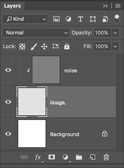
Noise can be clipped to a single layer.
Make Noise Layer Specific
You can clip noise effect layers to a single image layer. Simply press the Option/Alt key and click the line separating the two layers in the layers palette. Photoshop will then apply the noise only to the pixels on that layer. When a layer has transparency, like a retouching layer, no masking will be necessary once the noise layer is clipped to it.
Build FX Layers That You Can Use Again And Again
It can take some time and experimentation to create a custom noise you like, but once you find it, you can use it again and again. Noise on effects layers can be quickly and easily dragged and dropped between open files.
Try Noise On Image Layers
Noise builds up differently on the varied tonal structure of image layers than it does on effects layers whose pixels are all 50% gray. In most cases the difference is not significant or useful. In rare cases, it can be. In some extreme cases of banding, filtering a duplicate image layer multiple times (at lower intensities) may be helpful.
Avoid adding noise to the Background layer as long as possible. Instead, try duplicating the Background layer and then applying noise to the copy. If you have multiple image layers that you’d like to apply a single noise effect to multiple layers, you have two options. One, merge them into a new layer. Hold the Command/Control key before selecting Merge Visible from the layers palette submenu. Make sure adjustment layers are turned off and that the noise layer is moved to an appropriate position in the layer stack. Two, place the layers you want to affect into a group; pressing the Shift or Command key highlight them all and then select New Group From Layers in the layers palette submenu. Change the blend mode of the group from Pass Through to Normal, so the noise layer will only affect the layers inside the set. Finally, add the noise layer inside the group.
Explore Your Options
Take a little time to explore your options here. This toolset is relatively easy to master. The key to applying it masterfully is in looking carefully and responding sensitively to what you see. Use noise consistently in your images and you can mimic any other preexisting noise structure or customize a unique look no one has seen before. Noise is an essential quality of photographic images. With a little preparation and effort you can virtually have as much or as little of it as you like.
Check your inboxes! My newsletter Insights is out.
This issue features many valuable resources on printing.
Plus a round up of new features in Lightroom and Photoshop.
Sign up here.
Remember, your username is your email. Your password is free.
.
Adobe’s Julianne Kost and Photoshop Cafe’s Colin Smith demonstrate Adobe Lightroom Classic’s new Range Masking. (Remember, what works in Lightroom also works in Camera Raw.) Range Masking, by luminosity or color, is a significant step forward in selective or regional image adjustment during Raw processing.
Learn more in my digital photography and digital printing workshops.

Enjoy this collection of quotes on Integrity.
“Be as you wish to seem.” – Socrates
“Integrity is your destiny-it is the light that guides your way.” – Plato
“Our character … is an omen of our destiny, and the more integrity we have and keep, the simpler and nobler that destiny is likely to be.” – George Santayana
“The soul is dyed the color of its thoughts. Think only on those things that are in line with your principles and can bear the light of day. The content of your character is your choice. Day by day, what you choose, what you think, and what you do is who you become. Your integrity is your destiny … it is the light that guides your way.” – Heraclitus
“Living with integrity means…not settling for less than what you know you deserve in your relationships; asking for what you want and need from others; speaking your truth, even though it might create conflict or tension; behaving in ways that are in harmony with your personal values; making choices based on what you believe, and not what others believe.” – Barbara De Angelis
“A true leader has the confidence to stand alone, the courage to make tough decisions, and the compassion to listen to the needs of others. He does not set out to be a leader, but becomes one by the equality of his actions and the integrity of his intent.” – Douglas MacArthur
“The supreme quality for leadership is unquestionably integrity. Without it, no real success is possible.” – Dwight D. Eisenhower
“It is true that integrity alone won’t make you a leader, but without integrity you will never be one.” – Zig Ziglar
“Integrity without knowledge is weak and useless, and knowledge without integrity is dangerous and dreadful.” – Samuel Johnson
“When you are able to maintain your own highest standards of integrity – regardless of what others may do – you are destined for greatness.” – Napoleon Hill
“Integrity is the essence of everything successful.” – R. Buckminster Fuller
“Character is much easier kept than recovered.” – Thomas Paine
“Lead your life so you wouldn’t be ashamed to sell the family parrot to the town gossip.” – Will Rogers
“Real integrity is doing the right thing, knowing that nobody’s going to know whether you did it or not.” – Oprah Winfrey
“Integrity is telling myself the truth. And honesty is telling the truth to other people.” – Spencer Johnson
“Integrity is conforming reality to our words – in other words, keeping promises and fulfilling expectations.” – Stephen Covey
“Integrity is keeping a commitment even after circumstances have changed.” – David Jeremiah
“The glue that holds all relationships together … is trust, and trust is based on integrity.” – Brian Tracy
“People of integrity and honesty not only practice what they preach, they are what they preach.” – David A. Bednar
You can easily judge the character of a man by how he treats those who can do nothing for him.
Johann Wolfgang von Goethe
“Integrity gives you real freedom because you have nothing to fear since you have nothing to hide.” – Zig Ziglar
“If you don’t stand for something you will fall for anything.” – Malcolm X
“Each person must live their life as a model for others.” – Rosa Parks
“Integrity can be neither lost nor concealed nor faked nor quenched nor artificially come by nor outlived, nor, I believe, in the long run, denied.” – Eudora Welty
“I am not bound to win, but I am bound to be true. I am not bound to succeed, but I am bound to live up to what light I have.” – Abraham Lincoln
“It is curious that physical courage should be so common in the world and moral courage so rare.” – Mark Twain
“In any area of our lives where we fail to act from integrity or violate our own understanding of what is right or wrong for us, we fall prey to putting the outside world’s needs before our own. We then disconnect from the enormity of our power and our ability to create what we want.” – Debbie Ford
“The strongest thing that any human being has going is their own integrity and their own heart. As soon as you start veering away from that, the solidity that you need in order to be able to stand up for what you believe in and deliver what’s really inside, it’s just not going to be there.” – Herbie Hancock
“Losers make promises they often break. Winners make commitments they always keep.” – Denis Waitley
“Laws control the lesser man… Right conduct controls the greater one.” – Mark Twain
“Truth allows you to live with integrity. Everything you do and say shows the world who you really are. Let it be the Truth.” – Oprah Winfrey
“If it is not right do not do it; if it is not true do not say it.” – Marcus Aurelius
“Waste no more time arguing about what a good man should be. Be one.” – Marcus Aurelius
“The time is always right to do what is right.” – Martin Luther King, Jr.
“One person of integrity can make a difference.” – Elie Wiesel
“On personal integrity hangs humanity’s fate” – R. Buckminster Fuller
“If humanity does not opt for integrity we are through completely. It is absolutely touch and go. Each one of us could make the difference.” – R. Buckminster Fuller
“If everyone were clothed with integrity, if every heart were just, frank, kindly, the other virtues would be well-nigh useless.’ – Moliere
“Happiness is when what you think, what you say, and what you do are in harmony.” – Mahatma Gandhi
“If you have integrity, nothing else matters. If you don’t have integrity, nothing else matters.” – Alan K. Simpson
Explore The Essential Collection Of Creativity Quotes here.
View The Essential Collection Of Creativity Videos here.
Discover more quotes in my social networks.

PhotoPlus Expo brings together over 200 of your favorite international brands under one roof. See all the latest imaging products, previews, and more. PhotoPlus offers a wealth of seminars, panels, and reviews. Many manufacturer’s booths offer free seminars.
I’ll be presenting at the Epson booth.
Thursday, October 26
11-11:30 Julianne Kost
12-12:30 Mac Holbert
1-1:30 John Paul Caponigro
2-2:30 Mac Holbert
3-3:30 John Paul Caponigro
4-4:30 Vincent Versace
Friday, October 27
11-11:30 Julianne Kost
12-12:30 Mac Holbert
1-1:30 John Paul Caponigro
2-2:30 Matt Koslowski
3-3:30 Vincent Versace
Saturday, October 28
11-11:30 Matt Koslowski
12-12:30 Vincent Versace
1-1:30 Matt Koslowski
2-2:30 Vincent Versace

My interview with Dr. Lisa Belisle on Love Maine Radio is live!
It’s wide-ranging and soulful.
This episode also features Suzette McAvoy executive director of The Center For Maine Contemporary Art.
Listen to it here.
Check your inboxes! My newsletter Insights is out.
This issue features many valuable resources on B&W palettes.
Sign up here.
Remember, your username is your email. Your password is free.

Save 96% when you pay $117 for over $2,500 in photography videos, ebooks, software, presets, and more
Act now, this offer ends Wednesday October 18.


The resources in 5 Day Deal’s 2017 Photography Bundle come from a curated group of photographers, seasoned educators, and industry leaders. The downloadable tutorials, presets, videos, ebooks, and tools are all yours to keep forever.

Help Others In Need
10% of all proceeds are donated to various charities. Since 2013 5 Day Deal has raised more than $1,000,000 for charity. And, during checkout, you’ll have the opportunity to double the amount donated to charity and as a bonus, you’ll receive more than $500+ in additional eBooks and resources! To learn more about this year’s charity partners click here!

Save More With Discounts
Plus, 5 Day Deals’ sponsors, contributors, and pros put together a collection of discounts exclusive to their subscribers.
You can also enter to win a $10,000 prize give-away.
WOW!
4,500 minutes of training, 1,400 presets and actions, 340 videos, and ebooks plus discounts. It’s an overwhelming wealth of resources at a ridiculous discount.
So how do you decide whether to purchase it or not?
Look for the items you’ll definitely use and when the value of the items on your list exceeds $117 – buy it. After that great deal, everything else sweetens it even more.
Start by looking here.
David DuChemin’s After The Camera post-production video course.
Trey Ratcliff’s Complete HDR video.
Joel Grimes Portrait On Location videos.
Get Adobe’s Creative Cloud for less than $10 a month.
Save 30% on any Rocky Nook ebook.
Save 30% on Think Tank bags.
Save 30% at Amazon.
Save 20% at Adorama.
Save 20% at B&H.
Save 15% on Topaz software
Save 15% on everything in Lindsay Adler’s store.
Save 15% on Photomatix software.
Save 10% on Aurora software.
Save 10% on DJI drones.
Get 5 Day Deal’s 2017 Complete Photo Bundle here now.