Use Text To Enhance Your Photo Book

typesoftext
Photography books are often greatly enhanced when text is included. There are many types of text that can complement your images. Here are a few classic examples.
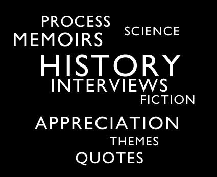
– facts about a subject
– history of a subject
– placing the images in an art historical perspective
– tracing influences
– appreciation expressed by an authority
– process descriptions
– project development
– thematic essay
– interviews of authorities
– interviews with the artist
– personal memoir
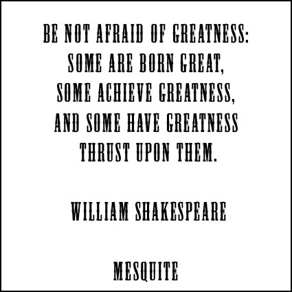
– excerpted texts with relevant themes
Include more than one of these types of text and you’ll offer a reader a more diverse perspective.
Whether it’s a little or a lot text complements photographs, making a presentation more powerful.
Next time you make a book of your images, ask yourself, “What kind of text would enhance this book?”
Find recommended reading on bookmaking here.
Learn more about books with these online resources.
Learn more in my upcoming Blurb seminar.
Learn more in my Fine Art Digital Printing Workshops.

Many Uses For Books

typesofbooks
There are many different kinds of books because people use books to do many different things.
– Share content
– Make a durable record (whether history or memento)
– Support an inquiry
– Produce a catalog to facilitate and create orders
– Enhance a proposition with added value
– Give away a leave behind
– Make an impression
– Gratify an ego
Can you think of other uses? Comment here!
Identifying your goals for your next book project will affect the choices you make at every stage in its creation and ultimately make it more effective.
When you produce your next book, ask yourself what function you want your book to serve?
Find recommended reading on bookmaking here.
Learn more about books with these online resources.
Learn more in my upcoming Blurb seminar.
Learn more in my Fine Art Digital Printing Workshops.

Comparing Blurb's Quality to Offset

blurquality
In its few year history, Blurb’s quality has improved tremendously.
How does Blurb’s print-on-demand quality compare to standard web offset press quality? Blurb delivers better quality than most offset presses where careful attention is not paid to production. Blurb doesn’t meet the best carefully overseen offset quality.
Common problems with Blurb printing include printing dark with some shadow detail loss, inconsistent neutrality and graybalance, and slight banding. Blurb’s dot structure or line screen is average, which is somewhat coarse in comparison with the finest 300 line screen offset. Blurb offers slightly better saturation compared to offset, but not six color hi-fi offset. The problems you encounter with Blurb are all common problems with offset printing if it’s not carefully overseen, which is common.
Oversight is one of the challenges with print-on-demand paradigms. It’s not practical to proof a book of one. It’s not practical to proof it again six months later with the next order. It’s unrealistic to expect an extremely low volume run to compete with a high volume run. In a high volume run, time and materials are allocated to test press conditions, carefully proof content before final printing, and maintained during a run of hundreds or even thousands. That’s why offset runs are only cost effective if you’re making a lot of books and that drives initial costs much higher and per unit costs much lower. Blurb’s offers extremely low initial costs but higher unit costs.
The Blurb revolution makes some books, that otherwise might never have been made, a reality
So, how good is Blurb’s quality?
Good enough.
And getting better all the time.
Find my Blurb book Antarctica here.
Find out about my Blurb seminars in New York April 29 and Toronto May 15.
Learn more in my Fine Art Digital Printing Workshops.
Use Space – Tracking & Leading

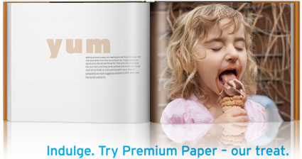
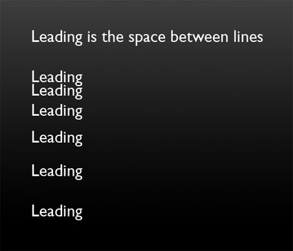
Use space to improve your design. There’s the space around blocks of text – margins. And there’s the space between elements of text – tracking and leading. Tracking is the space between letters. Leading is the space between lines. If tracking and leading are too tight, words appear cramped and are harder to distinguish from one another. If tracking and leading are too loose, units of text fall apart into separate units. Use enough space to help text rest gracefully on the page and breathe, but not so much space that it weakens the relationships between separate pieces and they drift apart.
tracking3
leading
Find books on design I recommend here.
Learn more in my Fine Art Digital Printing Workshops.
13 Go To Fonts, 7 Fonts to Avoid

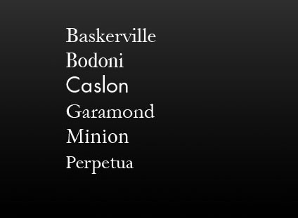
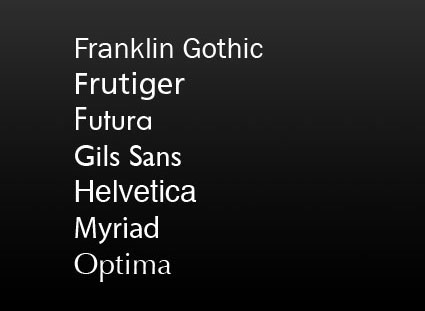
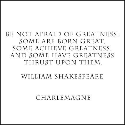
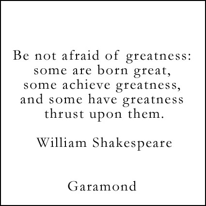
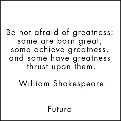
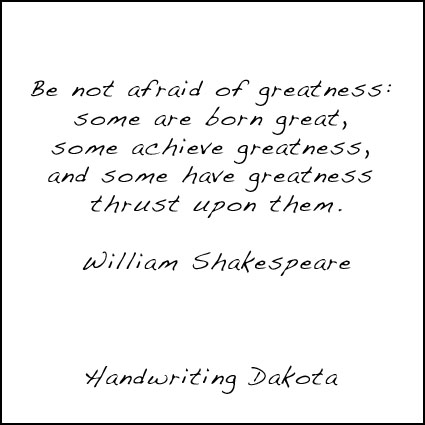
Whether you’re designing for a book or a presentation choosing the right type face is important. The font you choose helps shape the tone of what you create. As with any endeavor, it helps to have a trusted resources you can always turn to.
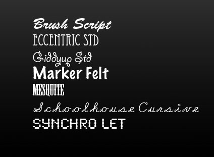
Here are my go to serif and sans serif fonts … and a few I steer clear of.
serif
sanserif
stylized
Serif and san serif and the most common kinds of fonts. Serif fonts have a classic feel. Sans serif fonts set a contemporary tone. Decorative or display fonts have a great deal more flair and are generally best used for signage; it takes the right project and a great designer to use them well in other applications. Design is typically best used as a support for content, not a distraction from it or a substitute for it.
Find books on design I recommend here.
Learn more in my Fine Art Digital Printing Workshops.
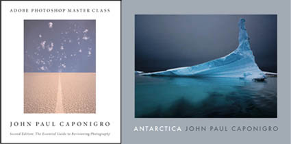
Use PDFs to Make Blurb Books

blurbpdf
Want to design your Blurb book with something other than BookSmart.
Want to use InDesign or Quark?
Make a PDF with them.
Then make a Blurb book from the PDF.
This way, you’ll have all the refined control of professional design software and still get print-on-demand books from Blurb.
Learn more about Blurb PDF workflow here.
Watch 3 helpful videos here.
Check out these great design books I recommend.
Find my Blurb book Antarctica here.
Learn more in my Fine Art Digital Printing Workshops.
Blurb Widget Makes Online Book Previews Easy


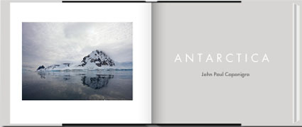
Blurb’s new book preview Widget lets you preview as much or as little of your Blurb book as you like online. You can embed it on any blog or webpage.
Visitors can view your book as a virtual page turning book or as thumbnails.
They can check Full Screen for a larger preview.
They can click the Share button and help you spread the word.
They can click the Comment button and give you instant feedback.
Or, they can click the Purchase button and get a copy of your book.
BlurbWidgetGrid
BlurbWidgetPage copy
This HTML code generates the widget.
<object classid=”clsid:d27cdb6e-ae6d-11cf-96b8-444553540000? width=”425? height=”300? codebase=”http://download.macromedia.com/pub/shockwave/cabs/flash/swflash.cab#version=6,0,40,0?><param name=”allowFullScreen” value=”true” /><param name=”allowScriptAccess” value=”always” /><param name=”src” value=”http://www.blurb.com/assets/embed.swf?book_id=1244722? /><param name=”allowfullscreen” value=”true” /><embed type=”application/x-shockwave-flash” width=”425? height=”300? src=”http://www.blurb.com/assets/embed.swf?book_id=1244722? allowscriptaccess=”always” allowfullscreen=”true”></embed></object>
You can scale the display by changing the dimension numbers.
It’s easy to implement and use.
Here’s more on how to install the widget.
Find out more about how to Share, Promote, Sell your Blurb books here.
Learn more in my Fine Art Digital Printing Workshops.
Blurb's Photography Book Now Contest Is Open

PhotographyBookNow2010
Blurb’s 2010 Photography Book Now contest is open through July 15, 2010.
Now it’s in its third year, this international competition celebrates the most creative, most innovative, finest print on demand photography books – and the people behind them.
Showcase your work to a jury of internationally-renowned judges – editors, publishers, photographers, and gallery owners.
Enter your books in one or more of three categories – Fine Art, Editorial, and Portfolio.
The grand prize is $25,000.
Find out more here.
See the 2009 winners here.