7 Things To Look For In Great Prints & Great Artists Who Make Exceptions

Classic prints exhibit sharp focus, extended depth of field, high dynamic range, pronounced contrast, and idealized color.

Reduced dynamic range, often with greatly reduced saturation, sometimes with reduced sharpness, occasionally with vignetting, and infrequently material process artifacts, printed on matte surfaces at small scales classically connotes historic photographic processes. 


Half of the battle is knowing how to do something. The other half is knowing what to do. So when it comes to making fine photographic prints, it helps to know what to look for.  A combination of elements (and their relationships with one another) is often evaluated when assessing print quality. When you depart from these standards you call attention to those elements, for better (intentional) or worse (accidental). Stack up too many exceptions and technique becomes a deal-breaker. Stack up enough well-crafted elements and technique becomes a deal maker. Speaking very broadly, you could say the goal is to clearly reproduce detail and minimize distractions from it. Let me get more specific.

1    Focussed

The default stance of a photograph is for everything to be in focus; critical focus is achieved (focal plane placed on the most important subject), depth of field is deep (aperture stopped down), motion blur is non-existent (high shutter speed). Blur is seen as an unfortunate product of poor tools and/or technique.

Exceptions

When exceptions are made, to work they need to appear obvious, deliberate, and be repeated in more than one image. Motion blur (from the subject or the camera) may be used to enhance gesture. (See Ernst Haas or Alexey Titarenko.) Selective focus may be used to direct attention away from less important elements toward more important elements. (See Keith Carter.) Soft focus may be used to reduce distracting detail and/or create impressionistic effects. (See Julia Margaret Cameron or Edward Steichen.)

2    Sharp

Sharpening (analog and digital) can be used to enhance focus by making lines and textures more pronounced. Push sharpening too far and an image begins to look graphic rather than photographic. Contours (bright halos and dark lines) may be accentuated unnaturally. Noise may become apparent. Texture may become overly crisp or even brittle. 

Exceptions 

So how crisp is too crip? That’s a matter of style, which follows intention. There’s a great gulf between Richard Avedon’s (extremely sharp) and Joyce Tenneson’s (soft) photographs. Both use more or less than standard sharpness expressively.

3    Low Noise

Noise is typically minimized. It can be reduced during capture (Use lower ISOs.), editing (Avoid aggressive contrast and/or sharpening.), or output (Use fine printer resolution and ink limits appropriate for the substrate used.).

Different types of images will present different limits. Noise becomes more apparent in smooth subjects and is often hidden in highly textured subjects. You may even elect to reduce noise during post-processing more in smooth areas than textured areas. A lot of noise becomes distracting. A little noise isn’t bad; it often makes an image appear sharper.

Exceptions 

Photographers like Sheila Metzner and (early) Michael Kenna have used extreme noise to emphasize medium and create compelling atmospheres.

4    Gradation

Gradation, or the ability to reproduce smooth tonal transitions continuously without posterization, is prized. Harsh tonal transitions quickly make an image appear graphic and sometimes even abstract, reducing the illusion of volume /space and calling attention to contours. 

Exceptions 

Photographers who have been successful with high contrast photography, like Anton Corbijn and Mario Giacomelli, take it to an extreme.


Insights Members can login to read the full article.
Email:
or Sign up

A Checklist OF Things To Look For In Prints

antarctica2016_3_425
When you’re evaluating print quality, knowing what to look for is almost as important as knowing how to achieve it. Many technical factors contribute to print quality. Here’s a list of things to look for when you’re evaluating print quality – yours and others’.
It’s not that every one of these factors has to be optimal to achieve great print quality. It is that every factor you optimize enhances print quality further.
Well Focused
No Motion Blur
No Sharpening Artifacts
Extended Depth Of Field
Extended Dynamic Range
Appropriate Lightness
Highlight Detail / Separation In Values
Shadow Detail / Separation In Values
Mid-tone Contrast
Gradation
No Posterization
Low Noise
No Noise Reduction Artifacts
 
Believable Color … or … Color Transformed With Intent
Color Without Artificial Color Casts
Variation In Single Colors
Saturated Color
 
Appropriate Materials
Appropriate Scale
Appropriate Presentation Materials
Appropriate Contextualization
Appropriate Price
So what’s ‘appropriate’? That all depends on the statement being made. The real question is, “What is the artist trying to do? And how well did they achieve that?” You can successfully break the rules if you break them for a reason.

My 12 Best Selling Images

Oriens

1

Oriens, 1999

Selva Obscura VI

2

Selva Obscura VI, 2002

Oriental II

3

Oriental II, 2000

Correspondence - Nocturne - XII

4

Correspondence XII – Nocturne, 1999

Reflection I Adagio

5

Reflection I – Adagio, 1999

Condensation II - Prelude

6

Condensation II – Prelude, 2001

Correspondence - Sonata in Blue -III

7

Correspondence III – Sonata in Blue, 1999

Refraction X

8

Refraction X, 2002

Exhalation I

9

Exhalation I, 1996

Resonance in Red and Gold IB

10

Resonance IB – in Red and Gold, 2000

Resonance in Blue and Gold IA

11

Resonance IA – in Blue and Gold, 2000

Wake I

12

Wake I, 2004

Enjoy this collection of my twelve best-selling images.

Click on the links to find their current prices.

Find out more about my editions here.

Find out about new releases here.

Ink

It’s complex chemistry

The science of ink formulation is one of the most significant, if not the most significant, factors driving the current inkjet revolution. Ink is complex chemistry. It’s colorants (dye or pigment varying in type and density), resins (protecting colorants and reduce metamerism), mediums (suspending the colorants), solvents (increasing viscosity to deliver it through tiny nozzles), and drying agents (decreasing drying time and reducing dot gain).

Consider the currently reigning inkset for professional photographic inkjet printing – Epson’s UltraChrome HDR. Epson UltraChrome HDR ink’s exceptional pigment density delivers supersaturated colors and dense blacks unprecedented in photographic output, able to be delivered in small droplet sizes (2-6 picoliters – a picoliter is one billionth of a billionth of a liter), smaller than the width of a human hair, so quick drying that droplets form a precise dot and prints emerge from printers essentially dry, water and ozone resistant pigment is encapsulated to reduce light refraction and abrasion. High Gloss Microcrystal Encapsulation Technology is formulated into the inkset’s suspension technology to make the print surface more uniformly reflective despite dramatic variances in ink density throughout a print. While counteracting the tendency for gloss to reduce as pigment content increases, gloss-optimizing additives also increase translucency allowing higher ink density and chroma.

Epson still leads the inkjet revolution. Recently, there are competitors whose newest solutions and their immanent evolutions deserve serious consideration and monitoring – Canon’s Lucia inkset and HP’s Vivera inkset.

Epson K3 on matte and luster

Dye vs pigment

While there are profound differences between dye-based and pigmented inks, the differences in image quality are frequently overstated and sometimes misstated. Years ago, pigmented inks suffered from reduced gamut (saturation) and dmax (maximum density or black) and increased metamerism. Today the differences lie largely in the areas of longevity and durability, where pigment still reigns supreme. (Cost may also be impacted, as dye inks are typically less expensive to manufacture.)

Multiple inks

To improve gamut and dmax manufacturers have been adding more inks to inksets; alternate colors (variants of offset’s high-fi orange and green, light cyan and magenta, or red, green, and blue) and additional blacks (blacks optimized for matte and glossy surfaces, light and medium blacks or grays) are used in combination with CMYK.

Do more inks yield better image quality? Typically. But not necessarily. Image quality is the result of a combination of a number of factors. To assess print quality, you have to assess the total printing solution – ink, profile, rendering intent, driver, screening algorithm, ink limit and substrate. Compare gamut, dmax, ISO brightness, neutrality, graybalance, metamerism, gloss differential, bronzing, gradation, fine line detail, longevity and durability. Both the physical makeup of ink and its application are important.
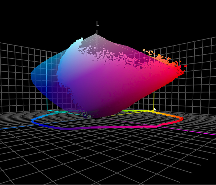
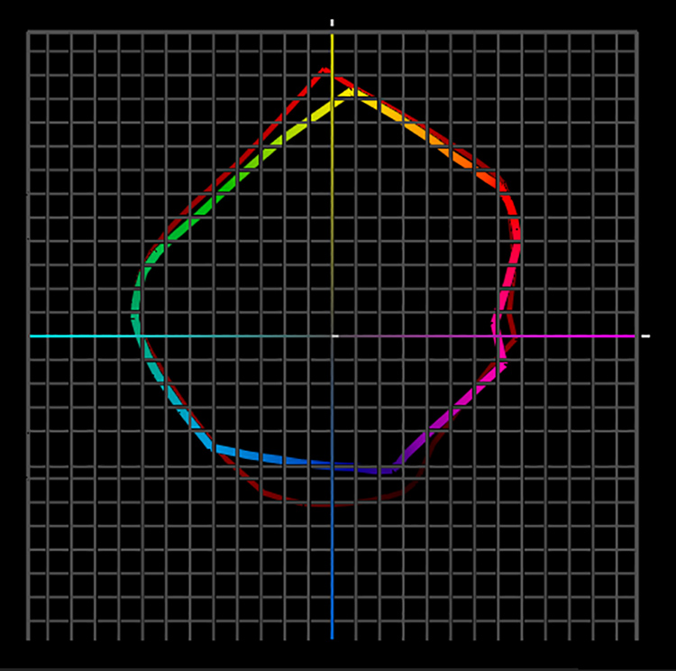
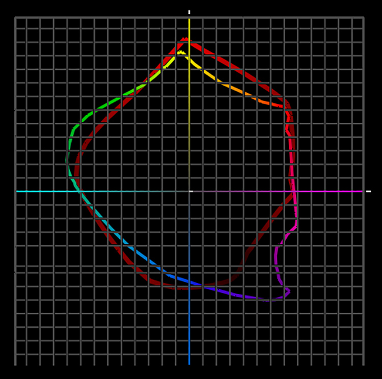
Gamut and dmax

The impacts of increased gamut and dmax are both easily seen. Gamut has a dramatic impact on color but not black-and-white print quality – more saturated color. Dmax has a tremendous impact on both color and black-and-white print quality – blacker blacks.

What is not obvious is that greater dmax extends gamut by increasing the saturation of dark colors.

Dmax and gamut figures for inkjet prints are at a photographic all time high. Both significantly exceed traditional print materials. (Dmax – silver gelatin 2.35, Epson UltraChrome HDR 2.45, Canon 2.5.)

Neutrality and graybalance

Inksets with multiple black inks not only deliver the best dmax, they also deliver the best neutrality and graybalance (consistent tint throughout the tonal scale). Producing truly neutral and consistently neutral colors with supersaturated inks is quite challenging; black ink becomes a stabilizing factor. While ink is an essential factor, it is not the only factor – driver’s and profiles play a significant role.

Highlight detail

Light inks, including light black inks, aid in the reproduction of highlight detail. They hold detail with not just smaller but also less visible dots.

Metamerism 

 Metamerism can be reduced with multiple black inks and heavier black plate generations (using more black ink to reproduce the image). Metamerism can be minimized by reducing the use more metameric saturated inks and increasing the use of less metameric neutral inks. Metamerism can also be subdued by coating irregularly shaped pigment particles with polymers, making surfaces more uniform and reducing light refraction. 

Gloss differential 

Gloss differential is an uneven sheen due to varying ink densities in highlights and shadows that affects glossy surfaces significantly more than matte surfaces. Gloss optimizing additives are incorporated into ink formulation to dramatically reduce gloss differential. It goes where ink doesn’t. It also counteracts the tendency for gloss to reduce as pigment content increases. It goes where ink doesn’t.

Sprays, coatings, and varnishes applied after printing can also help reduce gloss differential. When using these types of non-native chemistry guard against staining and poor adherence, the tendency towards additive failure (reduction of gloss, dmax, or gamut), and possible reductions of longevity. (Download a free PDF review of PremierArt’s PrintShield sprays at www.johnpaulcaponigro.com.)

Bronzing 

Inkjet prints may display bronzing (an iridescent flash of colors seen at different viewing angles particularly noticeable in neutral areas). Heavier black plate generation and alternate screening frequencies (dot placement) dramatically reduce this. 

Longevity

Dye ink achieves significant lightfastness and ozone resistance only with a limited choice of swellable papers, which are not water-resistant and prone to running in high levels of humidity. (Epson’s new Claria ink is an exception whose longevity ratings approach 100 years on a wide variety of substrates.) Pigmented ink offers superior longevity and durability with lightfastness, water and humidity resistance, and ozone resistance on all media (swellable, porous, rag). Inkjet longevity ratings are reaching new highs in photography (for color108 years, 166 years with PremierArt Spray – for black-and-white 284 years and 312 years with PremierArt Spray). (See wilhelm-research.com for more information.) Longevity is derived from a complex set of factors chemistry, adherence, lightfastness, and exposure are a few of the key elements. Where longevity is a concern, use tested materials whenever possible.

Durability 

Durability can be seen as separate from longevity or an extension of it. Ink plays a role. Pigmented inks are prone to scuffing and burnishing. Sprays can reduce this tendency somewhat. Related issues such as scratching, cracking, flaking involve ink but are often more attributable to substrate. Handle with care.

Switching inksets

Choosing an inkset limits or determines your choice of printer model. While some printer models can accommodate more than one inkset (generally not simultaneously), printers are usually designed for a specific inkset.

Avoid switching inksets in the same printer, such as dye with pigmented or the printer manufacturer’s inkset with a third-party manufacturer’s inkset. Don’t confuse this with swapping inks within the same inkset, such as different ink cartridges of the same ink or different black inks designed for specific substrates, such as matte and glossy. Different inksets inevitably contaminate one another producing unreliable results and frequent clogging. If you do switch inksets, be sure to thoroughly flush a printer of all residual ink before installing a new ink type.

Epson K3 verus Canon Lucia

Third party inks

There are a number of third-party manufacturers who produce both dye-based and pigment-based inks – Lyson, MIS, Generations, ConeTech, etc. It’s nice to have a choice. Many users are happy with them. While these inksets often offer significant savings over the printer manufacturer’s inksets, I’ve never been as impressed with the quality they deliver. Third-party inks are prone to clogging. Longevity is often questionable. Using them sometimes voids the warranty on your printer. Buyer beware.

The bottom line

While it is only one factor you should consider when evaluating print quality, ink is of paramount importance. Choosing an inkset is one of the most important decisions you can make when selecting tools and materials to make fine prints with. Research your options thoroughly and explore all the related variables carefully before committing your images to print. Continue monitoring this rapidly evolving field. Its arc has been so stunning that in less than a decade, inkjet printing has changed the nature of the photographic print.

Read more on digital Printing here.

Learn more in my digital photography and digital printing workshops.

Is It A New Or Updated Edition?

Framed_Square_RevelationXLIII_425

Revelation XLIII

Digital technology offers interesting new possibilities for print editions.

The appearance of the print may change.

It has long been an accepted practice that artists will change the rendition of their images over time.

Ansel Adams famously remarked,  “The negative is comparable to the composer’s score and the print to its performance. Each performance differs in subtle ways.” You can view the changes in Ansel Adams’ classic Moonrise Over Hernandez here. Some collectors search for the optimum print made in an artist’s lifetime, while others collect multiple prints to create a meaningful comparison.

The composition may change.

Similarly, it’s been accepted that a composition may vary if cropping is adjusted during printing, though typically this is a matter of fine tuning rather than dramatic change. Today, with composites, the composition may change by replacing components, often dramatically changing the composition.

I’ve released composited images and later changed the composition substantially.

In the following to image, Voyage Of Grace, the feather at the top of the waterfall was at the bottom of the waterfall in the first print sold. I chose not to start the edition again because it was not a substantially different statement. The one collector who has that print has a unique item with exceptional value. (I do offer print replacements for a fee, which the collector has not chosen to exercise.)

Voyage of Grace

Find out more about this and related images here.

Updated Or New Edition ?

For me, the question of whether to replace one edition with another or to issue a new edition is an interesting one. It’s one that my father – a traditional analog photographer – and most photographers of his generation do not have to address. New possibilities bring new challenges.

There are times when related but distinctly different images warrant a new edition.

The following two images are made from separate single exposures of the same subject made at approximately the same time, but their compositions and intent are quite different; one is straight and representational, the other is composited and surreal.

Antarctica XXXVIII

The straight image

View the straight series here.

Revelation XLIII

The composite

View the composited series here.

The two editions both complement and contrast with one another in ways that build value in each edition. In general, when you can align the interests of the artistic statement with the interests of the market, you’ve got a winning combination.

Find out more about my print editions here.

Sign up for my newsletter Collectors Alert here.

Download my free PDF on Editions here.

Learn more in my digital photography and digital printing workshops.

Watch Me Demo Softproofing & Proofing


Recently on TWIP’s (This Week In Photoshop) The Fix I spoke with Jan Kabili about the power of printing your photographs. Then I demonstrated how to get the best results possible with Softproofing & Proofing practices. Watch this and you’re sure to get better prints in less time with less waste.
Find more useful videos on TWIP’s The Fix here.
Read more with my free Color Management and Printing resources.
View more in my DVD series R/Evolution.
Learn more in my digital photography and digital printing workshops.

The Best Deal I've Ever Offered On My Prints

IlluminationXXXI_425
Members of my newsletter Collectors Alert just received a very special offer. Two prints for one very low price. It’s the best deal I’ve ever offered.
Collectors Alert will give you previews of new images, tell you the stories behind them, offer you special discounts, and alert you about upcoming exhibits and publications.
Sign up for my newsletter Collectors Alert here.

Inquire by emailing me at jpc@johnpaulcaponigro.com.