The Fine Art Of Digital Printing

Download your free copy now!


Print your images to achieve new levels of mastery and personal expression.


Dano’s Glossary of Fine Art Terms 


Looking


6 Benefits Of Making Prints – Video

12 Things To Look For In Great Prints – Video


What Printing Can Do For You

What Printing Can Do For Your Images

How To Strike Up A Lively Conversation With Your Images

How To Map Out A Strategy To Develop Your Photographs | Coming

Save Time, Money, And Resources With These Checklists

7 Things To Look For In Great Prints & Great Artists Who Make Exceptions

9 Ways To Tell If Your Photographs Are Over Cooked

12 Classic Mistakes We’ve All Made Trying To Make Better Prints

How To Avoid 6 Printing Mistakes That’ll Make You Want To Curse

How To Key Your Images Expressively – Go High, Medium, Or Low

How To Avoid Making Viewers Squint At Your Prints To See Their Highlights

The Key To Lively Images –  Midtone Contrast – And How To Get It

How To Render Lively Shadows In Your Prints


Resolution  Free to Members
Learn how resolution can ensure fine detail and smooth transition.

Outgassing  Free to Members
Let your prints dry fully before framing them.

Metamerism
Metamerism is the tendency of an object to change its appearance under different light sources.

Bronzing 
Bronzing is an iridescent flash of color when viewing prints under varying angles of light.

Gloss Differential 
Gloss differential is an uneven reflectance of the surface of a print.

Banding  Free to Members
Eliminate mechanically introduced fine lines in your prints.

Longevity & Durability  Free to Members
How long do inkjet prints last? What should you do to protect them? Find out here.


Tools


Why Your Tools Matter When Printing
This big overview gives you the bottom line – and links for more depth.

Ink
Choose media wisely.

Paper / Substrate
Your choice of materials has a profound impact on your prints.

Paper Sizes – Standard   Free to Members

Paper Size – Custom   Free to Members

Make New Film | .99
Printing digital negatives with Adobe Photoshop (all versions) – 6 pages
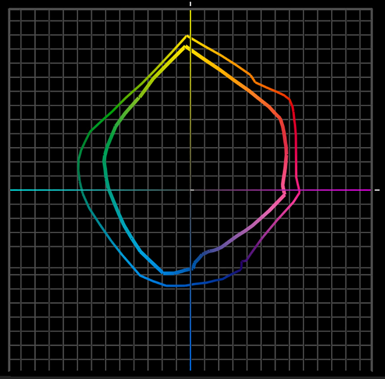
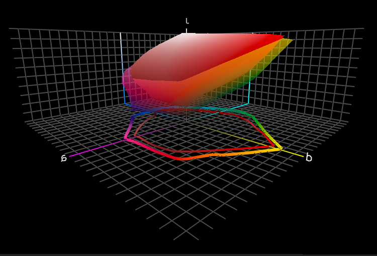
Printer Profiles
How do you make a printer profile? When do you need to?

Printer Points of Control   Free to Members
You have a number of points of control with digital printers.

Printer Maintenance  Free to Members
A little maintenance can go a long way!


Epson


Epson Driver – Color 

Epson Driver – Advanced B&W Photo

Epson Driver – Double Color Management

Epson Driver – Ink Limit  Free to Members

Delete and Reload Printer Driver  Free to Members

Epson – Print / File Size Chart   Free to Members
The relationship between print size, file resolution and bit depth for Epson printers.


Presentation


Scale  Free to Members
Size matters. Consider the size of your prints with care.

Signing Prints
Use the best tools to ensure your signature lasts. 

Notation  Free to Members
The notations you make on your prints add value to them.

Mounting  Free to Members
Ensure that your prints are protected and beautifully displayed.

Matting  Free to Members
Make sure your images are protected and presented properly.

Framing  Free to Members
The frames you choose will enhance the quality of your artwork.

Exhibiting  Free to Members
Make your experience more successful by knowing what is required.


Masterworks In My Collection


The Importance Of Viewing Masterworks

Paul Caponigro – Apple, New York City, 1964

Ansel Adams – Clearing Winter Storm, 1944

Jerry Uelsmann, Nude, 1983

Joyce Tenneson – Kristin, Hands In The Air, 1998

.

Photographers Celebrate The Print


Two Generations – Paul & John Paul Caponigro 

John Paul Caponigro 

Jeremy Cowart

Gregory Crewdson

Lois Greenfield 

Gerd Ludwig 

Steve McCurry

Mark Seliger 

John Sexton 

Tim Tadder 

Amy Toensing 

Stephen Wilkes 

.

Bambi Cantrell

John Paul Caponigro 

Douglas Dubler 

Greg Gorman 

Jay Maise

Steve McCurry

Jeff Schewe


John Sexton 

Kim Weston 


Sign up for Insights for news of new content!

Paper / Substrate

Epson K3 ink on Luster and Watercolor compared


There’s an art to making paper. Since its invention, thousands of years ago, paper has had a long and interesting history. There are many ways to make paper and many kinds of paper. We’ve found many ways to use paper – architecture, furniture, crockery, fashion, sculpture, and of course the display of text and images in a variety of forms. Contemporary printmakers don’t print exclusively on paper. There’s also canvas, wood, metal, and plastic too. Anything you print on could be considered a substrate.

Substrate dramatically impacts print quality.

Substrate determines white – ISO brightness. The white of the substrate determines the brightest values achievable and the quality of the highlights in a print. Some substrates have bright cool whites, while others have duller warmer whites, some are so dull they look antique. Short of bleaching or coating a substrate with a brighter substance, this is something you can’t change about the substrate.

Substrate has a dramatic impact on ink limit, how much ink can be put down before detail begins to be lost. Droplets of ink spread when they come in contact with paper and dry. Dot gain specifies how much a dot spreads. A dot spreads more on an uncoated paper than it does on a coated paper. A dot spreads more on a matte paper than it does on a glossy paper. Consequently, fine detail is more precisely rendered on coated glossy surfaces. In addition, very smooth surfaces render subtler gradations, without interference from ink spattering or textured surfaces.

Ink limit has a dramatic impact on black – dmax. More ink, blacker black, higher dmax ratings. Using Epson UltraChrome II ink, dmax on glossy papers is approximately 2.4, 1.8 on matte papers. 

Ink limit has a dramatic impact on saturation – gamut. More ink, more saturated color, wider gamut. It’s important to understand where gamut is extended. The dmax and gamut on glossy papers is greatly expanded in the shadows and minimally reduced in the highlights. Put another way, glossy papers render significantly more saturated shadows and slightly less saturated highlights. 

Most inkjet substrates are coated. Coatings involve complex chemistry. Coatings reduce the spread of ink, allowing less of it to sink into the base and more of it to sit up on the surface. Most coatings contain drying agents to increase drying time and reduce dot gain. Many coatings contain optical brighteners to render brighter, cooler whites and more saturated colors. Some optical brighteners actually fluoresce, emitting more light than they receive. You can tell if there are a lot of optical brighteners on a substrate if you view it under a black light and it glows. Many optical brighteners are not stable and prints made with them typically display reduced longevity ratings. If print permanence is a significant concern avoid them.

Substrate has a dramatic impact on longevity. Different substrates yield different longevity ratings. If longevity is a significant concern, research the most current data. Visit Wilhelm-research.com for a wealth of information from one of the most definitive and respected resources. Remember, when comparing data on longevity from a variety of sources, testing conditions must be comparable for comparisons to be valid.

For best results, print on the coated side of a substrate. How can you tell? If you can’t tell from the orientation in the manufacturer’s packaging and you can’t see a manufacturer’s logo on the back of the paper, wet your lips and press the paper in between them, the side that sticks most is coated. A few papers are coated on both sides. Printing on the uncoated side typically yields soft under-saturated results. Printing on uncoated papers yields similar results. You can coat your own custom substrates with products like Ink Aid. (See my review at www.johnpaulcaponigro.com.)

Today, you have an amazing array of substrates to choose from. The astonishing array of choices available for inkjet printers today should suit almost every need. With a single printer, you can print on surfaces that span the gamut, from matte to glossy. You’ll find fiber, plastic, and metal. Uncoated, hand-coated, mechanically-coated. Machine-made or hand-made. Silk, canvas, foil, and transparent mylar don’t seem exotic in comparison to the most unusual substrates people have tried to feed through their printers. I encourage you to experiment. Use some caution in your explorations as very fibrous substrates may clog print nozzles and you can damage print feed mechanisms with very thick substrates. While I don’t recommend you use third-party inksets, I do recommend you test third-party substrates. Because of the enormous industrial infrastructure required to mass-produce paper, most printer manufacturers don’t make their own substrates but instead partner with paper manufacturers to produce materials to their specifications. There are many fine companies that make papers specifically for inkjet printing; Arches, Cranes, Hahnemuele, Ilford, Innova, Legion, Moab, Museo, and Pictorico are just a few. New materials are being released every year. Some have unique characteristics. My recommendation is that you test many substrates. Make test prints using a representative image that contains the full spectrum and includes a neutral step wedge with specific values that will help you determine minimum and maximum printable densities. There’s only one way to truly find out how the look and feel of a substrate will impact your work – use it.

Above all, remember that looking is a sensual act. Aesthetics may win out over technical considerations. While it’s useful to identify quantitative criteria (such as ISO brightness, dmax, gamut, ink limit, and dot gain) other qualitative aspects of a substrate may be as or more important. Substrates come in various weights; some are so thick they don’t need mounting while some are so thin you can see through them. Substrates have different textures; some are wavy or ridged, some are woven or cratered, some are fibrous or fuzzy, some are very smooth. Some substrates have distinctive edges, such as deckling or excess fiber. Substrates have different reflectivities; some are so glossy they are mirror-like reflecting everything in front of them as well as within them, while others are extremely matte exhibiting no surface reflections. The material characteristics of a substrate may carry specific connotations; one may look synthetic while another looks organic, one may seem commercial while another seems artistic. These qualities, in combination with one another, may be extremely useful for enhancing the expressive characteristics of your prints.

Research your options thoroughly to help you make more informed decisions before you commit your images to print. It will be time very well spent.

Read more on digital Printing here.

Learn more in my digital photography and digital printing workshops.