The Sense Of Time
Wednesday, Dec 10 @ 8pm EST
Register Now
Creativity Continues at Santa Fe Workshops with The Sense Of Time, a conversation between Shiela Metzner and John Paul Caponigro.
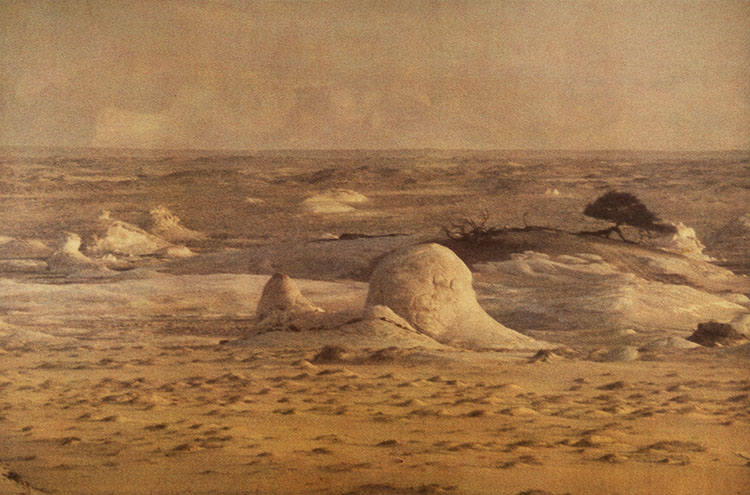
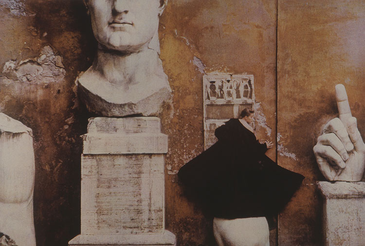
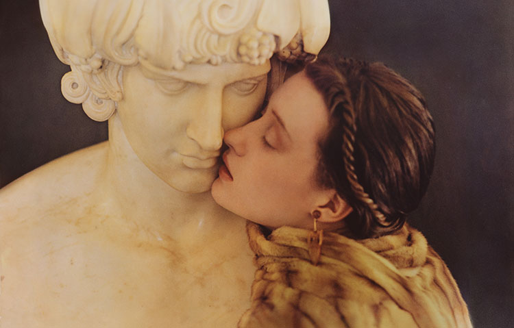
An icon in both fashion and fine art photography, whether she makes portraits, still lifes, or landscapes Sheila’s offers captivating sensual experiences, marked for their muted colors, soft focus, and rich textural grain. Both timeless and contemporary, echoing other art forms, her photographs have become a part of and are haunted by the history of photography.
Our hour of inspiration will begin with a short presentation of images by Shiela.
Next, Sheila and John Paul will discuss how time unfolds in still images, intermingling with our other senses, and may even be a sixth sense.
Finally, we’ll finish with a lively question-and-answer session open to all participants.
Join Santa Fe Workshops’ worldwide community of photographers and writers as Creativity Continues.
Register Now
Sheila Metzner (b. 1939, Brooklyn, NY) attended Pratt Institute, where she majored in Visual Communications, and was later hired by Doyle Dane Bernbach advertising agency as its first female art director. She has worked in photography ever since, creating work that has been displayed in gallery exhibitions and for commercial clients. Metzner is well known for using the Fresson printing process, a rare method of color printing developed in France in 1895 and continued by the family’s descendants. Metzner is just one of ten U.S. photographers they have chosen to collaborate with.
Metzner has created commercial photography for Vogue, Elizabeth Arden, Perry Ellis, Shiseido, Saks Fifth Avenue, Paloma Picasso, Victoria’s Secret, Levi’s, and Ralph Lauren, among others. She has published four monographs: Objects of Desire (1986), Sheila Metzner’s Color (1991), Inherit the Earth (2000), and Form and Fashion (2001). She was awarded the International Center of Photography Infinity Award and the 1987 Best Print Advertising Campaign Award from the Fragrance Foundation. Her work is featured in the collections of the Metropolitan Museum of Art, the Museum of Modern Art in New York, the International Center of Photography, and the Getty among others. She exhibits nationally at Fahey/Klein in Los Angeles, Staley Wise in New York, and internationally with Carla Sozzani in Milan.