© Ginette Vachon
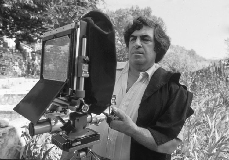
Paul Caponigro died of congestive heart failure on Sunday, Nov 10.
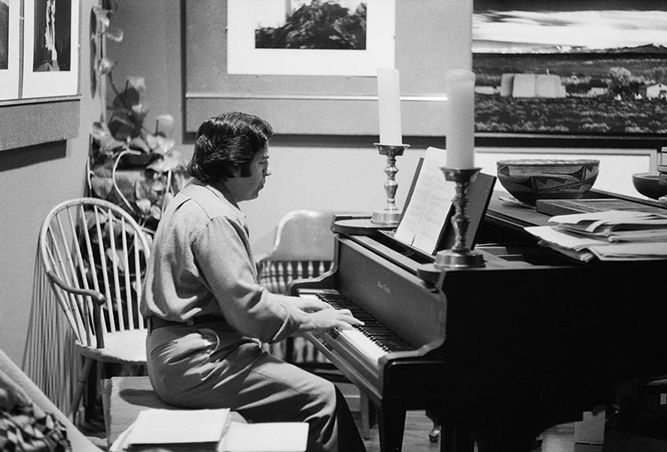
Born in Boston in 1932, at a young age, Paul Caponigro displayed dual passions for photography and music. He studied at Boston University College of Music in 1950 before deciding to focus on photography. Caponigro remained a dedicated classical pianist, and his music influenced his photography. You can hear him play here.
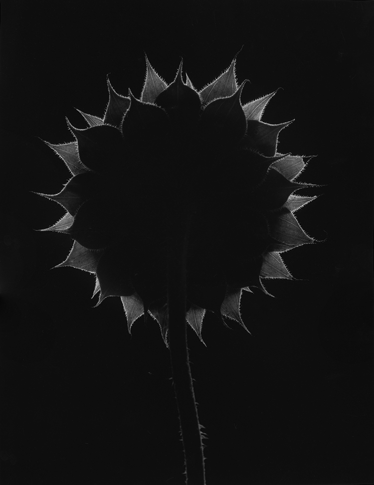
One of America’s foremost landscape photographers, Caponigro is best known for the spiritual qualities he revealed in natural forms, landscapes, and still lives. His subjects include the megalithic monuments of the British Isles, Scotland, and Ireland; the temples and sacred gardens of Japan; and the woodlands of New England. His photographs are featured in over a dozen monographs, including Sunflower, Landscape, Megaliths, New England Days, and The Wise Silence.
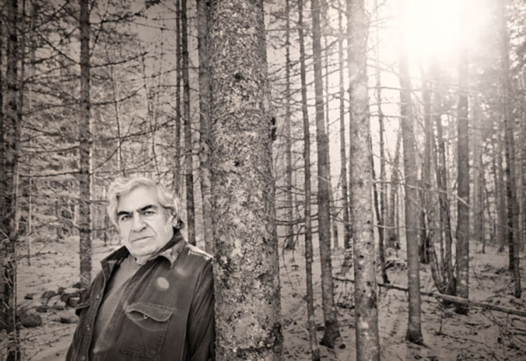
He had his first solo exhibition at the George Eastman House in 1958 and went on to be widely exhibited internationally. Caponigro’s work is in countless collections, including the Museum Of Modern Art, The Smithsonian America Art Museum, and The Getty.
He received two Guggenheim Fellowships and three National Endowment for the Arts (NEA) grants. He consulted with the Polaroid Corporation. In recognition of a career spanning nearly seventy years and a sustained, significant contribution to the art of photography, Caponigro was awarded The Royal Photographic Society’s Centenary Medal and Honorary Fellowship in 2001, was the Honoree for the Achievement in Fine Art presented by the Lucie Awards in 2020, and inducted into the International Photography Hall of Fame in 2024.
First visiting Maine as a boy with his father, later, he spent many summers as one of the first teachers at the Maine Media Workshops, before moving permanently in 1996 to be near his son in Cushing, Maine. Son of George and Mary Caponigro, he is survived by his ex-wife Eleanor, son John Paul, daughter-in-law Arduina, and granddaughter Gwen. In lieu of flowers, the family asks that you consider making a contribution to the Paul Caponigro Scholarship Fund at Maine Media Workshops.
Details about memorials, both in-person and online, will be forthcoming on his son’s website – johnpaulcaponigro.com. Fond memories of Paul are currently collecting on Instagram and Facebook. We invite you to join the chorus celebrating this unique man and his extraordinary art.
–
Below, our photography community shares thoughts, feelings, and stories about Paul.
–
Reid Callanan
“With my very first attempts at making my own landscape images, I was trying to be Paul Caponigro. I soon realized I couldn’t be him. That was a great lesson. As I mature as a photographer, I hold Paul’s photographs on high as my guiding light. I learned that Paul’s photographs unveil and reveal the underlying spirit that connects the natural world. From sunflowers to standing stones to apples and running white deer, his images surround me as reminders of his wise silence.”
_
Sean Kernan
“Paul was an influence on me, not in the sense that my work looked like his (I tried that early on, but soon saw that that place was taken). What I took away from him was, first, that one could conduct one’s self as he did, could aspire to be a seer who chose photography to convey what he saw, and second, that one could do work that seemed simple and was also deeply penetrative at the same time. These were two critical things to learn. I think that a lot of people learned these and similar things from him just by really perceiving his work. I can see echoes everywhere, in your work, for one.”
_
Alan Magee
“Paul’s work and example were an early and indelible influence in my life. He lived and worked above the agitation of fashion and opinion, and in that remove created art that was wise and sophisticated while being always accessible to all.
I remember seeing the page proofs of Paul’s book Megaliths laid out on a table at the Meriden Stinehour Press several decades back. The quiet power of those photographs have never left me, and Paul could find and convey that same gravity and grandeur in a scrap of aluminum foil. Each of his photographs contain lessons for those of us who aspire to make meaningful art. Paul was a masterful visual artist, a poet, and a fine musician—the perfect example of how one might live a fully creative life.”
_
Jennifer Schlessinger
“Making something glow from nothing is a specialty of Paul’s. Paul could find beauty in sometimes simple, modest subject matter, capture it both through the lens and in the meticulous fine printing of the black and white gelatin silver print medium, and produce an end result that elevates its subject to such regal stature. This is what makes Paul a master of our medium.”
_
Andrew Smith
“A photograph is a piece of paper, and Paul Caponigro made the most beautiful pieces of paper. Recalling his prints suggests the comfort in the afterglow of a delicious meal – a satisfaction that the world is in harmony. Using the basic elements of life, the stillness and motion of water, the color and density of air, the warmth of light glowing in the coldest of Irish stones, the quietness of trees and plants pulsing in the darkest shadows of the forest or underneath a rock, the prints emit a universal grounding in these basic elements — birth, growth in all its ages, death and regeneration. All in the lushness of sublime blacks and whites. Whether from his own alchemy or a polaroid, there is a completeness of tone and design–the winking pebble. And on the edges of the shadows there is Paul Caponigro emanating a mischievous delight and expression of joy sprinkling sparkles of light never before seen. My inner eyes revel in the wonder of his vision.”
_
Keith Carter
“Paul was my hero in my formative years. His work was elegant, transcendental, intelligent, and accessible. He introduced me to the possibilities inherent in the human spirit and the cosmic wonders of the ordinary. His work always seemed to me to be thoughtful and the loveliest of celestial gifts.”
_
Kenro Izu
“When I was eager to establish my photography career, on one occasion, I visited an auction house preview and found a portfolio of Stonehenge by Paul Caponigro. The prints were amazingly transparent gelatin silver prints to portray the spiritual stones of several thousands of years old. As well as they were beautiful, I also could hear music from the photographs of the sacred site. Later, I realized the master of photography was also a pianist.
For some time, the quality of Paul’s photography was the benchmark to achieve in my photography. I encountered prints of him, here and there, as if he was reminding me of what a fine photograph is supposed to be. Straight, elegant images with a class. One year, I visited his studio in Maine, and finally met the master in person, and thanked him for continuing to inspire me, though he didn’t know me.”
_
Brenton Hamilton
“My thoughts on the physical work of Paul Caponigro are prismatic. If there is an overwhelming character – it just may be transformation. To have a relationship with his work – to really look at it – you will be drawn within his virtuoso technique – and as unique as that is, that isn’t even the primary impact.
It may be, how Paul, so generously shares his own relationship with the invisible particles of light, the ephemeral, the unexplainable – combining his own energy with seeing and realizing by the act of picture making. I believe this act invokes the possibilities of change. His photographs provide a kind of witness to something unrecognizable, until you have seen his images before you and see what he recognized and wanted to share. That change that I speak of above, and that I have experienced myself in front of his work – Well, that very transformation you might feel, may just be your own heart.”
Arthur Meyerson
“I’ve known John Paul for almost 30 years and had the pleasure of being a house guest at he and Ardie’s home in Maine many, many times. Paul (aka: Babbo, Dad, Papa) was always around and it was like being part of an extended family. I’d always thought JP must have had the most extraordinary childhood, growing up with the likes of the “who’s who” of photography surrounding him… Ansel Adams, Minor While, Eliot Porter…. and the stories that he shared with me about them and his dad only confirmed what I had felt. I remember once asking JP, “So, who was the best printer of that group?” And without skipping a beat (and like a good son) he said, “My Dad!” And I thought, how nice. and asked again, “No really.. who was the best printer?”, “Seriously, Arthur, my Dad was by far and away the best printer of them all.”
Like many, I was always a big fan of Paul’s work and discussed with him how important “Galaxy Apple” was to me and how my wife, Linda, had been mesmerized by “Two Pears”. It was a wonderful conversation hearing him talk about those two images and their backstories. And then, one day the mail came to the studio and there was a carefully wrapped package included. I opened it and inside were two stunning photographs… the apple and the pears with a note, “Arthur, the apple is for you and the pears are for Linda, Love, Paul!” The photographs were the two most beautiful prints I’d ever seen. Add to that, the generous gesture from Paul… and it all brought tears to my eyes. Ever since, those two pictures hang prominently in our home and I walk past them every day and think of the man, his work and his kindness.”
_
David Scheinbaum
“Janet, in her work cataloging Eliot Porter’s prints, discovered a large body of work on the Southwest, all done with an 8 x 10” in the mid-1940s to the 1950s. This work was published, Eliot Porter’s Southwest , 1984. In order to publish the book and an accompanying exhibition, prints had to be made. Eliot, not wanting to convert his darkroom back from dye-transfer to the printing of black and white asked me if I would print this early work. I agreed. At the time I felt I was well trained and experienced in the darkroom and was only slightly intimidated. However, after reviewing a number of Eliot’s negative envelopes, I realized that he pretty much designed a different developer for each image! I had no experience making my own developers and was only peripherally familiar with chemistry. Eliot listed the names of the chemicals used for each negative but cryptic notes regarding the quantities. He printed using his eyes! – not scales nor clocks. I called around to photographers I knew asking for assistance preparing my own formulas. Most photographers were using packaged developers, as I was. When I called Paul explaining my dilemma, he said, “come over tomorrow”.
All the chemicals that Eliot had notated were in bottles on Paul’s darkroom shelves. He printed that morning with me demonstrating how to use each chemical additive and the visual effects and how they affected tonally. This way of printing was an epiphany for me and an approach I spent years sharing with my own students. I don’t think there was another photographer alive who not only had the technical knowledge but the visual sensitivity to approach each image individually and create a developer that reinforces the interpretation of the subject. This approach takes photography from a medium for “recording” to one of “transforming”.”
_
Mark Klett
“I was an 18 year old freshman when I took a workshop with Paul at St Lawrence University. Photography was my hobby, but I knew nothing about fine art photography. After a week with Paul what I had thought was my direction in life had been altered. The last night Paul was in town a few of us went out with him for dinner. We talked about what making photographs meant and I remember Paul saying, “What I’m really trying to do is touch the hemline of God.” My mouth dropped open just as I was about to bite into my hamburger. I wondered, is this really what photography can be about? There was no looking back from that moment.
I had the good fortune to spend an afternoon with Paul developing film during our workshop. We were both developing 4×5 B&W film in open tanks, using metal hangers that held the film immersed in the chemicals. This process had to be done in total darkness, including the necessary agitation of the film by briefly pulling the hangers out of the tank. I was excited the two of us would be standing side by side at the sink because I was trying to learn better technique. Shortly after we began development, he placed his hand on top of mine, “I just want to check how you’re agitating,” he said. I thought, this is great, I’m getting tutored by the master! I was careful to follow his instructions, and not to miss the moment my film was to be agitated. I had it timed to the second.
Then, unexpectedly, when we had only a couple of minutes left in the developer, I heard Paul walk away from the sink. I was puzzled and thought, he’s going to miss his agitation! Suddenly there was a flash of light coming through the blackness from the far corner of the darkroom. I quickly put my hands over the open top of my developer tank trying to prevent the light from reaching the film, and yelled out: WHAT?!! Then I saw the small red glow of a light moving towards me – he had lit a cigarette! Paul said, “Don’t worry, we’re more than 2/3rds through development, it won’t affect the film.” That was my moment of discovery: precision matters when it does, but sometimes it doesn’t, and you need to know the difference.”
_
Bernie Pucker
“Brother Thomas, artist and dear friend wrote, “Risking and dreaming are primary acts of creativity.” Paul’s works seemed to share both the Risk and the Creativity that enabled him to fashion masterworks that generate appreciation and love of the world around us.”
©Alan Ross
Huntington Witherill
“For many years prior to Ansel Adams’ death, Paul would regularly visit the Monterey Peninsula for extended periods of time. During those visits, he would often stay with Ansel and Virginia Adams at their home in the Carmel Highlands. The accommodation was clearly due to a long standing friendship and professional association. However, there was also an ulterior motive. Ansel maintained a good and in-tune piano which Paul was encouraged to play, at will, during those extended visits.
Long story short, after Ansel passed away, in 1984, it became (for reasons of social impropriety) less than ideal for Paul to be taking up residence with Virginia during his lengthy visits to the West Coast. And, while I’m not at all certain who actually informed him that I also maintained a good in-tune piano, at some point in 1985, I received a telephone call from Paul to inquire about whether or not my piano might be available to play while he was in town.
Needless to say, the opportunity to begin hosting Paul each time he would make the occasional pilgrimage to the West Coast became one of the greatest opportunities of my lifetime. Although the initial attraction had nothing to do with me (and everything to do with my piano) the friendship that developed and ensued was, and remains, immensely rewarding.”
_
Arno Rafael Minkkinen
Paul Caponigro is “a lost treasure to be found forever and ever by new generations.” This afternoon with the visit of our five-year-old granddaughter, Griffin, I put that sentiment to work immediately. We sat on a couch beside the fireplace near the Living Room library, to which Paul’s Masterworks book now belongs. After counting the number of white running deer on the cover we happened to turn to the S-like fragment of the Blue Ridge Parkway in Virginia. “From which direction would you say a car might come first?” I asked. “And how long would we have to wait?” Griffin’s reply came with a zigzag of her hand: “It’s just going to be like that.” It was a first lesson in recognizing the stunning stillness of a photograph, as only Paul Caponigro does it. Even with deer in motion.
_
Elizabeth Opalenik
“In those early years, I missed Paul’s connection to Connecticut until the day I walked into his photographs that had left such an impression on me the first time I saw them. I crossed a river and knew, absolutely knew, I had just walked into a Paul Caponigro photograph. How could that be….I was just on a small bridge over a little river? Craig had introduced me to Paul’s work in 1979 at my first MPW workshop and I was struck by the essence of what was within the images, something certainly beyond an image of a river or apple…something beyond my photographic knowledge at that time. How simple, yet poignant were the images…everyday things imbued with a spirituality that left a deep impression, obviously, for there I was, in the middle of Paul’s photograph. Unbeknownst to me, I was at the house he once rented, now owned by my friend. It wasn’t just the river in front of me, but the emotional poetry that continued to resonate through the power of his photography…that visual voice for stories left behind, now a whisper from the Maestro to be pondered again.”
_
Tim Whelan
“I was working in Paul’s studio in Santa Fe waiting for him to come down from the house. He was not in a good mood having stayed up late the night before trying to get a print. He explained that I was not to interrupt him for any reason. I was hearing a lot of swearing, banging around and incantations most of the day. The print was clearly not behaving. A call came in from a photo dealer in Atlanta who urgently and insistently needed to talk to Paul. I told her ok, but warned her it would not go well for either of us. Paul emerged glaring and grabbed the phone. After a few emphatic no’s he slammed the phone, admonished me and returned to the print.
At the end of that long day. He came out and asked me who the hell Elton John was. I explained he was a piano player who dressed a little differently than he did and made it clear to him that he should go to Atlanta. He explained that he had more important things to do. I never interrupted him in the darkroom again.”
© Skip Klein, November 9, 2024
Skip Klein
“When I married my wife 35 years ago, part of the dowry was a poster by a man I did not
know at the time. Judy had purchased the poster of the rooftop of a Buddhist temple for her dorm room at Penn. Forty years later, we are still in possession of the poster. We love the image, the prophetic title, and the poster has come to mean a great deal to us. On my first visit to Kyoto in 2018, I trekked up Mt. Hiei to find that temple and stand where Paul must have stood with his Deardorf to make that impactful image. Today, a large silver gelatin print of the warrior monk temple from the always inspiring Pucker Gallery hangs on the wall in our bedroom.
I first met Paul in Cushing well over a decade ago. We stood in his studio and he suggested that I “just listen…and stop asking so many damn questions.” He gave me his book also named The Wise Silence with a personal inscription, “See No Evil, Speak No Evil, Hear No Evil—Silence.” He must have enjoyed at least some of the questions as he invited me to come back, and thus began years of provocative, generally but not always pleasant interactions, and a great deal of learning about so many things ranging from the angels that visited Paul to Gurdjieff to Minor White to piano lessons to selenium toning, and to the importance of just taking deep breaths and remaining silent.
While those of you who know me may not believe it, I did learn to be silent in Paul’s presence and soak in the wisdom his years of experience, deep thought, and true seeing could provide. If not a better photographer, I know I am a better person for having spent more time in the wise silence of Paul.
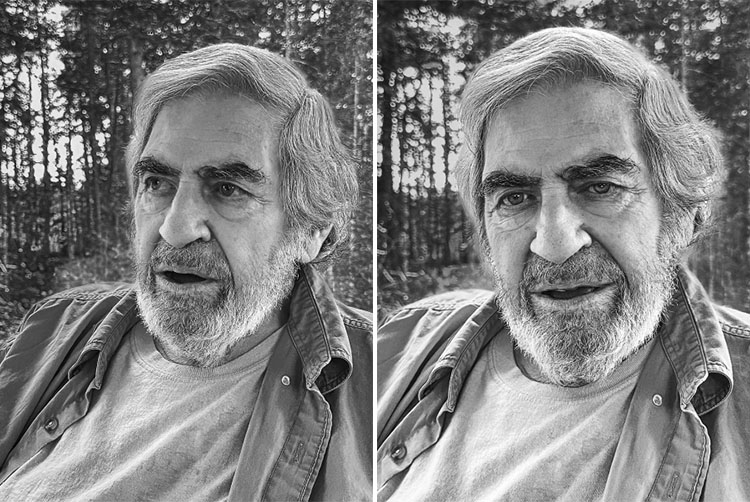
Saturday November 9th, was my last visit with Paul and he was more talkative than usual, filling me up with more words of wisdom and even encouraging me to ask questions. He agreed to let me make an iPhone image of the handsome beard he had grown since my last visit. When I returned on Sunday November 10th with two of his favorites from Maine Media, Rachel Coleman and Kari Wehrs, all we found was silence: a hard, cold silence. But after some tears and sleepless nights, there is now Paul’s wise silence coming forth from that final silence. I did learn from him that while his body may not be here, his energy would transform and his spirit would be here with us along with his spiritual images. Above all, I do know that his memory, the wisdom he shared, and the spiritual images he leaves behind, will all be a blessing for us all.”
© Robert Minden
Read More