Photographer George Nobechi Tells The Stories Behind Three Of His Images
Photographer George Nobechi tells the stories behind three of his images.
Photographer George Nobechi tells the stories behind three of his images.
Photoshop’s new Reference Image feature lets you guide Generative Fill using images instead of prompts—and it completely changes what’s possible.
Plus …
Adobe updated Generative Fill model in Photoshop, new Fill and Expand model in the Jan 2026 update. Colin Smith explains the new firefly model in Photoshop, understand how resolution works in Gen fill, how to switch models and am honest comparison between the old and new using difficult to generate objects.
Find out more from Colin Smith at Photoshop Cafe.
Learn more in my digital photography and digital printing workshops.
“In this video Julieanne demonstrates when to use Clarity, Dehaze, and Grain to increase or decrease edge contrast, add or subtract atmospheric perspective, and create structure through grain to seamlessly blend layers.”
Learn more on Julianne Kost’s blog.
Learn more in my digital photography and digital printing workshops.

Photographer Graeme Williams tells the stories behind three of his images.

Colin Smith gets us up to speed on the new (January 2026) features in Photoshop.
00:00 Intro
00:14 Updating Photoshop
01:11 New Adjustment Layers
01:30 Clarity and Dehaze
04:24 New Fill and Expand Generative ai Model. Extending an image, Higher Resolution!
07:23 Generating a new background with Fill and Expand Model
10:24 Using Reference image to generate
Find out more from Colin Smith at Photoshop Cafe.
Learn more in my digital photography and digital printing workshops.
Photographer Henry Hornstein tells the stories behind three of his images.
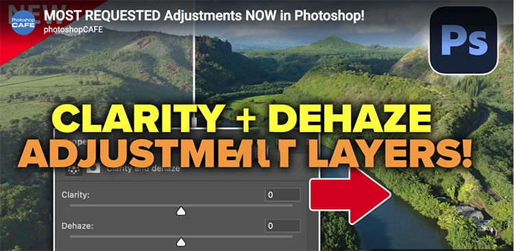
Clarity and Dehaze are now also adjustment layers inside Photoshop.
Colin Smith explains what Clarity and Dehaze do and how to use them.
Find out more from Colin Smith at Photoshop Cafe.
Learn more in my digital photography and digital printing workshops.

Photographer Lou Jones tells the stories behind three of his images.
Photographer Michael Hintlian tells the stories behind three of his images.
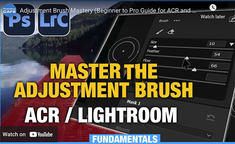
“Learn how to use the adjustment brush in Adobe Camera Raw and Lightroom. Colin Smith shows you how to use all the features in the powerful adjustment brush for paint-on edits in LR and ACR in Photoshop. The brush is powerful and moist, people barely use the features.”
Find out more from Colin Smith at Photoshop Cafe.
Learn more in my digital photography and digital printing workshops.