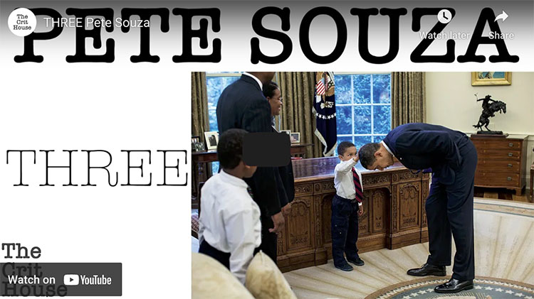
.

4 Tools You Can Use To Control Focus And Flow When Sequencing Your Images

Viewers search for significant changes between images presented together and the significance of the changes between them. It’s continuity. Every screenwriter needs to create it. Every storyboard needs to interpret it. Every director needs to guide it. Every editor needs to refine it. If you’re a still photographer, you may be called to do all of these things.

Continuity lies at the heart of the art of visual storytelling. The types of images selected and the transitions made between images presented in groups are powerful tools for visual communication. Sequences can provide useful comparisons and contrasts between separate images. They set a pace and rhythm for looking. Carefully orchestrated, they can create the illusion of moving in time, forward or backward, linearly or non-linearly. The best sequences make images, both collectively and individually, clearer, more meaningful, and more moving.

Photographers can use continuity to guide explorations on site and find more images; use a storyboard as a checklist to make sure no angle goes uncovered. Photographers can use continuity to find missing gaps or resolve challenging transitions in ongoing projects, update a storyboard and find out what you’ve got too much of and what you don’t have enough of, or find bridges to connect disparate images. Photographers can use continuity to edit, sequence, and present existing work more effectively; fine-tune an existing story to make it richer and more compelling or create a new one.

There are many classic strategies for sequencing images and creating transitions between them. They’re tools, not rules, that can be applied in many ways. How you apply them ultimately becomes a part of your style.


Because of persistence, this pair of images reads as one unit or a serial image.


Insights Members can login to read the full article.
Email:
or Sign up

William Neill’s Yosemite: Sanctuary In Stone

Order this book here.
Pre-Order offer ends on July 9.

11.6 x 11.6″
168 pages
128 photographs

Also available in a Deluxe/Collector’s Edition with your choice of prints.


When one thinks of photography in Yosemite, one thinks first of Ansel Adams and then William Neill. And for good reason. When you love a place, you look at it differently. William Neill’s photographs of Yosemite clearly demonstrate a lifelong passion for this very special place, made even more special by his dedicated attention to it.

“Now it is finally time to realize this project I dreamed of 20 years ago. Yosemite: Sanctuary in Stone is a personal collection of photographs reflecting 46 years of dedication to this wonderous landscape. Living here, photographing Yosemite and its vicinity, I have been working towards this dream for much of my lifetime.” – William Neill

I’ve seen the preview. You’re in for a treat!

Until you see it, get to know William Neill better in these collected resources.

View 12 Great Photographs By William Neill.

Read selected Quotes.

Read his Q&A here.

Visit the artist’s website here.

New Photoshop Tools – Remove & Generative Fill – Which Is Better?

.
Photoshop offers two new AI retouching tools – Remove and Generative Fill. Which is the best tool? Find out as Colin Smith tests both.
.

5 Mistakes To Avoid With The Photoshop Generative Fill

.
Generate better images by avoiding these critical mistakes with The Generative Fill in Photoshop!
.
00:00 – Mistake #1 – Instructional Prompts
01:32 – Mistake #2 – Basic Selections
03:00 – Mistake #3 – Not Using Intensity
07:25 – MSI Creator
08:00 – Mistake #4 – Keeping Adjustment Layers in The Fill
08:40 – Mistake #5 – Thinking of Gen Fill as a One-Click Solution
.

The Key To Lively Images – Midtone Contrast – And How To Get It

Contrast catches the eye. When looking at images short of an exciting subject and a dynamic composition, nothing does more to grab and hold attention. More contrast, more energy. Contrast is life.

Contrast is not as simple as one slider – thankfully. There’s real control here and so near infinite creative possibilities. Equally beneficial for both black-and-white and color images, there are many ways to enhance contrast, and every tool produces different qualities of life. Master these tools, and you’ll craft visual statements that speak with more confidence and complexity.

Let’s move through our options as we would in a classic workflow, from coarse to fine control.


Insights Members can login to read the full article.
Email:
or Sign up

4 Videos On How To Make The Most Of Photoshop’s Generative Fill

.

.
.

Jesus Ramirez offers a comprehensive guide on the Generative Fill.
.

The New 2023 Photoshop Features Have A Star – The Remove Tool

.
“In this video, we’ll talk about what’s new in the latest version of Photoshop (May 2023 Update). You’ll see the brand new “Remove Tool,” which is like content-aware fill but easier and simpler to use, as well as some other small updates.”
.

How To Use Photoshop’s New Mind-blowing Generative A.I. Fill


.

Generative ai is now inside Photoshop. Instantly retouching or replacing anything inside Photoshop. Adobe Firefly, generative AI is now in Photoshop. Colin Smith shows you how to extend images, replace images and generate art within Photoshop 2023.

00:00 Intro on Generative ai in Photoshop
00:09 Extend a photograph with ai
00:49 Replace a Dress with a shirt
01:10 How to get Firefly in Photoshop now
01:46 Replace a background and replace an object
03:09 Advanced replacement of clothing
04:54 Generative ai Tips
05:27 Generating objects out of nothing
05:52 Duplicating dogs
06:45 How to place an object on a surface
07:05 Where do the images come from? How does ai deep learning work

.

How To Avoid 6 Printing Mistakes That’ll Make You Want To Curse

Having taught over a thousand people for thirty years, I’ve seen and done it all. Here are the most common mistakes that people encounter when printing their images that you can avoid by simply looking at your files more closely and handling your paper more carefully.

Files

You won’t see this stuff if you’re zoomed out and looking at the whole image. Zoom in to 100% screen magnification. You’ll also miss things if you move around the image erratically. Move through each image one screen at a time and make a systematic quadrant-by-quadrant sweep.

1 – Noise

Too much noise can be distracting, especially color noise, unless you’re an impressionist. A little texture is good and makes images look sharper, so don’t overdo noise reduction, or your subjects will look like they’re made of plastic. Noise is most visible in smooth areas, like skies.

In some cases, you’ll want to reduce noise selectively with layers and masks in Photoshop, for instance, when you want to reduce noise in a sky more aggressively than in a foreground.

2 – Halos

One of the key things you want to watch out for when sharpening is producing halos. Most often seen along high-contrast contours, like horizons, halos are distracting and can make a straight photograph look like a composite. Though it can be done, retouching them is a bitch. So don’t produce them and use lower sharpening settings. If you need more sharpening in areas without contours (and the Texture slider won’t cut it), use layers and masks in Photoshop to sharpen selectively.

3 – Dust In Your File

Those dagnab little dust bunnies. They’re so easy to miss when you’re zoomed out and so easy to see when you’ve made a big print. Even if you keep your camera sensor clean, zoom in and check for them. If you find them, retouch them permanently.

Media

When it comes to media, the mantra is handle with care. This extra consideration will save you time, materials, and money. And it will earn the respect of your viewers. (God forbid that you don’t notice these things until your prints are exhibited.)

4 – Dust On Your Paper

If dust and lint fibers is on your paper while you’re printing, it can act as a resist and later fall off, leaving areas without ink. You can prevent this. First, store your paper in a sealed plastic bag or box. Two, look at your paper in the light and check for dust and lint, and if you see it, blow it off or use a soft brush to wipe it off. 

5 – Scuffing

Different than scratching, which gouges the paper surface, scuffing pushes down the fiber of paper and burnishes the particles in the ink, leaving a faint mark that can be seen as a difference in sheen on the surface of the print. Handle your paper carefully at all times, and cover it with a protective sheet when you’re not handling it.

6 – Wrong Side Of The Paper

If you print on the wrong side of the paper, blacks will be weak, colors will fade, and detail will be soft. How do you tell which side is the printable side? One, it’s the side your wet lips will stick to. Two, the printable side will usually feel smoother to the touch. Three, you can feel a slight lip on the edges of the back side where a cutting blade has pushed through the paper.

Pay your files and materials these extra considerations, and you’ll not only make better prints, you’ll also save you time, materials, and money.


Find more printing resources here. 

Learn more in my digital printing workshops.

Save Time, Money, Resources With These Printing Checklists

Have you ever had this feeling?

You’re looking at a gorgeous print of one of your photographs … then you notice a small detail that needs to be fixed, and you know you’re going to have to reprint it. More time, more paper, more ink. Frustration. It’s so obvious when you see it now! Why didn’t you see it before? Save time, money, resources, and increase your productivity and enjoyment at the same time.

Use these checklists to eliminate this problem.


Before you print check your … 

File

level horizon

precise crop

shadow detail

highlight detail                   especially at the edges

midtone contrast

saturation                             overall and specific hues

white balance                     casts are best seen in neutrals, flesh tones, and memory colors

noise reduced                      avoid blurring and artificial smoothing effects

sharpened                            avoid producing halos

imprecise masking            edges misaligned or haloed

imprecise retouching       blurry or misaligned or repeating patterns

dust                                           check at 100% screen magnification

softproof                                make output specific tweaks based on printer profile used

resampling                            if resolution is below 240 ppi or above 720 ppi

output sharpening             compensate for image softening due to dot gain


You can ensure you take all these steps with a consistent workflow.

Explore these color resources for more detail.

Explore these sharpening resources for more detail.


While you print check your …

Printer

orientation                             portrait (vertical) or landscape (horizontal)

page setup                             paper size and margins

color management             Adobe or Printer (for B&W)

printing profile

media setting                        precise or nearest paper type

ink                                              MK matte or PK photo black

printer resolution                1440 matte or 2880 photo


Save these settings as a Preset so you can use them again with a single click.

Explore these printing resources for more detail.


After you print check your …

Print

white spots                            dust on paper before printing

scuffing                                   handle paper with care before and after printing

banding                                   align heads or reduce print speed or make sure data transfer’s fast

microbanding                       check for nozzle clogs or print speed

local color casts                    areas check for nozzle clogs

colors faded                           wrong side of paper


Make sure you view prints in enough light with the right color temperature.

Explore these printing tips for more detail.


Learn more in my digital printing workshops.