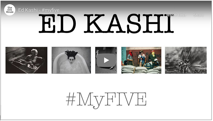
Photographer Henry Horenstein – His Top Five Influences
Henry Horenstein shares 5 photographs that influenced her creative journey on Jeff Larason’s The Crit House.
.
Henry Horenstein shares 5 photographs that influenced her creative journey on Jeff Larason’s The Crit House.
Photoshop’s filter High Pass is one every user should know. It can be either an edge sharpener or a unique luminosity contrast enhancer that produces a three-dimensional effect, unlike any other tool.
With only one slider, Radius, the differences between low and high settings can be found in the way they handle frequencies of detail: low (smooth spaces and planes), medium (broad lines and moderate texture), and high (fine lines and texture).
When you use low Radius settings, the High Pass filter adds contrast to the edges of lines. As the setting rises it brings out first coarse and then medium texture, accentuating fine texture, often confused with noise, much less.
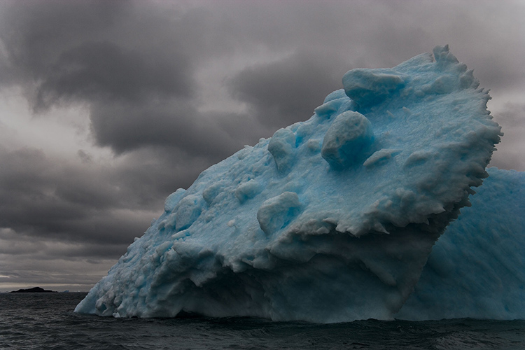
When you use high Radius settings, the High Pass filter moves beyond sharpening and becomes tonal enhancement. The halos (light lines) and lines (dark lines) it produces become so broad and feathered that rather than only contour contrast (Think edges and thin lines.) they instead accentuate broader image contrast (Think planes chiseled by a sculptor.). In short, images filtered with high High Pass settings look contrastier and more three-dimensional, as if all the planes in an image are dodged and burned.
Low or high, how do you choose?

The unfiltered image.
A low High Pass filter setting for sharpening
A high High Pass filter setting for contrast
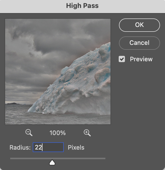
The filter High Pass
Photoshop’s often overlooked filter High Pass is one every user should know. It can be either an edge sharpener or a unique luminosity contrast enhancer that produces a three-dimensional effect unlike any other tool.
When you use high Radius settings with the High Pass filter, it moves beyond sharpening and becomes tonal enhancement. The halos (light lines) and lines (dark lines) it produces become so broad and feathered that rather than only contour contrast (Think edges and thin lines.) they instead accentuate broader image contrast (Think planes chiseled by a sculptor.). In short, images filtered with high High Pass settings look contrastier and more three dimensional, as if all the planes in an image are dodged and burned.
Take these steps to apply High Pass contrast.
before

after
Photoshop’s often overlooked filter High Pass is one every user should know. It can be either a unique luminosity contrast enhancer or a sharpener.
High Pass sharpening enhances edges with a softer halo and line and little or no accentuation of texture and noise. It bypasses many artifacts that trouble insensitive applications of Unsharp Mask.
High Pass sharpening requires layers so it’s only possible in Photoshop (not Lightroom or Camera Raw).
High Pass sharpening laid the foundation for Lightroom’s Print Sharpening, but in Photoshop it can also be used for creative sharpening, which can be combined with other sharpening effects and applied selectively.
Take these steps to apply High Pass sharpening.
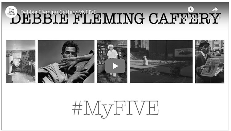
Debbie Fleming Caffrey shares 5 photographs that influenced her creative journey on Jeff Larason’s The Crit House.
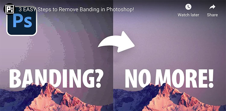
“Discover 3 simple steps to entirely eliminate color banding or gradient banding in your photos with Photoshop! In this lesson, we’ll learn how to use the right bit-depth to avoid banding in the first place and then explore several filters to dissolve the banding and add texture.”
Find more of Unmesh Dinda’s content here.
Learn more in my digital photography and digital printing workshops.
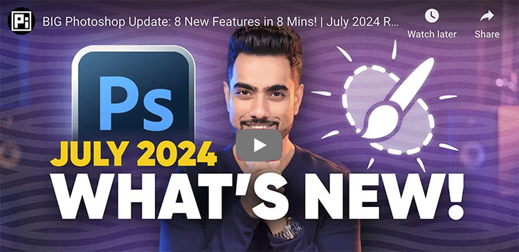
“See what’s new in Photoshop’s July 2024 Update, version 25.11.0, with all features explained! Right from the new Selection Brush tool to features like Enhance Details, we’ll cover everything new in Photoshop, including the features that have made their way from Photoshop Beta to this general version.”
00:00 Intro
00:13 Photoshop Version and Housekeeping
00:25 Selection Brush Tool
03:34 Enhance Details
04:28 Bullets and Numbering
05:02 Generator Plugins
06:11 Adjustment Brush
06:56 Enhanced Contextual Task Bar
07:39 Text to Image with Firefly Model 3
08:39 Single Adjustments
09:00 What’s Your Favorite?
Find more of Unmesh Dinda’s content here.
Learn more in my digital photography and digital printing workshops.
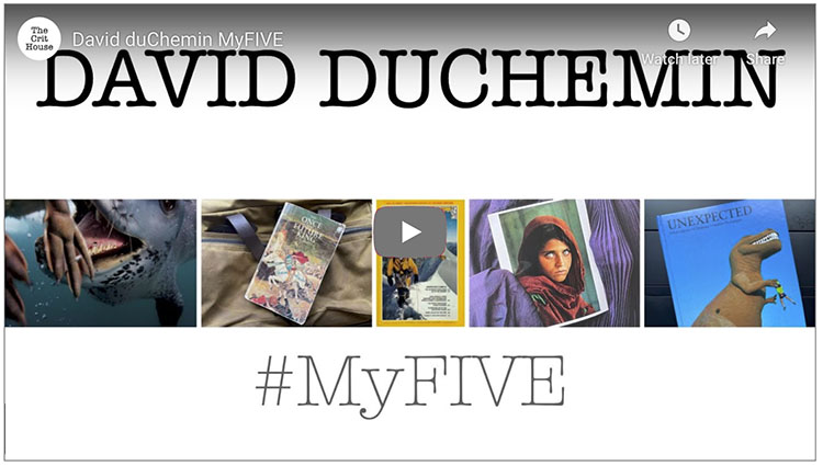
David Duchemin shares 5 photographs that influenced his creative journey on Jeff Larason’s The Crit House.
“What if we can use the same sharpening technique in Photoshop as NASA’s James Webb or Hubble Telescope team? In this video, we’ll test the APF-R plug-in, which automates the APF-R method for sharpening used by space telescopes and space agencies like NASA and ESA. ”
Find more of Unmesh Dinda’s content here.
Learn more in my digital photography and digital printing workshops.