Carlos Conseco – Print Surface


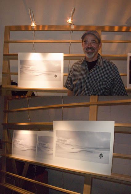
This week at The Fine Art of Digital Printing workshop (taking place at Brooks sponsored by Epson) Carlos Conseco discovered how important it is to test materials and evaluate images side-by-side. He printed one of his best images on a variety of surfaces – Epson Watercolor, Velvet, Ultrasmooth Fine Art, Luster, and Exhibition Fiber. They were all good. Each material added something new to the expression of his print. Materials affect print quality in technical ways (glossy papers produce blacker blacks) and aesthetic ways (matte papers seem softer and more organic). So he slept on it before making his final decision. The most important thing he learned was that materials matter.
What papers do you like? Why? Comment here!
Look for upcoming Epson Print Academy dates here.
Check out The Fine Art of Digital Printing workshops here.
Check out my Fine Digital Print workshops here.

Bill Atkinson – Test Files


Using real world in combination with synthetic information can help you evaluate the accuracy of a color management system. It’s important to use a full spectrum of colors and information you can evaluate objectively (information you aren’t so personally invested in you may not be able to maintain objectivity while evaluating it). Bill Atkinson, one of the world’s foremost authorities on color management, offers excellent test files on his website. They’re free!
Check out Bill’s website here.
Download Bill’s test files here.
Download my test files here.
Learn more in my DVD.
Learn more in my workshops.
See the printers in action in my workshops.

Cheryl Medow – Consistent Style


Cheryl Medow creates wildlife composites. She’s attending the Fine Art of Digital Printing workshop (Caponigro and Holbert at Brooks sponsored by Epson). Yesterday, some of them looked like photocomposites (surreal) and some looked like paintings (graphic). Today, after a long discussion about the most successful components in separate images and the intent she wants to communicate, they all look like they’re made by the same person who has a cohesive message. Some of the keys to unlocking her style included keeping shadow and highlight detail extremely full (none of them pure black or white, sometimes with significant color). In addition to keeping luminosity contrast low, she did the same with hue contrast, glazing the different colors in her images with a single color. Both create a more softly modulated color palette. Cheryl had to reconsider what she had learned about traditional photographs to find her own personal style. Her first step was to find the words to describe the new qualities she found through exploration (trial and error) and now wanted to repeat. The next step is to ask why. She’s got a lot of ideas, but she’s still working on it. That’s great. That’s when work starts to get really interesting.
Check out Cheryl Medow’s work here.
Check out the Fine Art of Digital Printing workshops here.
Check out my Fine Digital Print workshop series here.

Epson 7900/9900 Printers with Ultrachrome HDR Ink


Epson recently announced their new 7900 24″ and 9900 44″ printers and ink technologies Epson UltraChrome HDR Ink.
Find out more about the new Epson printers here.
LONG BEACH, Calif. – Oct. 28, 2008 – Representing a level of technology unprecedented in Epson’s history, Epson America today announced its next generation of professional ink jet printers – the 24-inch Epson Stylus® Pro 7900 and the 44-inch Epson Stylus Pro 9900. This Epson Stylus Pro series incorporates Epson’s latest achievements in photographic ink jet technology, including Epson’s MicroPiezo TFP™ print head with new Epson UltraChrome® HDR Ink technology, to deliver a higher level of print quality, increased performance with speeds almost twice as fast as previous models, and the widest color gamut ever from Epson Stylus Pro printers. Read More

Blurb Announces Premium Paper


Blurb, the most popular print on demand book maker, just announced their new Premium Paper option.
“Premium Paper is the crème-de-la-crème of our paper offerings. This 100-pound text silk-finish paper is 35% heavier than our standard paper, featuring improved opacity and stellar image quality to make your best work shine.
For our pro users, Premium Paper is another way to present your best work to your clients on 100-pound paper. If you’re already using the B3 Custom Workflow process, adding Premium Paper to the mix will simply blow you – and your clients – away.
You can order books with Premium Paper starting on October 23, for all our book sizes and types, up to 160 pages. All your existing Blurb books can be ordered with Premium Paper too (if they’re 160 pages or less).
Adding Premium Paper to your next book is as easy as a single click – just choose “purchase with Premium Paper” at check-out to order your best-looking Blurb book yet.”
Selecting the new Premium Paper option adds a few dollars ($3-5) to the cost of each book.
Check out my Blurb Premium Paper here.
Check out my Blurb book Antarctica here.

The Fine Digital Print – Seminar – Total Solution

Today I present a seminar The Fine Digital Print.
One of the things I discuss is that print quality is a product of a total a solution. It can be challenging to compare the many new offerings from multiple manufacturers. Breaking the systems down into their component parts and understanding what impact each has on print quality is essential to achieving a balanced well-informed viewpoint. Here are five items to bear in mind.
PRINTER
INK DELIVERY SYSTEM
PAPER DELIVERY SYSTEM
SELF-PROFILING
INK
DMAX & GAMUT
FAST DRYING
LONGEVITY & DURABILITY
SUBSTRATE
ISO BRIGHTNESS DMAX & GAMUT
COATINGS – DRYING AGENTS & BRIGHTENERS
LONGEVITY & DURABILITY
DRIVER
INK LIMIT
PAPER FEED
DOT STRUCTURE – SIZE & PLACEMENT
SEPARATION – WHICH INKS ARE USED WHERE
16 BIT
RIP – POSTSCRIPT COMPATIBILITY FOR VECTOR GRAPHICS & TEXT
PROFILES
HIGH QUALITY PROFILES ARE EASIER TO GENERATE IF …
PRINTERS ARE LINEARIZED (AT FACTORY) & STABLE
INKSETS ARE CONSISTENTLY FORMULATED
Check out my free Printing downloads here.
Check out my workshops here.

Extending Dynamic Range – Seminar – Contrast Ratios


Today I present a seminar Extending Dynamic Range. Extending dynamic range is one of the fundamental challenges of photography since it’s invention. All forms of visual representation map the appearance of a high dynamic range scene into a low dynamic range medium (typically print). There have been many approaches to solving this problem throughout history. Now, with new technology, there are new approaches. HDR merges are popular now. In time, all of our imagery will be able to incorporate increasingly high dynamic range information.
Here’s a comparison of contrast ratios from very high dynamic range self-luminiscent objects to low dynamic range prints.
sun to starlight                                 1,000,000,000,000:1
human vision w/ dark adaptation      100,000,000:1
Spherocam HDR camera                    50,000,000:1
Brightside monitor                            200,000:1
human vision – single  view               10,000:1
b/w negative film                              10,000:1
typical DSLR                                      500:1
LCD monitor                                      400:1
CRT monitor                                      200:1
paper – best possible                        100:1
paper – typical                                   50:1
Check out my free downloads here.
Check out my workshops here.

Fine Art Workflow – Seminar – Barriers of Flexibility


Today I present a seminar Fine Art Workflow with R Mac Holbert at PhotoPlus East in New York City.
Flexibility is one of the things we both emphasize in our seminars and workshops. Flexibility is an essential quality to preserve in your worfklow(s). You may change your mind in the future. You might have missed something in the past; you might learn something new; you might form a different opinion; things change and your workflow and files should be able to accommodate change. (Of course, this means allowing deliberate change not introducing unintentional change.) You want to be able to make a change as quickly and precisely as possible, without having to change everything
or repeat all your other successes. The practices you adopt in your workflow will determine how much and what kind of flexibility you preserve. Knowing what to avoid is as important as knowing what to do. Avoid practices that limit flexibility.
Here are 11 barriers.
1   resample resolution (lowering is worse than raising)
2   lower bit depth (8-16 bit)
3   convert to smaller gamut editing space
4   crop (mask instead)
5   erase pixels
6   work directly on the background
7   rasterize type
8   rasterize Smart Object and Smart Filters
9   apply masks permanently
10   merge layers
11   flatten
Can you name more? Comment here!
Check out my free download Barriers of Flexibility here.
Check out PhotoPlus here.
Check out my workshops here.

Ken Carl – Extreme Low Light Shooting


Ken Carl has attended every one of my Fall Foliage workshops. Over the years, he’s turned pro. Just when I think he’s done, he keeps coming back for more. After a long day of shooting past sunset at Pemaquid Point, Ken walked up the streets of Damariscotta while the rest of the group was being seated for dinner – and got some great shots. After dark? Hand held? ISO 8000? Really? And it’s actually useful, with surprisingly little noise by traditional standards. You’ve got to try it to believe it. The LCD on the back of the camera actually shows you more than you can see at that moment. Add a tripod to the equation and you’ll see even more. Today’s cameras can capture more than you can see at any one moment in time. With a little experimentation, you’ll find hours of new possibilities at the beginning and ends of the day. This weekend we tested shooting in many extreme lighting situations. Participants are seeing in new ways. I’m seeing in new ways. I recommend frequently testing new techniques to expand your repetoire and your vision.
Check out Ken Carl’s work here.
Check out my workshops here.