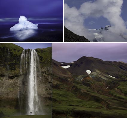
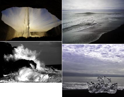
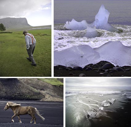
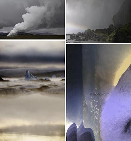
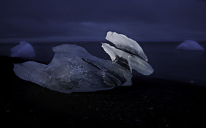
Paul Caponigro – Running White Deer – Inkjet Print


My father and I have been collaborating on reproducing his most famous image – Running White Deer. It’s a piece of photographic history. You’re hearing about it first here. And, you can get one of these special prints at a special discount for a limited time only. It’s not available anywhere else.
Find out more about the project here.
Order your print today here.

Stay tuned for more on this exciting project.

Video – Sam Abell & Richard Prince

Prices for photographs have hit historic records. Contemporary artists are now selling photographs for more than $3,000,000. Richard Prince created one of the most controversial and expensive photographs; an appropriated image used in advertsing, represented in large scale, printed on inkjet, in an edition of 2.
Here’s Sam Abell’s reaction to Prince’s appropriation of one of his images.

Here’s Richard Prince speaking about his work in general.

The Printed Picture at MOMA


Photographer Richard Benson is the man behind the highly informative new exhibit at the Museum of Modern Art in NYC – The Printed Picture (on exhibit through June, 2009). Anyone who goes will expand their understanding photographic printmaking and it’s short but rich history. I did. In it you’ll see exceptional examples of a wide variety of printmaking methods from offset to gravure, platinum to silver gelatin, and inkjet. I highly recommend the exhibit and the accompanying book.
“The Printed Picture traces the changing technology of picture-making from the Renaissance to the present, focusing on the vital role of images in multiple copies. The book surveys printing techniques before the invention of photography; the photographic processes that began to appear in the early 19th century; the marriage of printing and photography; and the rapidly evolving digital inventions of our time. From woodblocks to chromolithographs, from engravings to bar codes, from daguerreotypes to modern color photographs, the book succinctly examines the full range of pictorial processes. Exploring how pictures look by describing how they are made, author Richard Benson reaches fascinating and original conclusions about what pictures can mean. Includes 326 illustrations.”
Also visit the exhibit of Benson’s personal work – Found Views, Chosen Colors – at the Pace Macgill Gallery in New York through November 29.
Seen it? Comment here!
Find out more about The Printed Picture here.
Get the book here.
Visit Found Views, Chosen Colors online here.
Read my conversation with Richard Benson here.

David Wright – Help Two Good Causes at Once


David Wright, my fabulous assistant for the last two years, principle architect of the ambitious Pause to Begin project, is leaving soon to work with socially conscious organizations in Africa. He’s raising funds for his trip with a print offer. You can help two good causes with one action. Here’s how.
“In January 2009 I leave Maine for Alebtong, Uganda, where I will spend two months volunteering and photographing for A River Blue, a non-profit arts empowerment project for the children of internally-displaced persons in Northern Uganda.
I will be using my large format camera to photograph the people and landscape for a traveling exhibition and book that will be used to raise funds for A River Blue. Details will be announced in the spring/summer of 2009.
To raise funds for the trip, I am offering a selection of my limited edition prints at substantially reduced prices.”
Please visit davidwrightphoto.com to support his trip, A River Blue, and Africa.

Lecture – Academy of Arts in San Francisco


Tonight from 7-9 in San Francisco at the Academy of Arts, I lecture on my work and creative process with an eye towards advances in technology. The lecture is free and open to the public – sponsored by Canon.
Here’s an excerpt.
I often encounter resistance to new practices in photography. Some say, “You can’t do that.” I reply, “I just did.” They respond, “But that’s cheating.” I counter “Whose game are you playing?”
There’s no such thing as cheating in the creative arts. There is such a thing as misrepresentation. As creators we all share a responsibility to disclose our process so that viewers can react in informed ways. This has never been more true than today, where technology challenges many of the assumptions that were almost too easy to make in the past. This cultural dialog is an important part of understanding where we are today, how we got here, and where we may be going.
Listen to my artist’s statements here.
See my work here.

Pete Turner – Empowered By Color


“Legendary photographer Pete Turner still knows how to punch up the color and get people’s attention. The master colorist, who broke all the rules in the pre-computer era, is taking his creativity to an entirely new ground with the unprecedented control of digital technology. His photographs are best known for their blazing hues, atmospheric effects, daring perspectives and surreal landscapes.
Turner personally printed 50 of his most loved images, with colorful names like “Lifesaver, USA” and “Hot Lips,” for the recent retrospective, Pete Turner: Empowered by Color. The photographs were on view in his hometown of Rochester, N.Y. at the renowned George Eastman House International Museum of Photography and Film.”
See the short 6:33 video on Turner from Epson Focal Points here.

Transitions


“Every picture tells a story.  Every body of work tells a bigger story. In grouping and sequencing a collection of images larger ideas come to light. The missing pieces also become apparent. Often, transitional material is needed to develop an idea more fully or to move from one idea to another convincingly. Identifying and finding material that can bridge the gaps can makes bodies of work stronger. It can even lead to new ideas to be developed at a later date. The seeds of future work are often contained in present work.”
Find the rest of this article in the current issue of AfterCapture.
Find more free insights on editing in my downloads.

Metamerism / Metameric Failure


It’s often called metamerism, but the correct term is metameric failure.
Metameric failure is the tendency of an object to change appearance under different light sources. Different light sources, even of the same color temperature, are often comprised of differing amounts of spectral frequencies (i.e. red or blue frequencies). Some objects change appearance more quickly than others; they are more highly metameric. This is true when comparing dye-based inks with pigmented inks. As pigments are made of irregular particles, they tend to refract (reflect and bend) light more strongly than uniform dye globules. The most current ink technology coats pigment particles in resin to reduce this effect. Additionally, some color pigments, typically the most saturated ones, are more prone to metamerism. By separating the file differently and using more of the less metameric ink to reproduce an image, the print’s appearance stability is increased. This is particularly important when reproducing neutrals, as small shifts in hue are quickly detected in these colors.
How can you evaluate metameric failure? Make two prints of the same image (preferably containing significant neutrals) and compare them side by side in different light sources.
What can you do to reduce metameric failure? Use the latest inksets (such as Epson’s Ultrachrome K3) and drivers (with the latest separation routines). And, when practical, standardize the light your prints are viewed under. Can metamerism be completely eliminated? No. Everything is metameric. But metameric failure in prints can be reduced to the point where it is no longer significant.
Read the rest of this article in the current issue of Photoshop User.
Learn more in my workshops.

San Diego – Lecture Tonight & Workshop Next Two Days


Lecture – Museum of Photographic Arts
Tonight from 7-9 in San Diego at the Museum of Photographic Arts and Cuyamaca College, I lecture on my work and creative process.
Here’s an excerpt from my statement A Call To Connection. “This work is a call to incite conscientious creative interaction with our total environment. This work is a call to connection with us. If we feel that we are a part of nature, conscientious practices will no longer need to be legislated, they will simply happen. If we feel that we are not insignificant, we will act to make our own positive contributions in our own unique and creative ways.”
Read my Artist’s statements here.
See my work here.
Workshop – Julia Dean in San Diego
Friday and Saturday I’ll be teaching a workshop – The Power of Color. Space is still available.
Find out more here.
Find more Canon sponsored events here.

Digital Exposure


The histogram on the back of your camera is generated by a processed JPEG version of your Raw files. Your Raw files are unprocessed / uncooked, high resolution, uncompressed, wide-gamut, 12-14 bit, and so have more information in them, particularly in the highlights. This means the histogram can be misleading. What looks good is usually underexposed. Weight your histograms high. How high? At what point do highlights clip? It’s uncertain. Practically, it depends on the scene; higher if the scene doesn’t contain delicate highlight detail; less high if it does. To be safe, bracket, one slightly high and one very high. You can even program your DSLR to do this automatically for you. Here are four histograms.

1   Underexposed
2   A good exposure
3   A better exposure
4   Overexposed
Learn this and other techniques in my workshops.