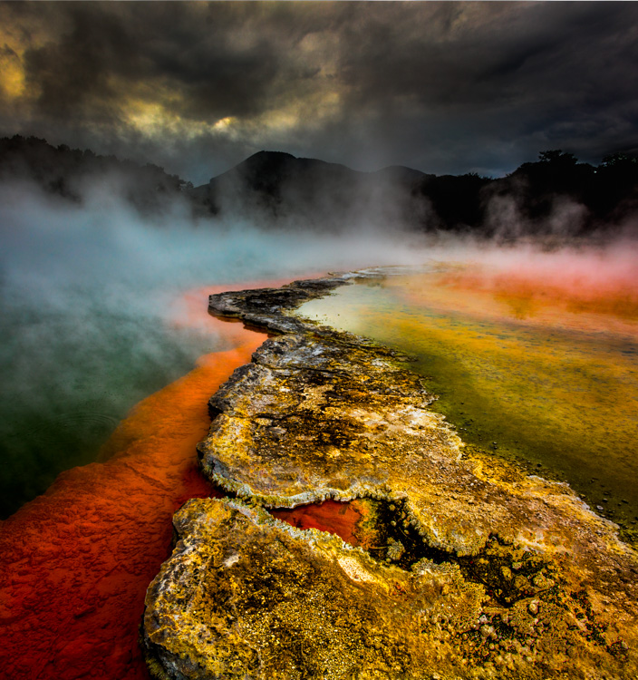
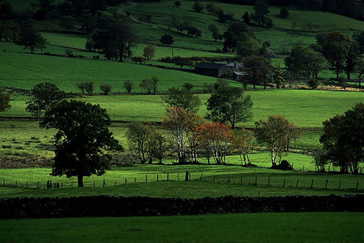
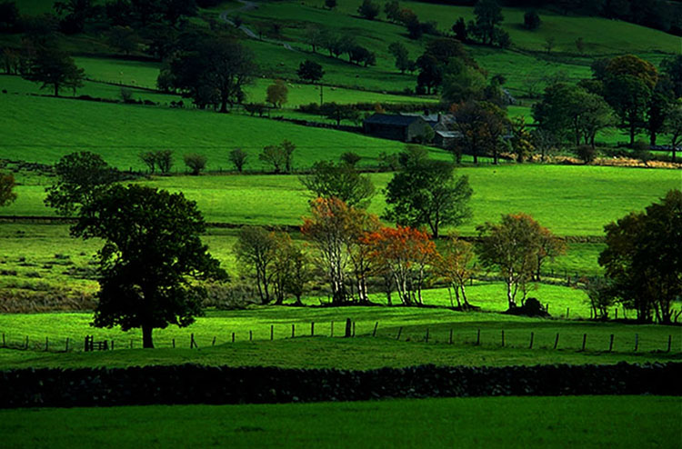
.

How To Use An Image’s Frame Effectively & Expressively

The four most important lines of any image are the ones that are often least recognized consciously – the frame. Part of learning to make successful compositions is learning to become more conscious of the frame and how to use the forces it exerts on your images for desired effects. 

Watch The Movement of the Eyes Within the Frame

Whether visible or invisible, every line creates vectors of force that encourage the eyes first to move along it and second to bounce off it. The eyes search the frame in a consistent fashion and these tendencies influence our experiences of all compositions, no matter how diverse. The general tendency is for the eyes to move within the frame from left to right and top to bottom and then to return and repeat this process. The eyes quickly scan the frame itself (determining the limits of what’s included and by extension what’s not) before they scan what’s within the frame. On their first pass, rather than scanning each line of the frame precisely, the eyes quickly average the competing forces of the four vectors in a single sweeping gesture. Afterward, given time for a more careful examination of an image, the eyes may trace and retrace each line of the frame more precisely, until their quest for information is better fulfilled by other paths.

When it comes to motion one must always consider momentum, gravity, and resistance. Some motions, like falling (within the frame think top to bottom and left to right), are easier to get started and harder to stop than others, such as climbing (within the frame think bottom to top and right to left). Once a motion is started it tends to persist until stronger forces modify it. Place one or more barriers in the path of motion and it will shift and sometimes even reverse. Individual compositions work with these tendencies, whether subtly or dramatically, reinforcing, modifying, or working against them.

The motion of the eye within the frame

Powerpoints on and in the frame


Scan the Frame Consciously

Always be conscious of the frame. Scan it. Consciously move your eyes around the entire frame. Anything that touches the frame exerts a stronger influence on a composition. (This is particularly true if it touches a power point, like a corner or the middle of a border.) If information that is not important touches the frame it becomes even more distracting. To make a composition stronger, frame it in a way that only important information touches the frame.

By emphasizing more important elements and deemphasizing less important elements (or eliminating them entirely) you make images stronger. Before exposure, you have an opportunity to make the composition stronger through reframing. After exposure, you have an opportunity to make a composition stronger through cropping (this eliminates other image information that may or may not be significant) and/or retouching (this includes the image information surrounding the flaws).

Use Proximity to the Frame

Frame loose or tight? How you place elements relative to the border of the frame can have a profound impact on any composition. 


Insights Members can login to read the full article.
Email:
or Sign up

What’s New in Lightroom’s Big June 2022 Update

.
.
Adobe just packed many useful features into a new June 2022 update to Lightroom and Adobe Camera Raw. Two updates make Masking faster and easier. Plus, there is a great new feature for presets.
.

Find out more from Colin Smith at Photoshop Cafe.

Learn more in my digital photography and digital printing workshops.

12 Things To Look For In Great Prints & Common Problems To Avoid


Most people evaluate a combination of elements to assess print quality. Find out what they are, how to get them, and how to avoid common mistakes in this new video.

7 Things To Look For In Great Prints & Great Artists Who Make Exceptions

Get The Digital Printing Quick Start Guide here.

9 Ways To Tell If Your Photographs Are Over Cooked

9 Ways To Tell If Your Photographs Are Over Cooked

Have you ever taken an image so far it gets completely out of control? I know that feeling well.  It happens to all of us. It’s not all bad. We have to step over the line to find it. It is better to work hot and then to cool down than play it so safe we never get where we really want to go. 

If you find yourself in so deep that you’re not sure where you got off track and you don’t know what to do, use this check list to identify the issue. Then fix it. Even one thing can make a big difference.

Here are some common pitfalls to avoid. (Most of these moves help images; this is just a matter of taking them too far.)

Highlights clipped

You want your highlights to glow, right? But you want them to have detail too. That’s the limit. Paper white is for poets not photographers.

Too Bright

Have you ever felt like viewing an image would be easier with sunglasses on? It’s common to make images brighter while trying to get them to glow. The key lies in midtone contrast. Place it in the most important image areas and darken and/or reduce the contrast of surrounding areas to support it further.

Shadows Clipped

Unless you’re going for gothic or graphic, hold that shadow detail. Areas of dark do make midtones and highlights appear brighter. Better still, handled sensitively these dark areas can hold a unique light at the same time.

Too Much Contrast

Contrast glows, until it makes you squint. More’s not always better.  Think of Goldilocks; one of them was just right.

Over-Sharpened

Yes, we tend to think of focussed sharp images as signs of good equipment and good technique. Blurry photographs are a real drag unless the blur in them is intentional. Nevertheless, it’s easy to overcompensate and make images too sharp, completely forgetting about the sensual possibilities of texture. Let those be your guide as to how far to go and not go. (Remember, angels have halos, not horizons.)

Noise 

A little bit of noise is not the end of the world. But try not to add more during processing. Guard against it when applying extreme contrast like Clarity and Dehaze as well as when sharpening. It’s not hard to reduce during post-processing but here again don’t overdo it; don’t make your subjects look like they’re made out of plastic wrap.

Posterization

Posterization is nobody’s friend except Andy Warhol. Not working in high-bit color modes and applying strong contrast and/or saturation adjustments quickly causes posterization. Use extra care when you’re working on JPEGs. (Don’t confuse this with a graphics card being challenged to display an image when zoomed in or out; if you don’t see posterization at 100% screen magnification it’s not in your file and won’t print.)

Unnatural Saturation

Don’t fool yourself. If you don’t believe it, neither will anyone else. Often just one or two colors will seem off. When this happens adjust them separately from the others. There’s no reason to limit one color because of another.

Vignetting

Vignetting can be a great way to strengthen the frame and to direct and keep attention in it. As with all things, it can be overdone, calling attention to itself and reducing the contrast of the areas it affects adversely. Monitor lens corrections as the ant-vignetting they apply often goes too far and you end up with corners that are so light they become distracting.

Using preflight checklists is a standard practice for pilots and doctors. Though the stakes aren’t as high, they’re a good idea for photographers too. Use this checklist before you share or print images and you’ll completely eliminate Homer Simpson moments. (Doh!) Checking these things will quickly become second nature for you, but don’t let that lead to sloppiness; be thorough. There are enough items to check that it’s easy to forget one or two. But there are so few that you can count them off with your fingers. It’s probably taken you longer to read this than it will to do it on your next image or print. Just scan the bullet points.

7 Things To Look For In Great Prints & Great Artists Who Make Exceptions

Get The Digital Printing Quick Start Guide here.

7 Things To Look For In Great Prints & Great Artists Who Make Exceptions

Classic prints exhibit sharp focus, extended depth of field, high dynamic range, pronounced contrast, and idealized color.

Reduced dynamic range, often with greatly reduced saturation, sometimes with reduced sharpness, occasionally with vignetting, and infrequently material process artifacts, printed on matte surfaces at small scales classically connotes historic photographic processes. 


Half of the battle is knowing how to do something. The other half is knowing what to do. So when it comes to making fine photographic prints, it helps to know what to look for.  A combination of elements (and their relationships with one another) is often evaluated when assessing print quality. When you depart from these standards you call attention to those elements, for better (intentional) or worse (accidental). Stack up too many exceptions and technique becomes a deal-breaker. Stack up enough well-crafted elements and technique becomes a deal maker. Speaking very broadly, you could say the goal is to clearly reproduce detail and minimize distractions from it. Let me get more specific.

1    Focussed

The default stance of a photograph is for everything to be in focus; critical focus is achieved (focal plane placed on the most important subject), depth of field is deep (aperture stopped down), motion blur is non-existent (high shutter speed). Blur is seen as an unfortunate product of poor tools and/or technique.

Exceptions

When exceptions are made, to work they need to appear obvious, deliberate, and be repeated in more than one image. Motion blur (from the subject or the camera) may be used to enhance gesture. (See Ernst Haas or Alexey Titarenko.) Selective focus may be used to direct attention away from less important elements toward more important elements. (See Keith Carter.) Soft focus may be used to reduce distracting detail and/or create impressionistic effects. (See Julia Margaret Cameron or Edward Steichen.)

2    Sharp

Sharpening (analog and digital) can be used to enhance focus by making lines and textures more pronounced. Push sharpening too far and an image begins to look graphic rather than photographic. Contours (bright halos and dark lines) may be accentuated unnaturally. Noise may become apparent. Texture may become overly crisp or even brittle. 

Exceptions 

So how crisp is too crip? That’s a matter of style, which follows intention. There’s a great gulf between Richard Avedon’s (extremely sharp) and Joyce Tenneson’s (soft) photographs. Both use more or less than standard sharpness expressively.

3    Low Noise

Noise is typically minimized. It can be reduced during capture (Use lower ISOs.), editing (Avoid aggressive contrast and/or sharpening.), or output (Use fine printer resolution and ink limits appropriate for the substrate used.).

Different types of images will present different limits. Noise becomes more apparent in smooth subjects and is often hidden in highly textured subjects. You may even elect to reduce noise during post-processing more in smooth areas than textured areas. A lot of noise becomes distracting. A little noise isn’t bad; it often makes an image appear sharper.

Exceptions 

Photographers like Sheila Metzner and (early) Michael Kenna have used extreme noise to emphasize medium and create compelling atmospheres.

4    Gradation

Gradation, or the ability to reproduce smooth tonal transitions continuously without posterization, is prized. Harsh tonal transitions quickly make an image appear graphic and sometimes even abstract, reducing the illusion of volume /space and calling attention to contours. 

Exceptions 

Photographers who have been successful with high contrast photography, like Anton Corbijn and Mario Giacomelli, take it to an extreme.


Insights Members can login to read the full article.
Email:
or Sign up

Design At The Intersection Of Technology And Biology – Neri Oxman

.
“Designer and architect Neri Oxman is leading the search for ways in which digital fabrication technologies can interact with the biological world. Working at the intersection of computational design, additive manufacturing, materials engineering and synthetic biology, her lab is pioneering a new age of symbiosis between microorganisms, our bodies, our products and even our buildings.”

6 Benefits Of Making Prints Of Your Photographs

.
In this video, I count the ways living with prints brings new life to you and your images. Making prints of your photographs benefits you and your images in many ways including improving your vision, making more high-quality images, sharing your work effectively, and much more.
.

How To Strike Up A Lively Conversation With Your Images

Decades ago, my friend Jeff Schewe asked me, “We both know how to do a lot of things to our images but how do you decide what to do to your images?” My response surprised him, “Talk with them.” Let me expand on that for you, as I did for him so many years ago.

We often deepen our relationship with other people by having a conversation with them. We can do the same with images. Even though they don’t speak, we can speak for them. There are many ways to do this.

Write

Before I go into more detail, let me offer you a crucial piece of advice. Make sure you write this stuff down as you go. You won’t be able to remember everything you come up with and the act of writing will allow you to come back to it and pick up where you left off, help you find more insights, forge deeper connections, and increase the chances that you’ll act on it.  All of these benefits happen more strongly when you write by hand but that’s slower and not as easily retrieved, so more often than not, I use the notes app on my phone, which can be accessed from any of my devices. I recommend you try many ways of taking notes to determine which ways work better for you.

Conversations start with questions. Ask a lot of questions. Then answer them as if you were the image. Write that down.

Ask Questions

Conversations start with questions. Ask a lot of questions. Ask way more questions than you ever thought to ask. I usually set my goal at 100. Why? The goal of this exercise is to get beyond the obvious and the conventional. Sure, ask those questions too but go well beyond them. Ask the kinds of “crazy” questions kids ask. (What does this image eat?) Pretend you’re someone or something else and ask the questions he/she/they/it might ask. (If you’re the frame … Who put these things in me? And why did they put me here?) Imagine you are the work of art and ask the questions it would ask if it could. (What do I have to do to stay out of that closet?) The skill of asking more questions gets easier if you simply rephrase the same question in different ways to get different perspectives. Change the w word – who, what, when, why, where, how. (What is this about? How does it go about it? Who goes there?) Reverse questions; ask the opposite question. (Why is it lower? Why isn’t it lower? Why isn’t it higher?) Or, add not to any question. (Is it dark? Is it not dark?) Once you have your list of questions scan it for patterns. What kinds of questions did you ask? What did you ask questions about most frequently? What questions stand out as most interesting? Asking questions may be all you need to do to find useful insights. Answers are optional. I recommend hypothesizing what they are and to look for opportunities to answer a single question in more than one way. Remember, write it down. You can revisit your list later and you’ll most likely have a different perspective with different outcomes. You can also repurpose many of the questions in your list to use with other images. This is a skill that gets easier over time. Make asking a lot of questions a habit.

Imagine that you’re the image.

If I were you, what would I do? 

If I were you, what would I feel?

If I were you, what would I want?

If I were you, what would I think?

(You can expand these questions by adding “about ___” at the end and filling in the blank.)

Walk a mile in your mind with your images. Just treating your images as if they are sentient creatures will instantly make you feel more connected to them, which will show in your final results, and people who see your images will be drawn closer to them because of that quality.

I recommend you do this more than once at different times. Your moods, influences, and perspectives are constantly shifting, sometimes only a little, sometimes a lot. In fact, practicing these internal conversations is one way of proactively influencing your internal flow. (And yes, we all have a mind-body connection.)

Associate

Let’s talk about you. When you look at an image … 

What emotions do you feel? What’s the mix?

How does your body feel when you look at it? Where?

What memories does it bring up? What’s the connection?

What other images do you think are related to it? Why?

What other things does it remind you of? 

What single words and phrases would you use to describe it? 

Make a list of nouns. What is it of?

Make a list of verbs. What is it doing?

Make a list of adjectives. What qualities do the things and actions possess?

In these kinds of … call them exercises or studies or research sessions … it’s supremely important not to judge or censor yourself. This will stunt the growth of this process, your growth. Write it all down. Nothing is too ridiculous. In fact, if you don’t let a good dose of that irrational stuff out you won’t find as much magic. For the moment, stop making sense. Make sensitivity. Let your inner child out to play with wild abandon. You can clean up your room later.

Ask why five times.

Read More

Two Generations Talk : Paul & John Paul Caponigro – Online MMW

Receive this ebook free.       26 images – 26 quotes

.
Recorded May 10, 2022 – 1 PM EST


Two Generations In Conversation, an afternoon with father Paul Caponigro and son John Paul Caponigro cohosted by Maine Media Workshops. During this captivating hour, the Caponigros, after a brief viewing of images, will share their thoughts about the soul of photography, the joys of printing, and how the two are related. Then we’ll finish our program with a lively question and answer session open to all participants.

Enjoy this shorter video as either an appetizer or a dessert.