Enjoy this collection of quotes on the color brown.
Which is your favorite? Have one to add? Leave a comment!
“I cannot pretend to feel impartial about colors. I rejoice with the brilliant ones and am genuinely sorry for the poor browns.”
- Winston Churchill
“Remember to be gentle with yourself and others. We are all children of chance, and none can say why some fields will blossom while others lay brown beneath the August sun.”
- Kent Nerburn
"Brown is a sober and sedate colour, grave and solemn, but not dismal, and contributes to the expression of strength, stability, and solidity, — vigour, warmth, and rusticity, — and in minor degree to the serious, the sombre, and the sad; not with the painter only, but also with the rhetorician and poet, with whom, nevertheless, many of the broken colours are yet "airy nothings" and "without a name."
- George Field
“Nevertheless, this external sound turns into internally powerful sound. When properly used brown paint produces indescribable inner beauty, self-restraint.”
- Wassily Kandinsky
“A baton of light across the bracken redeemed the reputation of the color brown with fiery reds and yellows.”
- Ian McEwan
“The color brown, I realized, is anything but nondescript. It comes in as many hues as there are colors of earth, which is commonly presumed infinite.”
- Barbara Kingsolver
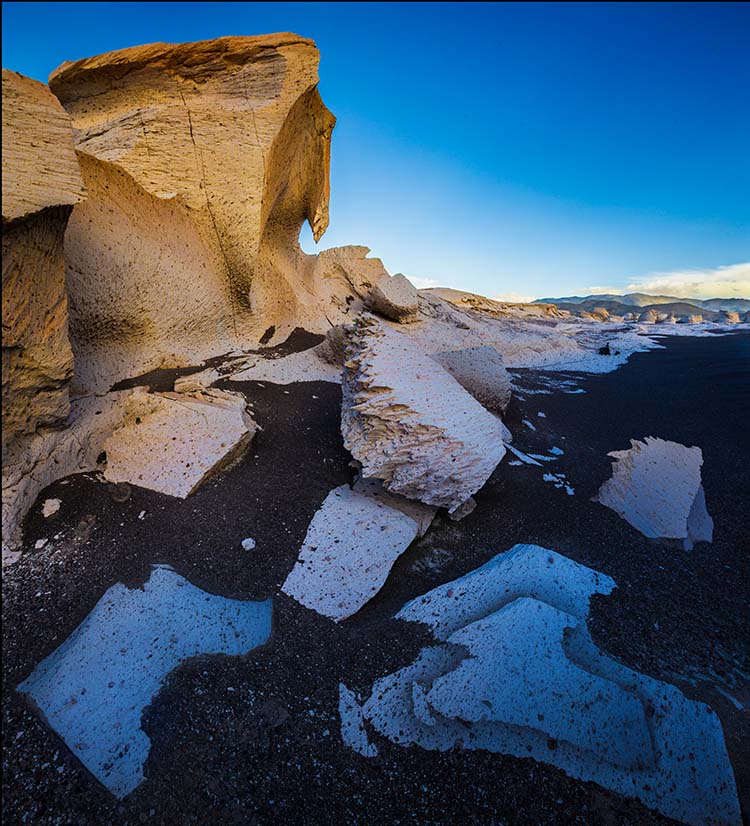
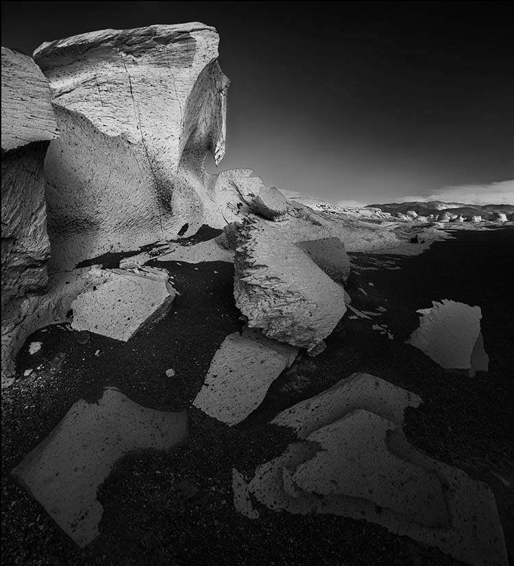
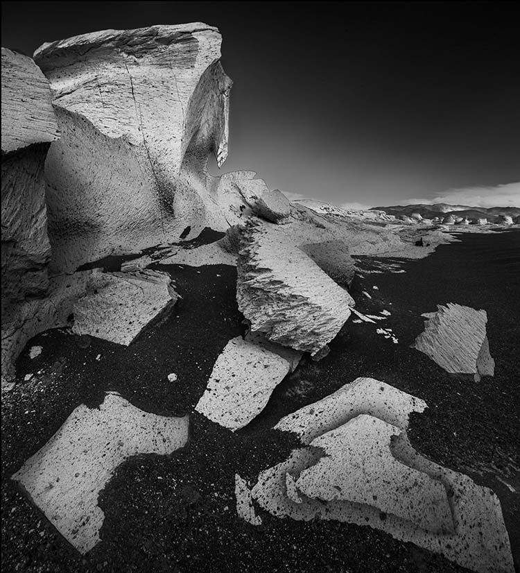
"Brown is neither one of the basic color perceptions nor a primary color used in color mixtures, but for human beings it is constantly present both in nature and in their everyday surroundings. It is the color of the earth itself — of rocks and sand, of the bark of trees, of the fur of animals. In that sense, at least, it could be called the basic color of everyday life."
- Kunio Fukuda
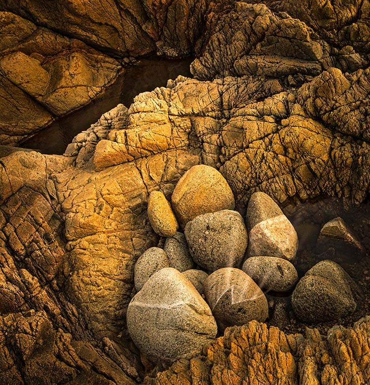
"Brown is the color of hearth and home — of dried herbs and stone-ground bread and freshly baked cookies. It represents all of the nurturing, life-sustaining, down-to-earth qualities of terra firma, the very shade of earth itself. Just as in the sturdy oak, brown represents roots, a steady, stable source of security, comfort, and normalcy. It is the color of fertile soil and plowed earth, buckskin and rawhide, weathered redwood, bison and mustang, frontier land — rugged and outdoorsy. It is pine cone and bracken, chipmunk and acorn, beaver and doe. Brown is considered a classic shade of solid substance."
- Leatrice Eiseman
“My skin is kind of sort of brownish pinkish yellowish white. My eyes are greyish blueish green, but I’m told they look orange in the night. My hair is reddish blondish brown, but it’s silver when it’s wet, and all the colors I am inside have not been invented yet.”
- Shel Silverstein