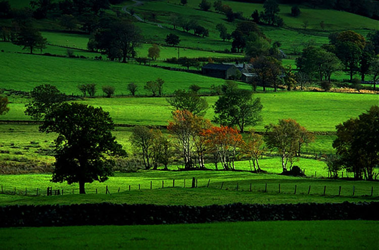
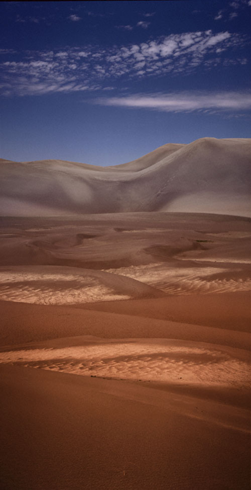
.

Cool Multi-Color Effect Using RGB Channels In Photoshop

.

Learn a bunch of creative effects you can apply using three simple checkboxes. My favorite use is to light an object from three different angles and then combine the three images into a colorful result.

Check out more of Ben Wilmore’s Digital Mastery here.

Learn more in my digital photography and digital printing workshops.

Use A Little Gestalt Psychology To Make Your Compositions Stronger

Motion attracts attention.

Danger attracts more attention.

Including a person in an image does more than show scale; the person becomes the main actor in the scene.

Typically, man-made objects are almost as interesting as the people who make them, sometimes more.

Animals are almost as captivating as people.

Though they demand less attention than animals, plants still demand more attention than minerals. 

Metaphor, especially anthropomorphism, helps establish human interest in animate elements.


You can use psychology’s insights into perception to creatively enhance your compositions. Psychological forces not only divert the flow of the eye through images but also change reactions to image content in specific ways.

While all psychologists agree that perceptions are the products of complex interactions between a variety of stimuli, not all fields of psychology have the same focus and so they offer different insights. One field of psychology offers a particularly rich set of theories for understanding perception – gestalt psychology.


Insights Members can login to read the full article.
Email:
or Sign up

How To Fix Red Faces In Your Photographs Using Photoshop

Learn how the pros remove red from faces. We’ll go beyond the standard technique of Hue/Saturation and will also take a look at why a lot of images from the internet always have red faces. In the process, you’ll learn how to isolate colors using Hue/Saturation, how to paint with color and how to perform basic color shifts using curves. You’ll learn a bunch that will be applicable even if you never run across skin tones that needs fixing.

Check out more of Ben Wilmore’s Digital Mastery here.

Learn more in my digital photography and digital printing workshops.

3 Great Books On Composition

Michael Freeman’s The Photographer’s Eye demonstrates how the elements of composition are applied in photographs, which are often so laden with detail that it’s more challenging to see the fundamentals.

Christian Leborg’s Visual Grammar is a quick read that you can look at for a long time. It is very useful to consider visual dynamics abstractly so that they can be applied more universally.

Rudolf Arnheim’s Art and Visual Perception is a classic that discusses how the principles of gestalt psychology apply to composition.

Read more in my Creative Composition resources.

Learn more in my digital photography and digital printing workshops.

Quickly And Easily Change White To Any Color With Photoshop

.

Learn three methods for adding color to white objects. The first two are the most common approaches, which to my eye do not look professional, so I’ll show you how to improve their results. The third approach is the highest quality and least common method and is the only one that involves zero guesswork to produce very professional-looking results.

Check out more of Ben Wilmore’s Digital Mastery here.

Learn more in my digital photography and digital printing workshops.

4 Reasons To Use Abstraction In Photography Plus 20 Experiments To Try

1 Structure Clarified

2 Process Detailed 

3 Concept Visualized

4 Pattern Created

5 Extreme Simplification


Abstraction

To one degree or another, every photograph is abstract. At a minimum, photographs are flat rather than three-dimensional. Some photographs are more graphic than others. And the origins of a few photographs are virtually unrecognizable. Answering to what degree a photograph is abstract, how it is abstract, and why it’s abstract will help you understand more about it and its creator’s intentions – this might be you.

Definitions

So what does abstract mean? First used in the 14th century the word abstract comes from the Latin abstrahere meaning to draw away (ab = away + trahere = to pull) and was used to mean “withdrawn or separated from materials objects or practical matters.” As a noun abstract means a condensed piece of writing. As an adjective or adverb the meanings of abstract are widely divergent; general, summarized, distilled, not specific, qualitative, disassociated, nonmaterial, theoretical, geometric, formal, non-representational, not applied, unreal, transcendent, abstruse … The list goes on until the meaning of abstract becomes diffuse to the point of being more suggestive than specific. Long used in fields as diverse as religion, philosophy, and science, surprisingly, the word abstract wasn’t widely used in the arts until the early 1900s during the modernist movement, when painters and sculptors departed from realism and even representation, which was in part a reaction to photography.

How Abstract Is It?

When looking at images it’s useful to ask a number of questions. Beginning to answer these questions will tell you a great deal about both individual images and their relationships to other images, even if the answers you arrive at are neither definitive nor complete. Sometimes the toughest questions are the most rewarding. They keep giving and giving, for a long time, perhaps even a lifetime.

Regarding abstraction, try these questions.

 “On a scale of 1-10, how abstract is it?” It may be only a little or it may be a lot.

“What’s abstract about it?” While some images are entirely abstract, in other images only certain aspects may be abstract and this may be partial or complete. What’s done and how it’s done can direct attention in specific ways, describe particular graphic qualities, and display interpretation.

“What kind of abstraction is it?” Though they may all coexist in a single image, conceptual, minimal, and non-representational, are three very different qualities, which often identify intent.

 Intent brings us to the most important and often most difficult question to answer. “What purpose does abstraction serve?” This is essential to answer before asking “Is the means appropriate for the end?” and “How well is it done?”

How long visual attention is sustained depends on whether the stylization has purpose, how well it serves the message, and how well it’s done.

The Many Uses Of Abstraction

Abstraction can serve many functions; it can stimulate, structure, inform, and express.


Insights Members can login to read the full article.
Email:
or Sign up

Use LAB Numbers To Match Color of Two Areas in Adobe Lightroom Classic

.

How To Use RGB and LAB Numbers in Adobe Lightroom Classic

Just below the histogram in Lightroom Classic’s Develop module are a set of three numbers that can be useful when optimizing your images. Let’s explore how I use those numbers when evaluating images before processing, when color correcting images and when I need to match the color between two areas. I’ll also attempt to explain the difference between RGB and LAB settings, how to switch between them, and when one option is more useful than the other.

.

.
Use LAB Numbers To Match Color of Two Areas in Adobe Lightroom Classic

.

Learn to take the guesswork out of matching colors by using the numbers that appear below the histogram in Lightroom Classic. In this case, I’ll match two different colored bricks on a building, but you could just as easily use this for all sorts of other purposes.

.

Check out more of Ben Wilmore’s Digital Mastery here.

Learn more in my digital photography and digital printing workshops.

Three Keys To Analyzing Images – Content, Form & Feeling

1 Realistic images emphasize content.

2 Graphic images emphasize form.

3 Expressionistic images emphasize feeling.

4 Impressionistic images may evoke content, form, and/or feeling.


Making verbal statements about visual images can be challenging. But, it’s also very useful. Learning to make useful statements about images can help you clarify the type of work you’re looking at or making. It can help you identify an artist’s intentions, including your own. It can help give you direction. It can help you improve your images. It can help you develop projects and predict outcomes. It can help you more effectively communicate with others. When it comes to appreciating and making images, words can be very useful. You don’t need to have a degree or be a professional writer to use words well. Sometimes, a few simple words can end up being the most useful – especially if they’re the right words.

One useful way to comment on images is to discuss three important and related aspects of images - content, form, and feeling. While all images have these dimensions, you can describe the kind of image a work of art is based on how it weights these three concerns. 

Here are several types of images that weigh these concerns differently.


Insights Members can login to read the full article.
Email:
or Sign up

The Best Ways To Use Multi-Colored Histograms In Adobe Lightroom & Camera Raw

.

The colors that appear in Lightroom, ACR, and Photoshop’s histograms can be useful to detect color casts, determine if detail is being lost, and know more about the colors that make up an image. I start by blindly interpreting a bunch of histograms while I cannot see the image that it represents (but you can). I then explain how basic color works and how that relates to the colors that appear in the histogram.

Check out more of Ben Wilmore’s Digital Mastery here.

Learn more in my digital photography and digital printing workshops.