Enjoy this collection of quotes on Commitment.
“The quality of a person’s life is in direct proportion to their commitment to excellence, regardless of their chosen field of endeavor.” – Vince Lombardi
“Motivation is what gets you started. Commitment is what keeps you going.” – Jim Rohn
“Desire is the key to motivation, but it’s the determination and commitment to an unrelenting pursuit of your goal – a commitment to excellence – that will enable you to attain the success you seek.” – Mario Andretti
“Most people fail not because of a lack of desire but because of a lack of commitment.” – Vince Lombardi
“Unless commitment is made, there are only promises and hopes; but no plans.”― Peter F. Drucker
“The most important element in the failure equation is your personal commitment to keep trying.” – Catherine Pulsifer
“Commitment is what transforms a promise into a reality.” – Abraham Lincoln
“Commitment is the foundation of great accomplishments.” – Heidi Reeder
“The only limit to your impact is your imagination and commitment.” – Tony Robbins
“You don’t know what your abilities are until you make a full commitment to developing them.”– Carol S. Dweck
“Without commitment you cannot have depth in anything.” – Neil Strauss
“Commitment is an act, not a word.” – Jean-Paul Sartre
“Commitment leads to action. Action brings your dream closer.” – Marica Wieder Read More
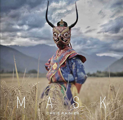
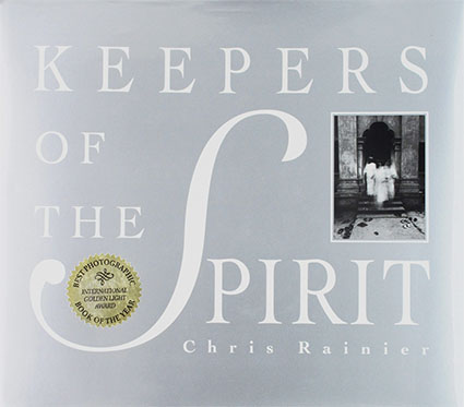
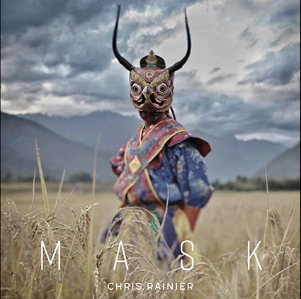
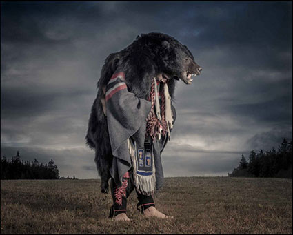
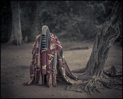
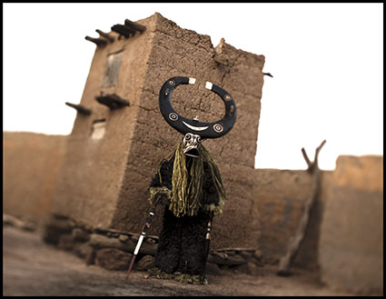
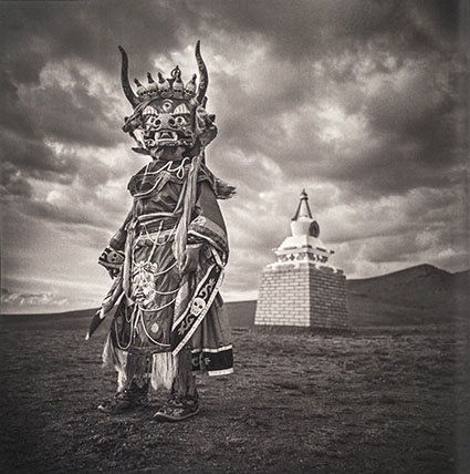
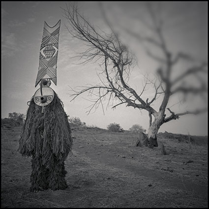
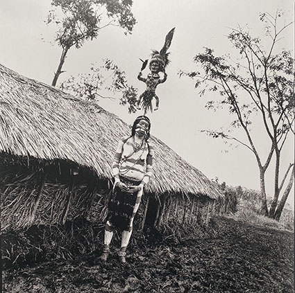
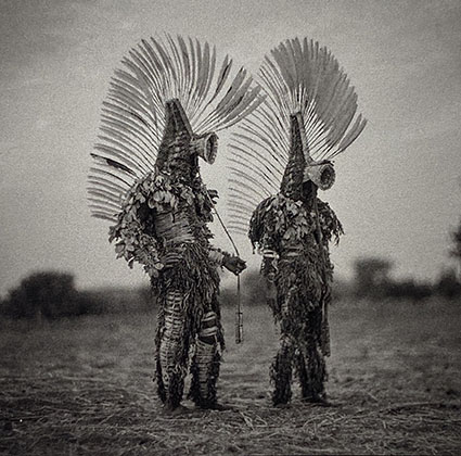
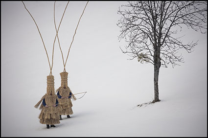
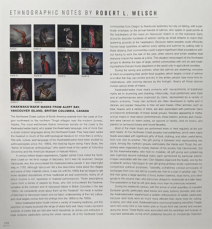
In his new book Mask, Chris Rainier focuses his lens on the uses of masks across cultures, religions, and eras to reveal something universal about humanity.
You’ll want to read this book twice. First, just look at it. Then, read the back matter.
The images are extremely powerful on their own yet the book takes us even deeper with the additi0n of ethnographer Robert L Welsch’s comments on the individual masks, traditions, and cultures. Learn more about Mask and Chris Rainier here.
“Using the power of photography, Chris Rainier, National Geographic Society fellow and photographer, takes us on a journey to cultures that are using computers, cameras, and video to archive and preserve their quickly disappearing ancient traditions. He will show clear examples of traditional communities using technology to revitalize and maintain their way of life. Traveling the planet for over 30 years, Rainier has been in a race against time — to document ancient communities struggling to save their ancient ways of living for future generations. Now, with the advent of technologically driven storytelling and social media, he focuses his energy on helping to empower indigenous communities to gather around the “fireplace” of the Web to tell stories — stories of what it means to be alive and human in the 21st century.” Discover more by Chris Rainier here.
Check your inboxes!
My newsletter Insights went out Monday, Nov 11th at 6 am EST.
This special issue features 24 Great TED Talks On Photography.
Plus there’s even more. Sign up today!
–
If you already signed up but didn’t get this issue, check your email for a reconfirmation email sent last Friday, Oct 25th at approximately 10:40 am EST.
Since 1984 TED (Technology, Entertainment, Design) has celebrated photography as a supreme communicator. Find out how today’s top photographers use photography to explore the world and share what they find with us. You’ll be amazed. It’s so inspiring!
Balog, Burtynsky, JR, Lanting, Nachtwey, Nicklen, Rainier, Salgado, Wolfe are just a few of the names included in this list of lists.
You’re sure to find not only information and inspiration but also techniques and ideas that you can use to reenergize and improve in your photography.
24 choices, 18 minutes each, 7 hours of viewing!
Where do you start? Try these first.
Edward Burtynsky exhibits the human race’s ability to change our environment. James Balog documents the massive changes in our planet’s ice.
James Nachtwey illuminates tragic the face of war hoping to limit conflict.
Chris Jordan illuminates human consumerism.
Chris Rainier preserves indigenous ways of being human.
JR offers innovative approaches to presentation and collaboration.
I show synergies between media that can energize your creative process.
Savor these!
David Griffin
How Photography Connects Us
The photo director for National Geographic, David Griffin knows the power of photography to connect us to our world. In a talk filled with glorious images, he talks about how we all use photos to tell our stories.
David Hume Kennerly
Telling The Story In 1/60th Of A Second
Ralph Gibson
According to ArtDaily: “For Gibson, photography isn’t about capturing a special event or a certain moment but about making the most insignificant subject into a work of art”.
James Balog
Time Lapse Proof Of Extreme Ice Loss
Photographer James Balog shares new image sequences from the Extreme Ice Survey, a network of time-lapse cameras recording glaciers receding at an alarming rate, some of the most vivid evidence yet of climate change.
Chris Rainier
Cultures On The Edge
Using the power of photography, Chris Rainier National Geographic Society Fellow takes us on a journey to cultures that are using modern technology smartphones, computers, cameras, and video to both preserve their quickly disappearing ancient traditions, as well incorporate traditional knowledge with cutting edge technology to find sustainable solutions for the pressing global issues.
Phil Borges
Photos Of Endangered Cultures
Dentist-turned-photographer Phil Borges documents the world’s disappearing cultures, capturing portraits of exiled Tibetan monks and many of the world’s embattled tribal and indigenous cultures.
Jimmy Nelson
Gorgeous Portraits Of The World’s Vanishing People
When Jimmy Nelson traveled to Siberia to photograph the Chukchi people, elders told him: “You cannot photograph us. You have to wait, you have to wait until you get to know us, you have to wait until you understand us.” In this gorgeously photo-filled talk, join Nelson’s quest to understand — the world, other people, himself — by making astonishing portraits of the world’s vanishing tribes and cultures.
James Nachtwey
Let Photographers Bear Witness
Accepting his 2007 TED Prize, war photographer James Nachtwey shows his life’s work and asks TED to help him continue telling the story with innovative, exciting uses of news photography in the digital era.
Sebastiao Salgado
The Silent Drama Of Photography
Economics PhD Sebastião Salgado only took up photography in his 30s, but the discipline became an obsession. His years-long projects beautifully capture the human side of a global story that all too often involves death, destruction or decay. Here, he tells a deeply personal story of the craft that nearly killed him, and shows breathtaking images from his latest work, Genesis, which documents the world’s forgotten people and places.
JR
Use Art To Turn The World Inside Out
French street artist JR uses his camera to show the world its true face, by pasting photos of the human face across massive canvases. At TED2011, he makes his audacious TED Prize wish: to use art to turn the world inside out.
Jeremy Cowart
A Picture Is Worth
Celebrity photographer Jeremy Cowart tells the story of Help-Portrait and the unexpected impact it had on both sides of the camera. Illustrating how it began as a simple idea that spread to a global movement in just a few months, Jeremy reminds us all that giving within your gifting can change the world.
Edward Burtynsky
Manufactured Landscapes & Green Education
Accepting his 2005 TED Prize, photographer Edward Burtynsky makes a wish: that his images – stunning landscapes that document humanity’s impact on the world – help persuade millions to join a global conversation on sustainability.
Frans Lanting
Photos That Give Voice To The Animal Kingdom
Art Wolfe
From Wildlife To The Human Canvas
The amazingly expansive range of work by Art Wolfe shows how a lifelong artist can evolve creatively throughout his lifetime. From snapping powerful shots of wildlife to painting and photographing people naked in stark settings, Art Wolfe explores his evolution as an artist, and how inspiration can strike at the most unlikely times (and even unlikelier places).
David Yarrow
Wild Encounters – What I Do Differently
This talk gives a retrospective of David’s work as a wildlife conservation photographer and the story of his different approach to photography. David also touches on his anticipations for the requirements of future photographers.
Paul Nicklen
Animal Tales From Icy Wonderlands
Diving under the Antarctic ice to get close to the much-feared leopard seal, photographer Paul Nicklen found an extraordinary new friend. Share his hilarious, passionate stories of the polar wonderlands, illustrated by glorious images of the animals who live on and under the ice.
Stephen Wilkes
The Passing Of Time Caught In A Single Photograph
Photographer Stephen Wilkes crafts stunning compositions of landscapes as they transition from day to night, exploring the space-time continuum within a two-dimensional still photograph. Journey with him to iconic locations like the Tournelle Bridge in Paris, El Capitan in Yosemite National Park and a life-giving watering hole in heart of the Serengeti in this tour of his art and process.
George Steinmetz
Photographs Of Africa Taken From A Flying Lawn Chair
George Steinmetz’s spectacular photos show Africa from the air, taken from the world’s slowest, lightest aircraft. Join Steinmetz to discover the surprising historical, ecological and sociopolitical patterns that emerge when you go low and slow in a flying lawn chair.
Yannus Bertrand
A Wide Angle View Of Fragile Earth
In this image-filled talk, Yann Arthus-Bertrand displays his three most recent projects on humanity and our habitat — stunning aerial photographs in his series “The Earth From Above,” personal interviews from around the globe featured in his web project “6 billion Others,” and his soon-to-be-released movie, “Home,” which documents human impact on the environment through breathtaking video.
Benjamin Grant
What It Feels Like To See Earth From Space
What the astronauts felt when they saw Earth from space changed them forever. Author and artist Benjamin Grant aims to provoke this same feeling of overwhelming scale and beauty in each of us through a series of stunning satellite images that show the effects human beings are having on the planet. “If we can adopt a more expansive perspective, embrace the truth of what is going on and contemplate the long-term health of our planet, we will create a better, safer and smarter future for our one and only home,” Grant says.
Nick Veasey
Exploring The Invisible
Nick Veasey shows outsized X-ray images that reveal the otherworldly inner workings of familiar objects — from the geometry of a wildflower to the anatomy of a Boeing 747. Producing these photos is dangerous and painstaking, but the reward is a superpower: looking at what the human eye can’t see.
Chris Jordan
Turning Powerful Stats Into Art
Artist Chris Jordan shows us an arresting view of what Western culture looks like. His supersized images picture some almost unimaginable statistics – like the astonishing number of paper cups we use every single day.
Chris Orwig
Chris Orwig celebrates Finding The Magnificent In The Mundane.
John Paul Caponigro
You’re More Creative Than You Think You Are
I detail how writing, drawing, and photographing are different modes of perception that you can be combined for surprising successes. View more Photographer’s Videos here.
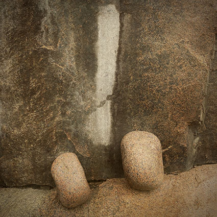
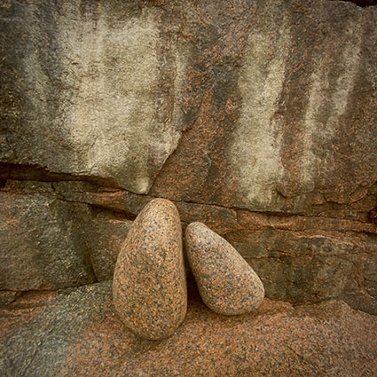
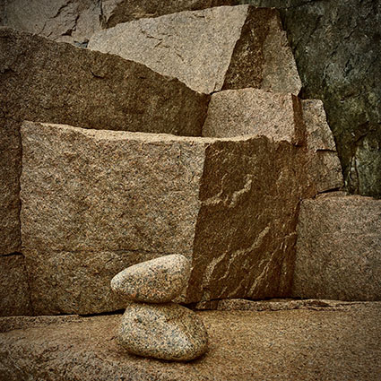
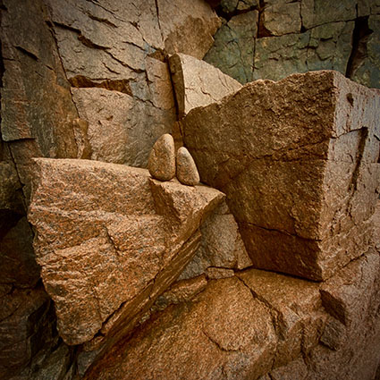
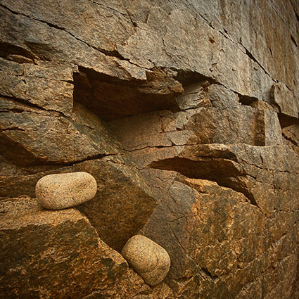
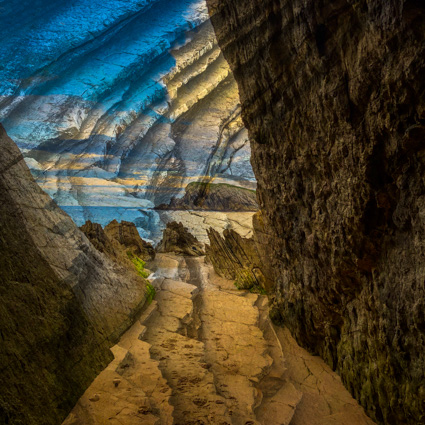
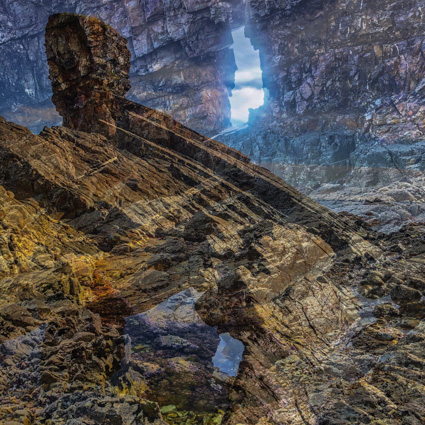
Wherever I go I explore the world visually with a camera. Sometimes this is during a walk. Sometimes this is during a workshop. Other times it’s while I’m making a body of work. You might think it distracting to think about one thing while you’re doing another but I find that working on two different ideas at the same time often leads to a fertile cross-pollination. I find new ideas this way.
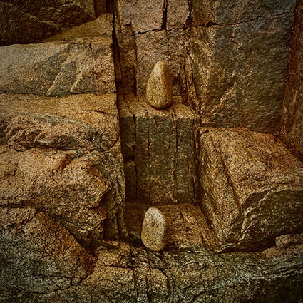
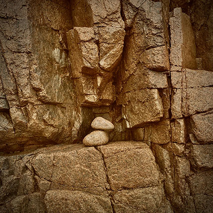
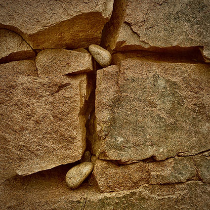
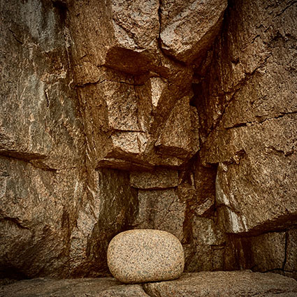
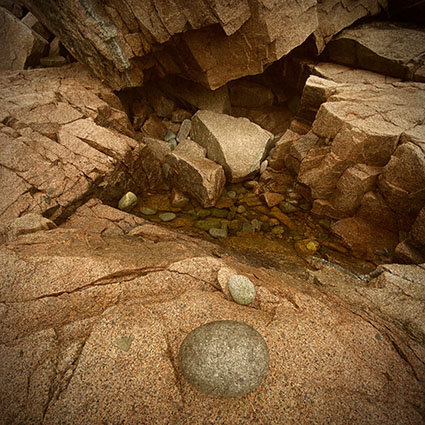
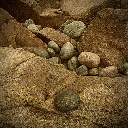
Of course, you’ve got to stay flexible. Recently, while I was leading a photography workshop in Maine’s Acadia National Park I went looking for the cairns so many visitors leave behind. I don’t like them in public lands, because when I go there I want to be able to experience the land uninterpreted. Still, I appreciate the playful contact people have with the land when they make cairns. So to work on my ambivalence I started making art out of the cairns. But this time, they weren’t there. I was pleasantly surprised and a little disappointed, which also surprised me. So I started to make my own cairns to photograph, intending to scatter them before I left, and never got to it because the first two stones I picked up were all I needed that day. The relationships between them and their environment were much richer than I expected. It felt like arranging still lifes, which I did for hours – and I’m sure I’ll do it again.
These studies relate to my series Alignment. View my Maine Cairns studies here. View my studies of Maine Artists here. View more studies of Maine here. Find out about my Maine fall photography workshop here.
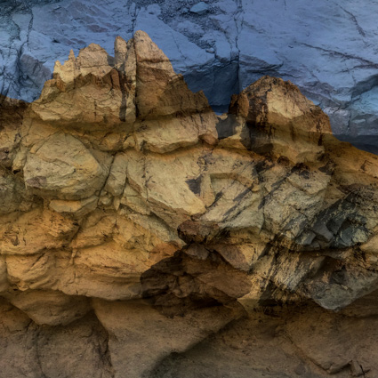
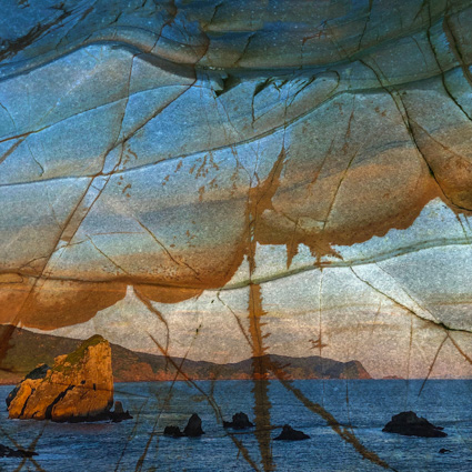
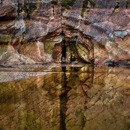
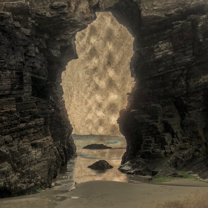
For years I’ve used my iPhone as a sketchbook to play, make images more spontaneously, and explore ideas. I’ve always been fascinated by how the tools we use change our perception. Yet, knowing it wasn’t the tool that made the difference between a study and a finished work, I’d been challenging myself to create a series of images with my iPhone that had as much depth of content and feeling as the images I’ve made with cameras that make higher quality files. Land In Land is the first series I’ve done this with. Here’s a quick look at how it developed.
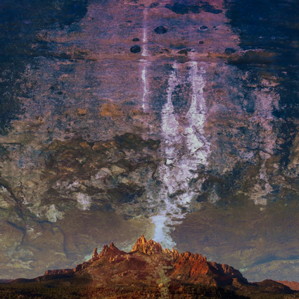
I knew I was onto something when I saw this first image in New Zealand.
I got confirmation that the idea could be sustained with this second image.
I found that meaningful variations could be found in other locations like California.
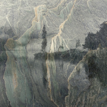
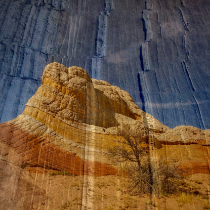
This process of discovery was repeatable in Utah.
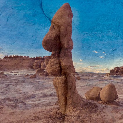
This new way of seeing finally became intuitive for me, leading to increased productivity in Spain.
My mother (an artist, a picture editor, a designer) has an exceptional eye. When she asked for a print of this last image and hung it near a prized Tibetan tanka, it was confirmation for me that I’d achieved a real depth that carries through to others. View the suite of images from Maine here. View the video here. Listen to the statement here.