Dan Steinhardt – About Paper / Meaningless Terms


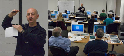
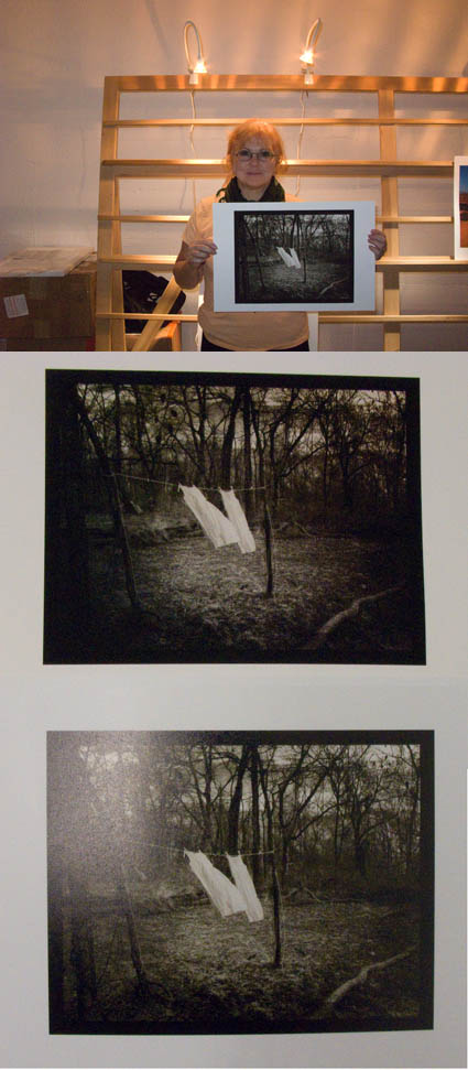
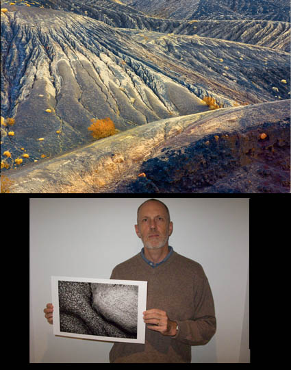
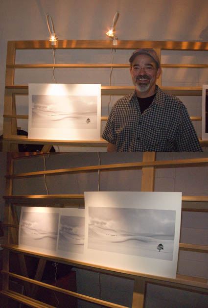
Last week at The Fine Art of Digital Printing workshop The Fine Art of Digital Printing workshop (taking place at Brooks sponsored by Epson) spoke about paper. We always have special guests at these events and we were delighted that Dano was able to come this time. Dano explained a lot of interesting things about paper (three types – swellable, microporous, cotton fiber)(the history and myths of OBA’s – optical brightening agents – used in paper coatings, some longer lasting than others)(longevity facts – it’s a combination of many factors, lightfastness being only one).
One of the funnier things that everyone came away with was how many terms we’re used to hearing and using that are essentially meaningless and can be potentially misleading if you make assumptions often associated with the terms. “Fine art paper”, “museum grade”, “archival”, “pearl”, “luster”, “stipple” are all marketing terms with no definite meaning. “Permanent” means water fast, but doesn’t imply light fast. “Compatibility” simply means the paper will transport through the printer – nothing more. So it pays to know which terms are truly meaningful/useful and which terms aren’t.
More to come on this. Stay tuned.
Look for upcoming Epson Print Academy dates here.
Check out The Fine Art of Digital Printing workshops here.
Check out my Fine Digital Print workshops here.

Peg Fredi – Simulating Alternative Processes / Waxing Prints


This week at The Fine Art of Digital Printing workshop (taking place at Brooks sponsored by Epson) Peg Fredi wanted to simulate the look of the alternative process prints she’s been making with digital contact negatives. She tried several toning solutions – variations of traditional warm toning solutions. She found that she like the black of the inkjet prints, which is even blacker than alternative process blacks. She tried several paper types, ultimately deciding on Epson Velvet paper, which she then planned to wax (with butcher’s wax) to enhance the surface further. Actually, waxing print surfaces has been around a long time. It adds an extra dimension and quality to any print. And it doesn’t affect longevity. It pays to experiment. You may find new solutions that are just right for your work.
Have you finished your prints in unusual ways? Tell us about it! Comment here!
See Peg Fredi’s work here.
Look for upcoming Epson Print Academy dates here.
Check out The Fine Art of Digital Printing workshops here.
Check out my Fine Digital Print workshops here.

Steve Robeck – Thinking File Structure


This week at The Fine Art of Digital Printing workshop (taking place at Brooks sponsored by Epson) Mac Holbert and I reviewed file structure at the end of the week – by processing student work. Everyone participating in the workshop got a valuable review of the file building workflow Mac and I use and recommend. Steve Robeck also got more than one possible window into the art of interpreting digital files. Time and time again, you modify how you apply a tool, eliminate it from the process, or add another. In this case we added a Photo Filter adjustment layer applied selectively to the highlights to add subtle warm ambient color and we used an additional Hue/Saturation layer to increase the saturation of yellow accent colors throughout the image. Adopting a consistent file structure and working methodology is important. And, knowing when and why to make exceptions is equally important.
Look for upcoming Epson Print Academy dates here.
Check out The Fine Art of Digital Printing workshops here.
Check out my Fine Digital Print workshops here.

Carlos Conseco – Print Surface


This week at The Fine Art of Digital Printing workshop (taking place at Brooks sponsored by Epson) Carlos Conseco discovered how important it is to test materials and evaluate images side-by-side. He printed one of his best images on a variety of surfaces – Epson Watercolor, Velvet, Ultrasmooth Fine Art, Luster, and Exhibition Fiber. They were all good. Each material added something new to the expression of his print. Materials affect print quality in technical ways (glossy papers produce blacker blacks) and aesthetic ways (matte papers seem softer and more organic). So he slept on it before making his final decision. The most important thing he learned was that materials matter.
What papers do you like? Why? Comment here!
Look for upcoming Epson Print Academy dates here.
Check out The Fine Art of Digital Printing workshops here.
Check out my Fine Digital Print workshops here.

Cheryl Medow – Consistent Style


Cheryl Medow creates wildlife composites. She’s attending the Fine Art of Digital Printing workshop (Caponigro and Holbert at Brooks sponsored by Epson). Yesterday, some of them looked like photocomposites (surreal) and some looked like paintings (graphic). Today, after a long discussion about the most successful components in separate images and the intent she wants to communicate, they all look like they’re made by the same person who has a cohesive message. Some of the keys to unlocking her style included keeping shadow and highlight detail extremely full (none of them pure black or white, sometimes with significant color). In addition to keeping luminosity contrast low, she did the same with hue contrast, glazing the different colors in her images with a single color. Both create a more softly modulated color palette. Cheryl had to reconsider what she had learned about traditional photographs to find her own personal style. Her first step was to find the words to describe the new qualities she found through exploration (trial and error) and now wanted to repeat. The next step is to ask why. She’s got a lot of ideas, but she’s still working on it. That’s great. That’s when work starts to get really interesting.
Check out Cheryl Medow’s work here.
Check out the Fine Art of Digital Printing workshops here.
Check out my Fine Digital Print workshop series here.