BillAtkinson.com – A Great Resource


Bill Atkinson, one of the original authors of the Mac interface and color management expert, offers excellent free resources on his website. His website is so rich you might miss the free color management resources he makes available – targets, profiles, test files. In particular his Profile Test Images file is excellent for evaluating inks, papers, and profiles objectively. These resources are excellent. I recommend them to all of my workshop and seminar participants. I recommend them to you too.
Find the downloads here.
Find out more about Bill here.
Check out his book here.
Check out his photographs here.
Want more? Check out my free downloads here.

ICC Is A Scale


During the Epson Print Academy Andrew Rodney uses many great metaphors to explain a complex subject – color managment. Here’s one. The ICC standard is just a scale that gives numbers a context and ultimately a meaning. 1500! What’s 1500? 1500 what? Meters? Kilometers? The scale gives the number meaning and ultimately use. And using a common scale that we all share makes communication easier and more precise. Color management is ultimately all about scientifically describing and communicating color.
Catch one of the last three Epson Print Academy dates this season.
Toronto – Saturday, 3/21
Boston – Tuesday, 3/24
Vancouver – Saturday, 5/23
Learn more.
Check out the Epson Print Academy here.
Check out Andrew Rodney’s Color Management here.
Find Andrew’s book Color Management for Photographers here.
Check out my Color Management downloads here.
Check out my DVD 6 Simple Steps to Good Color Management here.
Check out my Fine Digital Print Workshops series here.

Bill Atkinson – Test Files


Using real world in combination with synthetic information can help you evaluate the accuracy of a color management system. It’s important to use a full spectrum of colors and information you can evaluate objectively (information you aren’t so personally invested in you may not be able to maintain objectivity while evaluating it). Bill Atkinson, one of the world’s foremost authorities on color management, offers excellent test files on his website. They’re free!
Check out Bill’s website here.
Download Bill’s test files here.
Download my test files here.
Learn more in my DVD.
Learn more in my workshops.
See the printers in action in my workshops.

Printing – Proofing


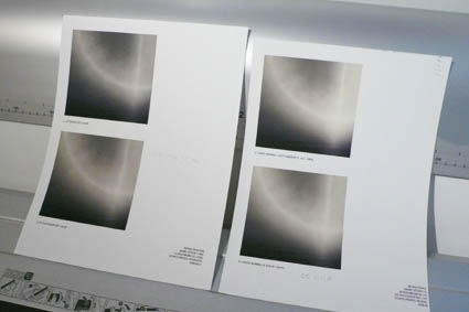
Proofing is an essential part of making the finest prints possible.
While color management and softproofing get you 90% of the way there, there are all kinds of things you still need to check in hardcopy – materials, ink limit, sharpening to name a few. Every time I print an image, I create a BAT (a final proof) that I archive for future reference. The next time I print the same image the BAT tells me how I got the best results the last time it was printed. That then becomes a starting point for future improvements. Combine advancing technology (printers, ink, substrates) and good color management / proofing practices and you’ll find your print quality will constantly evolve.
Do you proof? What kinds of things do you routinely proof?
Check out my DVD 6 Simple Steps to Good Color Management here.
Check out my DVD The Art of Proofing here.
Check out my Proofing downloads here.
Find out about my digital printing workshop series The Fine Digital Print here.

2880 vs 2400 – Gamut Comparisons


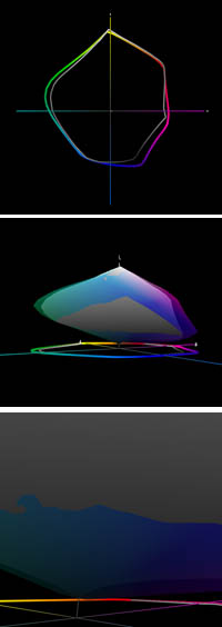
Today, Mac Holbert and I started teaching The Fine Art of Digital Printing at the Hallmark Institute of Photography in Turners Falls, MA. Epson shipped in new 2880 printers for this special event. Epson’s new 2880 uses UltraChrome K3 with Vivid Magenta. How much does Vivid Magenta expand the gamut? Check out these diagrams – 2D, 3D, and 3D looking at Dmax. The 2400 is in white and the 2880 is in full color. Both are graphing Epson Premium Luster Paper. The graphs indicate warm blues, magentas and greens are where it pays off. Slight increase in Dmax. It’s not a dramatic increase but in specific images (polarized skies and saturated foliage, it can be significant. There are also slight tradeoffs in other areas of the spectrum (wherever the white volume extends beyond the color volume).
Words and pictures can work together to tell a fuller story. These diagrams were made with Chromix’s ColorThink. I use it to graph ICC profiles and compare substrates and to compare inksets. Doing this more clearly illustrates the pros and cons of each.
It’s something I do in all of my color management sessions (like the whirlwind tour of color management participants in the FADP workshop got this morning and the sessions you’ll find on my DVD 6 Simple Steps to Color Management).
Check out my Review of Chromix’s ColorThink used to make these graphs.
Check out Chromix here.
Check out my earlier post on the 2880 here.
Check out the 2880 here.
Check out our workshop the Fine Art of Digital Printing here.
Check out my Fine Digital Print workshop series here.
Check out Hallmark’s post on today’s session.

Color Management & Proofing – Workshops, DVDs, Radio


We go into the ins and outs of advanced color management in my workshop series The Fine Digital Print. No matter what their level, it helps everyone participating. In my workshop The Fine Digital Print Advanced we take it step by step from concept to practice. In my even more advanced printing workshops The Fine Digital Print Expert and the Fine Digital Print Master we assume a higher level of knowledge and go into what doesn’t work perfectly. Here are a few examples. 1 – LCD monitors are too bright for precise prediction to print. 2 – Photoshop’s softproofing Simulate Paper Color is too aggressive.  3 – Printer drivers overink prints delivering slightly dark prints, typically losing subtle shadow detail. 4 – A majority of users don’t view their proofs and prints in ideal light. The cumulative effect leads many to think they’re doing something wrong (They might or might not be.) or that color management doesn’t work. It does. It just doesn’t work perfectly. And it’s important to know what the limitations are.
In my workshops, seminars, and DVDS, I cover what you can do to overcome these imperfections through proofing and then move on to other issues you can only address through proofing. Traditional photographic printing master John Sexton saw my demonstrations during the Epson Print Academy and remarked that watching them felt like deja vu because while the tools have changed the core concepts remain the same.
It’s been my mission to make color management relatively easy to understand and implement without dumbing it down. It can be done. No one else I know takes a more systematic and thorough an approach to proofing as I do.
I sat down several weeks ago with Scott Sheppard of Digital Photo Radio to talk about key Color Management and Proofing. Scott’s a great guy. Easy to talk with. Asks all the right questions. Scott’s one of the little guys doing big things. Digital Photo Radio is done entirely by one man. But the product is so good it seems like it’s created by an entire media team. I love to see individual entreprenuers go for it and succeed big. Scott’s done that.
Check out the audio cast and find out more about Digital Photo Radio here.
Check out my DVD 6 Simple Steps to Good Color Management here.
Check out my DVD The Art of Proofing here.
Check out free Color Management and Proofing resources on my website here.
Sign up for Insights enews to find out when new content is available here.

Color Management in Firefox 3 Browser


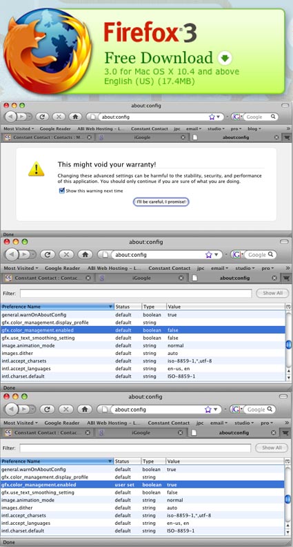
A majority of browsers have not been color managed. That’s starting to change. Apple’s Safari has been color managed for some time now. Firefox 3, Mozilla’s most recent browser version is now color managed. Color management is not on by default. Here’s how to turn it on.
1    In the address bar type in about:config.
2    Ignore the warning and click “I’ll be careful, I promise!”
3    Scroll to gfx.color_management enabled. (The default is false.)
4    Double click on this to change it to true.
5    Restart Firefox.
These new features help ensure that color management savvy users can see color as it is intended to be seen online.
I look forward to a day when all software is color managed by default.
And to a day when monitors are self-calibrating/profiling.
(And printers.)
Check out my DVDs 6 Simple Steps to Good Color Management and The Art of Proofing. Check out free color management resources in my Downloads.
How important do you think color managed monitors and browsers are? Comment here.