8 Questions Answered As I Celebrate Color For Calibrite
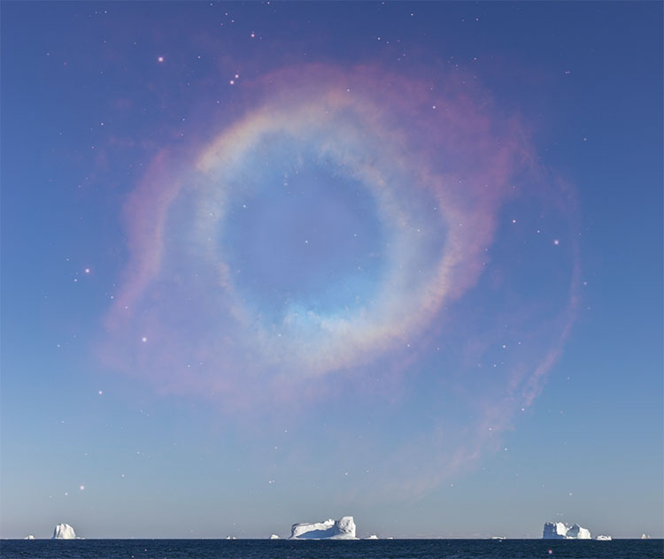
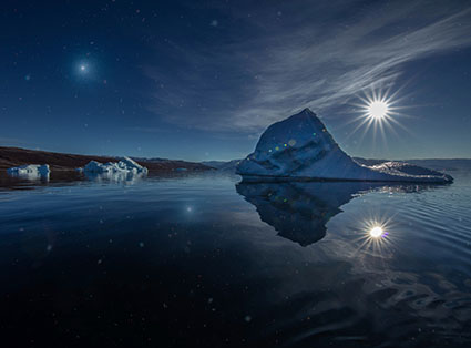
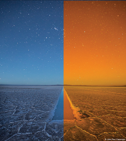
Enjoy a portfolio of my images while I celebrate color and answer eight questions for Calibrite.
Enjoy a portfolio of my images while I celebrate color and answer eight questions for Calibrite.
Use color management to make better files and insure others see them in their best light.
How To Do It
7 Simple Steps to Good Color Management
Take these simple steps to get consistent high-quality color.
Step 1 – Use ICC Profiles
Assign ICC profiles to make color consistent and predictable.
Step 2 – Profile Your Monitor
Calibrate your monitor with hardware.
Step 3 – Set Adobe Color Settings
Set good Photoshop Color Settings in seconds.
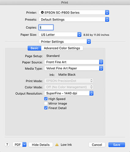
Step 4 – Profile Your Printer
Better printer profiles help make better prints.
Step 5 – Softproof Before You Proof
Preview how your print will look before printing it.
Step 6 – Check The Correct Boxes In Your Printer Driver
Set good color management policies in your printer driver.
Step 7 – Control Your Viewing Environment
Use good quality light in neutral environments to evaluate your images.
Things To Watch For
16-Bit
Thousands of shades of gray reduce posterization.
Choose A Wide-Gamut Editing Space
Choose a wide-gamut editing space to make the best prints possible.
Editing Spaces Compared
From small to large, standard RGB editing spaces including sRGB, Adobe RGB (1998), and ProPhoto.
Rendering Intents Compared
Perceptual, Relative Colorimetric, Absolute Colorimetric, Saturation.
What to Do with Color Management Dialogs
Know what to do with the color management dialog boxes you encounter.
The Difference Between Converting Versus Assigning With Color Profiles
Understand the difference between assigning and converting to a profile.
Where to Put ICC Profiles
ICC profiles need to be filed in the correct location on your computer.
Tools
When And Why To Print Test Files
Find out more about what to test.
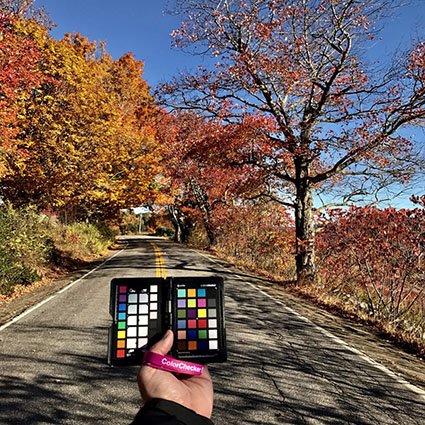
Make Camera Profiles With X-Rite’s Color Checker Passport
X-Rites’ Color Checker Passport can be used to quickly deliver more accurate color in a variety of ways.
Managing Camera Profiles
If you make camera profiles customized for your camera, sooner or later you’re going to want to rename or delete a few.
Graph Profiles With Chromix Colorthink
Colorthink graphs ICC profiles for visual comparison and contrast.
Use Full Spectrum Or HIgh CRI Viewing Light
Choose full-spectrum lighting with appropriate brightness and temperature.
One of the keys to making a great print is great shadow detail.
Shadow detail is something to be mindful of during exposure, processing, and printing. Curiously, even if you see shadow detail in your file on a calibrated monitor you may not see all of the details in your print. What can you do about this? Many things!
First Check Your Color Management
Before you start editing your files based on your proofs, check your color management system.
Recalibrate Your Monitor
Make sure you’ve calibrated your monitor with hardware. Set a brightness value of 90-100 lux, instead of using the default brightness target of 120 lux. If your monitor is too bright, your prints will look dark overall, especially in your shadows.
Read more on Profiling Your Monitor here.
Give Your Prints Enough Time To Dry
Inkjet prints come out of the printer almost dry, but not quite fully dry. When they’re fully dry, they’ll appear slightly lighter, especially in the shadows where there’s a lot of ink. So before you evaluate prints critically, give them a few minutes to dry. This affects absorbent matte surfaces even more than glossy surfaces.
Find my resource on Outgassing here.
Look At Your Prints In Good Light
Look at your prints in good light. You need the right amount of light (at least 500 lumens), the right color temperature light (5000K is the standard but many viewers prefer the warmer 3600K), and it helps to use full-spectrum light (a CRI of 90 or higher). (Many manufacturers now make full spectrum bulbs, like Solux and Soraa.)
Read more on Controlling Your Environment here.
Media Type sets the amount of ink that's used.
Set Your Media Type Correctly
Your printer driver will allow you to set your media type, which controls ink the amount of ink that is sprayed on your paper. Use too much ink and you’ll lose shadow detail. Use too little and your blacks and midtones will appear weak. If you’re using a paper not made by the manufacturer, choose the nearest media type and then adjust its settings with the printer driver’s advanced utilities. (You’ll find this under Advanced Media Control with Epson printers.)
Find my resource on Ink Limit here.

Print test patches to determine when maximum black is achieved and when separation is lost.
Print A Target To Determine How Much To Lighten Shadows
Before you adjust your files for printing precisely determine how much you need to lighten your deep shadows by printing a target. While they vary a little, most media settings lose shadow detail around a value of 96% on a grayscale. If you print patches of values between 100% and 90% you’ll see exactly where you lose shadow detail. Printed results will vary slightly with each different media setting, so you’ll need to adjust files slightly differently for different media.
You can download my targets here.
Next Adjust Your File
What color management tools do I use? Why?
Find out in my post Better Color Better Perception.
Get my free Gear Guide here.
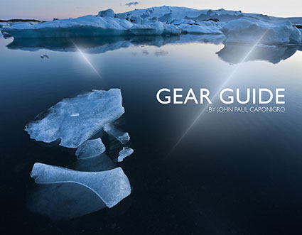
Great tools can change the way you see.
Discover my go to gear in this free eBook.
You’ll learn what I use and why I use it.
Table of Contents
1 Cameras
2 Lenses
3 Trip Essentials
4 Computers & Accessories
5 Color Management
6 Printing
Plus, my Gear Guide includes links to many helpful resources.
Download it here.
Recently on TWIP’s (This Week In Photoshop) The Fix I spoke with Jan Kabili about the power of printing your photographs. Then I demonstrated how to get the best results possible with Softproofing & Proofing practices. Watch this and you’re sure to get better prints in less time with less waste.
Find more useful videos on TWIP’s The Fix here.
Read more with my free Color Management and Printing resources.
View more in my DVD series R/Evolution.
Learn more in my digital photography and digital printing workshops.
In most cases, we think of using color management to accurately match colors when moving between different color spaces; ICC profiles are used to describe different color spaces and to make precise transformations to values moved from one to another to maintain consistent appearances. In very rare cases, when profiles are assigned to image files without a color conversion, the appearance of the image changes; values stay the same, but their meaning changes, so the image looks different. So when you use this unorthodox method of color adjustment, you get a change in appearance without changing the values in the file, and this is particularly useful when you want to pay a very small price for making very big changes.
With just a little experimentation, you’ll find you, too, can make big changes to your images and pay a small price using synthetic profiles. Using synthetic profiles is color adjustment without editing values; they change no values, but they do change the meaning of those values—and thus their appearance. Don’t believe it? Check your histogram when you assign a profile. You won’t even see it move! It’s kind of unbelievable. Try it. See it with your own eyes. You’ll quickly become a believer, too.
Learn the steps you need to take to make your own synthetic profiles …
Read more on Digital Photo Pro.
Learn more in my digital photography and digital printing workshops.
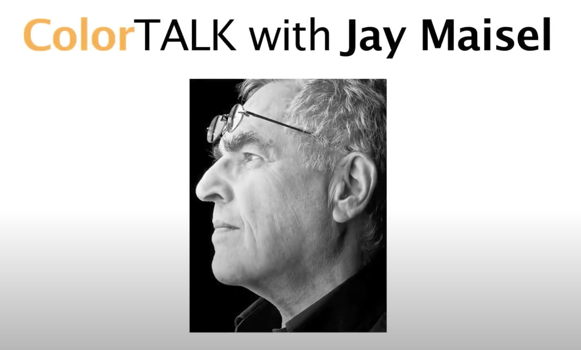
In this video, I share my thoughts and feelings on photography and color.
Find out more about color management here.
Read other interviews here.
Read my artists statements here.