The 25 Most Beautiful Black-And-White Movies

Wings Of Desire, Beauty And The Beast, Embrace Of The Serpent, Dead Man, Seven Samurai, The Seventh Seal, The Passion Of Joan Of Arc …
We’ve all got our favorite black-and-white films. Any top 10 or 25 list will surely leave some of our favorites out and start a debate – that’s well worth having. Doing the hard work of picking our tops and supporting our choices helps us be clearer about what we most appreciate, inspiring ideas for how we might incorporate those qualities in our own images and be better able to celebrate it with others. Preparing for this task is a pure pleasure. Consider immersing yourself in the wonderful world of black and white with classic movies.
Here are 5 lists of the most beautiful black-and-white movies. Enjoy!
Taste Of Cinema – The 25 Most Visually Stunning Black-and-White Movies of All Time
List Challenges – The 25 Most Visually Stunning Black-And-White Movies of All Time
IMDB – Most Beautiful Black And White Films (Post 1965)
Listal – The Most Beautiful Black And White Films
New York Film Academy – The Best Black & White Films In Cinematography
What are your favorite black-and-white movies?
Leave your recommendations in the comments.
Find more Color Theory inspiration from the movies here.
Explore my Black & White resources here.
Learn more in my digital photography and digital printing workshops.
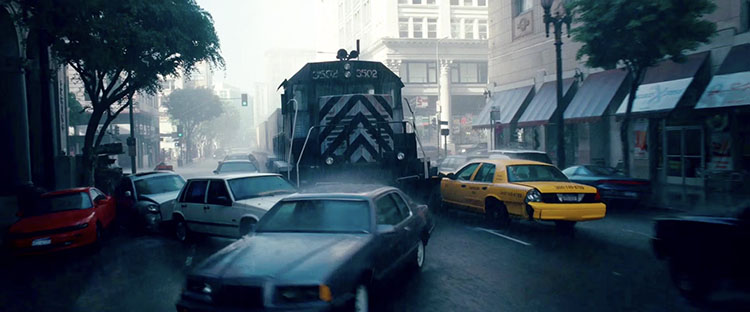 Dream layer one’s rainy exteriors are dominated by grays, dark blues, and blacks.
 Dream layer two’s urban interiors are composed of warm oranges and browns.
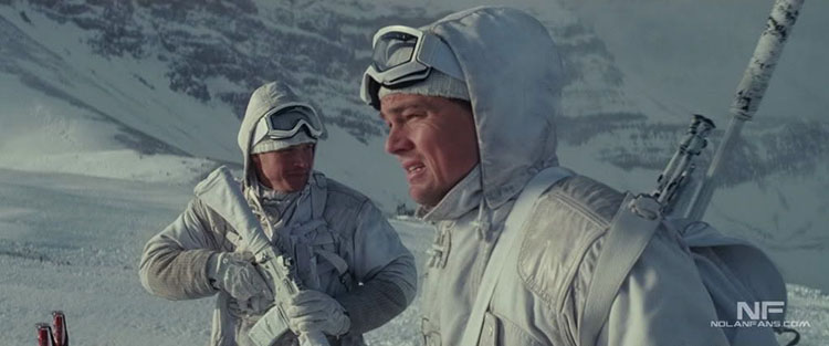 Dream layer three’s snowy exteriors are rendered with bright whites and grays.


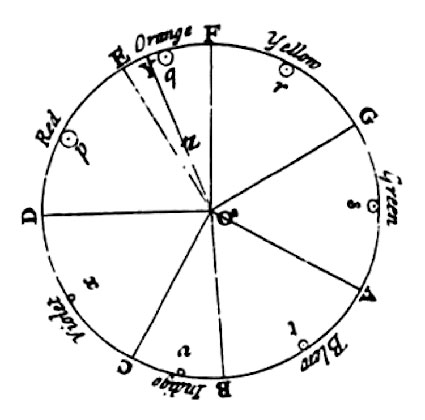 Newton
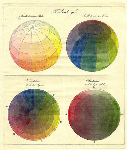
