Review Your Creative Plan Annually

3d9fc5231ca12d96b1a9b85cff2fa7b0_f605
One of the things I do at the beginning of every year is review the accomplishments of the past year.
I take my projects list from the last year and color code it, assigning one color for done, one color for soon to be done, and another color for not done.
I want to know what happened. It feels great to see a list of everything that got done, especially when you get a significant surprise windfall. It can also be disappointing to see what didn’t get done, especially when the items that weren’t accomplished are important. Seeing it the items collected in one place is always revealing.
I want to do more than just see clearly what happened. I also want to know why things happened.
I find the vast majority of things that got done were things I identified as important and scheduled time for – wishing won’t make things happen. If something great and unexpected happened, I want to know why it happened, so I can make similar things happen again. If at the end of the year, I’ve completely rewritten my plan for the year, but it’s been substantially improved, I’m delighted.
If something important didn’t happen, I want to know why. I want to learn from my failures.  How many items are close to being done? (A calendar date can sometimes be arbitrary.)  Was something delayed for an important reason? Will the delay make it more successful? Did I not see the problem clearly? Were my expectations unreasonable? Did I not perform at peak? Did I overextend myself, taking on too many projects? Did I not allocate enough resources? Did I have the wrong team? Was the timing not right?  Did I get distracted? What I can do to avoid this in the future? How can this apply what I learned on one project to my other projects?
This yearly review helps me mentally consolidate everything I’ve accomplished and everything I’ve learned. Often, while I’m doing this review, I learn more things and find more ideas. At the end of the review, learn from my failures and repeat my successes. I want to know if I’m on track and moving forward toward my long term goals.
With those insights fresh on my mind, I make a new projects list for the next year.  (I copy last year’s list and delete everything that got done or is no longer relevant, add new items but be careful not to add an unrealistic number, and prioritize them.)
What plans will you make for your creative life now?
Learn more about creative planning and goal setting here.
Learn more in my creativity and digital photography workshops.

Visible Dust Sensor Cleaning System


Let’s face it, dust happens.
The first step is to use an ounce of prevention. Minimize your equipment’s exposure to dust during storage and use, as much as practical. (I store and transport all my gear in Ziploc plastic bags.)
The second step is to remove dust from your camera’s sensor.
To protect themselves against carelessness of a minority of their clients, camera manufacturers claim to void warranties if you use third party cleaning solutions and recommend instead that you send the camera to them to be professionally cleaned. Even if you are not on a tight deadline or traveling in remote locations, this is often impractical. Initially, I was concerned about my ability to clean my camera’s sensor without damaging it. Then I found that cleaning your camera’s sensor is surprisingly easy and that you have to go to some length to actually damage a sensor. A little care and forethought is all that’s required. (See cleaningdigitalcameras.com for more information.)
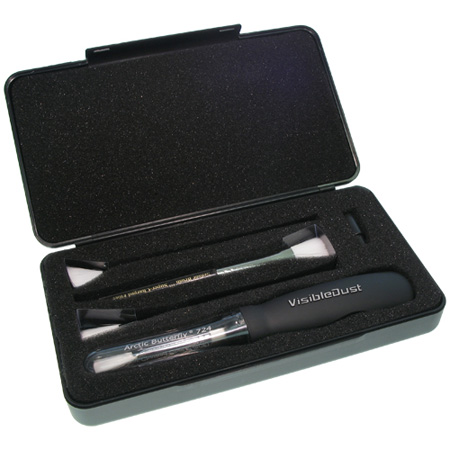
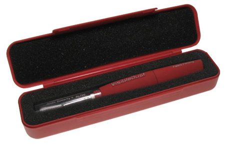
Visible Dust’s (visibledust.com) Arctic Butterfly is my preferred sensor cleaning solution. Unlike many other solutions the Arctic Butterfly doesn’t use fluids that may produce streaking on your sensor; instead, they use static electricity to attract the dust. Visible Dust has been making electrostatically charged brushes that won’t damage your camera’s sensor when you use them. The first brush solutions from Visible Dust used compressed air to create a static charge, which could be difficult to store and transport (impossible on airlines). The Artic Butterfly uses motion to create a static charge; the brush rotates at high speed. (The new units and their cases are far more durable than previous models.)
How easy is it to use? Extremely. Simply remove the top of the Arctic Butterfly and press the button to spin the brush. Turn your camera (without a lens) to sensor clean mode. Sweep the sensor a few times. Turn the camera off and put a lens back on it. Done! It takes less than a minute. It will save you hours of retouching. I recommend making this a regular practice whenever you change lenses – the time when most dust enters and moves.
Keep the brush clean; free of dust and oil (typically picked up from your hands or the chamber of your camera). If a brush becomes soiled, you can replace the ferules instead of the entire unit.
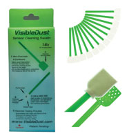
For difficult to remove dirt on sensors that can’t be swept away, Visible Dust’s Sensor Cleaning Swabs may be your final solution. Swabs and Sensor Clean or Vdust Plus liquid can be used to remove water and oil stains, providing even coverage without streaking and creating a light static barrier to help repel dust.
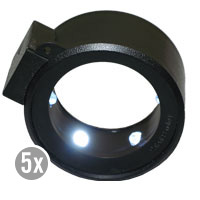
Optionally, a Sensor Loupe can be used to view the sensor under illumination at high magnification to ensure that the sensor is clean.
Whenever practical, confirm that your camera’s sensor has been successfully cleaned, by making an exposure of a flat field of color (such as a sky) at a small aperture (to better resolve the dust). Thoroughly check the file in Photoshop (or the image editor of your choice) at 100% magnification.
The Visible Dust sensor cleaning system hasn’t failed me yet. It goes everywhere I go. It’s easy to store, transport, and use. It’s saved me countless hours of time in image processing. It will save you valuable time too.
Arctic Butterfly SL700 ($70.95)
Sensor Loupe ($79.95)
Ultra MXD-100 Sensor Cleaning Swab ($37.95)
Sensor Clean ($35.90) and VDust Plus ($19.95)


Find more about visibledust here.
Read more about the tools I use here.
Learn more in my digital photography and digital printing workshops here.

Save Up To 20% On Chromix’s ColorThink Software


They say “A picture is worth a thousand words.” In some cases, it’s worth far more. That’s certainly true of the images generated by CHROMiX’s ColorThink. The folks at CHROMiX say, “You can’t manage your color if you don’t understand it. Nothing gets the idea across faster than the graph of a printer gamut.” They’re right.

CHROMiX ColorThink is the award-winning color management toolset that helps you understand your color more than ever before, primarily (but not exclusively) by graphing it. The ColorThink toolset is an application for managing, repairing, evaluating and graphing ICC profiles, composed of nine modules that are proven to “keep your brain on color”.

Profile Manager
Organize your profiles individually or in sets

Profile Inspector
Open all types of ICC Profiles and inspect their color data and other details. Change default settings to fit your workflow. Display neutral rendering curves.

2D Graphing
2D graphing gives you both general and specific views, allowing the overlay of multiple profiles and data sets.

3D Graphing
3D graphing gives you the whole picture. Analyze your devices and workflow. See the cause of proofing and printing problems. Graph measurement files and image colors to compare with device gamuts.

Image Inspector
Open images and see the embedded profile. Export, change(mac only) or delete(mac only) it at will. Learn to handle the files your customers are sending.

Profile Renamer
Profiles have two names; internal and external. Confused by what appears in menus? Change the internal and external names with this tool.

Profile Linker
Some RIPs allow linked profiles to be loaded for proofing purposes. Profile Linker will build those profiles for you, quickly and easily.

Profile Medic
Multi-point integrity checks can be performed on one or all the profiles in your system. If Profile Medic finds fixable problems with a single click it will get you back to work.

Color Lists
Open measurement files from most profiling applications. View them in list form with rendered colors. Apply profiles to the lists for testing and graphing.

ColorThink is a very robust color management software. Only a few advanced users will use its full toolset. But almost everyone can benefit from using a few of its most essential features.

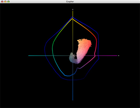
For me, graphing color is the core utility of this tool. Graphs are useful abstractions. When you’re dealing with a lot of information, graphs can condense and focus information from specific perspectives revealing useful information. This is certainly true of color. Because color has three dimensions (luminosity, hue, and saturation), graphs of color in 2D always leave something out, while graphs of color in 3D give you a more complete picture and more useful perspectives.

ColorThink gives you powerful tools for graphing color in both 2D and 3D. You can graph ICC profiles (input, display, output), color, color lists, or images. You can graph multiple profiles simultaneously for comparison. You can graph profiles and images simultaneously for comparison. You can view graphs in multiple formats such as shaded objects, wireframes, points, and vectors. You can change color and transparency to make comparison easier. And you can rotate, pan, and zoom your viewpoint dynamically.
Every time I lecture on color, I use ColorThink. Every time I evaluate a new inkset or substrate or printing profile, I use ColorThink. While I don’t graph every image before I print it, I do graph particularly challenging images to print and ColorThink always reveals useful information. I recommend it highly.

This utility not only expanded my understanding of color and color management but it has also helped me refine an advanced perspective on color theory (the conceptual tools artist’s often use to help structure color palettes and make color choices). It’s my hope that in the 21st-century 2D color wheels (such as Leonardo’s, Goethe’s, and Itten’s) will be replaced with 3D color volumes.


1    An image.


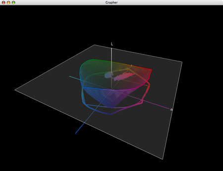
2    A 2D graph (two profiles and an image) tells only part of the story. The gamut of semi-gloss papers seem moderately extended when compared to matte papers; the image appears in gamut for both.


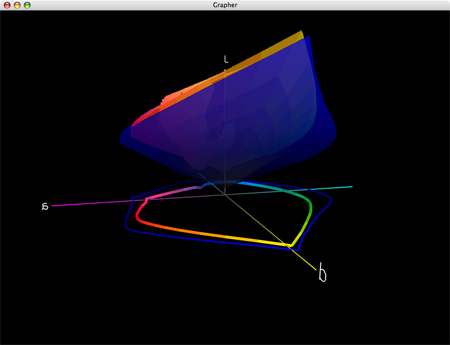
3    A 3D graph of two profiles tells you more. Semi-gloss papers have greatly extended dmax and gamut in dark values but reduced gamut in lighter hues; warm highlights are out of gamut for both (better highlight saturation is found in matte) and cool shadows are out of gamut for matte.


4    Gamut can be sliced at specific luminosity values.


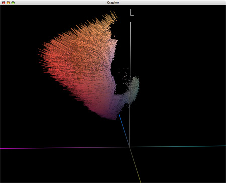
5    Display the effects of profiles on colors in images with vectors.


Visit the ColorThink product pages at www.chromix.com to learn more.


Read more on Color Management here.

Learn more in my digital photography and digital printing workshops.

Viewing Light – SoLux


Good light makes your prints appear even more beautiful. Get good light. It’s one of the most essential elements in any photographic image, at the point of capture, during processing, and at the point of display.

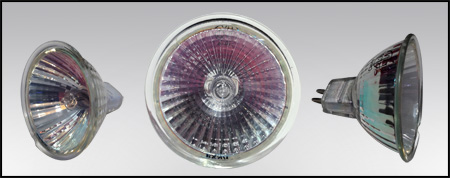
SoLux (www.solux.net) makes good light. SoLux bulbs’ Color Rendering Indexes (rating used to describe the quality of light) are 99 on a scale of 100. All SoLux bulbs are full smooth spectrum and ultra low UV and IR. SoLux bulbs come in a variety of color temperatures – 3500K, 4100K, 4700K, and 5000K. SoLux bulbs come in a variety of beam angles – 10-36 degrees. Low voltage (12 volt), SoLux bulbs fit in standard MR-16 2 pin socket fixtures and adaptors are available for regular screw in fixtures.

While light has many important qualities, two are particularly significant; temperature and spectral power distribution.

Most prints are viewed under light temperatures warmer than 5000K, typically a mix of tungsten (2800K) and daylight (variable). Galleries and museums favor halogen (2900K). Studies suggest that more people prefer viewing artwork under higher color temperatures (3500K).

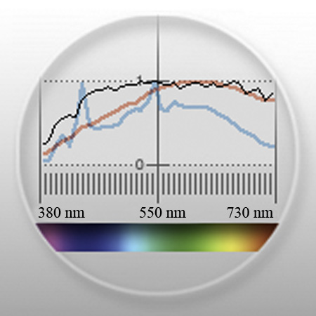
A majority of artificial light sources, including fluorescent, metal halide, and LEDs, have an uneven distribution of colors. Graphs of light sources with uneven spectral distributions display spikes in specific regions of the spectrum. Spikes limit the number of available colors in a spectrum to discern an object’s color. Due to missing colors in between spikes, objects may look dull or gray. When a spectrum is uneven, hues that are found in elevated levels appear brighter while hues that are found in low levels appear duller. Spikes create an imbalance in the relationships between hues. When possible, avoid lights that have them.

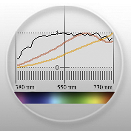
Incandescent light contains large amounts of yellow, orange, and red light. Though not as extreme, halogen suffers from the same tendencies. Cool white fluorescent light may produce a white that is cooler in appearance, but all fluorescent lights have uneven spectral distributions.

How important is viewing light? Very. To many, at first glance, the differences may seem subtle. To truly appreciate the differences you need a side-by-side comparison of the same or identical objects in spikey and smooth spectrum light sources.

The curators of the Van Gogh Museum (Netherlands) visited their traveling collection while it was on display at the National Gallery of Art (US). “What have you done with our paintings?” they exclaimed. They thought they had been cleaned. “Nothing.” was the reply. The real answer was in the light – SoLux. Under full-spectrum light sources the paintings appeared significantly brighter, clearer, and more saturated. The Van Gogh Museum now uses SoLux bulbs. More and more museums are beginning to use SoLux bulbs as well.

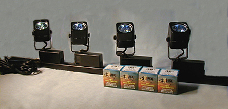
I use SoLux 3500K bulbs for my studio and gallery. I evaluate and display prints under the same light, one that most closely approximates the display conditions prints are most likely to be viewed under. I use four SoLux Gooseneck fixtures for portable light sources; two with 3500K bulbs to evaluate display conditions and two with 5000K bulbs to evaluate color management issues (calibration, softproofing, and profiles).

I recommend to owners of my prints that they strongly consider using 3500K SoLux bulbs for display and viewing.
To see, you need light. So it stands to reason that the light you view your prints in is extremely important. All lights are not created equally. For the best results, choose a high-quality light source.


SoLux bulb

Spectral curves comparing 3500K halogen (yellow) and SoLux (red)

Spectral curves for 5000K fluorescent gti lightbox (blue) and SoLux (red)
Visit www.solux.net to find out more about their products and light (there are excellent resources there on the science of light).
Contact Phil Bradfield – phil@solux.net or 800-254-4487.

Read more on Color Management here.

Read more on digital Printing here.

Learn more in my digital photography and digital printing workshops.

Review – Singh Ray Vari-ND Filter


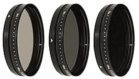
This one filter performs the function of many.  Reduce the amount of light coming through your lens by 2 to 8 stops. Simply rotate the filter to increase or decrease the effect.
Frame and focus with the filter on at minimum density. Rotate the filter to intensify the effect. It can get so dark you can hardly see through it.
Because the Vari-ND is so easy to use, it encourages experimentation with a wide range of exposures and effects.
Make long exposures.
Make selective focus easier.
Enhance close-up flash control.
Exaggerate the effects of panning during exposure.
As you test your Vari-ND Filter, you’ll find the effects will vary with focal length, direction and speed of motion (your subject’s or your own or both), and of course duration of exposure.
Use the preview on your DSLR to confirm your results instantly. Monitor your histogram after exposure to confirm proper exposure.
The Vari-ND comes in 77 and 82 mm sizes. Adaptors for other sizes are available.
The Vari-ND can be used with most other Sing-Ray filters, except Polarizers. You can amplify the effect of the Vari-ND by stacking it with the Mor-Slo 5 Stop Solid ND Filter.
Singh-Ray filters are legendary for their optical quality.
The VariND filter is one of the few filters I use.
For more information visit www.singh-ray.com.
Find out more about the tools I use here.
Learn more in my digital photography workshops.
D-Roller – Uncurl Your Prints


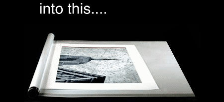
Quickly cure curl in prints made from roll papers with D-Roller.
This device is extraordinarily simple and effective.
You might wonder why a simple plastic tube with an attached sheet of plastic costs as much as it does – 24” $259.99, 36” $279.95, and 50” $299.99. When you see how effective, easy, and fast it is to use you’ll realize it’s money well spent.
Here’s how easy it is.
1 Place a print on the white carrier film near the tube.
2 Roll the tube away from you, wrapping the print between the tube and the film.
3 Hold for a few seconds.
4 Unroll the tube
5 Turn the print 180 degrees and repeat.
6 Remove the flattened print.
Here are a couple of tips for using it.
The longer you hold the paper rolled up the more curl you take out; you can actually reverse the curl if you hold the paper too long.
Paper coming off the outside of the roll requires less derolling than paper coming of closer to the core.
Low humidity requires more derolling.
Non-rag papers require more derolling.
Though the very smooth plastic won’t damage print surfaces, you can include a cover sheet in the derolling process for exceptionally delicate materials.
Special rollers can be custom ordered for very long prints.
Is it really that simple? Yes!
Does it really work? Yes!
Visit inkjetart.com for more information.
Read more about the tools I use here.
Learn more in my digital photography and digital printing workshops here.

InkAID – Coat Your Own Substrates


Interested in printing on exotic substrates? Consider InkAID (inkaid.com). InkAID is a liquid coating that prepares surfaces for inkjet printing. Coating an exotic substrate’s surface will do several things. It will reduce dot gain, allowing the print to hold more detail. It will increase gamut, providing greater saturation. It will increase dmax, yielding a better black.
Artists are experimenting with many types of exotic substrates from aluminum, to acrylic sheets, to wood, to uncoated fine art and handmade papers. Basically, if you can get it through the printer and you can get the ink to stick you can print on it. InkAID helps the ink stick.
InkAid is easy to use. Stir it. Brush it on. Let it dry. Print.
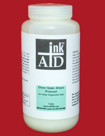
There are currently five InkAid products. White Matte Precoat creates a white matte coat on any surface. Clear Semi-Gloss Precoat creates a transparent semi-gloss finish on any surface.  InkAID Adhesive and Clear Gloss Precoat create a transparent glossy surface with two coats. Clear Gloss Precoat II creates a transparent glossy surface with one coat. When using clear coats, you can choose to let the coloration of the base surface show through (the material itself or a surface with an image) or you can coat it first with White Matte Precoat.
ping and handling.
Surfaces are water resistant and can be reworked with subsequent printings, over painting, or distressing.
You may be able to use ICC profiles for similar inkjet surfaces (if you get lucky), but it’s more likely that you will have to create new ICC profiles specifically for this surface to achieve the optimum results, especially if the final state of the coated substrate is not white.
InkAID is acid free and contains no optical brighteners. Nonstandard tests (hang samples in a window in direct sunlight next to other prints and compare) indicate longevity is roughly on par with similar inkjet prints. Longevity ratings obtained from standardized tests are not available as the variety of substrates being used today is so vast.
A liter costs $25. A gallon costs $65. A sample set (5 ounces of five products) is available for $21 plus ship
InkAID.com has a useful FAQ section answering many common questions about it’s use. The book Digital Art Studio: Techniques for Combining Inkjet Printing with Traditional Art Materials by Bonnie Lhotka, Karen Schminke, and Dorothy Simpson Krause is another source of useful information.
Find InkAid here.
Read more about the tools I use here.
Learn more in my digital photography and digital printing workshops here.

Print Shield – Protective Print Spray

There’s a print spray that anyone making inkjet prints needs to know about – Premier Art’s Print Shield. It’s a UV water resistant lacquer that comes in a variety of finishes – matte, semi-gloss, and glossy. It offers protection from light, water, moisture, airborne contaminants, and fingerprints. It doesn’t produce any visible changes in the print, either in color or density or surface.  It dries fast and doesn’t have a strong odor. It reduces burnishing and scuffing somewhat. Most importantly, it greatly increases longevity, in some cases by as much as 200%
Each $15 400ml can covers approximately 75 8×10” prints.
Henry Wilhelm has tested prints sprayed with Print Shield. Visit wilhelm_research.com for his most current data on longevity.
I spray all of my prints with Print Shield now.
Just like spraying a pastel, apply the fixative carefully. If the substrate gets soaked the surface may darken permanently. Instead of spraying the print directly, spray the air above the print and let the mist fall onto the print surface. Let the print dry for a few minutes. Then reapply.
Find PrintShield here.
Read more about the tools I use here.
Learn more in my digital photography and digital printing workshops here.