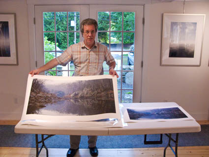
We started my Fine Digital Print Expert workshop today with extensive group portfolio reviews. The reviews are useful for unveiling issues that need resolution and for helping frame how to apply techniques in ways that are appropriate for and sensitive to an individual’s vision (rather than applying technique formulaically, which tends to make everyone’s images look the same). My workshop participants not only get my feedback, and the feedback from other participants, but they also learn a lot of ways to approach looking, commenting on images. The right questions can be just as important as the answers. Sometimes they’re best left open for future revisitation because more can come to light. And activating collective intelligence in group sessions can be very helpful. You get to see when you do and don’t have consensus and many more ideas come to light.
You can’t take a one size fits all approach. You have to take into account the experience level of the person and their artistic goals. Rather than criticism, I prefer to offer useful feedback. The new field of Appreciative Inquiry (born out of the science of qualitative analysis) has a lot to offer when it comes to making valuable statement about quality. It opens dialogs by first identifying core strengths and then discusses how to make them stronger.
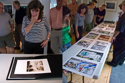
How participants present their work alters the type of feedback they get. You can present work without commentary and get spontaneous responses or you can speak about your work and get more focused commentary. You can present your images one at a time (this often highlights singular images, linear progressions of thought, and reveals memorable images – it’s best for more resolved work and when you want comments on broader issues and general thematic concerns) or many all at once (this makes it easier to see more subtle and complex connections between images, either formally or thematically, that might otherwise remain sensed but unseen – it’s best for more specific feedback). One isn’t better than another. They’re just different. The point is it’s important to decide what kind of feedback you’re looking for and to present your work in a way that encourages that type of feedback. Either way, you’ll often be surprised by the feedback you receive. That’s one of the great things about getting feedback from other people. You get exposed to new perspectives on your work.
Here, Claudia Rippee presented two bodies of work – a smaller set sequentially and a larger set contextually. She got very different kinds of feedback. At the end, she discovered that when the viewers understood that the two very different bodies of work were created by one artist that knowledge modified the responses of viewers to both bodies of work. Your images may be seen in reference to other artist’s images, but most importantly your images are seen in reference to all the other images you create.
Whether an individual’s goals are professional or purely personal I emphasize the development of an authentic voice and personally relevant themes. Signature Styles, Singular images and Bodies of Work are all core concepts that I reinforce. You can find out more about these keys to artistic fulfillment in my free Creativity Downloads.
See my PDF Portfolio Reviews and Artist’s palette here.
See my PDF Singular Images and Body of Work here.
Check out my column in AfterCapture magazine to read more.
Sign up for Insights to receive alerts when new free resources are posted.
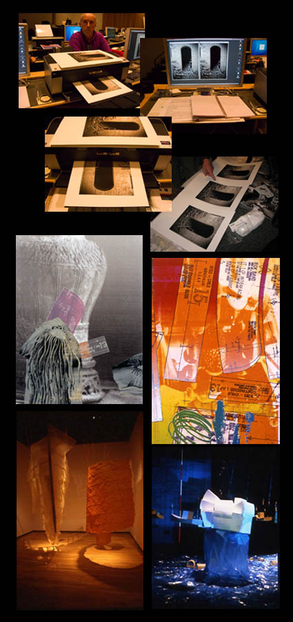
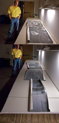
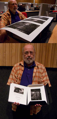
Find out about my Fine Digital Print Workshop series here.
Find out about The Fine Digital Print Expert workshop here.