

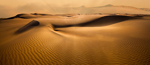
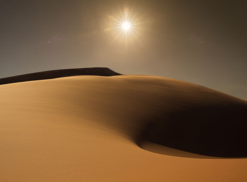
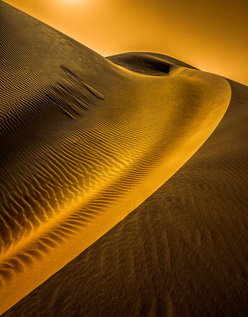
The single ground-level image above is an outlier in this series of aerial images.
Read the article to find out more.
See the solution at the end.
Outliers are the images that don’t fit neatly, testing the code of a body of work. Images can be outliers for many reasons. They don’t share the same ____ as other images in a body of work. (possible words to insert in the blank include subject, location, time, orientation, distance, angle of view, compositional device, stylistic treatment …)
If outliers are included for the wrong reasons (like you can’t put the image aside or find another context for it), they disrupt the tone and continuity of a collection of images, creating a mixed message and leading viewers down unproductive rabbit holes (like a smoking gun in a mystery that never gets explained). This weakens the effect of all of the images as a whole. And it leads viewers to question your artistry.
If outliers are included for the right reasons (they display a different but related way of seeing the same subject and provide new avenues for going deeper with your subject and your relationship to it), they strengthen both other specific images within a set and the group as a whole. This is particularly true if just one thing is changed from the characteristics of the larger set (angle of view, range, duration, etc), as what changes calls attention to itself, and questions are asked about how this change expands our understanding of the subject or artist’s intent. This requires careful placement in sequences. If a second or third outlier with the same characteristics is included, this move seems even more deliberate.
On occasion, one outlier can work within a body of work when presented as a prolog (beginning), turning point (middle), or epilog (end) to suggest other (often not fully resolved) dimensions within a body of work. On rare occasions, multiple outliers with shared characteristics can be grouped to create extended preludes, interludes, or coda, which also controls pace. Use these strategies carefully, as outliers draw a lot of attention to themselves. They set up inevitable comparisons and contrasts, so make sure they’re on point.
If outliers are great, they may represent a breakthrough, either as a way of expanding an existing body of work meaningfully or as a valuable area for discovery in a new body of work.
Pay attention to outliers. They’re your worst enemies. They’re your best friends.
What do you do with an outlier?
1 – Remove it from the body of work and try to forget about it.
2 – Place it in another body of work. Start a new one if you need to.
3 – Modify it so that it shares enough characteristics to fit.
4 – Find or make enough images like it that the series seems relatively balanced.
Read more in my Storytelling resources.
Learn more in my creativity and digital photography workshops.
The single images above is no longer an outlier when many more ground-level shots are added.
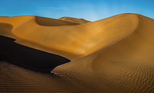
This expands the set and creates a comparison and contrast between ground and aerial viewpoints.
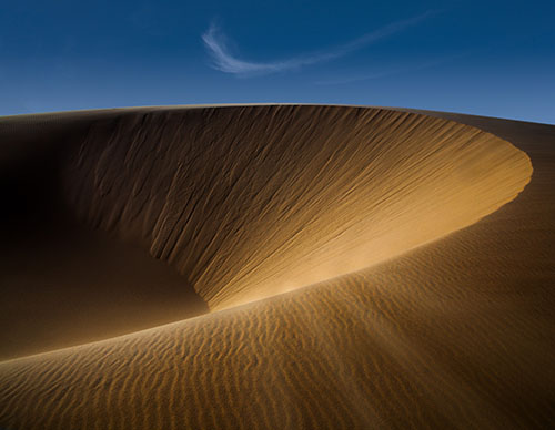
This final image represents a new idea found along the way, which is also expanded upon.
See 10 Benefits Of Building Bodies Of Work here.


